31 July 2012

Short Capless 1965

The first Pilot Capless, we saw, cost JPY 6000 in 1963. The second model, in 1964, JPY 3000. In Spring of 1965, the price went down to JPY 1000 for this model made of aluminum. Later models, as early as next fall, were marketed for JPY 5000.

Long vs. short Capless models released in Spring 1965.

This might not be the most appealing Capless model ever made, but it has some interesting features. There existed two versions—short (CS-100RW) and long (C-100RW), the later being rarer than the former. Their inking still relied on the double-spare type of cartridges and, therefore, we now need to use the CON-W converter. These pens are quite light and well balanced. The dimensions of the short version are as follows:

Diameter: 11 mm.
Length closed: 134 mm.
Length open: 126 mm.
Weight: 15.2 g (dry with converter CON-W).

Short model with its nib unit made of steel.

Closed, retracted,...

...and open, extended. Note how the small door opens out of the pen body.

The nibs, in all the units I have seen of these two models, were made of steel. The one I am showing was manufactured in March 1966.

My thanks to Mr. Niikura.

Pilot Decimo – Pgary’s red-black ink

Bruno Taut
July 24th, 2012
etiquetas: Pilot, Capless

25 July 2012

Capless 1963

On a recent chronicle I spoke of the Pilot Capless as one of the very few iconic pens made in Japan. Now I am showing the first model of that pen. It saw the market by the end of 1963, and it was an expensive pen: JPY 6000 for the basic version (C-600MW), and JPY 10000 for the luxurious gold plated (C-1000CW) and the clipless, possibly urushi-coated, (C-1000DW) pens: The later, though, was released already in 1964, the year of the Tokyo Olympic Games. In all of them, the nib unit moves up and down along the pen by twisting the whole barrel, and the knurled tail simply offers a nicer grip for this operation.

The C-600MW, from 1963.

Detail of the gripping section. The upper side is shown with a subtle arrow.

These Capless pens are characterized by a very short clip. The reason behind this lies in its position, on the lower side of the nib. The natural grip allows for a short space between the nib and the fingers underneath the pen.

Another view of the opposing nib and clip. In this case, on the gold plated C-1000GW model.

Model C-1000GW. These pens use the double-spare cartridge.

The C-1000DW from 1964.

Detail of the nib unit. This was manufactured in Novemeber of 1963.

The following model in the history of Pilot Capless has already been covered on these Chronicles. It is a push-button pen released in 1964 whose cost was JPY 3000.

In the second hand market, these first models from 1963 are the most expensive among all Capless variations.

My thanks to Mr. Niikura.

Platinum Glamour – Sailor Sei-boku

Bruno Taut
July 24th, 2012
etiquetas: Pilot

20 July 2012

Scrikss in Spain

Some weeks ago, the author of the blog Write to me Often –Zeynep— spoke of the Turkish brand Scrikss and about the Spanish origin of the brand. She mentioned the lack of reliable records on the history of the brand as well as the contradiction between the Spanish records (Registry of the Intellectual Property) and the claims of the Turkish company. These are my findings related, mostly, to the Spanish history of the company.

This brand, Scrikss, was first registered in Barcelona in 1959 by Luis Gispert Miró for his company Industrial Gispert [NEBOT 2009]. The name, some say, was inspired by the Catalan word for to write: escriure [SCRIKSS 2012]. During these years, besides producing pens, the company also supplied nibs to, at least, the Spanish pen company Soffer. In 1963, the brand name and the machinery were sold to Estilográficas Jabalina [NEBOT 2009]. Juan Navarro Sánchez had founded this company in 1948 [SAM DIVERSA 2012] or 1949 [NEBOT 2009] (application filed in November 1947 [RODRÍGUEZ 2003]) as a one man operation to repair fountain pens in Albacete, Spain.

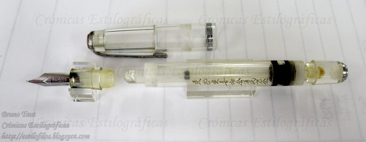
Two Scrikss pens made in Barcelona. Photographs by Mr. Alberto Linares.

It seems, however, that Jabalina barely used the name of Scrikss for its fountain pens. On the picture we can see a transitional model: box and pressing plate of the filling system are labeled as Jabalina, while the cap still holds the name of Scrikss. Although some accounts exist [RODRÍGUEZ 2003] of some initial production of pens in the early 1950s, it is reasonable to think that the main production of pens started with the acquisition of this machinery in 1963.

A transitional Scrikss-Jabalina model--both brand names coexist on the pen. Photographs by Mr. Eduardo Alcalde.

A Jabalina pen made in Albacete. Photograph by Mr. Alberto Linares.

At some point during the 1960s (maybe in 1963), the brand name Scrikss was sold to a Turkish entrepreneur, eventually with the intervention of the Swiss company Mowe SA. [SCRIKSS 2012]. Was Jabalina just interested on the machinery and then sold the brand rights right after acquiring them?


Jabalina, actually, continued producing pens and sometime either in the 1950s [SAM DIVERSA 2012] or in the 1980s [MOLINA 2005] it changed its name to STYB (its model Compact has already shown up on these chronicles), as it is known nowadays.

On the Turkish side, the company was established in Istanbul and started the development of products with the initial support of Spanish technicians (reference). It produces pens mostly for the domestic market while acting as importer of Cross in Turkey. Its website also mentions Pelikan as imported by this company, but some other records claimed this was not the case for the past years.

On the picture we can see the model 17, the first fountain pen made by Scrikss in Turkey in 1966, and still on the online catalog of the company. This model 17 has an uncanny similarity to the Súper T Olimpia released in Spain in 1961.

Turkish Scrikss model 17. This model dates from 1966.

My thanks to Alberto Linares, Eduardo Alcalde and Zeynep; all friends in the unreal realm of fountain pens.


REFERENCES:

MOLINA 2005. Carlos MOLINA. “Styb: tinta líquida para cien millones de bolígrafos”. Cinco Días. August 26, 2005.
NEBOT 2009. Pedro NEBOT. La estilográfica española. November 2009.
RODRÍGUEZ 2003. Juan Carlos RODRÍGUEZ. “La increíble historia del boli ‘Made in Albacete’”. El Mundo. España. November 2, 2003.
SAM DIVERSA 2012. Sam Diversa Corporation. Website. http://www.sanchez-muliterno.com/samdiversa/industrial.html . Retrieved July 2012.
SCRIKSS 2012. Scrikss Turkey website. http://www.scrikss.com.tr/History. Retrieved July 2012.


Montblanc 221 – Wagner 2012 ink, red-black

Bruno Taut
May-July 2012
etiquetas: Scrikss España, STYB, Scrikss Turquía, Jabalina, España, Turquía

17 July 2012

Capless Incompatibilities

The current Pilot’s Capless line of pens is formed by three basic models—the regular Capless (Vanishing Point in some markets), the slim Capless Decimo, and the twist knob Fermo. The theory goes that all nib units are interchangeable among all the models, and this brought me to say that Capless pens were empty boxes—choose the nib of your preference and dress it up with the body that matched your attire of the day, for instance.

The two Capless pens--the regular size on top, and the slim Decimo on bottom.


That was indeed my intention. I wanted to use a very pleasant F nib in the lighter and slimmer Capless Decimo, but I could not do it. The problem is that golden-looking nib units, made of gold or of stainless steel, are a tad thicker that those plated with Rhodium. As a result, these thicker units do not slide smoothly in their movement inside the Decimo pen. In the worst case, the nib unit becomes stuck inside and does not retract completely.

The origin of the problem lies, upon close inspection, on the notch to lead the nib into the right position inside the pen. On the pictures, it can be seen that those notches are different in size—both bigger and slightly thicker on the golden units.

18 K gold Capless nibs. The differences on the notches are clearly visible on this picture. Their shapes, their sizes,...

...and their thickness are different.

I must also say that my golden-looking nibs are older than those rhodiated, and this issue might have been corrected on later produced units. Or maybe not. Either case, checking this detail in the notch is important for the proper function of the Capless Decimo in connection with a golden nib.

These problems had already been reported on a previous chronicle on the Capless Sesenta.


Platinum Glamour – Sailor Sei-boku

Bruno Taut
July 17th, 2012
etiquetas: Pilot

14 July 2012

A-shiki (A-式)

Some weeks ago I describe a green celluloid Pilot pen. The main argument of the text was about the uncertain manufacturing date given the mixed information the pen provided.

The green celluloid pen described some weeks ago.

I described the pen as an eyedropper with shut-off valve, and that was not only wrong, but it made no sense given the structure of the valve. That filling system, let us remember, had the special feature of a sliding sheath with a cone-shape ending. But if the valve could slide along the axis, unscrewing the tail knob would not do much in order to open the access to the section.

The clip has the same design as that on the green celluloid pen.

A demonstrator Pilot from late 1940s with the A-shiki filling system. Note the sliding sheath on the picture on bottom.

In fact, that was not an eyedropper pen, and the filling system is a sort of “pulsating plunger filler”. It is a plunger filler that needs to be operated repeatedly –three or four times— to fill the ink deposit. The sliding sheath provides an incomplete seal to prevent the ink from flowing out of the deposit on the down strokes of the system. Its efficiency relies on the tight fit between the axis and its seal on the barrel end.

The section, left, and the sealing sheath, right, in detail.

This system is called A-shiki (A-式), and was implemented by Pilot in the late 1940s. This shows that the green celluloid pen was not a frankenpen but a true product of its time—1950.

The pen illustrating this chronicle is a beautiful example of a demonstrator pen with this A-shiki filling system.

Even the feed is transparent on this demonstrator.

My thanks to Mr. Niikura.

Pilot Short – Sailor Doyô

Bruno Taut
July 8th, 2012
etiquetas: Pilot, soluciones técnicas

10 July 2012

Coming Soon

The long awaited book Fountain Pens of Japan, by Andreas LAMBROU and Masamichi SUNAMI, is expected to be released in time for the incoming pen show of Washington DC (August 9 to 12). The authors intend to attend the event.

The reason for the delay in the publication lies in a number of problems related to the color rendition at the time of printing.

Pilot Short pen – Sailor Doyô

Bruno Taut
July 6th, 2012
etiquetas: libro, Japón, evento

07 July 2012

Icons in Japan

I can think of very few truly iconic pens in Japan. On the contrary, in the West it seems that all major brands have one or several icons that both identify and symbolize their glory—Parker 51, Sheaffer’s PFM, Waterman Patrician,… They all are well known and documented, and it is not too difficult to find them as they were produced in fairly big numbers. Whether the price is high or low is a different question.

Two Parker 51: the one on top is an aerometric filler; that on bottom, vacumatic.

But in Japan, I was saying, the case seems different. Pilot’s Capless family of pens –more a concept than a single pen given the number of variations and evolutions along almost 50 years of history—is one of them. Another is the all metal pocket pen Myu 701, also made by Pilot. Both, Capless and Myu, fit the three characteristics previously mentioned: well known, well documented, relatively common.

Capless, Capless, Capless. Different models from the mid 1960s to the present time.

The obvious question is why these differences between Western and Japanese markets. Why didn’t other Japanese companies –other than Pilot, that is-- create true symbols of their brands? Is that something that is done on purpose? Is it a secondary effect of the great admiration for foreign pens Japanese stylophiles profess?

Pilot's M90 and Myu-701. The former is the modern re-issue of the icon from the 1970s.

On another text I will speak about another possible icon, or almost-icon, in Japan.

LinkLink
Platinum Glamour – Sailor Sei-boku

Bruno Taut
July 7th, 2012
etiquetas: Pilot, Japón, estilofilia