24 July 2011

Drunken Sailor

Pen review of a Sailor pocket pen, 14 K gold nib, from around 1970.

Now we know pocket pens were probably invented by Platinum in 1964, and that Pilot released its first pocket pen model by the end of 1968. Nothing we know, though, about the origins of those pens when made by Sailor.

The pen under review today is a Sailor pocket with a sort of old look due to a number of reasons: short length, nib flexibility and shape, original clip…


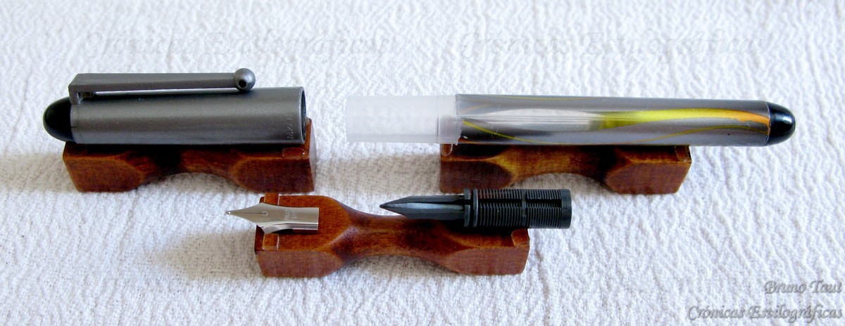
1. Appearance and design. (8.0/10)
This is an average looking pocket pen in terms of materials: plastic body, aluminum cap, steel clip, 14 K gold nib… Nothing special here. However, its very short length when capped gives this pen an additional appeal.

The clip is bended out of a single piece of steel, and resembles a paper clip. It adds an element of simplicity and functionality to the pen.


2. Construction and quality. (8.0/10)
The pen seems to have aged quite well and only some scratches can be seen on the cap. The rest is perfectly functional and shows no blemishes. The cap fits tightly on both the section –to close the pen— and the barrel —to post and to write with it.


3. Weight and dimensions. (9.0/10)

Small pen of average to low weight. It is so short that the option of writing with it unposted is almost out of the question unless the user’s hands were indeed small. But posted it is well balanced and comfortable to use.

Dimensions:
Diameter: 11 mm.
Length capped: 105 mm.
Length uncapped: 92 mm.
Length posted: 141 mm.
Total weight: 14.2 g (full)
Weight uncapped: 7.4 g (full)
(For dry weights, deduct 1 g from those values).


4. Nib and writing performance. (6.5/10)

The nib is made of 14 K gold. It has no point indication but it is likely to be a fine (F). The more surprising detail is its flexibility. Contrary to the very stiff modern nibs by Sailor, this one is definitely springy, almost a semi-flex. And this soft feeling is especially pleasant to write.


The feed, on its side, is not always up to the challenge. For usual writing and note taking, it works perfectly; but a little extra push to explore the full flexibility of the nib breaks the ink drop and the nib railroads. This is not a flexible nib —the feed seems to say—and we should be content with its pleasant springy effect. But it is certainly frustrating—the nib promises but the drunken sailor’s feed fails to deliver.

The bottom line is that this is a nice writer within its limits of ink flow.


5. Filling system and maintenance. (6.0/10)

Records say that Sailor used to market small converters for its pocket pens. But I have never seen any of those and neither can I say whether they would fit in these very short pens.

In any event, this one is now a cartridge-only pen, and only those manufactured by Sailor. This might not be a problem in Japan, but it is in other markets where the distribution of Sailor products is very unreliable. The options, then, are refilling the cartridges and using it as an eyedropper. The connecting piece between section and barrel is made of steel and some people might be afraid of corrosion due to the ink.

Maintenance-wise, this pen is quite easy. Nib and feed can easily be extracted by unscrewing the nipple and pushing them up the section.


6. Cost and value. (9.5/10)
Pocket pens are easily available in the second hand market and as NOS (New Old Stock). Save a couple of examples, they are cheap and make good writers.


7. Conclusion. (47.5/60=79/100)
There are a number of features that make this pen special: its very compact dimensions, the springy nib, the original clip. On the negative side, this is a cartridge-only pen, and the frustrating feed. But it is indeed a nice writer.

(Sailor pocket pen, 14 K gold nib – Sailor black)

Bruno Taut
July 22, 2011
[labels: Sailor]

22 July 2011

The Eiko

Today’s pen is labeled as “The Eiko”, and little else can be said about it. It is a well made pen. A very Japanese model, as the shut off valve shows.


There are three different engravings on the pen:
The clip is marked with a sign saying “NEW CLIP”, about which I should write something. The barrel, on its side, says “The “EIKO”. SAFETY FOUNTAIN”. The steel nib, finally, says “New Style Tubasa Iridium (5) Pen”. However, I cannot guarantee it is the original nib to this pen.

These "new clips" are rather common on Japanese pens from the 1940s.

The engraving says "New Style / Tubasa / Iridium / (5) / Pen". In a proper Japanese romanization, however, the name would be Tsubasa.

The Eiko is a fairly big tool: 15 cm long when closed and the eyedropper deposit holds about 4 ml of ink. These are the actual dimensions:

Diameter: 15 mm (cap).
Length capped: 130 mm.
Length uncapped: 123 mm.
Length posted: 170 mm.
Total weight: 21.3 g (empty).
Weight uncapped: 13.2 g (empty).
Ink deposit: about 4 ml.


Nothing have I found about this brand, and it is difficult to date without any further information. However, I would say it belongs to the early 1940s.

(Pilot Vpen F nib – Diamine Teal)

Bruno Taut
July 16, 2011
[labels: Eiko]

18 July 2011

The Platinum Logo

Not much detailed information there exists about fountain pens. A lot of research must still be done and, as a consequence, we all are subject to make mistakes.

Such was my case when I spoke about pocket pens one year ago (May 17, 2010). Despite my initial doubts, I ended up publishing a chronicle in which I said that they were invented by Pilot in 1968-69. Well, I was mistaken.

This Platinum pocket pen was made before 1968, as the nib shows through the logo on the nib.

The old Platinum logo.

Again, the old Platinum logo on a nib from, probably, the 1940s. The nib shows both the brand name Platinum and the name of the company Nakaya (Seisakusho).

Now (as of July 2011) I read on the Platinum website that this company had released the first pocket pen in 1964—and that makes some sense. That explains, for instance, how the old Platinum logo –that of the world globe– can be seen on a pocket pen. The new logo –the stylized P— was introduced in 1968, according to the same website, and this contradicting some claims dating this change in 1963.

The new logo on a B nib.

The Nakaya logo, on the box and on the nib, resembling the old Platinum logo.

Later on, in the early 2000s, the old Platinum logo was revived to create that of the Nakaya line of pens.

(Slim purple eyedropper – Diamine Amazing Amethyst)

Bruno Taut
July 14, 2011
[labels: Platinum]

14 July 2011

Slim

Jumbo pens were made, we are told, to ease the pen grip, especially for older people with problems in their joints. And those are certainly comfortable pens—provided their weights were not excessive, which can easily be the case when their ink capacity might be in the tens of milliliters. Any pen user knows that thin pens are uncomfortable to use for long writing periods. And this fact probably explains the very limited numbers of very thin pens in the market.

A posted Chalana, from 2009. The diameter in the barrel is just 6.5 mm. The total length, posted, is 137 mm.

The Sailor Chalana, in the market since 1980, is nowadays the obvious reference in this niche. It is a very attractive pen with a feeling of luxury and sophistication. Its 18 K gold nib certainly contributes to it. However, inside it is a cartridge/converter pen with a very limited ink capacity (about 0.2 ml fit in the converter).

The Chalana, disassembled. The feed is very long compared to the nib.

This Flaminaire pen sold, at least, in Spain —and possibly made by Waterman— is certainly thin. It is a cartridge/converter pen with a very smooth steel nib. A well constructed pen.

An ad of Flaminaire pens and lighters from 1981 in Spain. My thanks to Grafopasión member Claudio.

The diameter of this Flaminaire pen is 6.5 mm on the barrel.

I found these pens in Japan, but I cannot say anything about their origin.

A lot more unusual is this non-marked eyedropper pen. Little can be said about it since the only sign on the pen is that on the nib revealing nothing. But this is an interesting pen—well made, with a smooth semi-flex steel nib, and eyedropper. Its main problem is to fill such a narrow and dark barrel. The ink capacity is quite generous —about 1.0 ml— given its size.

The sign on the nib is partially hidden. The first line reads "SPECIA(L)". The second starts with "MAGN".

This pen is a simple eyedropper. It is a good writer whose only problem being too thin for a comfortable grip.

These are its dimensions:
Diameter: 8 mm (cap).
Length capped: 113 mm.
Length uncapped: 99 mm.
Length posted: 128 mm.
Total weight: 4.2 g (empty).
Weight uncapped: 2.2 g (empty).
Ink deposit: 1.0 ml.

My thanks to Mr. Alberto Linares and Kinno-san.


Navy Gold 200 – Pelikan 4001 Royal Blue

Bruno Taut
July 12, 2011
[labels: Sailor, Flaminaire, marca desconocida]

10 July 2011

Honest Pen

Past April I spoke about a strange Spanish pen by the name of Presidente. Actually, the only detail speaking of Spain on that pen was the engraved sign on the barrel: “PRESIDENTE / Registrada”. The rest screamed Japan out loud. Well, not just Japan but Platinum.

The Spanish Presidente pen. The brand was registered in Spain by Doroteo Pérez y Pérez in 1959.

The Honest 60 model by Platinum from 1956.

Today’s pen seems to be the actual Platinum relative to that Spanish pen. It is the Platinum Honest 60 pen from 1956.

The Honest 60's inscription on the barrel. Very different to that on the Spanish Presidente.

The top jewel, however, is the same on both pens.

Apparently, this Japanese company released the Honest model in 1955 with a bulb filler (according to Ron Dutcher, of Kamakura Pens). In 1956, the pen was marketed as the Honest 60 with a cartridge/converter system: “Good bye, ink bottle” was the pen’s motto at the time. This pen was, in fact, the first Platinum’s cartridge/converter model. In 1953, the ten year durable nib had been introduced and, therefore, the10 years imprint. The number 60 made reference to the company’s goal to become one of the top ten pen companies by year 1960.

The black pen on the back is the Honest 66 from 1960. On the front, the Honest 60 (1956).

This ad was taken from the Platinum's website. It speaks of the Honest 60, but the pen shown is the later model Honest 66. The date Christmas '60 is correct for the later 66 model.

The Platinum Honest 66 (P66-100) model. A mayor difference with the older 60 model is the smooth barrel on the 66 versus the stepped one on the 60.

In 1959, Platinum realized that goal could not be accomplished and put it off to 1966. And a refurbished Honest pen –the Honest 66 model, code number P66-100— was released.

The Honest 60, disassembled.

The Honest model here shown is the cartridge/converter model from 1956. And this filing system is the basic difference with the aerometric Spanish relative. The rest are mere cosmetic differences. Even the steel nib is engraved in the same way: “PLATINUM / (Company logo) / 10 YEARS / HONEST / (JIS logo) 11”.

The Platinum's Honest 60 steel nib.

Then, how did the aerometric Presidente become Spanish? How did the bulb filler or the cartridge/converter system become aerometric? Was the aerometric some sort of production test for those pens finally sold in Japan? I have no answers for these questions, but at least here we have the obvious relative to that not-so-honest Spanish pen registered by some Doroteo Pérez y Pérez in 1959. And the quest for information continues.

(Navy Gold 200 – Pelikan 4001 Royal Blue)

Bruno Taut
July 9, 2011
[labels: Presidente, Platinum, España, Japón]

04 July 2011

Center

2500 pen ventures at any given time anywhere are a huge number. But that is what Andreas Lambrou and Masa Sunami say about the post Second World War pen scene in Japan. Many of them simply assembled pens out of pre-bought parts and did not last long in the market. But nonetheless, the number of Japanese companies registered in texts and websites remains big. Most of them are minor and their pens are hard to find in the market, not to mention that too often their quality do not justify any effort in finding them. But some do find their way to your hands…

Not much can be found about the pen brand Center. Ron Dutcher, from Kamakura Pens, says that it was based in Osaka, either from the 1930s or from right after the war, and closed down by the mid 1950s. On the other hand, the Fountain Pen Network list of Japanese pen manufacturers speaks of this brand as owned by the company Sanwa Kogyo Co. Ltd. from Tokyo. It produced, the FPN link says, some celluloid pens in the 1950s.

The Center 61.


Today’s pen is a cheap model labeled as Center 61 on the barrel in bright pink celluloid. The nib is of the nail type, with the feed totally covered by the section. It is a semi flex, most likely made of steel. The filling system is aerometric. The dimensions are as follows:

Diameter: 10 mm.
Length capped: 127 mm.
Length uncapped: 116 mm.
Length posted: 140 mm.
Weight: 14.4 g (empty).
Cap weight: 5.0 g.
Ink deposit: 0.6 ml.


My best estimation is that this pen dates back from the late 1950s given its similarities with some Pilot Super models of that time.


Obviously, not all Japanese pens show good taste. This one is certainly kebai.

(Kaweco Sport – Diamine Amazing Amethyst)

Bruno Taut
July 4, 2011
[labels: Center, Japón]

Note added on May 7th, 2013: The company Sanwa Kogyo still exists, but it is (and was) based in Nara, not in Tokyo. More information, on this other Chronicle: More Center.

02 July 2011

JIS

On the previous chronicle I mentioned that the pen company SSS could not survive the tough competition in the Japanese market after the Second World War. Japanese pen collector Masa Sunami and Andreas Lambrou speak of over 2500 small ventures producing pens in Japan by the late 1940s. This number decreased quickly due to competition –the survival of the fittest— and to the control induced by the Japanese Ministry of Industry through the implementation of the Japan Industrial Standards (JIS) in 1952.

The JIS logo, prior to 2008. Image taken from the Wikipedia.

A size 1 nib by Meizen, in steel, with the JIS logo. This pen dates back from the late 1950s.

A Platinum pen from 1970. This nib is made of 18 K white gold.

The visible effect on pens was the new logo that from 1954 was imprinted on pen nibs to guarantee the material out of which they were made. Until that moment, a number of companies advertised theirs as golden when they were merely gold plated. Adopting the logo was, apparently, not compulsory, but Pilot adopted promptly thus pushing other brands to follow suit. However, some brands were reluctant to imprint the logo. With time, its use has decayed and in modern pens is no longer present.

A size 2 nib by Morison, made of steel. It belongs to a lever filler hard rubber pen.

This is the nib of a Pilot R, a popular pen in production for a long time. The JIS logo dates the pen in the late 1950s.

A nice side effect, fifty years later, is that the logo provides an argument to date the pen—any nib with that logo was certainly manufactured after 1954.

(Pilot V pen, F nib – Diamine Teal)

Bruno Taut
June 29, 2011
[labels: Japón]