14 August 2014

Matching (XIV)

Which one is the original and which one is the copy?

It is well known that the big three Japanese pen companies keep a close eye on each other, and we can see startling similarities on some of their current products. That, in fact, is not new. The original idea of the pocket pen, for instance, is disputed between Sailor and Platinum —Pilot’s first pocket pen came later, in 1968—, but the final result was by the end of 1960s all three of them –and even some other smaller brands— had their own version of a black and formal looking pocket pen well suited for the Japanese salary man.


From left to right, a Ferme, a Pilot, a Platinum (with damascene decoration, zogan in Japanese, on the section), and a Sailor. All pocket pens in black with golden accents. All four nibs of these pens are made of 18 K gold.

But not only that model was copied. Years later, by the mid 1970s, all big three offered pocket pens made of stainless steel—all clean and lean. Only one of them, however, dared to make an all-steel pen with integrated nib.


From top to bottom, Platinum, Sailor and Pilot pens. The Platinum unit uses a Pt-alloy nib. In other words, a white gold nib. Pilot and Sailor nibs are made of 14 K gold.

Which one is the original and which ones are the copies? Among the three examples shown today, the Platinum is probably the earliest of the lot given its Pt-alloy nib.


Inoxcom 77, steel nib – Platinum Black

Bruno Taut
Nakano, August 12th 2014
etiquetas: Japón, mercado, Platinum, Pilot, Sailor, Ferme

12 August 2014

Bulb Fillers

On the Chronicle describing the Surat pen, I mentioned that the bulb filling system was well known in Japan. That system, let us remember, consists in an ink deposit ended with a flexible rubber sac, and with a breathing tube inside.


From top to bottom, a Worla, a Surat (a Nakahara system, but that is a variation of the bulb system), a Tomei, and a SSS.

Today I am showing some examples from mostly unknown companies: Tomei, Worla, Meizen. The much better known SSS and Sailor also manufactured this filling system. And many others as well, most likely.


A Meizen pen in red urushi. This model was made after 1953, as the nib is marked with the JIS logo. Meizen was a brand active in Tokyo until the late 1950s or early 1960s.


A Sailor bulb filler from the early 1950s.

Albeit there are few, if any, indicators of the age of these pens, it is reasonable, given the construction style, to assume they were made around 1950.


Pilot Vpen – Diamine Graphite

Bruno Taut
Shinjuku, July 23rd 2014
etiquetas: Tomei, Worla, Meizen, SSS, Sailor, Surat, soluciones técnicas.

02 August 2014

4622

The information I offer today is already known—Kabutogi Ginjirô was a remarkable Japanese nibmeister who worked for a number of pen brands, including some of his own. And he was also responsible for the creation of some fake Pelikan nibs.

Today’s example is very significant. It is a wonderful paradox, a blatant contradiction. How could a Pelikan nib be engraved with the Japan Industrial Standards (JIS) mark and the registration number of a Japanese company? 4622 was registered to Kabutogi Ginjirô in connection to its brand Seilon, as we already saw.


A Japan-made Pelikan?

How far are countries willing to go in order to protect the local economy? Nowadays, Japan complains about China’s industry of counterfeit products but, didn’t Japan engage in these same activities back in the 1950s and 1960s?

This JIS-marked Pelikan nib is a stubborn proof.

My thanks to Mr. Sunami.


Inoxcrom 77, steel nib – Platinum Black

Bruno Taut
Nakano, August 1st 2014
etiquetas: Pelikan, Japón, nibmeister Kabutogi Ginjirô, Seilon

31 July 2014

Cheaper

Some months ago, over a year now, the Italian brand Delta launched a strange nib. Strange, but with a lot of hype on the benefits of its unusual structure.

The Delta Fusion is, in actual terms, a steel nib topped with a gold hat. This combination, Delta advertisement claimed, provided an improved flow because the interface steel-gold raised the temperature of the ink, this rendering it more fluid…


Delta's Fusion nib, made by Bock.


The reverse side of the very same nib--an untipped stub. These two pictures are courtesy of KMPN.

Really?

If so, any gold plated steel nib should provide the same effect. Let us remember that interfacial effects only involve some few layers of material –of gold and steel in this case— and no especially thick coatings were needed.


Two "fusion" nibs by Pilot.

But on top of this fallacy there another one—Delta’s nib is not even a novelty! A long time ago in a galaxy far away Wearever created another hybrid nib. On this case, however, the writing material –or that supporting the writing point—was gold, and steel was used to attach the nib to the feed and to the section.


A "hybrid" nib by Wearever. The steel plate holds the gold nib in place.

Both cases follow the same argument—how do we reduce the gold content of the nib while preserving the added value of the gold nib itself? A number of strategies have been attempted along the history of pens. Delta’s is simply the last one—and the most ridiculous of the lot.

My thanks to Wagner member Shokubutsuen and to KMPN, whose pictures of the Delta Fusion nib are greatly appreciated.


Pilot Custom 74, music nib – Gary’s Red-Black

Bruno Taut
Shinjuku, July 23rd 2014
etiquetas: plumín, Delta, Wearever, soluciones técnicas, Bock

24 July 2014

Nakahara-shiki (中原式)

I finished the previous Chronicle with the picture of an interesting but mostly unknown pen—a Surat. Now, given the reactions that picture triggered it seems that further information is in order.


I discovered this pen through a fellow stylophile from Kansai (Osaka region). Mr. Mochizuki had found a big number of them at some flea market. And, even better, many of them were complete with box and papers—like the one I am now presenting.


On the manual, the pen is described as featuring an original filling system names as Nakahara-system (中原式, Nakahara-shiki). However, upon opening the pen we only see a bulb filler –a rigid cylinder closed with a rubber sac. Nothing new as bulb fillers were one of the earliest self-filling systems and can easily be found in American, European and Japanese pens.


Basic parts of the Surat. In the middle, the "magic center", or breathing tube. Note the conic piece on the left end. It works as a valve against the section of the pen.

The Surat, though, does present an original detail. Inside the ink deposit, the breathing tube is not attached to the feed. On the contrary, this breathing tube –named “magic center” by the manufacturer— can move back and forth inside the deposit. The conic piece on the front part works like a valve to avoid emptying the deposit when depressing the rubber bulb. In this regard, this system reminds of two Pilot’s creations: the pulsated piston A-shiki, and the current CON-70 converter. The system works efficiently and the deposit is filled up in about 10 strokes of the bulb. This means that the ink enters the deposit through the “magic center” despite not being attached to the feed.

On its side, the manufacturer also claimed that this “magic center” balanced the internal pressure and prevented ink leaks. Whether this is real or just hype is at anybody’s guess.


The blind cap displays, on this picture, the black button that touches the rubber bulb enough to release a drop of ink out of the feed. A clear mistake in the design.

The Surat also displays an unsettling detail—the blind cap protecting the bulb has some sort of push button at the end. Its movement is not wide enough to depress the rubber bulb in any efficient way and, therefore, it cannot be used to ink the pen. But it does touch the bulb enough to release a small drop of ink through the feed. The manual simply mentions the existence of this button and does not comment on its actual function. This problem is just a flaw in the design, but does not affect the writing performance of the pen.

Finally, the deposit can be unscrewed from the section and the pen could also be filled with an eyedropper or a syringe.

These are the dimensions of the pen:
  • Length closed: 129 mm
  • Length open: 115 mm
  • Length posted: 151 mm
  • Diameter: 12.5 mm
  • Weight (dry): 12.1 g
  • Ink deposit: 2.2 ml

All in all, this pen seems another experiment in filling systems carried out in Japan in the last 100 plus years.


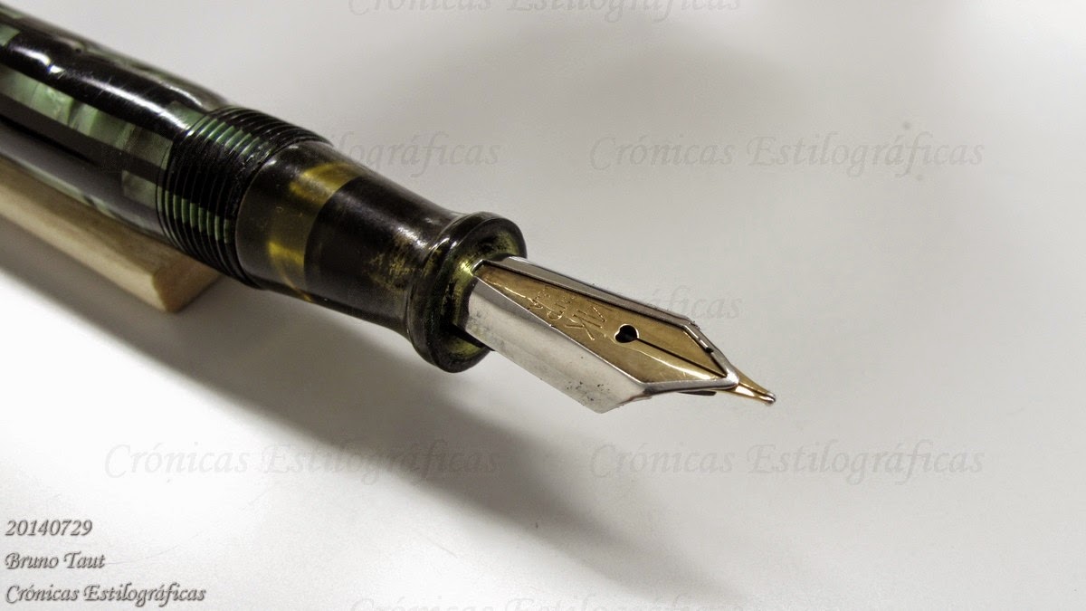
The nib is an extra-fine point with a hint of flexibility. It is made of stainless steel and carries the following inscription: “WARRANTED / HARDEST / IRIDIUM / STAINLESS / SPECIAL / PEN”.

The pen is also signed on the barrel (“SURAT / TRADE MARK / PATENTED 6564”). The instruction sheet speaks of Tokyo Suishindô as the manufacturing company. No address is provided.


And nothing else we know so far. This is just another pen that would rarely make its way in any book on pens despite its interesting features. But a detailed description of the technical evolution in pens would allow for some way of dating it. My best guess is that this Surat was manufactured around 1950.


My thanks to Mr. Mochizuki and to Poplicola-san.


Universal, music nib – Pelikan 4001 Brilliant Brown

Bruno Taut
Nakano & Shinjuku, July 2014
etiquetas: Surat, soluciones técnicas

18 July 2014

Context

I have insisted a number of times on these Chronicles on the need to generate reliable information about fountain pens. The history of these tools is only half written. Some brands, needless to say, are well known and documented. A few of them, Pelikan, for instance, produce their own books and documenting material. In other cases, pen enthusiasts have written a number of monographies on a particular model or brand. The case of Alfonso Mur and his “The Conklin Legacy” is a remarkable example.


Alfonso Mur's book. Available in fine book stores everywhere... Or maybe not--it is about pens.

But more is needed. The history of pens in a number of countries has not yet been written. Too often, and there are many examples, the approach to these pens is brand-by-brand. However, a historical perspective is more comprehensive and useful. And the reason is clear—a careful description of the technological developments, aesthetic trends, and sociological environment provides the frameset in which to fit, even if approximately, any rarity.


An unknown and yet interesting Surat pen. Made of celluloid, steel nib, bulb filler--and more.

That, of course, is not incompatible with the addition of an appendix on relevant brands and models, even though that implied some failure in the general text. We should never forget, and this is why the historical overview is fundamental, that the number of pen brands tends to infinite, and for every well-documented pen there are tens (if not hundreds) of them basically unknown.

My thanks to Mr. Paul Bloch.


Super T Gester 40 – Sailor Yama-dori

Bruno Taut
Nakano, July 16th 2014
etiquetas: Pelikan, Conklin, libro, Surat

13 July 2014

Music Evolution

The current Pilot model Custom in the all-too-well-known balance shape, so dear to Montblanc, has its starting point in modern times in 1983. In that year, to celebrate its 65th anniversary, the 65th anniversary model was released as a limited edition, This pen was designed, Masa Sunami says, following the style of some Pilot models from the 1930s, although some might insist in the German-copy theory.


Pilot Custom 65th, released in 1983. 6500 units were marketed.

Two years after those 6500 units, in 1985, Pilot launched the non-limited Custom 67. This newer model preserved the shape and dimensions of the previous model while simplified the cap ring. The nibs of these two pens were identical and, in actual terms, they are number 5 nibs (Pilot numbering) albeit without that label. Size 5 nibs, let us remember, are those of the current models Custom 74 and Custom Heritage 92, plus that of some low-end maki-e models branded as Pilot and as Namiki.


Pilot Custom 67, from 1985. Of course, a cartridge-converter pen.


Custom 74 (top) and Custom 67 (bottom), side by side.

Both Custom 67 and 74 implemented three-tined music nibs. They are apparently identical, but a careful inspection of their points reveals a clear change. On the older nib, made in 1989, the tipping material is smoothly integrated in the nib, and creates no apparent ball at the end. In this regard, this nib unit is closer to that of the Custom Grandee (1978). The nib of the newer Custom 74, on the contrary, displays an wide plateau that sticks out of the nib on the writing area.


The music nib of the Custom 67.

Feeds are also different: the newer unit implements and internal channel for ink and air that does not exist in older feeds by Pilot.


On the left, music nib of the Custom 74. On the bottom, that of the Custom Grandee. On the right, the Custom 67.

Therefore, the apparent similarities should not confuse us. There is always room for changes and innovations. In this particular case, the looks of the tip and the writing feeling on the hand are much closer to those of the Custom Grandee released in 1978, with which the nib has no resemblance.

My thanks to Mr. Noguchi.


Universal, music nib – Pelikan 4001 Brilliant Brown

Bruno Taut
Nakano, July 13th 2014
etiquetas: Pilot, plumín, plumín musical