20 May 2017

The Itoya Pen

Itoya is one of the reference stationers in Tokyo, and it has already shown up on these Chronicles. Most of the times, these appearances were due to changes on its shops, particularly at the headquarters in Ginza, the quintessential shopping district in the big city. But on occasion, Itoya also showed up because of its pens. For Itoya has marketed a number of pens under a number of brand names along it more than 100 years of history.

Romeo and Mighty were two popular brands for those pens, and Romeo, in fact, is still used nowadays. Some other pens were simply labeled as Itoya, or “The Itoya Pen”, as we are about to see. Finally, Itoya currently markets high end pens under the brand Taccia, and some inexpensive, Taiwan made, pens as Natsuki.


A selection of Taccia pens, by Itoya. These pens implement Sailor nibs.

The pen on display today is an Itoya pen made of celluloid. Instead of being cylindrical, its body and cap are octagonal. The filling mechanism is a sac operated by a lever. A similar pen, albeit made of black hard rubber (ebonite) and signed as Romeo, can be seen on the book Fountain Pens of Japan, by Lambrou and Sunami (ISBN: 978-0-9571230-0-2) on page 120.


The barrel is obviously engraved: "THE ITOYA PEN". No other brand name appears on the pen. Cap ring and clip are labeled with the gold content: "R14K", rolled gold, 14 K.


There is a patent number engraved on the lever: "PAT. 93914".

These are the dimensions of the celluloid version:

Length closed: 118 mm
Length open: 107 mm
Length posted: 154
Diameter (cap crown): 16 mm
Weight: 15.7 g (dry)


On the nib we can read "ITOYA / (logo) / -<3>- / 14 KT / GOLD".


The lever is also engraved with the Itoya logo.


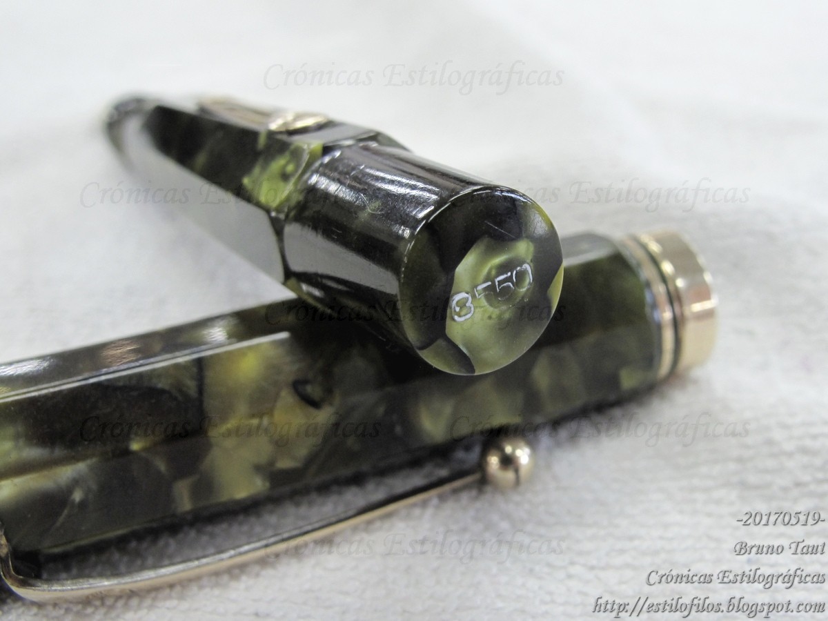
Finally, the barrel end carries an mysterious number: "8550".

This pen sports a beautiful nib of size 3 made of 14 K gold. The pen was manufactured, probably, during the first half of the 1930s.

My thanks to Mr. Sugimoto.


Sailor Pro Gear – Sailor Black

Bruno Taut
Nakano, May 19th 2017
etiquetas: Itoya

10 May 2017

On the Capless Clip

Pilot’s Capless, in all three or even more variations, are indeed successful models, well known by aficionados. Its design is often praised and deemed as functional, but its clip also remains as a point of contention for many. Is the clip really intrusive or the problem is in the user? Interestingly enough, though, there are very few examples of clipless versions along the more than 50 years of history of this model: the “seirei-nuri” version of the 1963 model (C-600MW), the never-marketed transparent version of the RW model (1965), and the Hermes Nautilus based on the current Fermo.


Three clipless Capless pens by Pilot, although the last one is marketed as a Hermes.

The first model of Capless, the C-600MW from 1963, sports a very short clip located on the lower side of the nose. It is just 16 mm long to allow for the middle finger to grab the pen on the classic tripod fashion. On the top side, two arrows show the position of the nib point.


The very short clip of the first model. Note how it is located on the lower side of the nib. The pen on the picture is the gold plated version of it, with catalog reference C-1000GW.


The arrows on the top side of the section-barrel pointing at the nib.

Today I am showing two prototypes of this first model. On one of them, beautifully made in stainless steel, there is a clip on the upper part of the barrel-section.


A prototype of the C-600MW made in stainless steel. Note the clip on the top side.

On the second prototype, made of aluminum, there is no clip. The overall look points out at the “seirei-nuri” limited version of the first Capless.


This prototype is made of aluminum. It has no clip.

There are some other small variations among all these pens, particularly on their noses and how they are cut with respect to the axis of the pen. The basic dimensions are approximately the same for all of them, save for the weight, where the manufacturing material really shows its presence.


The marketed model C-600MW, on top, and the two prototypes. Note the subtle differences on the curve on the nose.

The conclusion might be that it is not an easy task to design a clip for an “upside-down” pen like a capless, any capless. But few of us stylophiles and users would object to any of those prototypes.


My thanks to Mr. Shiomi and to Mr. NK.


Nakaya Cigar – Platinum Black

Bruno Taut
Nakano, May 10th 2017
etiquetas: Pilot, Capless

25 April 2017

Crisis of Growth?

Sailor has made a couple of shocking announcements in the last months. First was the suspension of the production of specialty nibs, including the basis for them all, the Naginata Togi nib. Then came the news of the discontinuation of the possibility of re-ordering original inks created with the invaluable help of Mr. Ishimaru, Sailor’s ink mixer. However, the creation of these personalized inks is still possible at the ink workshops regularly organized by Sailor throughout Japan.


My original ink, named Hiroko's Green.

Why would any company eliminate two of the elements that truly separated it from the rest? Why is Sailor giving up on his features of distinction in the market of fountain pens?

The issue with ink seems to be that many a user have been selling those original inks online at a premium cost, but I wonder if that should pose any problem for Sailor. More relevant could be that the ink production might have reached its limits with the popularization of some shop-original inks, particularly those by Nagasawa and by Bung-Box.


A Naginata Togi nib.


The Cross-Music nib.

That seems, in fact, to be the problem of the specialty nibs—the troubles of Mr. Nagahara to cope with the demand. Increasing the price of those nibs could ease the problem, but that is also an almost irreversible step.

Then, in summary, is Sailor suffering a growth crisis?


My thanks to Tinjapan.


Sailor Profit, Naginata Togi – Tomikei Blue

Bruno Taut
Nakano, April 18 2017
etiquetas: Sailor, tinta, plumín, mercado