31 August 2011

Candy

Despite what many people actually think, fountain pens are not necessarily expensive. A number of companies –and certainly so the big three pen producers in Japan— make entry level inexpensive pens aiming at younger users.


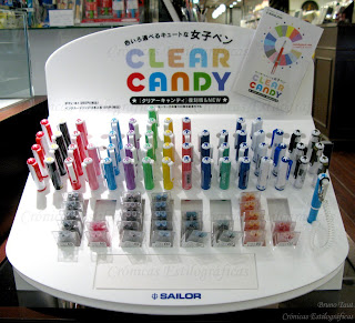
A recent arrival in this market is the Clear Candy pen made by Sailor. Sixteen different models —or sixteen different decorations for the same pen— form this line aiming at high school and college students. Regular Sailor cartridges and converters can be used on these pens, and a special selection of cartridged inks are marketed in combination with them. Sure enough, these cartridges can be used in any other cartridge/converter Sailor pen (save the obvious exception of the ultra-thin Chalana).

With the exception of the yellow ink, they could very likely be the same colors marketed in inkwells by Sailor for this year.

The Candy inks: pink, green, yellow, red brown, black, orange, blue black, and sky blue.

The F2 steel nib. The threads for the cap can be seen on the bottom right corner.

The pen, on its side, performs smoothly with a constant ink flow. The nib, in steel, is very rigid, and its point, not declared, might be a medium fine. The cap, quite surprisingly for an inexpensive product, screws in the barrel.

Sky blue and red brown ink cartridges.

The price of the pen is JPY 1000, plus taxes, and a set of two cartridges cost JPY 100 (plus taxes). The later is fairly expensive given the fact that a pack of six ink cartridges in black or blue-black can be found for that same price.

NOTE added on February 6th, 2013. More information on the Sailor Candy can be found on the chronicle "On Candies. Correction"

(Pilot Super Ultra 500– Pilot Blue black)

Bruno Taut
August 30th, 2011
[labels: Sailor]

27 August 2011

August Inks

Somehow this was expected… Platinum released the Mix Free set of inks in March, Sailor followed up with the new selection of colors after a whole year of limited seasonal inks, and Pilot was not doing anything on this active field. Actually, the very profitable line of Iroshizuku inks had not been changed for about a year… until this month of August.


Four new colors have just been added in brown, pink, purple and green. They come in poetic names whose translation is not always straight forward:


Ina-ho (稲穂): ear of rice. A brown ink.


Kosumosu (秋桜): cosmos; it refers to the plant Cosmos bipinnatus. A pink ink.


Murasaki-shikibu (紫式部): this name is very ambiguous. On one hand that is the name of the author of the Tale of Genji. On the other, it is also the name of a couple of flowers: wisteria (a whole genus in the Fabaceae family) and purple gromwell (Callicarpa japonica). Finally, the word Murasaki speaks of purple or violet color by itself. Of course, this is a purple ink.


Chiku-rin (竹林): bamboo woods. A green tonality.

Their price remains stable: JPY 1500 (plus taxes). That is about EUR 13.5, that despite the current strength of the Japanese currency is very well below the outrageous EUR 33 these ink cost in some places in Europe.


(Colors on the pictures are, needless to say, just approximate).

(Esterbrook J Double Jewel – Diamine Teal)

Bruno Taut
August 26th, 2011
[labels: Pilot, tinta, mercado]

19 August 2011

Size Differences

A blog is a work in progress—all the time. But hopefully what we learn today improves and completes what we wrote yesterday.

I have written extensively about the Platinum Honest 60 and its European counterparts in Italy –Joker 60— and Spain –Presidente. The similarities were obvious, but all these pens are far from being identical. To the differences on the filling systems –cartridge/converter for the Japanese; aerometric for the Europeans—we must add the additional detail of the size:

The Japanese Honest 60, with golden cap, is bigger than its European relatives. (Authorship of the pictures as stated on the watermarks).

Platinum Honest 60:
Length capped: 138 mm.
Length open: 126 mm.
Length posted: 146 mm.
Diameter: 12 mm.

Weight: 14.5 g (dry).


Presidente:

Length capped: 134 mm.
Length open: 123 mm.
Length posted: 150 mm.
Diameter: 10 mm.

Weight: 14.5 g (dry).


Joker 60:

Length capped: 134 mm.

Length open: 120 mm.

Length posted: 152 mm.

Diameter: 10 mm.

Weight:
14.5 g (dry).

Platinum Honest 60, on the left, and Presidente, on the right, disassembled.

On the left, the Platinum Honest 60´s feed. On the right, that of the Spanish Presidente.

These differences and the different filling systems affect to the size and shape of the feeds. However, the Presidente´s and Honest 60´s nibs are exactly identical save the cosmetic detail of the Presidente´s being gold plated. And this poses an interesting paradox—a Spanish pen manufactured under the control of the Japanese Ministry of Industry.

The Honest 60´s and Presidente´s nibs in steel.

The Joker 60´s nib. Picture by Kostas K.

The Italian Joker 60 seems to be closer in size to the Spanish Presidente. However, its nib has a totally different engraving.

The quest for information continues.

My thanks to Kostas K.


(Esterbrook J Double Jewel – Diamine Teal)

Bruno Taut
August 18th, 2011
[labels: Platinum, Presidente, Joker]

18 August 2011

Honest Cartridge

Some Chronicles ago I spoke about the Platinum Honest 60 pen. That was, let us remember, the first cartridge/converter pen made by this manufacturer.


Now we might not like the system that much, but it was a great improvement at the time—and even now. “Good bye, ink bottle”, was the argument of the advertisement campaign. Little did they know about marketing ink bottles fifty-plus years later, and that despite the fact that Platinum/Nakaya does not sell any self-filling pen.


Recently, I found one of those original cartridges from the 1950s. And sure it says it belonged to the Honest 60 pen.

"PLATINUM" / SPARE INK / HONEST "60" / BLUE BLACK INK. That is the inscription on the cartridge.

Much as the modern Platinum cartridges, this old one has a metal ball inside to favor the ink flow into the feed. But there are some important differences between old and new cartridges. Their openings have different sections and the current ones do not fit smoothly on the old Honest 60, and neither the current converter does. Certainly an inconvenient for those who wanted the use the first cartridge/converter pen by Platinum. Some arrangement should be devised.


I found this unused cartridge in the box of a non-Platinum pen from around 1960. The Honest 60 cartridge was its service cartridge. But this will be the argument of another Chronicle.

(Pilot Custom 74 Demonstrator – Diamine Teal)

Bruno Taut
August 17th, 2011
[labels: Platinum, conversor]

16 August 2011

Size 10

Most pen companies nowadays barely go beyond the F, M and B triad of nib points in their pen catalogs. The exceptions to this general rule are either variations on those —mostly in the shape of extra fine (EF or XF) or double and triple broad (BB) nibs—, or either non-symmetric points—stub/italic and oblique nibs.

These five exotic nibs by Pilot.

And this scarcity of nibs is a common complaint among pen aficionados. Japanese companies, though, seem to have a wider policy of nib points. Pilot, for instance, manufactures its size 10 nibs in fifteen different points. Ten of them are variations on the F-M-B theme, albeit with the very nice addition of soft, i. e. semi-flexible, variations for F, FM, and M nibs. The remaining five nibs do show some exciting character. In no particular order, they are as follows:

-- Waverly nib (WA). This is a very smooth fine nib. Its geometry allows for a wide variation of writing angles. No line variation can be achieved with this nib. Sheaffer had a similar waverly geometry on its iconic triumph nibs.

All in all, this is a very comfortable F nib.

Size 10 waverly nib.

-- Posting nib (PO). This is a very characteristic one: the nib point is hooked down. It makes this nib very rigid and draws a very thin line. As a result, this point is quite toothy—after all, the contact between nib and paper is very reduced.

In conclusion, a very rigid extra-fine nib.

The posting nib. Very rigid and extra fine.

-- Falcon nib (FA). This is the very flexible version of the size 10 nib. It has the sides cut to allow for the impressive flexibility, at least in contemporary pens. The problem, though, is that the feed does not seem to be up to the challenge of providing all the ink the nib demands. In dipping mode, however, the pen behaves nicely. Its bigger relative, the size 15 falcon nib, does not show these problems.

Therefore, this is a very flexible nib with serious performing problems.

The very problematic falcon nib in size 10.

-- Stub nib (SU). This type of point is relatively common in other manufacturers. It is non-circular: the vertical stroke is wider than the horizontal, thus allowing an obvious line variation. It is fairly smooth and nicely wet.

In summary, a nicely performing stub nib, like some others in the market.

The stub nib on top, and the music nib on bottom.

-- Music nib (MS). Only Japanese pen companies seem to implement their pens with this type of nib. It is a variation on the idea of a stub nib—an additional slit and a third tine make this nib richer in ink flow and thicker in stroke. This Custom 742 with music nib has been reviewed on these chronicles.

As a result, this is nicely looking and original stub nib with a generous ink flow.

Writing samples with the five nibs covered on this chronicle. The squares on the paper are 4x4 mm^2.

Pilot also offers a coarse nib (C) among its more exotic variations, but that is only an extra wide point (BBB) and, therefore, it is not unusual to Western users. All in all, these exotic nibs enlarge the writing experience, and that is what many of us look for in pens.

My thanks to Kinno-san.

(Pilot Custom 742 with several nibs – Diamine Teal)

Bruno Taut
August 15th, 2011
[labels: Pilot, Sheaffer, plumín]

15 August 2011

Got Ink?

Enough ink?

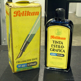
A lot could –and should— be said about how much ink we store and the reasons for such behavior. However, in what seems like a distant past, when fountain pens were the tool of choice there were big bottles of ink to be used in schools and offices. This was the case of this one-liter bottle of ferrogallic blue-black Pelikan ink from around 1960.

A liter of ink for 53 pesetas... Made by Productos Pelikan S. A, Barcelona. And with the name of Günther Wagner on the box...

That ink was made in Spain, in the manufacturing plant this company had in Mollet del Vallès, in Barcelona. Apparently, only consumables –ink, erasers, glue— were produced in there.
Other, smaller, inkwells came out from that plant.


(Sailor pocket pen with 14 K gold nib – Pilot Iroshizuku Sho-ro)

Bruno Taut
August 14th, 2011
[labels: Pelikan, tinta]

05 August 2011

Olimpia

Pen review of a Súper T Olimpia.

This model was released in 1961—that is, fifty years ago—by the company founded by Manuel Portús Ribas in 1942 in the city of Torelló in Barcelona. The brand Súper T made basically two models. The first one, initially unnamed, was the already reviewed Gester. The second was today’s pen—the Olimpia, named after the 1960 Olympic Games in Rome.

This pen could be purchased with either a gold or a steel nib, and with a gold plated cap. And time passing, a number of small variations simplified the pen. Initially, the barrel had an ink window and a small ball to secure the cap when closed. The ink window was soon eliminated, and the ball was later removed leaving a metal patch first to be finally completely removed. The clip, a beautiful feature of this pen, was also lightened during the later years of the company, already in the 1970s. Súper T ceased its activities in 1976.


1. Appearance and design. (9.5/10)
In few words, this pen is a streamlined piston filler with a steel cap and a gold nib.

More in detail, we can see that the ideas of barrel and section do not apply to this pen, as there is a continuous line from the nib to the piston knob. The clip is the well-known design by Manuel Portús—a single steel plate folded and attached to a single point in the cap.

The Olimpia is mostly a functional pen with little room for luxuries. It is not a pen to show, albeit its elegant and clean design would please many a stylophile—or an architect.


2. Construction and quality. (8.0/10)
No flaws can be seen on this unit after about 40 years of use. The only possible weak point might be in the sealing material used in the piston: that material makes some noise when operating the piston, which is a clear sign of it becoming more rigid.

A typical problem on this pens is a broken piston screw. But that is the fault of an unskilled user who did not know how this pen worked. However, you could say that the Súper T Olimpia is not fool-proof.


3. Weight and dimensions. (8.0/10)
The Olimpia feels comfortably on the hand. It is well balanced, especially if unposted. The ink deposit holds merely 1.2 ml, which seems on the low end for a piston filler.

Dimensions:
Diameter: 12 mm.
Length capped: 135 mm.
Length uncapped: 124 mm.
Length posted: 145 mm.
Total weight: 18.2 g (full)
Weight uncapped: 10.0 g (full)
(For dry weights, deduct 1 g from those values).
Ink deposit: 1.2 ml (aprox.).


4. Nib and writing performance. (8.0/10)
This unit, in particular, has a very fine gold nib. It is smooth and the ink flow, controlled by a hard rubber feed, is constant and reliable. Not a demanding nib, though, but neither it looses the line.


5. Filling system and maintenance. (7.5/10)
This is a piston filler with a good and reliable design unless some inexperienced hands tried to open the pen.

The price to pay for the streamlined design is the difficulty to disassemble the pen. The whole piston mechanism must be removed by pulling it up from the barrel—something not for the faint-hearted. And removing the feed and the nib is not any easier. As a consequence, a deep cleaning of the pen might only be made by some skilled person.

However, I grade this department with a 7.5 over 10 because it is a piston filler, something many of us enjoy, and those inconveniences are part of the deal. Cleaning, at the end, is often made –in this and in many other pens— just by pumping water repeatedly with the piston.


6. Cost and value. (8.5/10)
These pens cost around EUR 50 in the second hand market in Spain. In exchange you get a nice designed and very functional pen with a piston. The deal is good.


7. Conclusion. (49.5/60=82.5/100)
This is an original pen that performs very well for a very reasonable price. The negative points are associated to the otherwise attractive clean lines of the pen.

(Súper T Olimpia, 14 K gold nib – Montblanc White Forest)

Bruno Taut
July 30, 2011
[labels: Súper T]