Showing posts with label caligrafía. Show all posts

04 May 2013

Bokujû (墨汁)

This is an interesting ink. A puzzling one.


The label does say this ink is for fountain pens, but should it not be clear enough, there is also an obvious figure of a fountain pen. A Pilot, of course. The metal ring attached to the string is a common feature among old Japanese inkwells, but I confess my ignorance about its purpose.

We, pen aficionados, are very aware of the dangers of using inks not specifically designed for fountain pens. India ink, for instance, contains shellac –a bioadhesive that would easily clog the ink feed of any fountain pen.

In East Asia the basic reference of ink is different. Sumi ink (墨) is traditionally made of vegetable soot and animal glue. It is presented in the form of sticks, and to make the actual ink these sticks have to be ground against a stone (suzuri, 硯) in combination with water. The ink, now called bokujû (墨汁), is formed by the suspension of the powder removed from the ink stick in the water. This is the ink used in traditional calligraphy, shodô (書道) in Japanese, whose basic instrument is the brush instead of the stylus.


The inscription on the lid reads Special ink Pilot 特製墨汁パイロット. On the center, the company logo.

Nothing can I say about whether the use of this ink was a long time goal of Japanese pen companies. As of today, Platinum’s Carbon ink and Sailor’s Kiwa-guro simulate the idea of bokujû—particles in suspension in water. Pilot´s approach is just limited to the name of one the inks of the Iroshizuku line: Take-sumi (竹炭), although in this case, sumi is written as 炭, meaning coal, instead of 墨, ink. Both ideograms can be read in the same way—sumi (すみ).

Then, what about this old inkwell? The label clearly (well, sort of) says it contained bokujû—that is, the already prepared ink after grinding the ink stick—and that it is for fountain pens. On the back, the manufacturer, Namiki Seisakusho, explains that only after developing some procedures, which involved filtration, it was safe to use bokujû in fountain pens.


The explanations to justify the uniqueness of the ink.

Was it? Hard to say. However, a more relevant question is whether this was a real carbon ink, a precedent of the modern nanopigmented inks made by Sailor and Platinum. Interestingly enough, Pilot does not produce any such ink right now.

This ink dates back from the 1920s, and chemical analysis are in order. But few people might really care.

My thanks to Mr. Yamada, who also wrote on this ink for his blog, including a couple of samples on paper.


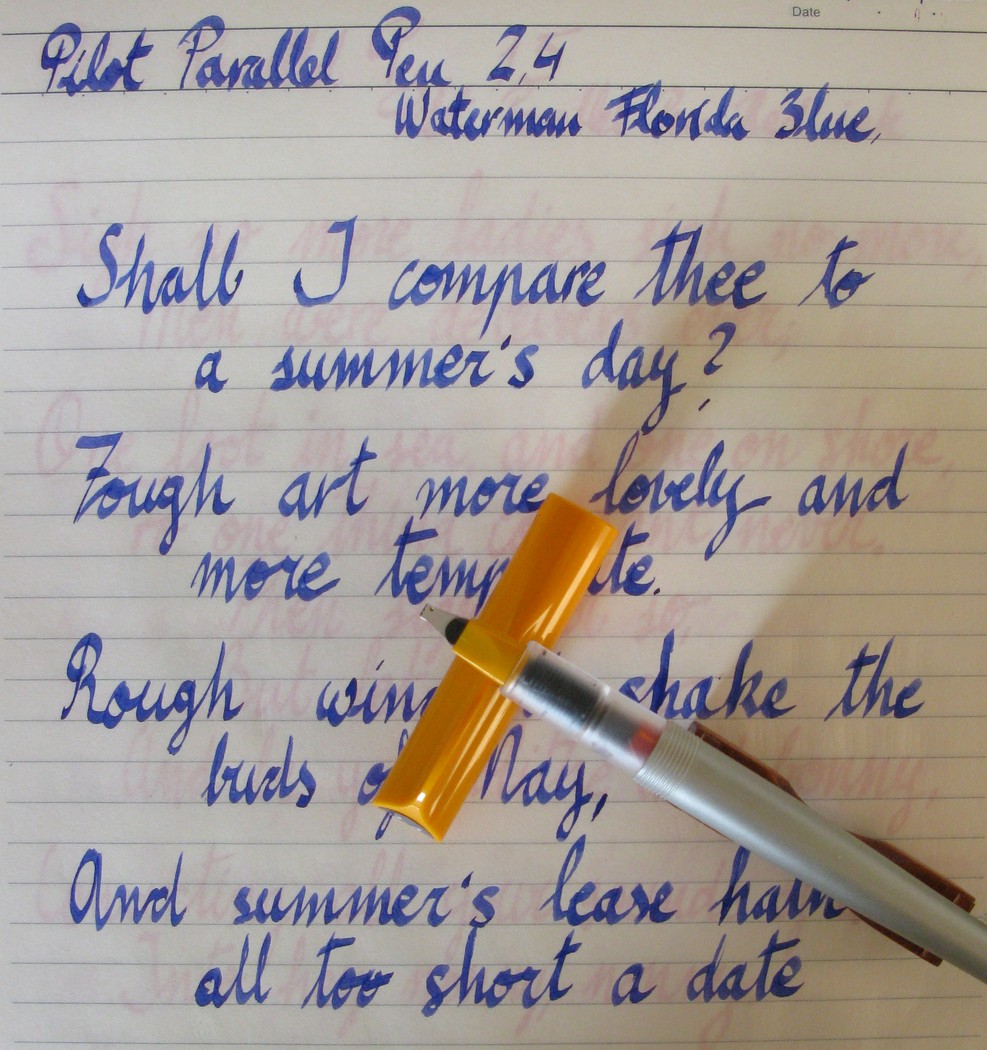
Pilot Capless, stub nib (Shimizu Seisakusho) – Waterman Mysterious Blue

Bruno Taut
Yokohama, May 4th, 2013
etiquetas: tinta, Pilot, Sailor, Platinum, Japón, caligrafía, pincel

14 September 2010

Parallel

This is one of these chronicles I hesitate to publish, so advertisement-like it might look. Especially as there is hardly any competition in the market for this product. But here I go...

An italic nib –we all know— is a nib whose line is thin on the horizontal strokes and broad on the vertical ones. And its edges are sharp, the theory goes, to ensure clear and well-defined lines.

Currently not many companies market italic nibs. Most of those sell calligraphy sets composed by several italic nibs of different widths. In a more expensive range, Pelikan has recently released a Souverän M800 with a 1.5 mm italic nib marked as IB.

Handwritten sample with one of the Parallel Pens. I used a standard inkWaterman's Florida Blue— instead of the dedicated Parallel-Pen ink.

Pilot offers the models Plumix –in the American market— and Pluminix –in Europe— with medium italic nibs of about 1 mm wide. But those are not sold in Japan. The closest to an italic are a stub and a three-tine music nibs in some of the Pilot Custom models. These two nibs have their edges polished and are fairly smooth in their writing.


The alternative, for italic writing, Pilot offers is the Parallel Pen. Apparently, these pens are very different to a fountain pen. Instead of a cylindrical or conical nib with a slit, the writing element in a Parallel Pen is composed by two thin plates that drive the ink to the lower flat end. The feeding system, however, is the same for a fountain pen and a parallel pen. And both use water-based ink.

Side and front views of the Parallel Pen nib.

Parallel Pens come in four sizes –1.5, 2.4, 3.8, and 6.0 mm. All of them are smooth and wet writers. The creative possibilities, endless. Especially for those touched with any artistic ability, which is not my case. These pens, however, can hardly become daily writers.

All four Parallel Pens. On the picture, only the red ink is specific for these pens. Yellow and green are Sailor's, and blue is Waterman's. Note how the pen with yellow ink became contaminated with red ink simply by writing on top of the later.

Pilot claims that the ink they provide is specific for these pens. They offer a selection of twelve colors in standard Pilot ink cartridges. All of them, they say, mixable. But despite these warnings, I have tried other inks –Waterman and Sailor in particular— in these pens with very good results. Now, intermixing them might be an issue. We know by now, though, that all Sailor inks –save the obvious exceptions of the pigmented black Kiwa Guro and blue-black Sei Bokucould be mixed.


Each of the pens comes in a plastic box that includes two cartridges –black and red—, a Pilot converter, and a cleaning sheet. The instructions say that the converter is only for cleaning purposes… Well, they do try to sell their overpriced cartridges. But at the same time, cartridges provide too little ink for these ink guzzlers. Then, a look at the barrel shows it is made entirely in plastic and the pen could easily be transformed into an eyedropper.

(Pilot Murex – Pilot Black)

Bruno Taut
(Chuo, Tokyo, September 11, 2010)
[labels: Pilot, plumín, papelería, caligrafía]

09 August 2010

Angle

Some days ago I wrote a review on a Sailor Fude Pen. On that pen, the nib is bended up at an angle of 40 degrees. The result was, as I concluded, a nice and fun pen, although definitely not a daily writer.

Soon after I finished using that pen, I inked its counterpart—a Sailor Fude Pen with the nib making an angle of 55 degrees. This small detail is, in actual terms, very significant in order to write comfortably. Therefore, here I am adding these additional notes to complement the above-mentioned review.

The nibs under analysis face to face: the 50-degree on the left, the 40-degree on the right.

In summary, there are three different cheap Sailor Fude Pens:
—a long pen in blue with a 40-degree nib,


—a long pen in green with a 55-degree nib,


—a torpedo in blue with a 55-degree nib.

The first two of them have exactly the same dimensions and price—JPY1050 (about €10). The third one is shorter and slightly more upscale in appearance. Its price is twice that of the previous two—JPY2100.

Then, how does the angle affect the writing? The answer is, however, very personal because it depends on the way each user holds the pen, and on the preferences regarding the line width. My experience is as follows:

With the 40-degree nib, writing with a thin line is relatively easy—the angle between pen and paper has to be greater than those 40 degrees. In my case, that is not difficult, and the line variation associated to the pen inclination is easy to achieve.

On the contrary, the 55-degree nib requires a higher angle to draw that same thin line. But higher than those 55-60 degrees, the pen is very perpendicular to the paper and that makes the grip uncomfortable.

The torpedo Fude Pen's 55-degree bended nib.

So, my writing style is such that I tend to hold the pen at a nearly 55 deg with respect to the paper, which is the optimal angle for the very wide horizontal lines. But these are not convenient for usual writing. Therefore, I rather use the 40-degree Fude Pen –the one I reviewed— and make a conscious effort in making a thick line at 40 degrees than making that conscious effort in writing my usual thin line.

Those are my personal constraints. People who enjoy writing with thick lines –those B or BB or BBB nib people— might choose the opposite strategy.

(Sailor torpedo Fude Pen 55 – Sailor Red Brown)

Bruno Taut
(Inagi, August 8-9 2010)
[labels: plumín, Sailor, caligrafía, Japón]

03 August 2010

Fude 40

Pen review of the Sailor Fude Pen 40.

This is a very special, and very East Asian pen. Fude pens, as they are called in Japan, have their nibs bended up at a certain sharp angle. By doing this, the user has the possibility of choosing the line width by changing the angle between pen and paper. On top of that, at a certain inclination, a horizontal line drawn with this nib is very wide, while the vertical line remains thin.

Only some Chinese companies and Sailor in Japan manufacture this type of nib. The waverly nib Pilot offers does not have these characteristics. Sailor, on its side, makes three cheap pens with these nibs. Two of them have the nibs at an angle of 55 degrees. This one reviewed here has it at 40 deg. This company also produces a golden fude nib for more upscale pens.


1. Appearance and design. (6.5/10)
This pen is made entirely of plastic and does nothing to hide it. It has no clip to attach the pen to a pocket, but a notch on the cap to keep it from rolling. The cap screws to the barrel.


This is a surprisingly long pen. It seems to be made for the purpose of using it on a desk, and not to carry it around.

2. Construction and quality. (8/10)
Despite its cheap price and appearance, this pen seems to be well made. Nothing is loose and everything fits well.


3. Weight and dimensions. (7.5/10)
As I mentioned before, this is a long pen. But made in plastic, it is light and well balanced, especially unposted.

Dimensions:
Diameter: 13.0 mm.
Length capped: 169 mm.
Length uncapped: 150 mm.
Length posted: 191 mm.
Weight: 14 g.


This is a big pen and it might be inconvenient to carry it around. However, this is not a usual pen and few people would use it as a daily writer. For that purpose, Sailor makes a smaller torpedo-like fude pen.


4. Nib and writing performance. (9.0/10)
This pen’s nib is, once again, the raison d’être of this pen. It is bended upwards at an angle of 40 degrees to allow the user to write with different line widths—from extra fine to extra coarse. Its purpose is to write Chinese characters with the line variation a brush provides naturally.


The nib is made of stainless steel. Non-tipped, rigid, very wet. And very smooth.

For those of us who do not write Chinese ideograms, this pen is more suitable for drawing and more creative tasks. It is fun to use.


5. Filling system and maintenance. (8.0/10)
A cheap pen, but accepts Sailor cartridges and converters. Its main problem is the limited capacity of those in a very wet pen. I see no major problem in making it an eyedropper, and then the pen would have a huge ink deposit.

Cleaning this pen is very easy. Nib and feed are easily removed from the section by pulling.


6. Cost and value. (9.0/10)
This is a very specialized pen. So, taken it into consideration, the value is excellent. The cost, less than €10 (JPY 1050, taxes included).


7. Conclusion. (48.0/60=80/100)
This pen is fun to use, although it can hardly become a daily writer. It is inexpensive and performs well. The lower scores come in the department of design and appearance—it could certainly be more attractive.

PS (August 9, 2010): Some additional comments on this pen are available on the entry entitled Angle.

(Sailor Fude Pen 40 – Sailor 100717031)

Bruno Taut
(Inagi, August 2-3, 2010)
[labels: Japón, Sailor, plumín, caligrafía]

07 June 2010

Fate

To Ningyo-chan, decipherer.

Spanish schools do not deal with fountain pens. And that is it. I mean, they do not require, as is the case in other countries, children to learn to write with them. And calligraphy is often deemed as obsolete.

In that environment it is not strange that my handwriting ended up messy, ugly, illegible. And I did not care. In fact, I never liked the endless repetition of patterns of the meager efforts my teacher paid to improve my hand.

Now, many years have passed and fountain pens have become an obsession to me. And then I learn about pens, modern and old; about materials, from caseine to steel to titanium; and also about nibs, rigid needles or flexible noodles. In learning to love these wonderful flexible pens I had to understand, oh, cruel irony, the beauty of good penmanship for, after all, that is the raison d’être of those nibs.

So, at my age I feel bound to learn to write again, gracefully this time, if I wanted to fully enjoy some of my pens.

Is this fate?

In the meantime, we can enjoy the works of Prof. Antonios Zavaliangos and of Leigh Reyes.


Sailor Ballerie (WG pocket pen) – Pelikan Brilliant Brown

Bruno Taut
(Inagi, April 30, 2010)
[labels: caligrafía, estilofilia, plumín]