18 January 2018

Ôsôji

Japanese people end the year with a traditional clean up of the house--and of the office at times. This is called ôsôji: big clean up. On the way, many forgotten or out of use goods end up in the garbage. But your junk might be someone else’s treasure.


The Wagner “end-of-the-year” bazaar is a mixture of an end of the year party and a small market where to sell all those pens –and accessories you might no longer want. Or at least that was at some time. Nowadays, it has become a small pen show for local traders perfectly comparable in size with the “Pen Trading” (such is the name) event celebrated in Tokyo in Spring, usually by the end of April or beginning of May (::1::, ::2::).


So, this past December 30th, pen aficionados in Tokyo gathered at the end-of-the-year bazaar organized by the Wagner group. Between 150 and 200 visitors, and about 15 traders conformed this event where the commercial activity dominated over any other aspect. Fair enough… save for the exhaustion of the formula: too few traders with small variety and selection of pens for a very active pen community. The paradox is that other events in Tokyo organized by Maruzen (World of Fountain Pens) and by Mitsukoshi (Fountain Pens of the World Festival; ::1::, ::2::, ::3::), both focused on new pens—attract a lot more people and generate a higher economic activity.


Japan seems faithful to its tradition of isolation. The Galápagos syndrome is alive and well in a number of areas in this island nation. It is not easy to pinpoint a single reason to explain such attitude, but Economics might provide some arguments—are there real incentives to open the market to Barbaric influences?

Now, how long can this isolation last?


Romillo Nervión – Sailor Blue Iron

Bruno Taut
Nakano, January 8th 2018
labels: evento, Tokyo, mercado, Japón

07 January 2018

Sailor Double Sided Nib

Double side nibs are not new to this blog. Not so long ago we saw a Vanco pen with a beautiful “duet” nib. On more recent years, several of the Sailor’s “specialty nibs” sported that same feature; that is, the nib points are cut and polished to provide a good writing experience both on the regular and on the inverted (upside down) positions.

Older than the Vanco Duet is the Sailor on display today. Everything on it points out at the 1930s as the production date. The pen is a flat top Japanese eyedropper inspired by the fashion set by the Parker Duofold, as was often the case in Japan at the time. It is made of ebonite and is coated with urushi lacquer.


There is an inscription on the pen body: "Sailor / Fountain Pens / PAT. O. 116315", together with the logo of the company.

The nib –the real protagonist of this story— is made of 14 K gold and is labeled as size 30. This number does not say much –or anything at all— about its actual size. If fact, it is very modest in dimensions: its total length is 23 mm, perfectly comparable to sizes 2 or 1 nibs by Pilot at the time.


The size 30 nib by Sailor.


The beak-shaped point of the lower end of the nib.

Its point is carefully cut. On the lower side –regular writing— the point takes the form of a bird beak with a very thin ending, thus drawing a very fine line. The upper side, on the contrary, is cut as a broad nib. The writing sample shows the final effects of these two points.


Writing sample of the double sided nib by Sailor. The square on the paper is 5x5 mm2.

These are the dimensions of the pen:

Length closed: 135 mm
Length open: 120 mm
Length posted: 168 mm
Diameter: 14.0 mm
Weight (dry): 18.5 g
Ink deposit: 2.4 ml

And these are the dimensions of the nib:

Length: 23.2 mm
Shoulder width: 5.8 mm
Weight: about 0.25 g
Material: 14 K gold


The engraving on the nib reads "14 CRT GOLD / Sailor / REGISTERED / PATENT OFFICE / -30-".


The manufacturing date: 11.4. Probably November of 1934.

The nib is dated on the lower side: 11.4. According to the regular way of dating Sailor pens and nibs, this means that the nib was probably manufactured in November of 1934.

The experimentation with fountain pens in Japan has indeed a long history.


Athena (1950s), lever filler – Pelikan 4001 Royal Blue

Bruno Taut
Nakano, January 5th 2018
labels: Sailor, plumín, Vanco, soluciones técnicas

29 December 2017

Madrid 2017 (II)

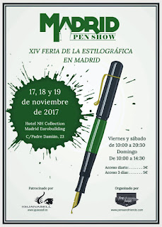
The Madrid Pen Show of 2017 –its 14th edition—took place over a month ago, on November 17th to 19th. As I had announced, I attended it and these are some of my reflections and conclusions.


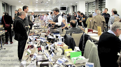
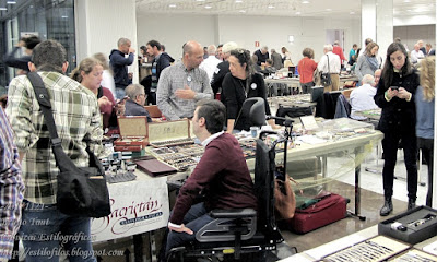
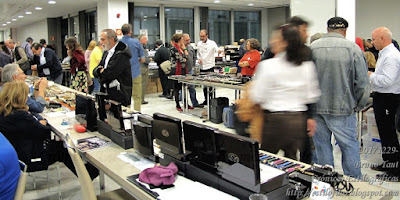
The event is, according to numerous sources, the leader of its class in Europe. 63 dealers, some of them with more than one table, offered their products to about 1500 visitors along the three days of the show. The typical expense can be traced between EUR 200 and EUR 300 per visitor, which makes a total business in the order of EUR 400,000. The average business per dealer is, therefore, around EUR 6000. Of course, these numbers are just approximate—save that of the number of dealers!


The Madrid Pen Show is also the major celebration of the very active Spanish pen community. The community provides most of the social aspect of the party, as the following video shows.


My thanks to Mr. José Riofrío, author of the video.


Some new people could be seen on the floor during those days. On one hand, some younger dealers offering both new and vintage pens as well as some paper products and other accessories. On the other, I could also see some foreign visitors, adding an additional layer to the international expansion of the event. This should not be a surprise—after all, American shows attract visitors across state lines...


On their side, locals seem to have understood the value of having such an event at their footsteps: knowledge, pens, better prices through competition… The contrast with the very parochial Japanese pen scene –a country where the pen industry is still strong and the community is very active— is startling.


Romillo Nervión – Sailor Blue Iron

Bruno Taut
Nakano, December 29th 2017
labels: evento, Madrid

07 December 2017

The Obvious Connection

Years ago, fellow stylophile KostasK and myself described the pen brand Joker. After some research, we concluded that Joker was a Greek brand that marketed Japane-made Platinum pens.

The Platinum origin of those pens --just a couple of models-- was clear almost from the very begining by comparing some details: the obvious similarity with some Platinum models, the logo on the clip,...

Today I am showing another proof of the link between Platinum and Joker: the box of a Joker where both names coexist peacefully.


A Joker pen with a Joker box. Or is it a Platinum box? On the barrel, simply "JOKER".


The Platinum counterpart. On the barrel, "PLATINUM / TRADE (platinum logo) MARK / 10 YEARS PEN".

On top of that, boxes like this one were obiqutous in the Japanese industry in the 1950s. Many a brand used them, although displaying different designs.


A collection of boxes of Japanese pens from the 1940s and 1950s.

This box by Joker and Platinum contained a Joker pen fashioned after the Parker 51. This same model exists branded as Platinum, although with some significant differences. Tha main one lies on the nib--the Platinum nib is tipped whereas the Joker is merely folded. There are some other cosmetic variations: different engravings and a non-plated cap on the Joker pen.


The Joker nib is gold-plated and untipped. The engraving is not branded: "OSMIRIDIUM / 30".


The Platinum pen implements a "10 years" nib with the inscription "PLATINUM / 10 YEARS P-B / (JIS Logo)". It is tipped, and was likely to be gold-plated.

If only, the box of this Joker pen shows a clear connection between that brand and Platinum. But this is a connection Platinum said to know nothing about.


Sailor Ballerie - Sailor Red-brown

Bruno Taut
Nakano, November 11 2017
etiquetas: Joker, Platinum

23 November 2017

Yatate

Originally, a “yatate” (矢立) is a stand for the arrows in the old tradition of Japanese archery, “kyudô” (弓道). But the word is better known as a container to carry a brush and a small deposit of water. It was used by merchants and educated people who had the need to write on the go.


"Benri-gata" type of "yatate". This is the type whose style was copied for the "yatate" pen. On this example, the brush container has some holes.


This type of "yatate", "ittai-gata", is better known.

With the apparition of the fountain pen, those traditional “yatate” became obsolete. However, the name was rescued to describe a particular type of fountain pen. On them, the cap is almost as long as the pen itself—nib, section, and barrel. When closed, the pen might look just like a rod of ebonite, but upon opening it, a full size pen show up.


A typical "yatate" pen made of ebonite. At first, it just looks like an ebonite rod. Picture courtesy of Mr. Ariel Zúñiga.


Only open it is possible to see that there was a pen inside. Picture courtesy of Mr. Ariel Zúñiga.

“Yatate” pens saw their glory days by the beginning of the twentieth century. By 1920 they were gone almost completely, and only the occasional retro-looking pen in this geometry kept them alive.

Taccia is one of the brands stationer Itoya uses for its own pens, others being Romeo, Mighty, Natsuki, Itoya. Taccia pens, interestingly enough, are available overseas. In Japan, though, its distribution seems limited to Itoya shops. Some of its models, mostly high end, implement Sailor nibs, whereas the least expensive ones use JoWo nibs made of steel.


Obviously, a Taccia pen.

The following model is called Taccia Covenant, and it is, in actual terms, a “yatate” pen made of plastic. The Covenant uses international cartridges and converters, and sports a very correct JoWo steel nib. The available nib points are F, M, and B. The feed, needless to say, is made of plastic.


The "Midnight Breeze" Taccia Covenant. Well, a "yatate" pen.

This model comes in three possible colors: marbled brown (“Parchment Swirl”) with silver clip and rings; marbled blue (“Midnight Breeze”) with silver ornaments; and black (“Jet Black”) with golden accents.

The long cap screws on the pen both when closed and when posted. Posted, the pen is quite thick and could become a bit uncomfortable to some users. Unposted, the pen is very comfortable.


When posted, it becomes a hefty pen.

These are its dimensions:

Length closed: 145 mm.
Length open: 139 mm.
Length posted: 182 mm.
Diameter of the body: 12.5 mm.
Diameter of the cap: 15.5 mm.
Weight (inked): 34 g (uncapped, 19.0 g)


The steel nib made by JoWo.

The current price in Japan is JPY 14000, plus taxes, and it does not fare well against the workhorses of the main three Japanese manufacturers of fountain pens—Pilot´s Custom 74 and Custom 91, Platinum´s 3776 Century, and Sailor´s Slim Pro Gear, Profit and Promenade. All of them implement 14 K gold nibs and cost between JPY 10000 and JPY 12000 (save for the Platinum Century 3776 with music nib).

But they are not “yatate” pens…


My thanks to Mr. Ariel Zúñiga.


Eboya Hakobune XL – Sailor Black

Bruno Taut
Nakano, November 5th, 2017
etiquetas: Itoya, mercado, Japón, JoWo, Taccia

12 November 2017

Kyôto Colors

Takeda Jimuki is a company based in Kyôto dedicated to supply office equipment. As part of its business, Takeda Jimuki also runs a small chain of stationers called TAG with branches, among other places, in Tokyo.

In collaboration with the corporation Kyôto Kusaki Zome Kenkyujo, dedicated to develop and market dyes out of plants, Takeda Jimuki manufactures some inks for fountain pens.

As of today, November of 2017, these two companies produce two lines of inks: Sounds of Kyôto (Kyô-no Oto), and Colors of Kyôto (Kyô-no Iro). Each of them is formed by six inks with, of course, poetic and allegoric names.

The Kyô-no Oto line:
-- Azuki Iro, the color of Vigna angulares. Purplish brown.
-- Nureba Iro, wet crow. A black ink.
-- Imayô Iro, trendy color (at least in the Heian period). Purple.
-- Koke Iro, moss color. Green.
-- Yamabuki Iro, Kerria japonica. Yellow.
-- Aonibi, dull blue. A grayish blue.


Some of the "sounds of Kyôto" (Kyô-no Oto).

The Kyô-no Iro inks:
-- Arashiyama-no Shimofuri, frost in Arashiyama. An orange brown ink.
-- Gion-no Ishidatami, cobblestones in Gion. Green.
-- Higashiyama-no Tukikage, moon shadow of Higashiyama. Orange.
-- Fushimi-no Shunuri, gates of Fushimi. Red.
-- Keage-no Sakuragasane, pink color on a kimono collar. Pink.
-- Ohara-no Mochiyuki, soft snow in Ohara. Purple.


Some of the "colors of Kyôto" (Kyô-no Iro).

Some of those colors might not be currently in production. That could be the case of Azuki Iro and Arishiyama-no Shimofuri. But at the same time there are some limited edition inks like the “secret color”, Hisoku; a pale blue. This ink is part of the Kyô-no Oto line.


Another sound of Kyôto: Hisoku.

These inks come in 40 ml. bottles at a price of JPY 1400 (taxes included). That is JPY 1296 without taxes, and about JPY 32.5/ml. This price is JPY 2.5/ml more expensive than the Pilot’s Iroshizuku inks.

The packaging is very attractive while simple.


Gion-no Ishidatami and Koke Iro.

As long as I can see, these inks have a very limited distribution both inside and outside of Japan, albeit some companies are selling them overseas.


Romillo Nervión – Sailor Blue Iron (personal ink)

Bruno Taut
Nakano, November 6th 2017
labels: Kyôto, tinta, Takeda Jimuki

06 November 2017

Strange Marketing by Sailor

Some days ago I reported on the new presentation of the old line of Sailor Jentle inks together with the release of four new colors—Yonaga, Shimoyo, Yozakura and Yodaki. And from now on, the name of these inks is going to be “Shikiori”.


The new four colors of the Shikiori inks. Only these are new.

The unfortunate side effect of this move by Sailor is the dramatic increase in the price. The old presentation cost JPY 1000 per a 50 ml inkwell—that is, JPY 20/ml. The new one costs, again, JPY 1000, but for only 20 ml of ink in a fancier inkwell. That is, JPY 50/ml.


The full catalog of Shikiori inks. Note how 16 of them are the well-known seasonal inks.

At the time of that text (October 6th 2017), I wondered whether this new policy was temporary. Now, from Sailor I have heard that this new price is definitive and that the new old presentation will be available for as long as stocks remained in existence.

By doing this, Sailor positions their inks among the most expensive tier of inks in the Japanese market, including some pigmented inks made by themselves and by rival companies.

Another shocking detail is the decision of allowing both old (50 ml inkwells) and new (20 ml inkwells) to coexist at retail shops. In these way, Sailor blatantly show the huge increase in the price –a 2.5 factor- while putting the retailer in an uncomfortable situation in front of the customer.

But such is the new policy of Sailor. The rationale? The same sources said that the old inkwells looked too cheap and needed an update; and that the ink was too inexpensive compared to that of the competitors.


The old inkwells used by Sailor. Now they are deemed as unfashionable.


And Sailor seems to forget they also had this other inkwell...

But with this new prices, Sailor inks become significantly more expensive than those of the original inks that Sailor themselves make for a (big) number of shops. Typically, these original inks cost JPY 2000 (plus taxes) for 50 ml. That is, JPY 40/ml. Nagasawa’s Kobe inks (::1::, ::2::), with its very large collection of colors, are even cheaper: JPY 1800 per inkwell, or JPY 36/ml.


Now, these Sailor-made Kobe inks marketed by Nagasawa are cheaper than those made by Sailor themselves.

Is Sailor going to push all those shops to increase the prices of the original inks?


Sailor 21 K, full size (1970s) – Sailor Yama-dori

Bruno Taut
Nakano, November 2nd 2017
labels: Sailor, mercado, tinta