18 August 2011

Honest Cartridge

Some Chronicles ago I spoke about the Platinum Honest 60 pen. That was, let us remember, the first cartridge/converter pen made by this manufacturer.


Now we might not like the system that much, but it was a great improvement at the time—and even now. “Good bye, ink bottle”, was the argument of the advertisement campaign. Little did they know about marketing ink bottles fifty-plus years later, and that despite the fact that Platinum/Nakaya does not sell any self-filling pen.


Recently, I found one of those original cartridges from the 1950s. And sure it says it belonged to the Honest 60 pen.

"PLATINUM" / SPARE INK / HONEST "60" / BLUE BLACK INK. That is the inscription on the cartridge.

Much as the modern Platinum cartridges, this old one has a metal ball inside to favor the ink flow into the feed. But there are some important differences between old and new cartridges. Their openings have different sections and the current ones do not fit smoothly on the old Honest 60, and neither the current converter does. Certainly an inconvenient for those who wanted the use the first cartridge/converter pen by Platinum. Some arrangement should be devised.


I found this unused cartridge in the box of a non-Platinum pen from around 1960. The Honest 60 cartridge was its service cartridge. But this will be the argument of another Chronicle.

(Pilot Custom 74 Demonstrator – Diamine Teal)

Bruno Taut
August 17th, 2011
[labels: Platinum, conversor]

16 August 2011

Size 10

Most pen companies nowadays barely go beyond the F, M and B triad of nib points in their pen catalogs. The exceptions to this general rule are either variations on those —mostly in the shape of extra fine (EF or XF) or double and triple broad (BB) nibs—, or either non-symmetric points—stub/italic and oblique nibs.

These five exotic nibs by Pilot.

And this scarcity of nibs is a common complaint among pen aficionados. Japanese companies, though, seem to have a wider policy of nib points. Pilot, for instance, manufactures its size 10 nibs in fifteen different points. Ten of them are variations on the F-M-B theme, albeit with the very nice addition of soft, i. e. semi-flexible, variations for F, FM, and M nibs. The remaining five nibs do show some exciting character. In no particular order, they are as follows:

-- Waverly nib (WA). This is a very smooth fine nib. Its geometry allows for a wide variation of writing angles. No line variation can be achieved with this nib. Sheaffer had a similar waverly geometry on its iconic triumph nibs.

All in all, this is a very comfortable F nib.

Size 10 waverly nib.

-- Posting nib (PO). This is a very characteristic one: the nib point is hooked down. It makes this nib very rigid and draws a very thin line. As a result, this point is quite toothy—after all, the contact between nib and paper is very reduced.

In conclusion, a very rigid extra-fine nib.

The posting nib. Very rigid and extra fine.

-- Falcon nib (FA). This is the very flexible version of the size 10 nib. It has the sides cut to allow for the impressive flexibility, at least in contemporary pens. The problem, though, is that the feed does not seem to be up to the challenge of providing all the ink the nib demands. In dipping mode, however, the pen behaves nicely. Its bigger relative, the size 15 falcon nib, does not show these problems.

Therefore, this is a very flexible nib with serious performing problems.

The very problematic falcon nib in size 10.

-- Stub nib (SU). This type of point is relatively common in other manufacturers. It is non-circular: the vertical stroke is wider than the horizontal, thus allowing an obvious line variation. It is fairly smooth and nicely wet.

In summary, a nicely performing stub nib, like some others in the market.

The stub nib on top, and the music nib on bottom.

-- Music nib (MS). Only Japanese pen companies seem to implement their pens with this type of nib. It is a variation on the idea of a stub nib—an additional slit and a third tine make this nib richer in ink flow and thicker in stroke. This Custom 742 with music nib has been reviewed on these chronicles.

As a result, this is nicely looking and original stub nib with a generous ink flow.

Writing samples with the five nibs covered on this chronicle. The squares on the paper are 4x4 mm^2.

Pilot also offers a coarse nib (C) among its more exotic variations, but that is only an extra wide point (BBB) and, therefore, it is not unusual to Western users. All in all, these exotic nibs enlarge the writing experience, and that is what many of us look for in pens.

My thanks to Kinno-san.

(Pilot Custom 742 with several nibs – Diamine Teal)

Bruno Taut
August 15th, 2011
[labels: Pilot, Sheaffer, plumín]

15 August 2011

Got Ink?

Enough ink?

A lot could –and should— be said about how much ink we store and the reasons for such behavior. However, in what seems like a distant past, when fountain pens were the tool of choice there were big bottles of ink to be used in schools and offices. This was the case of this one-liter bottle of ferrogallic blue-black Pelikan ink from around 1960.

A liter of ink for 53 pesetas... Made by Productos Pelikan S. A, Barcelona. And with the name of Günther Wagner on the box...

That ink was made in Spain, in the manufacturing plant this company had in Mollet del Vallès, in Barcelona. Apparently, only consumables –ink, erasers, glue— were produced in there.
Other, smaller, inkwells came out from that plant.


(Sailor pocket pen with 14 K gold nib – Pilot Iroshizuku Sho-ro)

Bruno Taut
August 14th, 2011
[labels: Pelikan, tinta]

05 August 2011

Olimpia

Pen review of a Súper T Olimpia.

This model was released in 1961—that is, fifty years ago—by the company founded by Manuel Portús Ribas in 1942 in the city of Torelló in Barcelona. The brand Súper T made basically two models. The first one, initially unnamed, was the already reviewed Gester. The second was today’s pen—the Olimpia, named after the 1960 Olympic Games in Rome.

This pen could be purchased with either a gold or a steel nib, and with a gold plated cap. And time passing, a number of small variations simplified the pen. Initially, the barrel had an ink window and a small ball to secure the cap when closed. The ink window was soon eliminated, and the ball was later removed leaving a metal patch first to be finally completely removed. The clip, a beautiful feature of this pen, was also lightened during the later years of the company, already in the 1970s. Súper T ceased its activities in 1976.


1. Appearance and design. (9.5/10)
In few words, this pen is a streamlined piston filler with a steel cap and a gold nib.

More in detail, we can see that the ideas of barrel and section do not apply to this pen, as there is a continuous line from the nib to the piston knob. The clip is the well-known design by Manuel Portús—a single steel plate folded and attached to a single point in the cap.

The Olimpia is mostly a functional pen with little room for luxuries. It is not a pen to show, albeit its elegant and clean design would please many a stylophile—or an architect.


2. Construction and quality. (8.0/10)
No flaws can be seen on this unit after about 40 years of use. The only possible weak point might be in the sealing material used in the piston: that material makes some noise when operating the piston, which is a clear sign of it becoming more rigid.

A typical problem on this pens is a broken piston screw. But that is the fault of an unskilled user who did not know how this pen worked. However, you could say that the Súper T Olimpia is not fool-proof.


3. Weight and dimensions. (8.0/10)
The Olimpia feels comfortably on the hand. It is well balanced, especially if unposted. The ink deposit holds merely 1.2 ml, which seems on the low end for a piston filler.

Dimensions:
Diameter: 12 mm.
Length capped: 135 mm.
Length uncapped: 124 mm.
Length posted: 145 mm.
Total weight: 18.2 g (full)
Weight uncapped: 10.0 g (full)
(For dry weights, deduct 1 g from those values).
Ink deposit: 1.2 ml (aprox.).


4. Nib and writing performance. (8.0/10)
This unit, in particular, has a very fine gold nib. It is smooth and the ink flow, controlled by a hard rubber feed, is constant and reliable. Not a demanding nib, though, but neither it looses the line.


5. Filling system and maintenance. (7.5/10)
This is a piston filler with a good and reliable design unless some inexperienced hands tried to open the pen.

The price to pay for the streamlined design is the difficulty to disassemble the pen. The whole piston mechanism must be removed by pulling it up from the barrel—something not for the faint-hearted. And removing the feed and the nib is not any easier. As a consequence, a deep cleaning of the pen might only be made by some skilled person.

However, I grade this department with a 7.5 over 10 because it is a piston filler, something many of us enjoy, and those inconveniences are part of the deal. Cleaning, at the end, is often made –in this and in many other pens— just by pumping water repeatedly with the piston.


6. Cost and value. (8.5/10)
These pens cost around EUR 50 in the second hand market in Spain. In exchange you get a nice designed and very functional pen with a piston. The deal is good.


7. Conclusion. (49.5/60=82.5/100)
This is an original pen that performs very well for a very reasonable price. The negative points are associated to the otherwise attractive clean lines of the pen.

(Súper T Olimpia, 14 K gold nib – Montblanc White Forest)

Bruno Taut
July 30, 2011
[labels: Súper T]

31 July 2011

Joker 60

We concluded on a previous chronicle that the Spanish pen Presidente was in fact a small variation on the Japanese Platinum Honest 60 from 1956. That conclusion, however, opened a number of other questions and the search for more information continues.

Thanks to fellow stylophile Kostas K, I learned of another possible variation of the original Honest 60. That is the Joker 60. Little we know of this brand, but a quick search in the Net points out at Italy as the country of origin.

The Joker 60, capped. It looks like a real Platinum pen. Picture by Kostas K.

The Joker 60, disassembled. Picture by Kostas K.

The Joker 60 is, again, an aerometric filler very much alike to the Honest 60. But there are some additional differences between them. The Joker 60 nib, for instance, is imprinted with the name of this company and with the word PLADIUM, and there is no sign of the original Japanese company. However, this apparent misspelling has already been reported on these chronicles as belonging to a Platinum shiro nib from the 1950s. Therefore, it is reasonable to consider this nib as made by Platinum.

A music shiro nib by Platinum with the "PLADIUM" imprint.

The Joker 60 nib, in "PLADIUM". Picture by Kostas K.

A second, major, difference in the Joker 60 is the wide clutch ring at the end of the section. This wide ring shows an important difference with respect to both the original Platinum Honest 60 and to the Spanish relative. These two pens show a very characteristic shape in the barrel --albeit not unique at all. This ring, then, implies that the manufacturing mold of this Joker was different from those of the Japanese and Spanish Platinums.

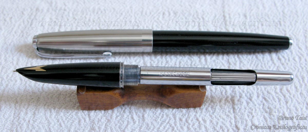
The Joker 60, uncapped. The metal ring belongs to the section and is covered by the cap when closed. Picture by Kostas K.

A third difference can be seen in the section: the nib mouth is different from that in the Honest 60, which abounds in the idea of these two pens being separate models, albeit related.

Nib and section of the Joker 60, on top, and of the Platinum Honest 60. There are some obvious differences in the way the sections expose the nib. (Authorship of the pictures as stated on the watermarks).

Finally, the barrel is engraved with the name of the Italian company. As a result, the only obvious sign of the Platinum origin of this pen is the logo on the cap jewel.

The cap jewel in the Joker 60. Picture by Kostas K.

There exists, Kostas K reports, another Joker pen with some additional differences: its cap has no logo, and the feed and the connecting piece between barrel and section are black. Their nibs are identical; i. e., both show the Joker and the “PLADIUM” imprints.

Everything on these Joker pens smell Platinum despite the small differences with respect to the Honest 60, as was the case with the Spanish Presidente.

The two variations of the Joker 60, side by side. The one on the left has the old Platinum logo on the cap. Picture by Kostas K.

There are also news, yet to be confirmed, of some Platinum pen very much alike to the Honest 60, but implemented with an aerometric system. Ron Dutcher has spoken of a previous Honest 60 pen released in 1955 with a bulb filler.

In view of all these facts, I dare to formulate a hypothesis: The Honest 60 was initially released in 1955 as a self-filler pen, either as a bulb-filler or as an aerometric. The next year, Platinum changed it to become the first cartridge/converter pen of the company. Then, I suggest, Platinum got rid of the remaining self-filling pens by selling them in other markets and through other companies, such as Presidente and Joker.

And the quest for information continues.

My great appreciation to my friend Kostas K.

(Kaweco Sport – Diamine Amazing Amethyst)

Bruno Taut
July 27, 2011
[labels: Presidente, Platinum, Joker]

29 July 2011

Reliquias

Per l'Olga.

La gente no debería festejar el paso del tiempo,
aunque siempre sea noble el obstinarse en celebrar el triunfo del enemigo.
Pedro ZARRALUKI. El responsable de las ranas. 1990.

En este año 2011 se cumple el 50 aniversario del modelo Olimpia de la empresa Súper T. Normalmente, éstas son fechas para celebrar y para descorchar una botella de buen cava. Sin embargo, el panorama estilográfico español, y aun europeo, no invita al optimismo.

Súper T Olimpia.

Tres compañías producen hoy plumas estilográficas en España. La más evidente es Inoxcrom. Su situación económica es mala y eso se nota en los productos que proporcionan prestigio pero no dinero. Su catálogo de plumas apenas ha cambiado en los últimos años y esta división parece ir a la deriva, sin una estrategia comercial clara. No obstante, sigue presente en bastantes comercios en Madrid y, presumiblemente, en España.

Inoxcrom 77.

La segunda marca española de plumas –desde un punto de vista histórico— es STYB, antigua Jabalina. Produce tan solo tres modelos de estilográficas y su presencia en el mercado es anecdótica.

STYB Compact.

Finalmente queda la empresa Pixeline como creadora de la marca Romillopens. Son estas plumas artículos de gran lujo, de producción pequeña y artesanal. Se distribuyen tan solo a través de una única tienda física, en Madrid, y, por supuesto, de su página web. Por tanto, las Romillopens no se ven en las tiendas del ramo.


Súper T, por su lado, desapareció en 1976 y sus plumas son ya reliquias en manos de coleccionistas y comerciantes u objetos olvidados en un cajón. Desgraciadamente, me apuro a añadir, porque tanto la Gester como la Olimpia son plumas de buena calidad y de diseño interesante.

Pero ante este panorama, limitarnos a brindar y a darnos palmaditas en la espalda por el cumpleaños de la Olimpia no conduce a nada. ¡Es que ni siquiera podemos exclamar “per molts anys” al brindar!

Por ello quisiera que hubiera alguna iniciativa más atrevida que nos permita mirar al futuro de la estilográfica española con más optimismo. Con objeto de que en algún momento, con motivo de otro aniversario, sí podamos brindar por la larga vida de esa pluma, de esa marca, de esta industria.

(Kaweco Sport transparente – Senator Regent Royal Blue)

Bruno Taut
29 de julio de 2011
[labels: Súper T, Inoxcrom, STYB, Romillopens, España]

28 July 2011

Matching (X)

The controversy is always there: Is that pen original or a copy of another? Which company did father that idea? Sometimes, the answers are clear…

We all have heard the idea that the Japanese did not invent anything but they merely copied other countries’s products. And even thought that might have been true at some point, I do not think a leading country in technology could be accused of not creating anything new. So, the accusation is now directed to China—they just copy and manufacture fake products.

It only takes a quick look at the history of technology to realize that with the single exception of the UK, every country’s industrial revolution started by copying goods and products created previously in more developed areas of the world. And now is the time for China.

So, it should be no surprise to find copies of Western products manufactured in China. And in the case of fountain pens, copying the very successful Parker 51 seems like a rite of passage.

The section is closer to that of a Parker 61, showing the damascene decoration to point out where the nib is.

Such is the case of the pen with which I am writing these lines—a Rainbow 202.


Externally, it is a well constructed pen. It feels solidly made, with good quality materials. All the parts fit well. The cap attaches firmly to both section and barrel through an internal clutch. And there is even a small window between section and barrel to check the ink level. However, disassembling the section and discovering the nib quickly break the spell. Steel nibs are all right, but they need to be made of good quality steel and well manufactured. And as the picture shows, none of those conditions is fulfilled.

No second breathing hole but just a defect on the steel. The only engraving on the nib is a subtle "IRIDIUM" close to the feed.

But, how does it write? I have two units of this pen and one of them is terrible and the other is surprisingly good, drawing a juicy and reliable line. In any of the cases, I would be very concerned about the corrosion that might arise in such bad quality steel.


These are the pen dimensions:
Diameter: 12 mm.
Length capped: 133 mm.
Length uncapped: 127 mm.
Length posted: 144 mm.
Total weight: 18.8 g (empty).
Cap weight: 6.7 g.
Ink deposit: 1.4 ml.

China, as Japan or Italy or Spain did in the past, is learning by copying. And by doing that they run along the thin line of intellectual property rights—just as others did in the past and even today. Condemning or absolving them depends too often on what side of the fence we stand on.

(Rainbow 202 – Pelikan 4001 Royal Blue)

Bruno Taut
July 27th, 2011
[labels: Rainbow, Parker]