14 May 2013

More GK

GK stands for Ginjirô Kabutogi. Or, Kabutogi Ginjirô (兜木銀次郎) in Japanese—family name first. We saw those letters imprinted on a couple of Ban-ei pen nibs, and those letters were, in fact, the only real identification of those pens.

On this things were different. For one, the pen is labeled with the name DIA on the clip and on the nib. In this case, two other signs showed that nibmeister Kabutogi was involved—the brand Steady and the number 3233, which was the Japan Industrial Standard associated to pen operations Steady and Ideal, owned by Kabutogi.


The pen clip. Rolled 14 K gold, and labeled as DIA.


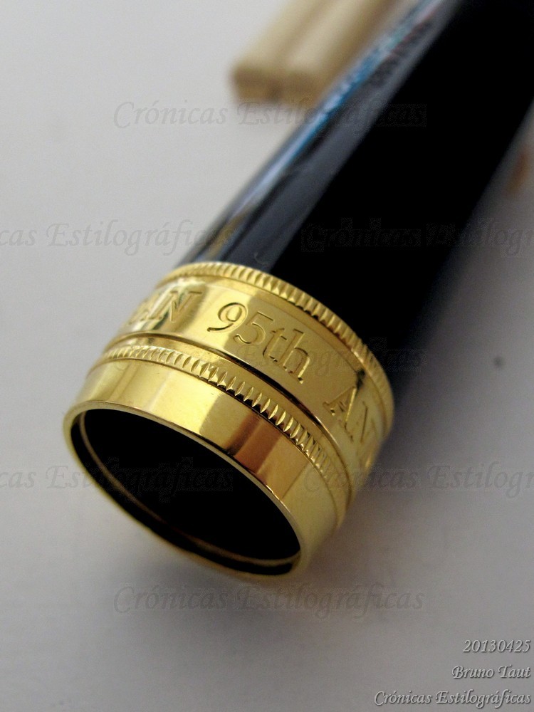
The inscription on the nib reads "Steady / DIA / LIFETIME / 14K / JIS logo / 3233".

Lambrou and Sunami describe Diamond as a family business founded in 1948 in Ôsaka by Shibata Tetsuo. The production of fountain pens, under brand names Diamond and DIA, was greatly improved in 1957, when Nishikawa Noburu, skilled craftsman and pen maker, joined the company. However, the pen production ceased by mid 1960s.

Most Diamond pens were made of celluloid or of lacquered ebonite. Today’s pen belongs to the second group, and it is decorated with a urushi-e technique called togidashimon. On it, different colored layers are applied to the surface, and are later cut or polished to reveal a colorful pattern in oval shape.


The barrel shows the colors of the different layers of lacquer applied on the pen. This maki-e technique technique is called togidashimon.

These are the pen dimensions:
Length capped: 144 mm
Length open: 128 mm
Length posted: 172 mm
Diameter: 14 mm
Weight (dry): 21.6 g

The pen, in this case, is an eyedropper filler with shut-off valve. Lambrou and Sunami, in their book Fountain Pens of Japan (2012, ISBN: 978-0-9571230-0), show a very similar pen, albeit with a different filling system—a lever filler. They date it in 1957.


My thanks to Mr. Chen and to Mr. Furuya.


Pilot Custom Grandee, music nib – Gary’s yellow-black iron-gall ink

Bruno Taut
Yokohama, May 14th 2013
etiquetas: Diamond, nibmeister Kabutogi, Steady, urushi-e

11 May 2013

November 1st

The mystery, apparently, has been solved—the pen to celebrate the 50th anniversary of the Pilot Capless will be a modern Capless pen (1998 model) made of maple wood with golden trim. This will be a limited and numbered edition, and the release date will be November 1st. The news source is KeatsPhD, of the Fountain Pen Network (FPN), and he cites John Lane, the National Sales Manager of Pilot-Namiki for the US, as the origin of it.

It is interesting to note that Pilot had released this information in the US and not in Japan. Fellow blogger Bromfield, in Japan, pointed out that this is not the first time that soon after a “no plans for Japan” statement by Pilot news have arrived from across the Pacific Ocean. So, it is hard to think of all this as not planned by Pilot.

In fact, this strategy might be easy to explain. There are more stylophiles in the US than in Japan, and pen fora –FPN and others— and blogs in English reach much farther away than those in Japanese.

And, once again, we active users and collectors became tools of advertisement in the hands of some few companies.


Morison 18 K pocket pen – Sailor Black

Bruno Taut
Yokohama, May 11th 2013
etiquetas: Pilot, mercado, fora, metabitácora

10 May 2013

Ultra (IV)

Kabutogi Ginjirô (兜木銀次郎) is no alien to these Chronicles. His presence in the pen industry in Japan seemed to be more of a reliable supporting actor than playing a leading role. His nibs were either inconspicuous, almost anonymous, or passed as copies of some other designs.

The following inlaid nib belongs to the second category:


The pen carries no name other that a very generic “Super De Luxe” imprinted on the cap lip. But it certainly follows the style of the Pilot Super Ultra 500 of Shigeki Chiba, and does it beautifully. This time, contrary to most non-Pilot Ultra models, the nib is truly inlaid and extends itself along the section and fully around it.


The imprint on the nib read "Steady / K14 / JIS logo / 4622". 4622 is the JIS registry number of Kabutogi's pen operation Seilon.


It is engraved with one of the pen brands associated to Kabutogi –Steady— together with the JIS registry number 4622. This belonged, as well, to Kabutogi Ginjirô, but in connection to another pen brand: Seilon.

The pen uses Platinum-proprietary cartridges which were a de-facto standard in Japan by the late 1950s and 1960s (see the Chronicle on Mitaka). Platinum, may we remember, had been the first Japanese company to produce ink cartridges.


Some units of this pen were manufactured for the department store Daimaru.

These are the dimensions of this pen:
Length capped: 145 mm
Length open: 131 mm
Length posted: 164 mm
Diameter: 11 mm
Weight (dry): 13.7 g

My thanks to Mr. Furuya.

Platinum 3776 (1978 model) – Platinum Blue-black

Bruno Taut
Machida, May 17th, 2013
etiquetas: Steady, Seilon, nibmeister Kabutogi Ginjirô, Platinum, Pilot, marca desconocida, plumín

07 May 2013

More Center

Japanese pens are a lot more than maki-e and urushi, and a lot more than Pilot, Platinum and Sailor. Hundreds of pen operations struggled in the domestic market during the post-war years. Then, two political decisions changed the landscape—the first was the implementation of the Japan Industrial Standards (JIS). Although it was not obligatory for the brands to adopt those norms, the JIS mark became visible on the nibs of the major companies. That mark ensured that the nib material was as declared, thus preventing the easy fraud of passing as solid gold those nibs that were just gold plated.


The second measure was the liberalization of the Japanese market to foreign–made pens in 1964. And according to Lambrou and Sunami (Fountain Pens of Japan. 2012. ISBN: 978-0-9571230-0), several hundreds of million of Chinese-made pens were sold in Japan on the following years, which seem like an awful lot of pens given the population of Japan: between 90 and 100 million people along the 1960s.


In any event, this foreign competition drove many Japanese pen operations out of the business and focused their activity in other products. That was the case, for instance, of the Sanwa Kôgyô Co. Ltd., owner of the brand Center. The company, based in Nara, is still active and on its website it mentions year 1964 and the endpoint to its pen production, started in 1932, due to the liberalization of the Japanese pen market.

Therefore, the model Center 61 was certainly produced before that year of 1964.


Sailor white pocket pen, 14 K gold nib – Pelikan 4001 Brilliant Brown

谷村あいる & Bruno Taut
March-April, 2013
etiquetas: Japón, mercado, Center

04 May 2013

Bokujû (墨汁)

This is an interesting ink. A puzzling one.


The label does say this ink is for fountain pens, but should it not be clear enough, there is also an obvious figure of a fountain pen. A Pilot, of course. The metal ring attached to the string is a common feature among old Japanese inkwells, but I confess my ignorance about its purpose.

We, pen aficionados, are very aware of the dangers of using inks not specifically designed for fountain pens. India ink, for instance, contains shellac –a bioadhesive that would easily clog the ink feed of any fountain pen.

In East Asia the basic reference of ink is different. Sumi ink (墨) is traditionally made of vegetable soot and animal glue. It is presented in the form of sticks, and to make the actual ink these sticks have to be ground against a stone (suzuri, 硯) in combination with water. The ink, now called bokujû (墨汁), is formed by the suspension of the powder removed from the ink stick in the water. This is the ink used in traditional calligraphy, shodô (書道) in Japanese, whose basic instrument is the brush instead of the stylus.


The inscription on the lid reads Special ink Pilot 特製墨汁パイロット. On the center, the company logo.

Nothing can I say about whether the use of this ink was a long time goal of Japanese pen companies. As of today, Platinum’s Carbon ink and Sailor’s Kiwa-guro simulate the idea of bokujû—particles in suspension in water. Pilot´s approach is just limited to the name of one the inks of the Iroshizuku line: Take-sumi (竹炭), although in this case, sumi is written as 炭, meaning coal, instead of 墨, ink. Both ideograms can be read in the same way—sumi (すみ).

Then, what about this old inkwell? The label clearly (well, sort of) says it contained bokujû—that is, the already prepared ink after grinding the ink stick—and that it is for fountain pens. On the back, the manufacturer, Namiki Seisakusho, explains that only after developing some procedures, which involved filtration, it was safe to use bokujû in fountain pens.


The explanations to justify the uniqueness of the ink.

Was it? Hard to say. However, a more relevant question is whether this was a real carbon ink, a precedent of the modern nanopigmented inks made by Sailor and Platinum. Interestingly enough, Pilot does not produce any such ink right now.

This ink dates back from the 1920s, and chemical analysis are in order. But few people might really care.

My thanks to Mr. Yamada, who also wrote on this ink for his blog, including a couple of samples on paper.


Pilot Capless, stub nib (Shimizu Seisakusho) – Waterman Mysterious Blue

Bruno Taut
Yokohama, May 4th, 2013
etiquetas: tinta, Pilot, Sailor, Platinum, Japón, caligrafía, pincel

30 April 2013

Super 1970s

The Pilot Super line of fountain pens is well known among the readers of these Chronicles. It was, let us remember, the family of pens that formed the core of the Pilot catalog in the late 1950s. The basic characteristics were a nail-shaped nib with a totally hidden feed and a sac-based filling system. More often than not, it was the hose system (some people call it quarter-switch filler). Later evolutions, already in the 1960, changed the shape of the cap and created the cartridge filling Super V series (Super 200V, for instance), overlapping the E series and followed, later, by the Elite models. It is interesting to note that the nail-type nib and the hidden feed scheme remained basically the same –save changes in sizes— until well into the 1980s.


A Pilot Super 300 from late 1950s (with maki-e seirei-nuri decoration) and a cartridge-converter Super from the early 1970s. Note the different design of the section.

In the early 1970s, Pilot launched a nostalgic reissue of the original Super model with a large nib. The basic modification in this newer pen was the use of ink cartridges and converters. The section was also re-designed –in line with some of the Elite models—and now the cap was perfectly aligned with the barrel when closed.


Two units of these Pilot Super pens made in the early 1970s. They implement very different nibs, as will be shown on other pictures.


The insides of one of the newer Pilot Super pens.

The wide golden ring of the cap, so characteristic of the original Super pens (although not all of the variations carried it) was now plated with 22 K gold. The engraving on the ring says 22 AKG, but nobody seemed to really know what it stood for. As for the nib, some inscriptions on them seemed to recreate an old Pilot logo –that with a stylized L underlining the O—and some others use a more modern script for the company name.


A script and a soft nib. Note the different geometry of both--the soft nib has longer and thinner tines. The imprinted logos are also different.

Several nib points were available including some unusual ones. Here I am showing a very stiff and quite fine script, and a semi-flexible one labeled as “soft”. This nib can provide a significant line variation while being quite soft—little pressure you had to apply to create that effect. Manifold nibs were also available on these modern Super pens.


Writing samples --excuse my poor hand-- with the previously shown nibs. The paper squares are 2 mm wide.

These are the measurements of these cartridge-converter Super pens:
Length closed: 136 mm
Length open: 121 mm
Length posted: 149 mm
Diameter: 12 mm
Weight: 21.2 g (dry)
Ink deposit: 0.9 ml (cartridge), 0.8 (CON-20), 0.6 ml (CON-50)

Both units shown in here were manufactured at the Tokyo plant in 1973.


Pilot Super (cartridge-converter), soft nib – Pelikan 4001 Brilliant Brown

Bruno Taut
Yokohama, April 8th, 2013
etiquetas: Pilot

25 April 2013

First Piston by Sailor

After speaking about an old self-filler by Sailor, it might be time to speak about the origins of the new, contemporary, self-filling fountain pens of this company. Between the old bulb-fillers from the 1950s and the first Sailor Realo (2006), about 50 years of boring and clean and efficient cartridges and converters have passed.

Then, to celebrate the 95th anniversary of the company in 2006, Sailor marketed a big piston filler based on the King of Pen line in the Profit (1911 in some markets) style of balance pens. And this was the first piston ever made by Sailor.


500 units were made for Japan, and 100 more for overseas markets. Most of them were black, but there seems to have been a small number units in maroon, and an even smaller number with maki-e decoration for Singapore (as reported by A. Lambrou and M. Sunami; Fountain Pens of Japan. Andreas Lambrou Publishers 2012. ISBN: 978-0-9571230-0-2). Speaking for myself, I have only seen black units.


The inkwell shown on the picture is not the original one. It had the Sailor logo on the lid.


The package includes a pen pouch made of deerskin leather coated with urushi, a traditional craft from Yamanashi prefecture. But should we remember that is only an accessory.

The second element of interest in this pen, after the filling system, is the nib. It is a Naginata Togi in M partially rhodiated. This is exceptional because Naginata nibs come usually in the big size (in Sailor terms, opposed to medium and super big sizes), and this meant that Sailor made a special casting of this nib for the commemorative pen.


The cap is subtlely engraved: "REALO 2006 / (serial number)/500". This pen is one of the 500 units made for Japan. Those for overseas markets were numbered over 100.

The final result is a pen with two elements many stylophiles love—an exciting nib and a non-trivial filling system—making this one of the most interesting commemorative pens ever made by Sailor. Should it have been more exotic with the looks, it would have been almost perfect. And that might be the case of those Sailor Realo with maki-e made for the Singaporean market. However, cheap might be not, and that in the case you found one.


The super big, in Sailor terms, nib made of 21 K gold. It is a Naginata Togi nib in M.

This first and original Realo is indeed big and could easily compete with classic oversized pens as the Montblanc 149 and the Pelikan M1000. These are their dimensions:

.Sailor Realo 95.

.Montblanc 149. .Pelikan M1000.
Length closed (mm) 153 148 146
Length open (mm) 130 132 135
Length posted (mm) 167 169 173
Barrel Diameter (mm) 16.0 15.0 14.5
Ink deposit (ml) 1.6 1.9 1.6
Weight, dry (g) 31.9 31.0 32.9

The original price of the Sailor Realo in Japan was JPY 80000, plus tax.


The wide cap ring carries the following inscription: "SAILOR JAPAN 95th ANNIVERSARY".


Detail of the decorative ring between the barrel and the culotte.

But this was a limited edition and only 600 units went into the market. Sailor, however, followed up in 2009 with a more affordable, and smaller, piston filler based on senior size of both the balance Profit/1911 and of the flat top Professional Gear models. The basic price of these smaller Realos is JPY 30000, plus tax, and that implies sticking to the usual triad of points—F, M and B. Upgrades to more complex nibs are available during Sailor sale events and at some Sailor Friendly Shops. They are not cheap.


The picture shows the original Realo from 2006, on top, and the regular model, not limited, from 2009, on bottom. The later is a much smaller pen, based on the senior size of the Profit/1911 or the Professional Gear series of pens.


Platinum 3776 (1978) – Platinum Blue-black

Bruno Taut
Shinjuku, April 17th, 2013
etiquetas: Sailor, plumín, Singapur, Montblanc, Pelikan