Some weeks ago I spoke of the new release of eight not-so-new ink colors by Sailor. Not-so-new because those eight colors had already been marketed 2010 as seasonal inks in limited editions with big success.

Weeks later, news and rumors in the Net claimed that Sailor had reduced the selection of inks in its catalog. From now on, only three basic colors would be available—black, blue and blue-black—and that there would be some fancy colors at a premium. That would mean, at least, that the basic color line (peach, sky-high, ultramarine, grenade, epinard and apricot) was coming to an end after just three years in the market.

The ink selection in 2011. Taken from Sailor website in 2011.
Now, Sailor has just released a new catalog of fountain pens and accessories after years of the same boring and incomplete edition. The new catalog included, needless to say, the latest releases like the Sigma and the Promenade and the Precious Woods series. And on the page dedicated to consumables we can see that the transition in the ink department is completed. Now, besides the permanent black (kiwa-guro) and blue-black (sei-boku), Sailor makes eleven Jentle inks: the basic three plus the eight re-editions of the 2010 seasonal inks. And the price is the same for all the eleven Jentle inks—JPY 1000 plus tax. So, no variations on this department with respect to the previous colors.

Page of consumables in the new (Summer 2014) catalog of Sailor for fountain pens and high quality writing utensils. Click on the picture for better resolution (too often Blogger is not up to the challenge).
One final reflection—does Sailor have any consistent policy about its inks? The changes in its catalog of the last five years seem quite erratic, especially when compared to Pilot and Platinum. However, those changes could also be understood as an effort to call the attention of all of us. And that Sailor did get.

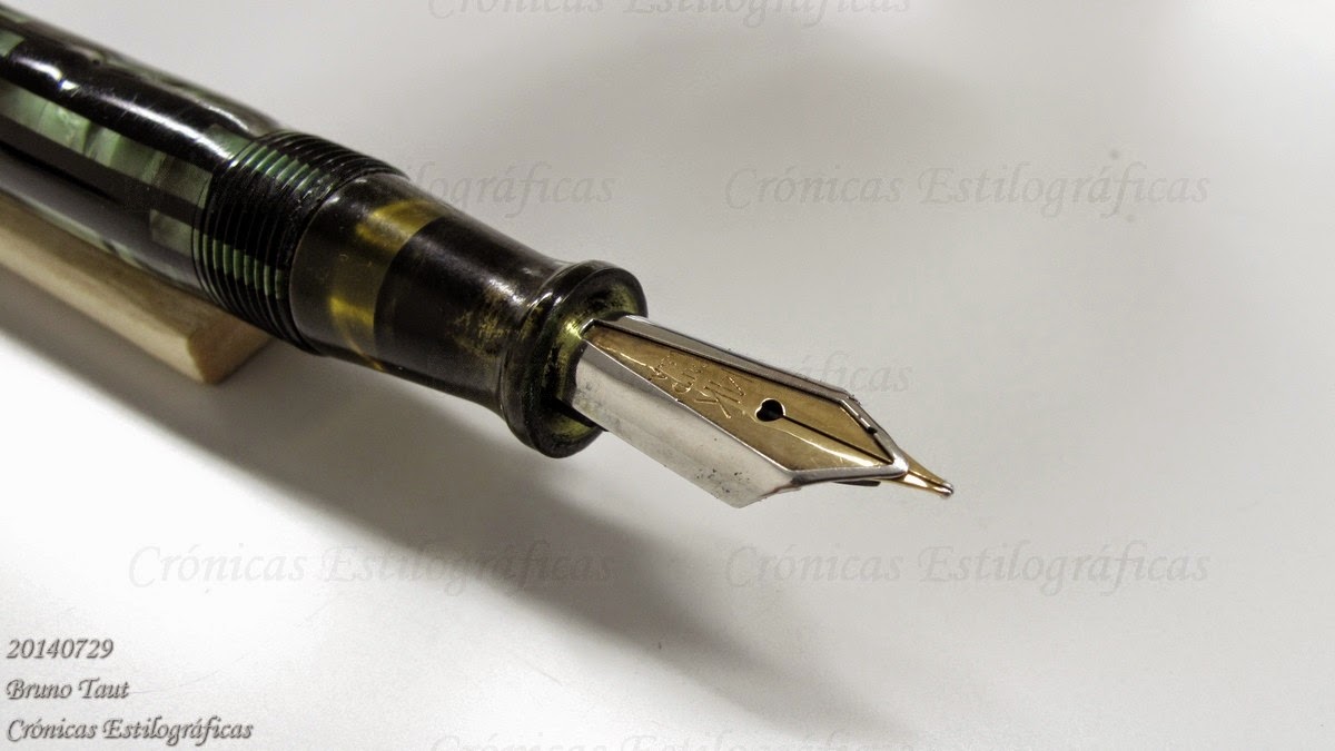
Super T Gester 40 – Sailor Yama-dori
Bruno Taut
Nakano, Augusr 15th 2014
etiquetas: tinta, mercado, Sailor
Bruno Taut
Nakano, Augusr 15th 2014
etiquetas: tinta, mercado, Sailor