31 December 2011

Evolution

Let us remember now that all the Presidente pens I have seen were aerometric fillers. And they were based on the first cartridge pens ever made in Japan—the Platinum Honest 60 and its later evolution the Honest 66.

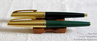
Two Presidentes.

Platinum Honest 66, on the back, and Honest 60 on the front.

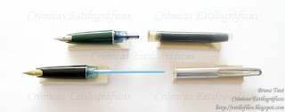
How do those filling structures compare?

On the top, a Platinum Honest 60 with its Honest cartridge. On the bottom a Presidente with the squeezer removed from the section.

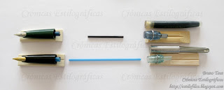
A further step in disassembling the pens. Again, the Platinum pen on the top, and the self-filling Presidente on the bottom.

The answer is both easy and revealing. On two of the Presidente pens, the squeezer device can easily be removed from the pen, and, inside, the breathing tube remains attached to the feed. The interesting detail is that these squeezers could work as converters on the Platinum Honest 60 and 66 pens. On these, the breathing tube is much shorter and is covered by the nipple where the cartridge is attached. This makes perfect sense—this tube is never strong enough to open the cartridge. Its shorter length, however, makes the filling system less efficient. On the opposite direction, the Platinum Honest cartridge could be used on the Presidentes if the breathing tube were removed, which is not difficult to do.

On the left, the Platinum Honest cartridge; on the right, the squeezer of one of the Presidente pens.

All this illustrates the logical evolution of filling systems. Some sources (Ron Dutcher, Kamakura Pens) speak of a bulb filler Platinum Honest in 1955. However, in view of the similarities among the Presidentes and Honest pens, I think of the Spanish brand pens as the early self-filling versions of the Japanese models.


(Athena Basic Line – Sailor Yama-dori)

Bruno Taut
December 31st, 2011
[etiquetas: Presidente, Platinum, conversor, soluciones técnicas]
29 December 2011

Family Portrait (I)

My first chronicle was entitled Metamorfosis, and it was about the internal change many of us, stylophiles, go through when we acquire a passion like this. It does not come without mixed feelings and I have already spoken about how many pen aficionados insist in being users over collectors … if not hoarders! On my side, I did give up some time ago—I am a collector, even if modest, and a hoarder.

Small family portrait: Four hoshiawase pens.

Then, the following family picture makes some sense. It displays my modest collection of Pilot hoshiawase pens from the 1920s. All four of them are late models, from between 1926 and 1928.


The latest arrival dated from August 1927. It has a 14 K gold nib in size 3, and the hard rubber body is chased. Its overall condition is fairly good.

The latest arrival.

These are its dimensions:
Diameter: 12 mm.
Length capped: 122 mm.
Length uncapped: 117 mm.
Length posted: 155 mm.
Weight: 12 g.


The hoshiawase system was finally dropped because it never worked well enough in its purpose to seal the ink deposit. Therefore, its interest nowadays lies more in its originality and rarity than on the actual functionality of these pens. But the temptation to use them is always present. How would the experience of writing with such a pen be?

(Sailor Profit Junior – Pilot Iroshizuku Yama-budo)

Bruno Taut
December 29th, 2011
[labels: Pilot, estilofilia]

28 December 2011

Swiss Bank

On my previous chronicle I mentioned the existence of this Sailor’s nib engraved with the rather cryptic text “Gold from the Swiss Bank”. Nibs like this are made of 14 K gold and were present in a number of pens, both in pocket and full sizes.

The Swiss Bank gold.

But what about this reference to banks in Switzerland or, better, THE Swiss Bank? Does it account for any actual origin of the gold or was it a mere cosmetic detail or a marketing trick?

This inscription could also be seen on older Sailor pens (I, II), probably from the 1970s, whose nibs were very different to the one here shown. As for this particular one, in this original shape, dating it should not be difficult. It is engraved with what looks like a date: 902. It could correspond to September of Heisei year 2, which corresponds to 1990. Although a bit late for pocket pens, it might still be reasonable.

Where did this white gold come from?

A similar nib is present on this other pen, made of steel with black stripes. This time, the nib is made of 18 K white gold and has no engraving stating the origin of the gold. It seems to be dated in 610, which could correspond to June 1998 (Heisei 10). However, these two pens share an air of familiarity that suggest a common origin.

These are the pen dimensions:


Pocket pen. Catalog number 11-0408 220. 14 K gold nib:
Diameter: 12 mm.

Length capped: 120 mm.

Length uncapped: 102 mm.
Length posted: 141 mm.
Weight: 17 g.


Full size pen. Catalog number 11-0604 220. 18 K white gold nib:
Diameter: 11 mm.

Length capped: 136 mm.

Length uncapped: 121 mm.

Length posted: 150 mm.

Weight: 15 g.


(Pilot Custom 74 with music nib – Pilot Iroshizuku Sho-ro)

Bruno Taut
December 27th, 2011)
[etiquetas: plumín, Sailor]

24 December 2011

Sailor's Pockets

Sailor’s approach to pocket pens –that Japanese invention initiated by this company in 1963—was quite erratic. Even though pocket pens indeed came in a number of nib points and body decorations, the nib styles were limited for both Platinum and Pilot pens.


In contrast, Sailor’s pocket pens display almost all kinds of nib shapes —from semi-hooded to inlaid— and on materials, although in this department Pilot and Platinum were also quite promiscuous. However, only Sailor made nibs with "gold from the Swiss bank". But that should the topic of another chronicle.

A collection of different nibs, all from Sailor's pocket pens. All of them are made of gold with purities between 14 and 23 K. Two of them are made of white gold.


(Parker 51 – Pilot Iroshizuku Kon-peki)

Bruno Taut
December 22nd, 2011
[etiquetas: Sailor, plumín]

22 December 2011

ED (III)

On these chronicles, I have spoken several times about eyedropper transformations of some pens—Pilot Prera, Kaweco Sport, Platinum Preppy… Good, correct writers as those are, they are not the most charming pens in the market, and filling their barrels with ink is a safe bet for having them inked for a long and boring while. But those experiments show a couple of things.

A Kaweco Sport filled as eyedropper. In this case, the italic nib from the Kaweco Calligraphy set makes this pen a lot more interesting.

Making an eyedropper pen is easy. Easy for the user and, more important, easy for the manufacturer. However, very few companies market pens openly as eyedroppers: Stipula, Pilot-Namiki, Romillopens, Danitrio, Eboya-Nebotek,… And with the exception of the Stipula T, all those pens are very expensive. But the market of stylophiles, on its side, demands arcane filling systems like this.

The Stipula T. A good idea for a poorly performing pen.

Stipula seems to be the only company truly understanding this, although its eyedropper-cartridge-converter pen –the Stipula T— does not perform correctly. Then, why do other companies not try this approach? Why do Pilot, Platinum and Sailor not try to create affordable eyedroppers with their admirable selection of nibs? On top of that, as Stipula showed, eyedropper pens are not incompatible with the convenience of cartridges and converters.

Maybe they are pushing us into buying vintage pens instead of their newly crafted goods...


(Sailor Realo with Cross-music nib – Pelikan 4001 Royal Blue)

Bruno Taut
December 18th, 2011
[etiquetas: soluciones técnicas, mercado, estilofilia, Stipula]

16 December 2011

Spheres

For my friend Kugel 149.

Kugel is the German word for sphere or ball, and it is also a label associated to some nibs of, to my knowledge, German manufacturers: Montblanc, Pelikan, Lamy. The idea behind a Kugel nib was to enlarge the “sweet” spot of the nib and to make it easier and more pleasant to write with those fountain pens.

Kugel nib of a Montblanc 149 from the early 1950s. It is a KOB.

These nibs can easily be spotted—the nib point is a small sphere that clearly sticks out over the nib’s upper side. Kugel nibs are usually labeled with a K before the actual nib point—KM, KB, KOB… However, there are a number of nibs sporting this same feature that are not labeled as “Kugel”. Does that mean these were not Kugel nibs?

I see a big ball here. Parker Falcon 50, from ca. 1980.

This question would be irrelevant might not be that German Kugel nibs, labeled as such, reach much higher prices in the second hand market that those not labeled as such. So, what do stylophiles value? The rarity of the label or the actual nib, labeled or not?

Another sphere. A Pilot Capless nib currently on production.

Modern nibs tend to have larger tips, as can be seen on the pictures. I can think of two reasons to explain this: The first one is the current lower price of the raw materials –mostly Ruthenium alloys in modern nibs— with respect to the labor costs of producing smooth and material-efficient points. The second is the lack of use of fountain pens—for people raised in the era of ball-points and keyboards, fountain pens with larger sweet spots and smoother nibs might be arguments to attract new users.

Anyway, that is just a hypothesis. The main conclusion is that there are more Kugel nibs in the market that just those labeled with a K.

(Parker Falcon 50 – Sailor Miruai)

Bruno Taut
December 15th, 2011
[etiquetas: Alemania, plumín, estilofilia]

14 December 2011

Hepburn

When writing about Japan in English or Spanish soon one encounters a linguistic problem—that of the transliteration of Japanese words into alphabet. And this is an important issue as we, non-Japanese, need a consistent way of writing those, otherwise, mostly incomprehensible terms and names.

The most common set of rules for these transcriptions, or in Japanese terms, to write in Romaji, is the so called Hepburn Romanization, after James Curtis Hepburn, who proposed his system by the end of the nineteen century. The problem arises when Japanese native speakers are not really familiar with it. Needless to say, they do not need any transliteration in their daily life, and Romaji is not seriously covered at school. However, sooner or later, many a Japanese will have to write something in alphabet —a name, an address…— and mistakes are in order. The first type of mistakes is to follow the writing of the Japanese syllabaries. The second is to make the pronunciation of the written word in alphabet close to the Japanese sound when read by an (American) English speaker.

Behind the first mistake lays the inconsistency of writing certain sounds –mostly long o and most diphthongs (Yôon, 拗音). This is the reason why we see the name of the founder of the Japanese brand Swan written as Itou instead of Itô.

The second type of mistake --to help English native speakers to pronounce Japanese more correctly—accounts for spelling Ohto (大戸), a Japanese pen brand and a common family name—instead of Oto or Ôto, although this case creates no problem as the commercial name is well known and is not subject to different spellings.


At the end, the basic problem is one of consistency. Consistency both within any given text as well as with respect to other texts. Andreas Lambrou’s Fountain Pens of the World (1995) is an example of the opposite. The founder of Swan in Japan is spelled both as Itou and as Ito; SSS’s founder is both Asahirou and Asahiro Hosonuma; workshop or works (製作所) is randomly written as seisakusyo and as seisakusho; to name just a few examples.


I hope these problems were absent in the incoming Fountain Pens of Japan, by A. Lambrou and Masamichi Sunami. This book is bound to become a basic reference on Japanese fountain pens, and everything would be easier with good foundations.

(Pilot Prera, eyedropper – Senator Regent Royal Blue)

Bruno Taut
December 13th, 2011
[labels: japonés (idioma), libro, Japón]

11 December 2011

Retirement

Sailor’s nibmeister Nagahara Nobuyoshi (長原宣義) has announced his retirement on the last issue (December 2011) of magazine Shumi-no Bungubako. Logical as it is at his age (he was born in 1932), it is indeed a big loss for the fountain pen scene.

Nibmeister Mr. Nagahara Nobuyoshi at the past Fuente Pen Show (Tokyo, October 2011).

As I have already stated on previous chronicles, Nagahara’s specialty nibs are the single most exciting innovation in fountain pens in many years. After over one hundred years of pen history, not much room there seems to be for changes in an out-of-fashion writing tool. Filling systems, body materials, and nibs and feeds are the basic areas of evolution in a fountain pen. However, it is hard to become impressed by new materials and nothing new we have seen in ages re filling systems and feeds.

Cover of issue 21 of Shumi no Bungubako where the retirement of Mr. Nahagara is announced.

In the nib department, most companies became content with a very limited selection of points, mostly based on the F-M-B triad. A small number of companies, fortunately, are working on revisiting some arcane nib points—flexible and stub, mostly. And then came Sailor and the radical approach to nibs of Mr. Nobuyoshi Nagahara.

In 2007, Mr Nagahara was awarded by the Ministry of Health, Labor and Welfare of Japan with the distinction of Master of Modern Arts. At the time, Sailor released this limited edition pen whose nib is engraved with Mr. Nagahara's first name: Nobuyoshi (宣義).

I hope his retirement did not mean Sailor abandoned either the will to innovate or the production of these impressive specialty nibs.


My thanks to Mr. Noguchi.

(Sailor Realo with Cross-music nib – Pelikan 4001 Royal Blue)

Bruno Taut

December 10th, 2011
[labels: Sailor, soluciones técnicas, plumín, Shumi no Bungubako]

09 December 2011

Even More Ink

Japan also had its big bottles of ink at the heyday of fountain pens. The bottles I am showing today are on display at the Pilot Museum in Tokyo—the beautiful Pen Station, museum & café.

Pilot's Pen Station in Chuo ward in Tokyo.

The first bottle dates back from before 1938, as the logo –the N encircled by the lifebuoy—shows. The ad, from 1929, shows a similar bottle in the background. It holds, apparently, 14 fluid ounces (about 400 ml) for one single yen.

An ink bottle from around 1930.

Pilot ad from 1929. (Taken from Yoshiharu's blog).

The second bottle is also depicted in an ad, this time from 1950. For JPY 270 one could get 24 fl. oz. (about 700 ml) of fountain pen ink, also suitable for general purposes. The price for smaller quantities is displayed on the wooden frame: 1 oz (a little less than 30 ml) for JPY 30, and 2 oz for JPY 50.

About 700 ml. of Pilot ink.

Pilot's ink ad from 1950. (Taken from Yoshiharu's blog).

Nowadays, Pilot still sells ink bottles of 350 ml for JPY 1575. Just three colors are available: black, blue-black and red.

(Pilot Prera, eyedropper – Senator Regent Royal Blue)

Bruno Taut
December 8th, 2011
[etiquetas: Pilot, tinta]

06 December 2011

Sailor's Piston

Two are the basic arguments for stylophiles to favor self-filling systems –and eyedroppers— over the more modern and convenient cartridge-converter scheme. The first one, already analyzed, is the romantic appeal associated to this beautiful but obsolete writing tool (CE—Romanticism).

The second argument is the usual claim that traditional filling systems hold more ink. The first critique to this claim is whether we really want big ink deposits (CE—In Defense of Small Deposits). And there is a second one—is that claim on the ink capacity correct? Are self-filling mechanisms that capable?


This question, however, only makes sense when comparing similar pens. One such example are the Profit and Professional Gear models, by Sailor, with 21 K gold nibs in senior size.


Piston filler Sailor Profit Realo.

On the Profit version (torpedo, also called 1911 in some markets), the piston filler Realo holds 1.0 ml of ink according to my own measurements. And this pen is only available in three nib points: F, M, and B. The cost, JPY 31500.

Cartridge-converter Profit with a Naginata togi nib.

Professional Gear with an F nib.

On the other hand, the cartridge-converter version holds either 0.7 ml (converter) or 1.2 ml (cartridge), implements nine different nibs, and its price ranges between JPY 21000 (with nibs EF, F, MF, M, B, and zoom) and JPY 31500. All these facts also apply to the Professional Gear models, Realo and cartridge-converter, with the exception of a shorter nib selection.

This table summarizes the differences between Sailor models associated to the filling system.

Therefore, the price difference associated to the piston mechanism is JPY 10500. In view of these results, is it worth to pay such a premium for a piston filler whose ink capacity was smaller than that of the ink cartridge? How romantic are you, dear stylophile?

(Sailor Pocket pen, 14 K gold nib – Pilot Iroshizuku Sho-ro)

Bruno Taut
December 5th, 2011
[labels: Sailor, soluciones técnicas, conversor, estilofilia]

01 December 2011

More Spanish Platinum

Doroteo Pérez y Pérez, as we already know, registered the brand Presidente in Madrid in 1959. And we also know of the actual Japanese origin of, at least, one Presidente pen model, which was closely related to the first Japanese cartridge-converter pen—the Platinum Honest 60 from 1956. Now two more Presidente models have reached my hands and more questions could be answered.

A Platinum Honest 66, on top, and two Presidentes.

These two pens are, again, Platinum. However, this time the Presidente signs are more clear than in the first model, in which the Spanish name (PRESIDENTE / Registrada) was only present as a subtle engraving on the barrel. Now, on these, the brand name is engraved on the nib, on the cap lip and on the filling plate, as well as on the barrel. The original Japanese brand remains on the nib and on the cap jewel, like if the Platinum logo were also the logo of the Spanish brand.

The Presidente nib, engraved with the Spanish name. This time, the nib is not sealed with the JIS logo of the Japanese Ministry of Industry.

Actually, these pens seem more related to the Platinum 66 model, from 1960. And, as was the case with the previous Presidente with respect to the 1956 Honest 60, the Spanish pens are thinner and shorter than the Japanese original.

The metal plate of the aerometric filling system is engraved in Spanish, albeit with some mistakes: "PRESIDENTE / PARA LLENAR TINTA APRETAR / EL CARTUCHO CUATRO TIEMPOS".

Again, these Presidentes are aerometric fillers as opposed to the more advance cartridge-converter system of the Platinum Honest 60 and 66. This is a perfect logical decision—the Honest 60 cartridge had been released in Japan just in 1956 and it would not reach Europe in a long while.

These caps belong to one Joker 60, two Platinum Honest pens, and three Presidentes.

In conclusion, these two Presidentes are in fact Platinum pens. The metamorphosis to become Spanish out of a Japanese pen is now more thorough, but it did not erase its original genoma completely. In this regard, these pens resemble the case of the Italian Joker 60.

These are the dimensions of the Presidente pens:

Black cap Presidente:
Diameter: 10.5 mm
Length capped: 135 mm.
Length open: 116 mm.
Length posted: 147 mm.
Weight: 11.6 g.

Golden cap Presidente:
Diameter: 10 mm
Length capped: 130 mm.
Length open: 115 mm.
Length posted: 140 mm.
Weight: 12.9 g.

And these, those of the Platinum Honest 66:
Diameter: 12 mm
Length capped: 140 mm.
Length open: 123 mm.
Length posted: 147 mm.
Weight: 11.0 g.

However interesting all this might be, the most relevant conclusion is related to the entrepreneurial activity of Doroteo Pérez y Pérez. Now we see that this man did something else than just buying a batch of old Platinum pens, engraving their barrels and selling them as Presidente. On the contrary, he did negotiate with the Japanese company and changed the engraving on nibs and caps to make the pens more Spanish. Nonetheless, those Presidente pens never lost the Platinum signature, and never the Spanish brand became popular or even known.


(Pilot Petit-1 second generation – Pilot Light Green)

Bruno Taut
November 28th, 2011
[etiquetas: Platinum, Presidente, España, Japón, Joker]