Showing posts with label nibmeister Nagahara. Show all posts

31 January 2012

Cross-music

The cross-music nib is one of the specialty nibs created by nibmeister Nagahara. Being a cross nib means that it is composed by two overlapping nibs. Therefore, it has four tines and two slits, and the space between the nibs acts as an additional reservoir of ink. The primary result is a fairly wet nib with a broad line… if so we wanted.

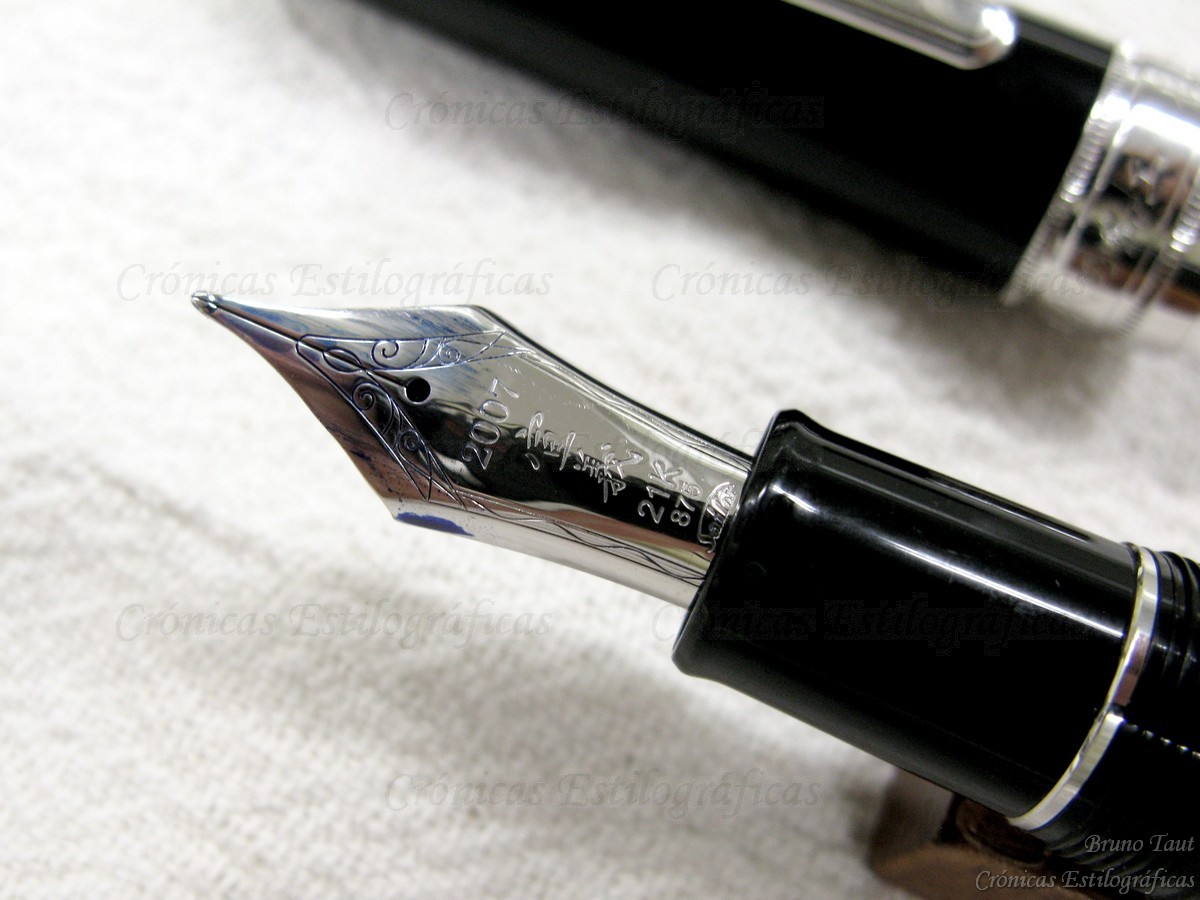
The two-fold cross-music nib on the left and a fude nib (55 degrees) on the right. The fude nib is not tipped.

The second characteristic of the cross-music is the way the point is cut: the vertical lines are very fine, and the horizontal strokes are very broad. However, grabbing the pen at a high angle with respect to the paper generates a fine line drawn only by the upper nib of the set.

Steel fude nib on the left, and gold cross-music on the right.

This way of writing is very similar to that of fude nibs, also made by Sailor, and by some other Asian brands. The problem is the price difference between them.

Writing samples. The color rendition of the scanned page is very inaccurate. The angles shown on the image are those between pen and paper.

Needless to say, the cross-music nib is a lot more complex than any fude, and its price reflects this in a quite dramatic way. For similar looking pens –Sailor’s Profit in senior size, 21 K gold nibs, cartridge-converter filling system—the cross-music nib has an overprice of JPY 15000: JPY 50000 for the cross-music, and JPY 35000 for the naginata fude. And if we were interested mostly on the function, there are even cheaper options: fude pens by Sailor with steel nibs bended at angles of 40 or 55 degrees are available for only JPY 1000.

The cross-music nib in a Profit Realo, on top, and, on bottom, a Fude pen (55 degrees) in a balance model by Sailor.

Chasing the nib over the pen has some interesting consequences. The cross-music nib, though, is truly exciting.

(Sailor ふでDEまんねん, 40 degrees – Waterman South Sea Blue)

Bruno Taut
January 29, 2012
[etiquetas: plumín, Sailor]

11 December 2011

Retirement

Sailor’s nibmeister Nagahara Nobuyoshi (長原宣義) has announced his retirement on the last issue (December 2011) of magazine Shumi-no Bungubako. Logical as it is at his age (he was born in 1932), it is indeed a big loss for the fountain pen scene.

Nibmeister Mr. Nagahara Nobuyoshi at the past Fuente Pen Show (Tokyo, October 2011).

As I have already stated on previous chronicles, Nagahara’s specialty nibs are the single most exciting innovation in fountain pens in many years. After over one hundred years of pen history, not much room there seems to be for changes in an out-of-fashion writing tool. Filling systems, body materials, and nibs and feeds are the basic areas of evolution in a fountain pen. However, it is hard to become impressed by new materials and nothing new we have seen in ages re filling systems and feeds.

Cover of issue 21 of Shumi no Bungubako where the retirement of Mr. Nahagara is announced.

In the nib department, most companies became content with a very limited selection of points, mostly based on the F-M-B triad. A small number of companies, fortunately, are working on revisiting some arcane nib points—flexible and stub, mostly. And then came Sailor and the radical approach to nibs of Mr. Nobuyoshi Nagahara.

In 2007, Mr Nagahara was awarded by the Ministry of Health, Labor and Welfare of Japan with the distinction of Master of Modern Arts. At the time, Sailor released this limited edition pen whose nib is engraved with Mr. Nagahara's first name: Nobuyoshi (宣義).

I hope his retirement did not mean Sailor abandoned either the will to innovate or the production of these impressive specialty nibs.


My thanks to Mr. Noguchi.

(Sailor Realo with Cross-music nib – Pelikan 4001 Royal Blue)

Bruno Taut

December 10th, 2011
[labels: Sailor, soluciones técnicas, plumín, Shumi no Bungubako]

13 October 2011

Music Metaphysics

The NK nib by Kubo Kohei I showed some weeks ago raises some metaphysical questions on the essence of music nibs. What is indeed a music nib?

Kubo Kohei´s music nib in steel.

This Japanese nib, let us remember now, barely shows any line variation unless was pushed down against the paper. And at the same time, the second slit does provide the extra ink flow this wider line demands.


Modern three-tined music nibs: one by Platinum (on top) and two by Pilot.

Music shiro nib by Platinum (mid 1950s).

On the other hand, I voluntarily ignored Sailor´s approach to music nibs when I compared those by Pilot and by Platinum a year ago. “Sailor´s”, I said, “lacks the visual appeal and the extra flow of the second slit. Sailor´s is more of a smooth stub than a real music nib.” But it really shows some line variation.

Modern two-tined music nib by Sailor in steel.

So, what is the essence of a music nib? Is it on the line variation? If so, mostly any stub or italic nib —broad vertical stroke and thin horizontal one— could qualify for such.

What about the three tines? Should this be the standard, what do we do with three-tined nibs showing barely any line variation, like that by Kubo Kohei?

Pilot pen from 1970s with a three-tined music nib in 14 K gold.

Some stylophiles claim that a true music nib must show some flexibility, thus dismissing all those modern Japan-made music nibs. But then, does any flexible or semi-flexible nib qualify for this category? Again, the case of Kubo Kohei´s nib comes in handy—it is not really very different from a semi-flex nib in its performance, but regular nibs showing some flexibility are not considered music nibs.

One more note on this regard. One of those wonderful specialty nibs by Sailor´s master Nagahara is named Cross Music. It has not just three tines but four by means of overlapping two nibs. The result is a very juicy point with a wonderful line variation opposite to that of a standard music nib and closer to an Arabic or fude nibs: thin vertical strokes and wide, very wide, horizontal lines.

The Cross Music nib by Sailor´s nibmeister Nagahara.

Reverse view of the Cross Music nib. The four tines are now visible.

At the end, we might conclude that a music nib is any nib the maker wanted to label as such. Just like a novel is any text under whose title the author added the word “novel.”

(Sailor Young Profit with music nib – Sailor Blue)

Bruno Taut
Yokohama, September-October, 2011
[labels: Pilot, Platinum, Sailor, Kubo Kohei, plumín, plumín musical]

07 March 2011

Sailor Converters

The Sailor Pen Company is arguably one of the most interesting pen manufacturers nowadays. The craftsmanship tradition –so keen to Japan— is alive and well in the company through the hands and expertise of Mr. Nobuyoshi Nagahara. His specialty nibs are –dare I say— the most interesting, and one of the few truly innovative, features in the world of fountain pens today.

The Cross nib by Nagahara for Sailor.

However, those nibs –many of which are voracious ink guzzlers— are rarely matched with equally generous ink deposits. Actually, Sailor’s policy regarding ink storage relies in small converters and cartridges, with the single exception of the Realo line of piston-filler pens. This is very unsatisfactory for many users.

That beautiful nib is accompanied by this sad converter... This pen is called “Mannenhitsu Doraku” (万年筆楽).

And the pain of this limitation goes further as there is a great variety of behaviors within the brand. We could categorize Sailor pens in one of the following groups:

-- Pens that use very specific cartridges and converters—the ultra slim Chalana series. I will not speak about these pens on this chronicle.

-- Pens that use regular Sailor-proprietary cartridges –and only cartridges.

-- Pens that use proprietary cartridges and converters, but the later need to be modified in some way.

-- Pens that use cartridge and converters without any modification.

--Finally, some pens –the already mentioned Realo series— have their self-filling mechanism.

All these five Sailor can use cartridges, but only some of them can use converters, and in different ways.

The pens, from the previous picture showing their insides. From left to right: the first pen can only use cartridges; the second can use modified converters without the central ring; the third can use shortened converters; the fourth can use unmodified converters without the central ring; and the fifth can use untouched regular converters.

From left to right: a Sailor proprietary regular cartridge; a shortened converter without the central ring; a shortened converter with the central ring; an unmodified converter without the central ring; and finally the untouched regular converter.

Costs and capacities of Sailor cartridge and converters. Chalana cartridges and converters are not included.

All these categories might not be so unusual was it not because of the number of different modifications the converter needs to fit. And that shows some lack of consistency in the pen design:


-- Some pocket pens are so short that there is no room for the present converter to fit in no matter how short we might make it. Some sources say that an old converter existed for these pocket pens, but I have never seen it.


-- Another group of pocket pens have their section's bore too narrow for the converter’s metallic ring. Therefore, they need to have the converter shortened in the same way Platinum converters had to be modified to fit inside Platinum pocket pens, and the central converter's ring removed.


-- A third group of pocket pens need a shortened converter, but there is no need to remove the metallic ring.


-- Some full size pens have their barrels too thin for the converter’s ring. Again, the only option —other than the cartridge, that is— is to remove the converter’s ring.


-- And of course, there are some pens in which the converter fits without any modification.

All in all, Sailor shows a great interest in creating the most exciting nibs in the market and forgets about how to keep the ink inside the pen. The unbalance between those outstanding nibs and this poor looking converter is too shocking to oversee. Truly disappointing.

(Pilot Volex demonstrator H475 – Diamine Evergreen)

Bruno Taut
(March 3rd, 2011)
[labels: Sailor, conversor, soluciones técnicas]

28 September 2010

Dissipation

This month’s Wagner Pen Clinic was more crowded than in previous occasions. The weather was very nice in Tokyo this past weekend and it invited to go out after the humid Turkish-bath-like days of this past summer.

To this event, Mr Noguchi, the expert in commemorative editions, brought the pen Sailor marketed on the occasion of its 90th anniversary in 2001. It is called “Mannenhitsu Doraku” (万年筆楽), which could be translated as Stylographic Dissipation. That really seems an apt name for all us stylophiles.


This is a very beautiful pen. It is made of carefully treated rosewood. Only 200 units were produced.


However beautiful, its main feature is the nib. Sailor opted for one of its specialty nibs created by master Nobuyoshi Nagahara—the two-fold cross nib. This is a very wet and broad nib, a real pleasure for the senses—might this be what Sailor meant by “Stylographic Dissipation”…


One of the usual attendees to these pen clinics is another creative craftsman—Mr. Yamada. So, comparing the Sailor cross nib to the two folded creation by Mr. Yamada based upon the Pelikan Souverän M800, already mentioned in these chronicles, was only natural.

On the left, and on top on the last picture, the Mr. Yamada's re-creation of a Pelikan M800. On the left, bottom on the last picture, the Sailor cross nib by master Nagahara.

The writing experiences with those pens are difficult to judge, and personal preferences will play the most important role in this call. What is very different, and very significant is the filling system on each of those pens. The Pelikan uses its traditional piston filling system whose ink capacity is about 2 ml. On the other side, Sailor chose a cartridge/converter system with an ink capacity of about 0.6 ml for the converter, and 0.9 for the cartridge. These values are fairly small when dealing with ink guzzlers like these nibs.

The somehow disappointing insides of a beautiful pen.

That is a major problem among Japanese pen manufacturers. And only recently this is changing with pens like the Sailor Realo and the Pilot Custom 823. Now, these two companies have the possibility to combine exciting nibs with interesting –and generous— filling systems.

With thanks to Mr. Noguchi.

(Waterman Lever Filler made in Canada – Sailor Red Brown)

Bruno Taut
(Inagi, September 28, 2010)
[labels: evento, plumín, Sailor, Pilot]

22 June 2010

Craftsman

Last Sunday (June 20th), the monthly Wagner association Pen Clinic took place. As in previous occasions, lots of magnificent fountain pens gathered in there, together with their happy owners.

Today’s report will focus only on one pen: Mr. Yamada’s tuned Pelikan M800. On a first look, it appears to be a regular green stripped M800 with a BB nib.

It writes very smoothly, and is very wet. But that is usually the case with these Birds and, more particularly, with thick nibs.

But if looked sideways to the nib, things start to change:

The nib is, say, two-folded.

Mr. Yamada is an expert in tuning nibs in order to make them to perform in new ways. Most of his creations have the purpose of making them a lot more flexible. He drills holes here and there weakening the structure of the nib.

Junior 14 K gold Sailor nib with two drills on the sides to increase the flexibility. Note also the enlargement of the breathing hole to add more ink flow (by letting air in) to cope with the increased demand of ink.

This time, he opted for making a very broad nib with a big flux to cope with that big demand of ink.

Sure enough, this nib reminds of those wonderful creations by Sailor nibmeister Mr. Nagahara.

The next Wagner Pen Clinic will be celebrated on July 25th, Sunday, at the usual venue.

(Soennecken 110 – Waterman Florida Blue)

Bruno Taut
(Inagi, June 21, 2010)
[labels: Pelikan, plumín, evento, Sailor, Tokyo]