Showing posts with label papelería. Show all posts

28 May 2013

Kokuyo Ink

Kokuyo stationery products are ubiquitous in Japan. Nothing seems to be easier than buying any of its notebooks or erasers or filing folders... However, for the fountain pen aficionado, Kokuyo did not seem to have much to offer save a collection of notebooks with very good quality paper.

But that was not the case at some point. And that makes a lot of sense as the company now named Kokuyo S&T Co. had been founded in Osaka in 1905. Along its more than 100 years of history, the fountain pen has been a primary tool for a very good part of it. So, catering that marker was only natural.


The picture shows one such example—a bottle of Kokuyo kk55 ink for fountain pen. According to the price, JPY 24.00, it should have been in the marker in the 1950s.


The Campus notebook shown together with the bottle is one of the most poular products of Kokuyo. It was first marketed in 1965 as spiral-wire bound notebooks, and in 1975 there changed to adhesive bound, as we know them today. The paper of these notebooks works very well with fountain pens, regardless of their inkflow, for a very affordable price. But very fancy they are not.


コクヨkk55インキ. Kokuyo kk55 Ink.

In 2011, Kokuyo S&T Co. acquired 51% of the share of the Indian company Camlin, since then renamed as Kokuyo Camlin Ltd. This Indian company does produce fountain pens and fountain pen inks, under the brand name Camel.

NOTE added on May 30th, 2013: More pictures of Kokuyo ink on the blog by Kamisama-samama (aka Paper): http://ameblo.jp/kamisama-samasama/entry-11541093085.html


Sailor Ballerie pocket pen – Platinum Black

Bruno Taut
Yokohama, May 27th, 2013
etiquetas: Kokuyo, tinta, India, Camlin, papelería

14 October 2012

Itoya 2012

Itoya is one of the big stationery shops in Tokyo. Its two buildings in Ginza are a Mecca for any lover of stationery goods, including fountain pens, visiting this city.

Itoya's building in 1909

Itoya has recently –opening this past October 3rd—reorganized its sections. Fountain pens are now located on the backstreet building, named K. Itoya 1904 after the foundation of the company in 1904 by Katsutaro Ito, and occupies the first two floors. On the ground floor we see the Montblanc counter, always separated from the rest of pens by imposition of the company, and most pens in price ranges medium and low. The second floor is dedicated to maki-e and urushi fountain pens and to the technical service.


The K.Itoya 1904 building is clearly marked as the fountain pen building, although only two of the seven floors are in fact devoted to these tools.

View of the second floor, dedicated mostly to fountain pens decorated in maki-e and urushi.

This investment in the new organization and this larger space dedicated to sophisticated pens can only mean that the profits derived from upscale writing tools in increasing in the total balance of the company. And foreign visitors might have played an important role in this as there is now a native English-speaker salesman.

Pilot E, manifold nib – Pilot blue-black

Bruno Taut
Shinjuku, October 12th, 2012
Etiquetas: Tokyo, mercado, Japón, papelería, Itoya

09 February 2012

100 g/sq m

I had this text pending for some time. Hong-Kong-based company Daycraft had sent me a sample of its very appealing line of notebooks for me to enjoy and analyze. Travels and other circumstances kept me away from them and only now I could put my hands on them

The one under analysis today is the model named Daycraft Illusions Notebook—an A5 size with white 100g/sq m lined paper. Its 88 sheets (176 pages) are securely sewed together and are attached to a very colorful flexible cover that includes a pocket on the back.

The psychodelic cover.

But how does this heavy paper react to fountain pens? Well but not exceedingly well. We could think that a density of 100 g/sq m would be a good argument for an excellent performance, but density is not everything. The coating of the paper is indeed a very important element.

The reaction of the paper to the ink is based on two factors: evaporation and absorption. The ink must either be absorbed by the paper or, if kept over the paper, should lose its solvents, mostly water, by evaporation. Then, a very absorbent paper needs to be thick and heavy to prevent the ink from bleeding to the opposite page. But in very glossy, non-absorbing papers, the problem is a very long drying time with the risk of smearing.

On a side note, I will add that the absorbed ink also loses its solvents through evaporation, but in this situation the surface exposed is much bigger and the evaporation is quicker.

Six pens and five inks. Only one--the very wet Sailor Fude pen--creates a problem.

Bleed through of a very wet Sailor Fude pen with Waterman South Sea Blue ink.

The 100 g/sq m paper by Daycraft is very absorbing and creates no problem in drying and smearing. But wet inks and nibs do bleed through it, although this is not an issue for the vast majority of nibs.

Final verdict: Nice looking notebook. Heavy and good quality paper. However, wet nibs and inks can create minor problems.


(Sailor Profit Realo – Athena Sepia)

Bruno Taut
February 7th, 2012
[labels: papelería, Daycraft]

14 June 2011

Parallel Converters

Pilot’s Parallel pens have already been described on these chronicles. Arguably, they are the best italic nibs in the market. But their ink demands –these are wet writers— are not matched with equally generous ink deposits.


The official position of the company can be summarized as follows:

1. Pilot’s Parallel Pens use a dedicated ink—more fluid than most standard fountain pen inks. And all of those dedicated inks are mixable among them.

2. The cartridges containing that ink are the same as the regular Pilot cartridges. However, inside them there is a metallic ball.

3. The converter included in the package is only for cleaning purposes.

A disassembled Parallel Pen.


My experience, as can be seen on the video, is different:

1. Pilot’s Parallel Pen inks are indeed more fluid than other inks, but I have used some other inks –by Sailor, for instance—with no mayor problem. Slowing the writing pace avoids any problem associated to the thicker texture of those inks. And we all know that most inks are mixable—Sailor’s, in particular, are well behaved.

2. The cleaning converter can be used as regular converter on these and on other Pilot pens.

From left to right, standard (empty) Pilot cartridge, and converters CON-20, CON-50, CON-70, and CON-W. The CON-W cannot be used in the Parallel Pens.

3. Standard CON-20 and CON-50 converters can be used on these Parallel Pens. The CON-70, with bigger ink capacity, does not fit inside the barrel.

4. There is no problem in using these pens as eyedroppers, thus enlarging their ink capacity a great deal.

The 6 mm-Parallel Pen nib unit.

In my opinion, the only point of those warnings, as stated by Pilot, is to protect its market of dedicated ink and cartridges.

(Pilot Vpen, F nib – Diamine Teal)

Bruno Taut
June 5th, 2011
[labels: Pilot, soluciones técnicas, papelería, conversores]

14 September 2010

Parallel

This is one of these chronicles I hesitate to publish, so advertisement-like it might look. Especially as there is hardly any competition in the market for this product. But here I go...

An italic nib –we all know— is a nib whose line is thin on the horizontal strokes and broad on the vertical ones. And its edges are sharp, the theory goes, to ensure clear and well-defined lines.

Currently not many companies market italic nibs. Most of those sell calligraphy sets composed by several italic nibs of different widths. In a more expensive range, Pelikan has recently released a Souverän M800 with a 1.5 mm italic nib marked as IB.

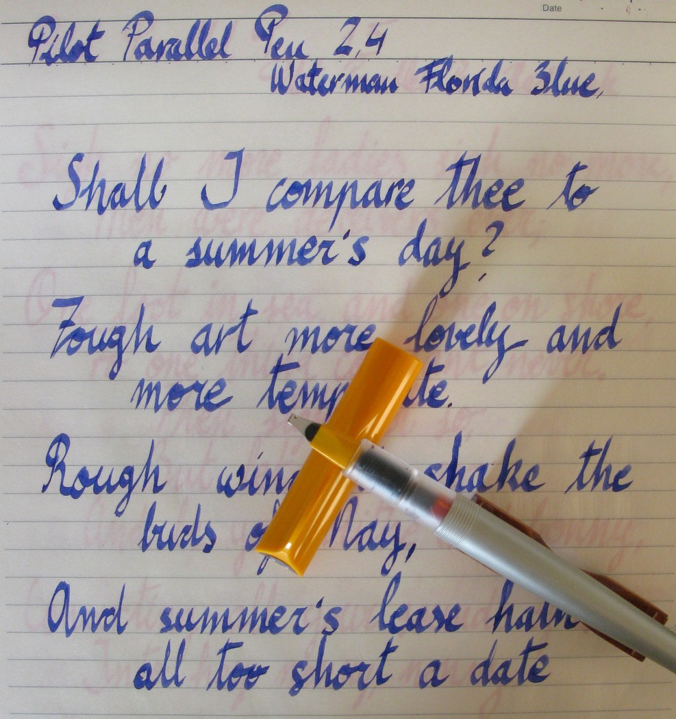
Handwritten sample with one of the Parallel Pens. I used a standard inkWaterman's Florida Blue— instead of the dedicated Parallel-Pen ink.

Pilot offers the models Plumix –in the American market— and Pluminix –in Europe— with medium italic nibs of about 1 mm wide. But those are not sold in Japan. The closest to an italic are a stub and a three-tine music nibs in some of the Pilot Custom models. These two nibs have their edges polished and are fairly smooth in their writing.


The alternative, for italic writing, Pilot offers is the Parallel Pen. Apparently, these pens are very different to a fountain pen. Instead of a cylindrical or conical nib with a slit, the writing element in a Parallel Pen is composed by two thin plates that drive the ink to the lower flat end. The feeding system, however, is the same for a fountain pen and a parallel pen. And both use water-based ink.

Side and front views of the Parallel Pen nib.

Parallel Pens come in four sizes –1.5, 2.4, 3.8, and 6.0 mm. All of them are smooth and wet writers. The creative possibilities, endless. Especially for those touched with any artistic ability, which is not my case. These pens, however, can hardly become daily writers.

All four Parallel Pens. On the picture, only the red ink is specific for these pens. Yellow and green are Sailor's, and blue is Waterman's. Note how the pen with yellow ink became contaminated with red ink simply by writing on top of the later.

Pilot claims that the ink they provide is specific for these pens. They offer a selection of twelve colors in standard Pilot ink cartridges. All of them, they say, mixable. But despite these warnings, I have tried other inks –Waterman and Sailor in particular— in these pens with very good results. Now, intermixing them might be an issue. We know by now, though, that all Sailor inks –save the obvious exceptions of the pigmented black Kiwa Guro and blue-black Sei Bokucould be mixed.


Each of the pens comes in a plastic box that includes two cartridges –black and red—, a Pilot converter, and a cleaning sheet. The instructions say that the converter is only for cleaning purposes… Well, they do try to sell their overpriced cartridges. But at the same time, cartridges provide too little ink for these ink guzzlers. Then, a look at the barrel shows it is made entirely in plastic and the pen could easily be transformed into an eyedropper.

(Pilot Murex – Pilot Black)

Bruno Taut
(Chuo, Tokyo, September 11, 2010)
[labels: Pilot, plumín, papelería, caligrafía]

25 July 2010

Ippitsu

I wanted to talk about a stationery article that I have only seen in Japan. It is called ippitsu (一筆). Literally, it means “one brush”. A better translation, however, would be "few words". The second ideogram, 筆, by the way, is also used in the Japanese word for fountain pen: mannenhitsu (万年筆), ten thousand year brush.

Several ippitsu-sen (ippitsu notebooks) with different motifs.

These are small pieces of paper for short notes to mail—invitations, thank you notes, acknowledgments of reception… all those are often written on ippitsu.

Ippitsu with drawings inspired by the Kobe Jazz Festival.

Nothing strange or unusual, we could say. In fact, reduced format papers are used here and there in the West. But what is not so usual is the inclusion of clear decorative elements on them. And that is the feature that makes ippitsu unique.

On the left, a reproduction of a ukiyo-e engraving in an ippitsu bought at the Japan Ukiyo-e Museum, in Matsumoto (Nagano). On the right, an engraving by Jean Cocteau honoring Paul Klee.

I am always willing to send one of them on the mail, the old snail mail. Their paper is, more often than not, very good and it becomes a pleasure to write with a fountain pen on them. Now, I only need to find the right excuse.

(Sailor Pocket Pen WG – Sailor 100717031)

Bruno Taut
(Inagi, July 24 2010)
[labels: Japón, papelería]

08 May 2010

Goshuin

The writing tradition in East Asia does not rely on the stylus —on the pen— but on the brush. This is most evident in the art form of calligraphy in China, Korea and Japan. This calligraphy, so different from the Western penmanship, acquires a quasi-religious meaning in Japan in the form of shodō —書道.

The name of this discipline involves the term –道: path, way; showing the constant struggle for perfection. Budō (武道), bushidō, (武士道), kadō (華道), sadō (茶道) … All of them imply that journey in search of excellence. Much in the mystic mode of Teresa of Ávila and her The Way of Perfection (Camino de perfección).

Religious superstitions aside, what we finally get is a form of art with a brush. And it is easy to get some samples of it in Japan. In most temples —Buddhist— and shrines —Shinto— you can find a monk in charge of these stamps to certify the passing through that station in the pilgrimage route.


These certificates are called goshuin –御朱印. Usually, they are a combination of a stamp and some writing. Sometimes they are great, impressive, amazing. The monk mastered his art and showed it. Some other times, the writing is plain and boring —anyone could write those. But such is life.

Buy the goshuin notebook (goshuin-chô, 御主印帳) in any stationery shop —check my May 2, 2010 entry— or at the temple itself, and ask for the stamp. Boring or exciting, the final collection will speak of your own .

(Sailor WG Pocket Pen – Pelikan Brilliant Brown)

Bruno Taut
(Fuchu, April 7th 2010)
[labels: Japón, pincel]