16 July 2010

Preferences

There is something reactionary in this hobby called stylophilia. Those infected by this strange virus pay attention to an object whose prime time is long gone. We insist in using some utensils that are not convenient given the technological advances in the last fifty years. So, once the convenience of use is no longer an argument, almost anything goes.

Fountain pens have evolved a lot along their 150 years of history. One of the systems that has seen more changes is that related to the way the pen is filled with ink. From the dip pens with no ink deposit to the present disposable pens, a number of technical solutions have been proposed and developed. All of them, in practical terms, fit into these three categories: eyedroppers, self-fillers, cartridges.

Eyedropper pens need an external device –an eyedropper or a syringe— to fill the pen barrel with ink. This is an old system, but these pens have the great advantages of a big ink reservoir and of no technical complication.

A Sheaffer pen with the complex snorkel self-filling system.

Self-fillers, on the contrary, need of some internal deposit and of some device to pump the ink from the inkwell through the nib and feed. These systems are really varied—from piston fillers to aerometric bladders to levers acting on rubber sacs… These pens are the most technically complex in the market. Their ink deposits can be both big and small—each pen is different on this.

Cartridges and converters of the three major Japanese pen companies.

Nowadays, however, most newly made pens use sealed cartridges together –if the pen allowed so— with ad-hoc converters to make the pen to work as a self-filler. These pens, usually, have small ink capacity, given by the cartridge or converter, but their cartridges are small and easy to carry.

Two German piston fillers: a Pelikan 400NN (Merz & Krell, 1970s), and a Soennecken 110 (1950s).

Some brands remain loyal to self-filling systems. That is the case of Pelikan, for instance. Others opt for the simplicity of cartridges and converters. That is the case of most Japanese manufacturers, although recently they have marketed a couple of self-filling models. Some of their top models, however, are eyedroppers.

One of the few Japanese modern examples of self-filling pen. A piston-filler Katoseisakusho made in celluloid.


So, the final decision pertains to the collector or to the user. The convenience of the cartridge or the romantic tradition of the self-filling or eyedropper systems?

This discussion is never ending and often leads nowhere. Weight and technical complexity or ease of use and reliability? A second pen as a back up or a spare cartridge in the pocket? Romantic authenticity —whatever that might mean— or ease of use?

At the end, companies are catering the cravings of the buyer, not to mention that there exist a vast number of old pens with any technical solution. There are pens in all price ranges with either of the systems: self-fillers, cartridge only pens, cartridge and converter pens, eyedroppers… The exception, however, might be that of currently-produced eyedroppers—new eyedroppers tend to be very expensive.

It is my impression, however, that most stylophiles prefer self-filling fountain pens. Some, very ardently, following the backwardness of the fountain pen use.

As for myself, I am very eclectic on this matter. I do dislike disposable pens, although I manage to refill them. And I rather stay away from cartridge-only pens, despite I am fond of refilling cartridges with the ink of my choice.

Now, you, fellow stylophile reader, what do you prefer?

(Sailor 21 Black pocket pen – Sailor Brown)

Bruno Taut
(Inagi, July 11-12 2010)
[labels: estilofilia, Pelikan, Soennecken, soluciones técnicas, Katoseisakusho, Sheaffer, conversor, Japón, Merz and Krell]

14 July 2010

Murex

Pen review. Pilot Murex (MR, model MR-500SS)

1. Introduction. General impression. (8.5/10)
After the success of the all steel pocket pen Myu-701, Pilot decided to create a full sized pen in the same fashion with the goal of comfort in mind. Such is the Pilot Murex, in production between 1977 and 1983 (according to Russ Stutler) or starting in 1972 (according to Masamichi Sunami).

This is a well known pen that follows the trend initiated by Parker with the short lived Parker T-1. Interestingly enough, Parker followed up this idea in 1978 with the model Falcon 50—this time in steel instead of in titanium.

So, this Pilot Murex is an all–steel pen with the nib perfectly integrated in the grip section—they are the same piece of metal. The only contrasting elements in the pen are the black plastic feed and the black accents on the clip.

It is unavoidable to compare this pen to its immediate predecessor the Myu-701. The Murex lacks the overall cleanliness of lines and shows many more rough angles.


2. Design. (8.5/10)
This is a well made pen. It has a number of details that make it comfortable in the hand. The gripping section, for instance, has some grooves to reduce the slippery feeling of stainless steel. The cap attaches firmly to the section with a set of spring-loaded protrusions inserted in the section. Posted, the cap and the barrel fit tightly, making the set comfortable to write.

The spring-loaded protrusions inserted in the section to attach the cap when the pen is closed. The gripping grooves are also visible.

The black accented clip. It is loaded with a spring.

The clip is probably the least appealing feature on this pen. Very square, it looks like it had just been glued to the cap, with little if any intention to integrate both elements smoothly. Quite a paradox in a pen where nib and section show the ultimate integration. Anyway, the clip is not totally awful and this design allows to be spring loaded.

The company name and the pen model are engraved on the cap.

3. Design, size, weight. (7.5/10)
Despite being an all metal pen, it does not feel heavy. Its 21 grams are correctly balanced and writing is comfortable either posted or unposted. Perhaps it is marginally better unposted.

Size-wise, there is not much to add. This pen is average in size. Its only problem might be on its diameter—thicker would make it more comfortable to write.

These are the physical dimensions:
Diameter: 10.5 mm.
Length capped: 132 mm.
Length uncapped: 117 mm.
Length posted: 142 mm.
Weight: 21 g.


4. Nib writing and performance. (8.0/10)
This pen has a stainless steel F nib. Few examples of this pen can be seen with an M nib.

This is a smooth, albeit dry, nib to write with. And being as rigid as a nail, not much ink flow is needed. No line variation at all, of course.

All in all, a pleasant, if boring, writer.


5. Filling system. (8.5/10)
Being Pilot, both proprietary cartridges and converters can be used. Only the CON-20, aerometric, fits in. This converter does not allow checking the remaining ink in the pen.

As an all metal pen, this pen is not suitable for conversion into an eye-dropper.


6. Cost and value. (6.0/10)
The Murex pen, as well as its older cousin the Myu-701, is becoming popular and basic market laws are making both of them quite expensive.

The appeal of this pen lies mainly on the looks. Therefore, the question of how much is worth becomes very personal. The nib, nice as it is, is nothing special—just a smooth rigid nail with correct ink flow.

All in all, I give this pen low marks on this section based not on the performance and looks –I do like this pen— but on the present price.


7. Conclusion. (47/60 = 78/100)
This is a correct pen with a very nice design. It performs very well but without much excitement or character.

The lower scores come in the actual value given the current market conditions, which is alien to the pen or to the manufacturer.

(Pilot Murex – Pilot black, cartridge)

Bruno Taut
(Inagi, July 13 2010)
[labels: Pilot, Parker]

12 July 2010

Champion

Para Ningyo-chan, forofa.

Yesterday I paid a visit to a number of fountain pen shops in Tokyo. In one of them –a big one— I saw this nib I am very fond of. The display window had this Nakaya Piccolo with a beautiful soft-elastic M nib. These nibs are mostly made to order and, therefore, Nakaya craftsmen attending events do not have them for you to buy them on the spot.

Elastic nib by Nakaya. Picture taken from the Nakaya website.

I asked the clerk if I could try it:
–Sure, no problem--, and there I went.
“Nice pen”, I thought when writing the first letters. But soon afterward I realized it was not all that flexible. “Is it the pen or me?”

So, I asked if I could try the Pilot Custom 742 with the size-10 falcon nib. Oh! That was totally different. That was really flexible—at least, for a modern pen. What a difference with the elastic Nakaya nib!

Pilot's Falcon nibs in sizes 10 and 15.

I also tried the bigger size-15 falcon nib in the Custom 743. Nice as well, but not so flexible as the size-10, just as Leigh Reyes reported on her blog. And that poses some interesting questions indeed.

So, what should I choose, the wonderful looks of an urushi pen or a wonderful nib in a boring pen? The price of those stunning looks is almost three times that of the sweet nib!

The champion nib.

This time, I went for the champion nib.

(Pilot R Lever Filler 1956 – Pelikan Brilliant Brown)

Bruno Taut
(Inagi, July 12, 2010)
[labels: Pilot, Platinum, plumín]

Post data: Not everything was as nice and beautiful as I described here. There were a number of problems with this nib. They are described on the chronicles entitled Verdict (September 7, 2010), and Inadequate (September 21, 2010).


10 July 2010

Formal

Pen review. Platinum black pocket pen with soft fine nib.


1. General impression. Introduction. (6/10)
This is a formal pocket pen, black with gold accents. Very typical in he conservative attitude of the Japanese white collar worker –the sarariman (salary-man). The big three Japanese pen companies made similar pens in the seventies—small, black, formal.


2. Design. (8/10)
This is a handy and convenient pocket pen—short and compact when capped, and regular size and comfortable when posted for writing. Pens like this need to be posted to write comfortably unless the user’s hands were very small.


Clip and central rings are made in plastic, painted in gold color. The quality, however, seems good. The adjustment between cap and section and between cap and barrel is perfect despite its age. The V-mark engraved in the barrel has lost its color and is barely visible.


3. Size, weight. (8.5/10)
This is a regular sized pocket pen. It is light and well balanced.

These are the physical dimensions:
Diameter: 12 mm.
Length capped: 118 mm.
Length uncapped: 100 mm.
Length posted: 147 mm.
Weight: 11 g.


4. Nib writing and performance. (8/10)
The nib is a nominally soft fine in 18 K gold. Not really flexible, but it shows some nice springiness. But in actual terms, there is barely any line variation when pressing down. Springy, maybe; flexible this is not.


I rather very smooth nibs, but the feedback –some might call it toothiness— this pens shows is perfectly bearable. The flux in this very thin writer is perfect—it never misses a bite and it does not become dry easily. This is, in my opinion, the great virtue of Platinum pens—perfect flow.


5. Filling system. (7.5/10)
All I said about the Silver Cap Platinum filling system applies here.

Platinum stopped producing the pocket pen converters long ago and we are bound to use Platinum cartridges or to modify the current converters. A third option is to use the international cartridge adapter with those cartridges or with a short aerometric converter.

At the end, what used to be a problem has become a virtue by means of the inventiveness and resources of the users of these pens. But this is not the merit of the manufacturer.


6. Cost and value. (8.5/10)
Cheap pen in the second hand market in Japan. Great writer. Excellent value.


7. Conclusion. (46.5/60 = 77.5/100)
Boring looking pen, at least for those who are used to pocket pens. But inside there is a very reliable and pleasant writer.

This pen scores high in the design, nib and value departments. Looks took points away

(Platinum Black Pocket Pen – Platinum blue black)

Bruno Taut
(Inagi, July 06 2010)
[labels: Platinum, Japón]

08 July 2010

Indecisiones

(12/julio/2010: Hago correcciones a este texto acerca de las tintas no estacionales y sobre las ediciones especiales para tiendas).

Este texto estaba pendiente desde hace mucho tiempo. Sailor cambió su línea de tintas hace unos meses y yo lo mencioné en mi entrada sobre el mezclador de tintas. Pero quería describir con más detalle las nuevas estrategias de esta marca. No me siento muy feliz con todo esto porque, al fin y al cabo, le doy una publicidad que no se merece cuando sube el precio de algunos productos de un modo exagerado. En fin…

Pilot es, en el mercado japonés, la marca de plumas más visible. Su línea básica Custom 74, con plumines de oro de 14 K que van desde el EF hasta el musical, está presente en el mostrador de la muchas papelerías y de las secciones correspondientes de la mayoría de los grandes almacenes de Tokyo, que es lo que yo conozco. En comparación, Platinum y Sailor eran casi invisibles.

Pero desde hace unos meses Sailor ha aumentado su presencia en las tiendas. Ahora es fácil encontrar su gama Profit 14 –la competencia directa de la Custom 74— codo con codo con su competidor de Pilot. En Occidente, la Profit 14 es la serie más barata, plumín junior de 14 K, del modelo 1911.

Otro campo de batalla es el de la tinta. Empezó con lo que parecía una cambio completo de sus tintas habituales. Así, dejaba de lado las conocidas marrón (brown), marrón rojiza (red brown), verde (green), gris (grey) y amarillo anaranjado (yellow orange) para centrarse en los tres colores serios: negro, azul negro y azul. Y además, este cambio suponía un aumento significativo de precios: de los JPY 600 a los JPY 1000 por la misma cantidad de 50 ml de tinta. Para justificar lo injustificable Sailor habla de que el tintero ahora incorpora un dispositivo que permite aprovechar mejor los restos de tinta al cargar plumas con sistemas de autollenado.

Las tres tintas tradicionales --negro, azul-negro y azul-- que han sobrevivido al cambio en las estrategias comerciales de Sailor.

Y poco más o menos en esas fechas, Sailor sacó al mercado la primera de las series de tintas estacionales, la de invierno. A día de hoy, hay tres series de ellas –invierno, primavera, verano— con cuatro tintas cada una. Estos son los colores y el significado, entre poético y jocoso, de sus nombres.

Invierno:
Shigure: lluvia suave.
Yuki-akari: luz de nieve.
Irori: hogar, en el sentido de fogón, chimenea.
Tokiwa-matsu: pino de Tokiwa, una variedad japonesa.

Primavera:
Waka-uguisu: ruiseñor joven. El uguisu es, en particular, la variedad japonesa Cettia diphone.
Sakura-mori: bosque de cerezos.
Nioi-sumire: fragancia de violetas.
Miruai: azul de pino marítimo.

Verano:
Fuji-musume: la hija de la glicinia (Wisteria floribunda). Este nombre hace referencia a un personaje del festival dedicado a las niñas el 3 de marzo.
Sôten (transliterado erróneamente como souten): azul cielo.
Doyô (transliterado como doyou): fin del verano. Doyô hace referencia a los 18 días previos al cambio de estación. El más popular es el del verano, antes del equinoccio de otoño.
Rikyû-cha: te de Rikyû. Sen Rikyû fue el creador de la ceremonia del te en el s. XVI.

Pero aún hay más. Sailor se ha mostrado muy activa a la hora de colaborar con algunas tiendas para crear tintas exclusivas para ellas. Una de ellas es la serie de la tienda Ishida Bungu en Hokuto, ciudad vecina de Hakodate, en el sur de la isla de Hokkaido.

Tintas para la tienda Ishida Bungu hechas por Sailor. La foto está sacada de la revista Shumi no Bungubako, Vol. 16, (EI Publishing Co., Ltd. 2010).

Son tres tintas:
Hakodate gagome: alga kombu de Hakodate. Color marrón verdoso.
Gotoken: hace referencia al color del curry de Hakodate en la versión de un restaurante muy tradicional. Color marrón.
Hakodate Twilight Blue (sí, en inglés): el azul del atardecer de Hakodate. Color azul oscuro.

Otras tiendas con tintas exclusivas realizdas por Sailor son Maruzen (al menos en su central de Nihonbashi en Tokyo) y Nagasawa, en Kobe.

Tintas permanentes de Sailor. También han subido de precio...

Por su parte, las tintas permanentes, pigmentadas, han aumentado con la inclusión de un azul-negro. En precio también han subido de los antiguos JPY 1500 a los presentes JPY 2000.

Parte de mi provisión de tintas ya anticuadas de Sailor.

Como dije en mi entrada Reflexiones, me pregunto si Sailor se merece tanto tiempo y espacio después de subir sus precios de un modo tan escandaloso. Las tintas normales han subido un 66%, y las permanentes un 33%. Y sin embargo sé que muchos estilófilos caerán en la tentación. Yo, por mi parte, me he aprovisonado de tintas viejas a precios viejos. En Japón, los comercios son honestos y no suben el precio de las antiguas por el hecho de que las nuevas sean más caras. Alguna ventaja tenía que tener vivir aquí.

(Todos los precios reseñados aquí son los reseñados en el catálogo de Sailor. Son precios en yenes, JPY, y sin IVA, un 5 %).

(Pilot Telescopic Pen – Waterman Florida Blue)

Bruno Taut
(Inagi, 7-8 de julio de 2010)
[labels: Sailor, Pilot, Platinum, Japón, tinta, estilofilia, Shumi no Bungubako]

06 July 2010

White

It seems to be the case that white gold as the nib material is not very common outside Japan. In this country, it is not unusual. We already know how the big three pen companies pay close attention to each other and are fast in copying the neighbor’s trends.

The picture shows six 18 carat white gold nibs by those companies.

From left to right, counter-clock wise: Platinum medium in size 4 engraved steel body, Platinum fine in size 4 polished steel body, Platinum medium, Pilot Custom Sterling nib in medium point from 1976, Sailor pocket pen with steel body, Sailor pocket pen with plastic section and aluminum body.

Colored gold is an alloy with a gold content given by the number of carats (18 K or 75% in those shown in the pic) and a careful selection of the remaining impurities –25% in this case—. To make it white, these impurities usually include platinum, palladium, nickel, manganese, zinc —or a selection of them— in different proportions.

This is a totally different strategy to that of electroplating the gold, or steel, nib with another metal to give it a different color.

These two Pilot Capless nibs have been problably electroplated. The one on the left, made of 18 K gold, with rhodium. That on the right, in steel, with gold.

(Platinum engraved stainless steel body with 18 K WG nib – Platinum black)

Bruno Taut
(Inagi, July 6, 2010)
[labels: Japón, plumín, Pilot, Sailor, Platinum]

04 July 2010

Low Cost

Fountain pens can be inordinately expensive. And there are indeed pens that did not seem to be thought as writing utensils but as ornaments and status symbols.

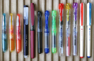
On the other end there are a number of inexpensive pens. Unfortunately, they are often ignored. The picture shows a selection of these inexpensive pens. There might be many others—these I show I could buy them easily without going out of my way.

Low cost pens.

Starting from the left, the first three are Pilot Petit 1. The catalog price (MSRP) is JPY 315 including taxes. They are available in fourteen different colors in cartridges that are specific for these pens. No converter can be used on them. Very smooth writers.

Pilot's Petit 1. It uses the same nib as the disposable V-pen/Varsity pen.

Then comes the Sailor Ink Pen. This is available in 100-yen shop chain called Daiso. It uses Sailor cartridges and converters. The nib is not tipped and this makes it to write a bit like a stub. Smooth writer.

The untipped nib of the Sailor Ink Pen.

The long read and the short black have no brand other than “Produced for Daiso Japan”, written in both English and Japanese. These pens accept Sailor cartridges. The short one, however, does not have room for the converter.

The tipped nib of a 100-yen Daiso pen.

Their quality is not consistent. The first one I tried was very smooth. But I lost it –big loss!— and the next one was a more deficient pen.

The short blue and green pens are basically the same as the black Daiso save for the detail of using international cartridges. This pen also comes in other colors—red, black. The price is the same —JPY 105—, and it can be found in some 100-yen shops other than Daiso.

The Platinum Preppy –here shown in red, yellow, and violet— costs JPY 210. It uses regular Platinum cartridges and converters. This pen's nib can be either F (0.3 mm) or M (0.5 mm). They are nice writers with very reliable flow, but not as smooth as the Petit 1. Their size, however, gives the Preppy a great advantage in terms of comfort.

Platinum Preppy's medium nib and feed.

With time, the cap develops some cracks making the pen impossible to close. Those unhappy with this problem can opt for the newly released Platinum Plaisir (as of July 2010)—same nib in an anodized aluminum body. Hopefully more durable, although the price is five times higher.

Platinum Riviere.

The last two pens are Platinum Riviere. These are available from Daiso shops for JPY 105. They have smooth M nibs, although different from those in the Preppy. These are on the dry side. Riviere uses Platinum cartridges and converters.

Cheap pens in a 100-yen shop. From left to right: Platinum cartridges in red; Daiso's short pen (Mini); three Platinum Riviere in different colors; disposable pens in three colors; Daiso's full size pens in black and red; and red ink cartridges for these Daiso pens (Sailor compatible).

Sometimes I wonder… er... Well, I’ll leave it at this point.

(Nakaya Aka-tamenuri – Platinum Brown)

Bruno Taut
(Inagi, July 3, 2010)
[labels: Pilot, Platinum, Sailor, Japón, Daiso]