03 February 2012

Fora

Blogs and fora are the main channels that keep any cyber-community connected. Both allow, although in different degrees, the exchange of information. Blogs like this one have obvious authors and that exchange of information is mostly unidirectional—from the author to the readers; but there is some room, through comments, for some bidirectional exchange. But it is on fora where most of discussions and most information are shared.

Now, we wanted to believe that fora are free and open to accept any discussion, but it is actually not like that. After all, fora belong to some people who have their own legitimate interests, and sooner or later, forum administrators show them. The temptation of limiting censoring is the unpleasant way to say it— the expression of ideas in order to protect those interests is hard to avoid. Fora become an extension of their business activities and there are certain limits not to be trespassed… But some of them can become ridiculous and question the role of the forum as an agora to learn.

On what grounds can an honest question on the safety of Noodler’s Baystate Blue be banned? Why does questioning the Japanese origin of Danitrio make the moderator –and Danitrio salesman— lock the thread? Why did asking what a fake is trigger bitter responses from a forum administrator?

All these forum policies and all those reactions of forum administrators reveal agendas and interests. And even if legitimate, they are annoying and misleading. Nobody asked us to participate on those fora, and we all agreed on abiding by some rules the forum organizer set in the beginning; and, by the same token, we could quit and leave any time. However, fora need participants and participants need places to discuss and learn.

The bottom line might be not to be misled by the apparent freedom of fora—they are not free.

(Pilot Super Ultra 500 – Athena Sepia)

Bruno Taut
February 1st, 2012
[labels: fora, Mercado, metabitácora]

31 January 2012

Cross-music

The cross-music nib is one of the specialty nibs created by nibmeister Nagahara. Being a cross nib means that it is composed by two overlapping nibs. Therefore, it has four tines and two slits, and the space between the nibs acts as an additional reservoir of ink. The primary result is a fairly wet nib with a broad line… if so we wanted.

The two-fold cross-music nib on the left and a fude nib (55 degrees) on the right. The fude nib is not tipped.

The second characteristic of the cross-music is the way the point is cut: the vertical lines are very fine, and the horizontal strokes are very broad. However, grabbing the pen at a high angle with respect to the paper generates a fine line drawn only by the upper nib of the set.

Steel fude nib on the left, and gold cross-music on the right.

This way of writing is very similar to that of fude nibs, also made by Sailor, and by some other Asian brands. The problem is the price difference between them.

Writing samples. The color rendition of the scanned page is very inaccurate. The angles shown on the image are those between pen and paper.

Needless to say, the cross-music nib is a lot more complex than any fude, and its price reflects this in a quite dramatic way. For similar looking pens –Sailor’s Profit in senior size, 21 K gold nibs, cartridge-converter filling system—the cross-music nib has an overprice of JPY 15000: JPY 50000 for the cross-music, and JPY 35000 for the naginata fude. And if we were interested mostly on the function, there are even cheaper options: fude pens by Sailor with steel nibs bended at angles of 40 or 55 degrees are available for only JPY 1000.

The cross-music nib in a Profit Realo, on top, and, on bottom, a Fude pen (55 degrees) in a balance model by Sailor.

Chasing the nib over the pen has some interesting consequences. The cross-music nib, though, is truly exciting.

(Sailor ふでDEまんねん, 40 degrees – Waterman South Sea Blue)

Bruno Taut
January 29, 2012
[etiquetas: plumín, Sailor]

27 January 2012

Metablog

About what you wanted to learn, start teaching. Surely I can’t teach much, but this old academic sentence describes my intention when I started this blog. I wanted to share experiences and I wanted to learn about fountain pens, and I indeed succeeded—I shared and I learned.

But this blog has its own life. I started writing about Japanese pens out of simple physical proximity, and then I realized the limited information available on them. And suddenly these chronicles became specialized in mannenhitsu, 万年筆,—it was easier to say something original about Japanese Swan or SSS than about Sheaffer, for instance.

A Japanese Swan from the 1910s.

The blog’s life is also determined by those who visit and even read these texts, and the reactions they inspire. Not many comments I receive, and then I turned my eyes to secondary sources of information—number and origin of the hits. Some texts I never thought as truly interesting became very popular; and, reversely, some contributions about which I felt particularly happy barely received any attention. Among the first, the text on the new line of Platinum inks is a perfect example: I had written it about two weeks before I published it. Due to some personal constraints I could not work on these pages for some time and publishing that text was a quick way to say I was still active. Quick and efficient, as the number of hits increased sharply.

Although not an exotic pen, little information can be found online about the brand Athena.

Among the second, I am particularly happy about those texts on the Presidente and Joker pens. Nothing seemed to be known on their Japanese origin, and I think my friends and I made some modest but original contributions.

But such is life. At the end, we write mostly for ourselves, and any feedback is a nice surprise. Then, I will continue writing as long as I enjoy it.

With thanks to all those who showed up on these chronicles: Leigh, Kostas, Anele, Kinno, Readymade, Peninkcillin, Merino, pitquim, La Tortuga Vacumática, Julie, Kurazaybo, Nina, Bleubug, Kugel149, MANC... And to all those friends who shared their knowledge and pens with me.

(Waterman, lever filler, made in Canada – Sailor Hiroko’s Green)

Bruno Taut
January 22nd, 2012
[labels: metabitácora]

19 January 2012

Second Chance

Even though a number of pens go through some changes over their production years, few of them see re-editions after having been discontinued. Now, how faithful to the original these re-editions are is a different point—little resemblance there seems to be between the modern Parker Duofolds and those from the 1920s and 1930s, for instance. Another example was the Parker 100 trying to re-create the venerable Parker 51.

Myu-701 on the top, and M90 on the bottom.

The Pilot M90 followed this pattern as a re-issue of the iconic Myu-701 from the 1970s. In 2008, on the occasion of the 90th anniversary of the company, 9000 units were released. Then, how do both pens compare?

M90 on the top, and Myu-701 on the bottom.

There are indeed some differences between these two models, but the overall aspect of the newer model is remarkably similar to the original. Other than the small size variations, they differ on the following details:

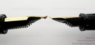
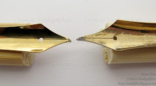
There are also some differences on the feeds. M90 on the left, Myu on the right.

Nib
. Both pens implement integrated steel nibs. However, those on the M90 are springier than those of the Myu. Pilot, on its catalog, called these M90 nibs as “soft” (SF and SM). Only two points were available on this pen, F and M, versus the three points of the Myu.


M90 on the left, Myu on the right.

Cap jewel. The M90 sports and bright blue jewel that gives this pen a fancier look. This stone is often the bigger source of disappointment among those users who got the M90 as a replacement for the harder-to-find Myu.

The blue jewel belongs to the newer M90. The Myu-701 has a softer look.

Section clutch and central ring. As was described on the review of the Myu-701, one of the weak points of the original pen laid on the central ring. Occasionally, at opening the barrel, the ring would unscrew from the section leaving the clutch exposed. The newer M90 solved this problem—now the clutch is integrated in the ring, and the ring cannot be removed (not easily, at least) from the section. The price for this is a significant increase in the weight of the pen.

Close-up of the central rings, with the barrels slightly off. That of the M90, on the left, is wider and thicker, and integrates the clutch. On the Myu, on the right, the clutch is attached to the section. The production dates are clearly visible: August 2008 for the M90, December 1980 for the Myu.

The new design of the ring also prevents the usual scratches on section and barrel caused by the cap. On the M90, the clutch secures the cap on both closed and posted configurations. On the Myu, the posted configuration relied solely on the tight fit between barrel and cap and was responsible for those scratches.

M90 on the top. It cost JPY 12000 (without taxes) in 2008. Myu-701 on the bottom. It still has the price sticker--JPY 3500 (without taxes) in 1980.

Clip. The M90 clip, while preserving the basic design of the Myu, is longer and has a clear arc shape. This causes to be stiffer, and makes the pen to look bigger. The new clip is subtly engraved with the model name.

The rest of features are mostly the same, including the filling system by Pilot proprietary cartridges and by the converter CON-20, the only one fitting inside the sections of these two pens.

These are their dimensions

................................................Myu-701...............M90
Diameter:..................................11 mm...............12 mm
Length capped:......................119 mm..............119 mm
Length open:..........................105 mm..............105 mm
Length posted:.......................143 mm..............140 mm
Dry weight with CON-20:.........20.5 g.................26.3 g

The overall impression is that Pilot took benefit of this second chance to improve the weak points of the original Myu-701, mostly on the central ring and the clutch. These improvements, however, had some cost and the question of whether the M90 is better of worse than the Myu-701 remains open in many a forum.

(Pilot Prera, M nib, eyedropper – Senator Regent Royal Blue)

Bruno Taut
January 18th, 2011
[labels: Pilot]

18 January 2012

Family Portrait (III)

The following pictures might very well summarize the connection between these pens from East and West… or might them all be Eastern pens. Joker, Presidente, Platinum... all made by Nakaya Seisakusho.

Two Platinum, one Joker, three Presidentes.

Their nibs...

I will note that the unit I have of the Platinum Honest 66 is in very bad condition. It even lacks the original nib and is not usable! So, I am on the hunt for a unit in better shape.

...and their caps.

My thanks to my friend Kostas K.


(Pilot Myu 701 – Pilot blue, cartridge)

Bruno Taut
January 16th, 2011
[labels: Presidente, Joker, Platinum, Japón, España]

13 January 2012

701

Para Juanjo, por todo lo que nos dejamos en el tintero.

Pen review. Pilot Myu 701 (M-350SS)


Little have I said after almost 200 chronicles about one of the most popular Japanese pens—the Pilot Myu 701. On a personal note I can say that the Pilot Myu was responsible for my renewed interest on fountain pens. I was already in Japan and an Internet search produced one of the very few websites with information in English on Japanese pens and, more in particular, this pen. Its online price, though, looked totally unreasonable, but being in Japan I thought I could find it for much less. For once, I was right. That was in 2004. Since then, a number of things have changed and there is a lot more information on Japanese pens. The invisible hand of the market, on its side, did its share to reduce the price of a very common pen.

The Pilot Myu was launched in 1971 and was clearly inspired on the short lived Parker T1 for its basic feature: the integrated nib. On the other hand, this is a pocket pen, a concept created in 1964 and adopted by Pilot in 1968. It was on production until 1980. There existed three basic variations—the most common in plain steel shown on this chronicle; another in black stripes; and the very rare with non-colored stripes.

Interestingly enough, this pen deserves just one short sentence, and no picture, on Lambrou’s book Fountain Pens of the World despite being well known outside Japan and having become an icon. Arguably, this pen might be responsible for the popularity of affordable Japanese pens outside Japan. It certainly proves that Japanese pens are a lot more than just those decorated with maki-e and urushi techniques.


1. Appearance and design. (8.0/10)
I will start by admitting that I am positively biased towards this pen. I find its clean lines very attractive and being a pocket pen only adds value to it. However, I reckon that some users (strongly) dislike metallic gripping sections. This pen is clearly not for them.

Regarding the design, I am prompt to admit this pen has several weak points. The main one is directly associated to its streamlined look—the integration of nib and section makes the pen very vulnerable to defects and to accidents affecting the nib as there is no actual replacement for the nib. This is the inherent price to pay for pens like this.

Not so inherent are other elements. The beautifully looking clip is not spring-loaded and cannot be used with thick fabrics. Some would say that this was a pocket pen and, therefore, this pen was intended to be carried in shirt pocket, and this purpose is perfectly suited with this clip.

On this picture, both threads of the central ring are loose. Only one, that on the right, should open when inking the pen with anew cartridge or to access the converter.

A third weak point is the central ring. Section and barrel are hold together by this two-threaded ring. When opening the pen, only the barrel thread should come off. However, at times it is that in the section that comes off, and that exposes the spring loaded clutch —a very subtle detail— that secures the cap when closed.

These defects, though, do not affect the performance of the pen.

The central ring, completely disassembled from the section (top left) and from the barrel (bottom right). The clutch to secure the cap can be seen on the section.


2. Construction and quality. (9.0/10)
This pen is certainly well made. It is solid and has stood rough treatment in pockets and backpacks over the years. The fit between barrel and cap, essential for the writing comfort of a pocket pen, is still perfect. On the negative side, I will note that the barrel has become slightly scratched by the cap by the repeated process of posting the pen.


3. Weight and dimensions. (9.5/10)
This pen is a bit on the heavy side, but its very correct balance (55% to the tip-45% to the top, posted) makes it for its ease of use. And indeed this pen is a very good writer.

Diameter: 11 mm.
Length capped: 119 mm.
Length open: 105 mm.
Length posted: 143 mm.
Weight: 19.4 g. (inked, full cartridge)
Center of gravity: at 78 mm from the tip, posted.


4. Nib and writing performance. (8.0/10)
This pen is equipped with a very rigid nib made of steel. Its F point is very smooth despite being on the dry side. However, the ink flow is perfectly constant and never skips a bit. This Pilot is, in my opinion, a basic functional pen and this nib is accordingly reliable even if uneventful beyond its looks.

These pens had three nib point options: F, FM, and M. The second of them, though, is very rare.

Nib and feed of two Pilot Myu with points F (back) and M (front).


5. Filling system and maintenance. (8.5/10)
This is a Pilot-proprietary cartridge-converter pen, and of all the different converters of the company, only the bladder-type CON-20 actually fits in this pen.

Cleaning wise, this is not a difficult pen, as is the case with most cartridge-converters. On this pen, though, removing the feed is not straight-forward and the basic cleaning option is simply flushing some water through the section.

Minor corrections of ink flow are harder and riskier to carry out on this pen than in more standard pens, i. e. with non-integrated nibs. But this is hardly a real need given good quality control of these pens.


6. Cost and value. (8.5/10)
This pen cost JPY 3500 when it was marketed in the 1970s. The contemporary Capless (1971), on its side, was JPY 4000, and the fancier black stripped Myu (model M-500BS), JPY 5000. These relative costs make some sense after all—the Capless is a more sophisticated pen and includes a 14 K gold nib. The Myu was a more basic tool and was price accordingly. And, therefore, there is a steep overprice for the more appealing looks of the black stripped pen.

My grades reflect the current pricing in Japan, where the plain steel Myu is relatively easy to find.


7. Conclusion. (51.5/60 = 86/100)
Writing this review was a struggle between my high appreciation for this pen and the actual knowledge of its weak points, and the final score seems to reflect the first rather than the second. Nonetheless, I hope I had described the defects I have seen in this pen over the years, which, at the same time, do not compromise its very good performance.


(Pilot Myu 701 – Pilot blue, cartridge)

Bruno Taut
January 11th, 2012
[etiquetas: Pilot, Japón]

08 January 2012

Sailor's Inlaid Nib

Among all the pocket pens made by Sailor I have shown there are some with a special interest. One of them was the already described steel pen with a Swiss, or wherever, gold nib. Another is this one with inlaid nib.

Another example of a pocket pen.

This is a typical formal looking pen in black and gold. Re filling system, there is nothing remarkable—nominally a cartridge-converter that actually is a cartridge-only pen. The 14 K gold nib on this pen is inlaid on the section and its shape resembles that of the accordion filler by Pilot (Super 500 G)—both nibs are formed by almost flat sections. The Sailor’s looks less extreme that the Pilot’s, and it is certainly smaller. On the more positive side, this Sailor nib is nicely springy, and provides what Japanese aficionados call a “soft touch”.

On the left, the Pilot Super 500 G; on the right, the Sailor's pocket pen with a similar looking nib.

These are the dimensions of the pen:

Diameter: 12 mm
Length closed: 121 mm
Length open: 104 mm
Length posted: 139 mm
Weight: 12.5 g

The section of the pen is engraved with a subtle sign saying 301. I do not know what this figure might mean. If a date stamp, it could be March of Heisei year 1 (1989), which seems a bit too late for a pen like this. The other option, January of Showa 30 (1956), is far too early for a pocket pen. My best guess is that this pen is from the 1970s.


(Sailor, 14 K gold inlaid nib – Montblanc Irish Green)

Bruno Taut
January 7th, 2012
[labels: Sailor, plumín]