26 October 2012

November Inks in October

The announcement (::1::, ::2::, ::3::) was that the last three colors of the Iroshizuku line of Pilot inks were seeing the market this coming month of November. Well, it is not yet November, but the inks are already available in the shops in Japan.

Take-sumi (竹炭): bamboo charcoal. A black ink.
Ama-iro (天色): sky color. A light blue.
Shin-kai (深海): deep sea. A dark blue.

The last three inks on a see of Iroshizuku.

Apparently, the Iroshizuku line of inks in now complete. Is this all given its success? Is this all given the much wider selection of colors of other manufacturers?


Sailor pocket pen, 14 K nib – Wagner 2008 ink

Bruno Taut
Yokohama, October 26th, 2012
labels: Pilot, tinta, Mercado, Japón

21 October 2012

On Modern Capless

There are three models of Pilot Capless currently available in the market. Or, at least, in Japan, as the distribution of Pilot pens overseas follows some strange patterns. These three models are named as Capless (or Vanishing Point in the North American market), Décimo, and Fermo.

From top to bottom, Fermo in black, Décimo in burgundy, and regular Capless (Vanishing Point) in green with golden trim.

How do they compare? Beyond the pictures, these are some hard facts:

The regular Capless model comes in both golden and silver trims (plus the newer matte black finish), as well as with steel (JPY 10000) and 18 K gold nibs (JPY 15000). As was reported previously on these Chronicles, golden trimmed nibs in steel or in gold need to be adapted to operate correctly in Décimo and Fermo pens.

The regular Capless (gold trimmed) is now in the middle, with the Fermo on the left, and the Décimo on the right.

The Fermo, as opposed to the Capless and the Décimo, is very symmetric on the mouth. This design, combined with the small portion of the nib sticking out of the pen body, does not allow for a high grip despite the high position of its center of mass.

The basic differences are clear. The Décimo is slimmer than the others –in fact, it looks much slimmer than what the bare numbers say—, and the twist-operated Fermo is the heaviest of the lot. However, the main difference lies in the position of the center of mass—roughly the same for Décimo and Capless, but much higher up for the already heavier Fermo. This feature might make the Fermo more apt for those with big hands or those who grab their pens high up.


Pilot Elite pocket pen, posting nib – Pilot Blue

Bruno Taut
Yokohama, October 21st, 2012
labels: Pilot, Capless

16 October 2012

South African

This text is the final result of a collaboration of stylophiles in several countries: Eduardo Alcalde, Elena Kouvaris, Kostas Kouvaris, and myself, Bruno Taut.

To any reader of these Chronicles the story is already well known, almost trite. Sometime in the late 1950s or early 1960s some Platinum pens, barely disguising their Japanese origin, were sold in Europe under the name of some local company—Presidente in Spain and Joker in Italy (most likely) were reported on these texts. Were those the only cases? Not at all.

The Hifra 4421, open. The text on the barrel reads "'HIFRA' / TRADE (FH logo) MARK / REG 85809 / 4421".

Hifra is a rather obscure pen brand. Not much is known and the few questions on its origin published in Internet fora produced assorted answers including Spain and Israel. However, South Africa seems to be the source of most Hifra pens for sale online. Some quotes in South African texts (Teachers and memories; The training of a good stenographer, on p. 18 of the document) also point out at pens of this brand as common domestic objects for some time. Therefore, in absence of definitive proofs of its origin, I will settle on the idea that Hifra was a South African pen brand.

Hifra 4421 (top) and Platinum Honest (bottom), disassembled. The engraving on the Hifra's nib reads "HIGHGRADE / SUPERIOR / IDEAL / PEN".

Detail of section and nib of the Hifra 4421. The Platinum logo can be seen on the cap jewel.

But, were Hifra pens made in South Africa? Some of the models, as seen online, have a very different origin—they are Platinum pens and were made in Japan.

Such is the case of Hifra’s model 4421. It is in fact a Platinum Honest with aerometric filling system and steel nib, albeit with some minor variations with the original Japanese pen. The cap on the South African pen keeps the Platinum globle logo (SN stands for Shun-ichi Nakata, founder of Platinum in 1919). The barrel is engraved with the name Hifra and with a variation of the globe logo: instead of S and N, the letters encircled are now F and H. The nib and the feed are identical to those of some Platinum and Presidente models.

From top left to bottom right, Presidente, Hifra 4421 and Platinum Honest. All are aerometric fillers. The size and position of the Platinum logos are different in all these three pens, but their internal structures are the same.

These are the Hifra 4421 dimensions:
Diameter: 10.5 mm.
Length closed: 135 mm.
Length open: 122 mm.
Length posted: 150 mm.
Weight (dry): 15.1 g.

Nothing is really known about these Platinum in disguise. Platinum exported pens to some South American markets in the late 1940s, but those were, in essence, copies of the Wahl-Eversharp model Skyline. President, was, on the other hand, the name Platinum used for its export models thus avoiding confusion with English brand Platignum. But that is basically all we know.

The search for more missing Platinum continues.

Pilot E, manifold nib, quarter-switch filler – Pilot Blue-black

EA, EK, KK, BT
October 2012
labels: Sudáfrica, Hifra, Presidente, Joker, Platinum

14 October 2012

Itoya 2012

Itoya is one of the big stationery shops in Tokyo. Its two buildings in Ginza are a Mecca for any lover of stationery goods, including fountain pens, visiting this city.

Itoya's building in 1909

Itoya has recently –opening this past October 3rd—reorganized its sections. Fountain pens are now located on the backstreet building, named K. Itoya 1904 after the foundation of the company in 1904 by Katsutaro Ito, and occupies the first two floors. On the ground floor we see the Montblanc counter, always separated from the rest of pens by imposition of the company, and most pens in price ranges medium and low. The second floor is dedicated to maki-e and urushi fountain pens and to the technical service.


The K.Itoya 1904 building is clearly marked as the fountain pen building, although only two of the seven floors are in fact devoted to these tools.

View of the second floor, dedicated mostly to fountain pens decorated in maki-e and urushi.

This investment in the new organization and this larger space dedicated to sophisticated pens can only mean that the profits derived from upscale writing tools in increasing in the total balance of the company. And foreign visitors might have played an important role in this as there is now a native English-speaker salesman.

Pilot E, manifold nib – Pilot blue-black

Bruno Taut
Shinjuku, October 12th, 2012
Etiquetas: Tokyo, mercado, Japón, papelería, Itoya

03 October 2012

Double Spare

In 1956, Platinum marketed the model Honest 60. This pen was the first ever cartridge-converter pen in Japan and, therefore, saying good-bye to ink bottles implied the development and marketing of ink cartridges—the Honest cartridge.

Two double spare cartridges, connected. They can easily be detached from the central piece.

Pilot reacted to this innovation with its own line of cartridges. It was called “double-spare”--two independent ink cartridges held together by a plastic central piece. The merit of this system, Pilot claimed at the time, was that the user would hardly ever run out of ink—not even in the most difficult situation. Once the working cartridge was empty, plug the spare one in, and, back home, replace the former. Smart, but it is not that inconvenient to carry some spare cartridges in your pocket, especially during those critical situations.

A 1963 Capless, first Capless model, with the "double-spare" cartridge.

The system was short lived. It might have started around 1962, and in 1968 it was phased out. But a number of pens, of interesting pens, were produced during those years. Among them, all the Capless models up to 1968. Finding these “double-spare” cartridges is now very difficult, either used or new, and the modern solution is to use the CON-W converter, still included in Pilot’s catalog and available at some shops in Japan.

Pilot converter CON-W.

However, the most interesting feature of these cartridges is that they provide an easy way to date some Pilot pens—any double-spare belongs to this 1962-1968 period. And any pen with the “single-spare” cartridge –such was the initial name of the current cartridge design by Pilot— is from a later date.

CORRECTION (2013/09/20): There are double-spare pens up to, at least, 1969. And the single spare cartridge appears in the market as early as in 1964, if not earlier. Please, check the Chronicle Pilot Filling Systems in the 1960s.


Bruno Taut
Shinjuku, October 2nd, 2012
labels: Pilot, Platinum, soluciones técnicas, Japón, conversor

01 October 2012

Home Made

What can you do when you were not satisfied with any ink in the market? Make it yourself is the immediate answer. Or, at least, if you had the knowledge to do so.

That was Gary’s approach. He was particularly frustrated by the very limited availability of ferrogallic inks. These, with the exception of Rohrer & Klingner’s Scabiosa, come only in blue-black, and he thought he could do better.

He started by creating the basic ink mixing by mixing Iron Chloride and Gallic Acid. Initially transparent, this ink quickly darkens upon being laid by means of the oxidation of the Iron ions by the atmospheric Oxygen. Then, the following step was to add some dyes to the basic ink to provide some color from the very beginning. Gary uses mostly food colorants to create about half a dozen different ferrogallic inks. Finally, some additives were used to control viscosity (Glycerin and Diethylen Glycol) and to prevent the growth of mold (Phenol). The recipes are published (Gary’s blog in English and in Japanese, YouTube channel, Shumi-no Bungubako no. 16, p. 66) and are available for anyone to try.

A number of pen aficionados are afraid of iron-gall inks due to a couple of reasons:

-- Rust. These inks are stable in acidic environment (low pH), and that could be the source of undesirable reactions between ink and metal parts of the pen. In fact, corrosion of the nib was the main argument to use gold, a noble metal. This is a fair concern, but proper pen hygiene does reduce this risk, and stylophiles enjoy performing these maintenance tasks on a regular basis.

-- The second factor is the difficulty to clean these ferro-gallic inks. Again, proper hygiene does take care of the this problem, and the use of diluted Ascorbic Acid (vitamin C) as a cleaning agent does the rest.

Therefore, although there exist a higher risk in using these permanent inks, it is nothing any usual stylophile could not deal with.

The fundamental property of these inks is that they are water-proof. Water, actually, washes the dyes away, but nothing can do to eliminate the mechanical bonds of the iron-tannic pigments with the cellulose fibers. The result, then, is a dark text with a hint of the original color.

Sailor pigmented Sei-boku ink and Gary's red-black ink. Both were immersed in water for over five minutes.
Gary's red-black ink and its resistance to water compared to several other inks. The piece of paper where I scribbled was immersed in water for over 5 minutes.
On my side I have tried and tested Gary’s red-black ink. Initially upon laid, this ink shows a bright red color that darkens as it dries up on the following minute. The final result is an almost black line, albeit with a hint of red. Dry blood is the best description that comes to my mind.

Fluidity and lubrication are on par with most other inks I have tried and I have had no major problem in any pen. The hardest of those was a relatively slow start of a Sailor pocket pen from early 1970s.

The main conclusion is that this home made ink is perfectly usable and, in fact, it actually adds some exciting elements to the present selection on permanent inks in the market.

A secondary conclusion is that the technology of inks is nothing truly sophisticated. It is there in the open for anyone –or any company— to try. The arguments for the prices we pay for many of them cannot be related to any delicate process or to any expensive research.

My thanks to Gary.


Push in celluloid, lever filler  – Pelikan Royal blue

Bruno Taut
September 15th, 2012
labels: tinta, Rohrer & Klingner, Gary, mercado

23 September 2012

Cocoon

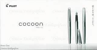
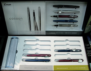
Some media, FP Geeks among them, have recently announced the immediate release of a new pen model by Pilot—the Metropolitan. The name in Japan is Cocoon and has recently been released in the domestic market. It is actually a whole line of pens composed by a mechanical pencil, a ball-point pen and a fountain pen. All of them are made of "coated brass" and come in five different colors: silver, blue, bordeaux, titan, and metallic grey.


Regarding the fountain pen –our object of obsession--, its price is JPY 3150 (5% tax included, MSRP). It is a cartridge-converter pen with a stainless steel nib in F or M. An interesting detail is that this same nib is used in the Pilot Prera, and both pens cost exactly the same. The Prera demonstrator, let us remember, cost JPY 3675 because it includes the CON-50 converter whose price is JPY 525. Therefore, both pens, Prera and Cocoon, are lined up in the same market segment, apparently competing against each other.


Prera on the left, Cocoon on the right. The engravings are different, but the nibs and feeds are the same.
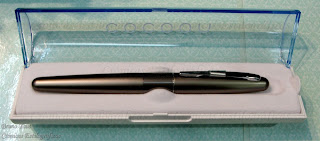
The pen in the presentation box.
Other products in the Japanese market in this price range are the Platinum Balance nibs in F and M) and the Sailor Lecoule (in MF only). It seems this might be a quite active area of the market and offering more models might increase Pilot’s share.

Platinum pocket pen, stainless steel with black stripes – Platinum black

Bruno Taut
September 22th, 2012
labels: Japón, mercado, Pilot, Sailor, Platinum