20 May 2015

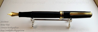
The Two Super Ultra 500

The assumed knowledge –to which I mindlessly contributed (::1::, ::2::, ::3::)— was that there were two versions of the Pilot Super Ultra 500 (or Ultra Super 500): the original pen made in 1958-59 and the cartridge-converter replica (the Pilot Ultra) in 1995. And it went even further: the original pen was so expensive to produce that it had a short history. Well, we might need to add some pinches of salt to all that information.

In fact, there are TWO versions of the original pen, not counting the decorative variations such as the well-known model with gold filled cap. The first of them is THE original model made in 1958-59. After that, a second batch was in production between 1963 and 1964. And there are some subtle differences between them.


The same pen, but not so much the same...

The original pen is slightly longer –just 3 mm longer--, does not carry any inscription on the cap ring, and is not dated on the barrel. In fact, we already know that those codes were implemented in 1960.


The caps have the same dimensions, but differ on the cap ring, and on the depth of the engraving on the clip. That on the 1958 pen is deeper.


The second edition pen has an additional engraving on the cap lip: PILOTR14K.

The second edition, on the contrary, does carry those dating codes starting either with a D, 1963, or an E, 1964, and has some inscription on the wider cap ring: PILOTR14K. The engravings on the nib and on the clip of this second model seem to be shallower than on the 1958 pen.
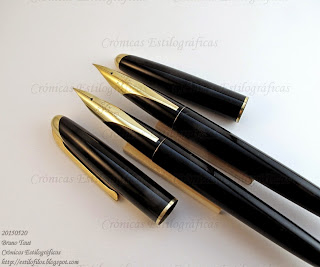

The engraving on the nibs have different depths, which is hard to notice if both pens were not side by side. And on the example of the picture, the differences are very minor. Closer to the camera is the 1963 edition.


The differences in the length of the pens lie solely on the length of the barrels. The filling systems are the same hose-filling system so dear to Pilot in the 1950s and 1960s.

Both editions implement the same filling system—the quarter-switch or hose system.

.1958 edition.

.1963 edition.
Length closed (mm) 141 138
Length open (mm) 125 122
Length posted (mm) 151 144
Diameter (mm) 12 12
Weight, dry (g) 18.0 16.5
The table shows the dimensions of both pens.

All in all, these differences are minimal, but they are enough to show that the original model was a success and that it might have not been a big economic burden for Pilot. They also show the importance of small details when trying to date a pen. This stylographic archaeology is mostly irrelevant to the whole picture, but it is of great interest to the collector looking for that precise pen with no mixture of elements from here and there.

Yes, this is an otaku thing. But these differences might as well trigger some price differences between these two editions of essentially the same pen.

My thanks to Mr. Sunami.

Sailor Young Profit, music nib – Parker Quink Blue

Bruno Taut
Nakano, March 4th, 2015
etiquetas: Pilot

14 May 2015

Information Providers

This story is already old and well known, and many a commentator and stylophile have voiced their opinions and views. But I am slow and had to take some time.

Some months ago the very active website FPGeeks went blank and, in fact, it has not showed any activity since then. The team formed by Eric Schneider and Dan Smith seems to be broken beyond repair. And later on we learned that Dan Smith had joined the company Kenro Industries, distributor of Aurora, Omas, Montegrappa, Tibaldi, in the US, as Director of Social Media.


The devil is often hidden in the details, but in essence this issue seems to be yet another example of conflict between money and freedom. Or, in other words, how much does information cost?

The Internet is full of free information. Not always reliable, but certainly free. Blogs and fora and a number of websites cost nothing to the reader (save, that is, for the internet service to be paid to the provider), and we all have become too comfortable with this fact. But all of those sites rely on the work and time and resources of a number of people.

How sustainable is this system? So far, it seems to be doing very well. And the main reason might be a simple one—there is enough number of information providers, of people, willing to share their resources. Consequently, the total load of work per capita is acceptable. And when someone could not cope with that load, another aficionado will promptly fill the void.

The information thus offered could be considered free of economic bias. There are no obvious economic incentives and authors would, in principle, feel free to express any opinion, positive and negative, on products and services.

The problem arises when the information providers look for some compensation for their dedication and resources. Some websites have advertisements, some blog authors ask for donations, some fora restrict what could be said on them to avoid annoying some actual or potential sponsors (::1::, ::2::)…

How does all this money affect the ecosystem of information in the Net? Economic incentives often, if not always, introduce bias in the expressed opinions. An obvious example, and not an extreme case, is that of Dan Smith—working for Kenro Industries, he will hardly say anything negative about the pens this company distributes. He is still an information provider, but a biased one.

It is not easy to draw a line between what is an acceptable incentive and what becomes a source of unacceptable bias. It is, in fact, a lot worse—those lines are personal. And, probably, differences in opinion about that line caused the break up of the Dan and Eric team and the present disappearance of the FPGeeks site.


Platinum 3776 (1984) – Parker Quink Blue

Bruno Taut
Nakano, May 4th, 2015
etiquetas: metabitácora, fora

10 May 2015

Fountain Pens of the World Festival (III)

The third leg of these texts on the Festival “Fountain Pens of the World” organized by Mitsukoshi department store are the limited releases made for the occasion, and for the 100th anniversary of the company.


The brown version of the Custom 742.

Pilot offered two versions of the well-known Custom 742 model. The varuiations oer the regular model laid on the body colors, red and brown, and on the nib. The regular size-10 nibs were now made of 18 K gold —just like those of the Namiki Yukari or the new Chinkin Series--, and showed a special engraving referring to Mitsukoshi’s symbol, a lion. 50 units of each color were made.


The nib of the Custom 742 is made of 18 K gold.

Sailor, on its side, offered a red ink by the name of “101 st”, and three pens—a Professional Gear in green (60 units), a black Profit (1911 in some markets, 50 units), and a maki-e decorated Profit (10 units) equipped with a Naginata Togi nib. The engraving of the black Profit nib was also special for the event.


Sailor's products for the occasion.


Detail of the maki-e pen by Sailor. Its name is "Lion and Bridge"--Mitsukoshi at Nihonbashi.


Detail of nib of the limited edition Sailor Profit. Again, a lion.

Finally, Platinum also offered a 3776 Century with a special decoration involving, of course, a lion. 100 units were released. I did not have the chance to see this pen and the picture is taken from the leaflet of the whole event.


Platinum's 3776 Century made for the Mitsukoshi's event. Picture taken from Mitsukoshi's leaflet of the event.

These limited edition pens attract the eye of the collector willing to pay premium for an unusual unit. These pens create an incentive for him –very often well aware of the market news and releases—to attend an event that otherwise would be all too predictable. Again, the outreach plan works even for the aficionado.

No wonder the pen scene in Japan was so active nowadays.


Romillo Essential Black – Parker Quink Blue

Bruno Taut
Nakano, April 24th, 2015
etiquetas: Sailor, Platinum, Pilot, mercado, evento

08 May 2015

Short Lived

News in the Madrid pen scene. The brick and mortar shop Miestilografica.com has closed. The online business seems to continue. On the website, the owners still mention the address of the physical shop (checked on May 8th, 2015).

Indeed a short lived shop.


Romillo Essential Black – Parker Quink Blue

Bruno Taut
Nakano, May 1st, 2015
etiquetas: Madrid, mercado

30 April 2015

Fountain Pens of the World Festival (II)

There was more I wanted to talk about re the Mitsukoshi’s Fountain Pens of the World Festival. The initial Chronicle was filled with pictures and I decided to cut it short, and this is the second, and largely overdue, part of it. There will be a third text in a near future.

The Fountain Pen of the World Festival, as I already explained, is a one-week long event--a week to sell pens by making them more accessible to potential customers. We, pen otaku, barely need these initiatives as we are well aware of the new releases and we often visit those few specialized shops with a good selection of pens, inks and papers. But at the same time, we are a small bunch and the market cannot sustain on us alone. So, the name of the game is outreaching.

The first step is the event itself. And then, what else? During this whole week a number of activities are organized with the obvious purpose of attracting new users.


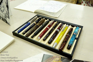
Fountain pens and paper to try. First tray. Can the reader identify all of them? The comment section welcomes any guess.

A table with about twenty pens, inked and perfectly tuned, and good quality paper welcomed the visitor on the first days. No need to speak, no need to ask. Just sit and write.


The second tray of pens. And again, readers could use the comment section to publish their guesses.

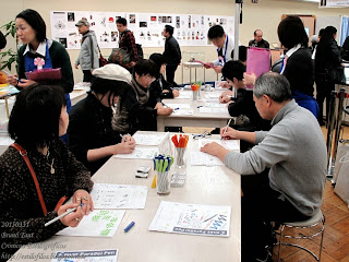
But that was not all. Pilot organized some calligraphy lessons to show the virtues of their Parallel pens.


Preparing the lesson.


Practizing.

Publisher AI-Books was also present to publicize its specialized magazine Shumi-no Bungubaku. An exhibition displaying the history of S. T. Dupont attracted some other people. And, of course, the pen tuners ready to adjust any nib to your taste and needs by courtesy of each company at each of their counters.


General view of the calligraphy lesson. On the background, the exhibition on the history of S. T. Dupont pens.

Outreaching… No wonder, then, the Japanese fountain pen scene was so active nowadays.


Platinum 3776 (1984) – Parker Quink Blue

Bruno Taut
Nakano, April 17th, 2015
etiquetas: evento, mercado

28 April 2015

75th Anniversary

Pilot has often used its anniversary pens as a benchmark for new models. Later on, those editions, albeit with some minor modifications, could become regular and unlimited models.

A very obvious example was the Custom 65, which was also the first real anniversary pen by Pilot. This pen was a limited released in 1983 on the occasion of the 65th year of the company. Two years later, a simplified Custom 65 became the Custom 67. And even later (1992), it became the Custom 74.


Pilot Custom 65. Note the wide cap ring and the textured surface.


Pilot Custom 67.


Pilot Custom 74.

In 1993, Pilot celebrated its 75 years of history. Such a big accomplishment deserved a big pen—the 75th Anniversary pen. It was a flat-top made of ebonite –coated with urushi lacquer— and plastic. It followed the line of the “vest” models from the late 1920s and 1930s. An interesting feature of this anniversary pen was the implementation of the very traditional “kikuza” (chrysanthemum) clip present in many a pen –and not only by Pilot— in the 1930s, 1940s, and 1950s.


A kikuza clip of a pen from 1937.


The 75th Anniversary Pilot in its box.

Pen-wise, this unit carries a 15-size nib made of 18 K gold with a unique engraving. M was the most usual nib point, and F and B were also available by request. The feed, as is the case with all modern Pilot pens, is made of plastic. The filling system is through the well-known Pilot proprietary cartridges and converters. A CON-70 converter, painted black, was included in the package.


The insides of the pen--the black painted CON-70 converter. On the pen body, it is worth to note the bicolor nib and the rings on the cap and on the body.

These are the dimensions of this pen:

Length closed: 148 mm
Length open: 133 mm
Length posted: 165 mm
Diameter: 15.3 mm
Weight (dry, with converter): 27.7 g

7500 units were made at a price of JPY 50000.

But that is not all—the 75th Anniversary pen had an obvious descendant—the Pilot’s flagship Custom 845. By the end of 2002, about 200 units of this new pen were released at some department stores in Japan as a response to a demand for a luxury pen. It was initially made to order and its price was, again, JPY 50000. It took some time to become successful, but finally it was included as a regular model in the standard catalog.


Blue Custom 845--a special edition made for Maruzen stationery in 2014. Note that not the whole pen is painted in blue. The black parts --section and the ends of body and cap-- are made of black plastic. This is also the case on the 75th Anniversary pen and on the regular Custom 845. Note also how the nib, the rings and the clip are different with respect to the original model from 1993.

The Custom 845 showed some variations over the 75th Anniversary pen. The kikuza clip was replaced by the simpler standard ball clip of most Custom models. The rings adorning the pen were also modified, and the nib was stripped from any reference to the anniversary it initially celebrated. The materials and areas coated with urushi remained untouched. And the price has not changed in over 13 years of production.

However, needless to say, the limited edition preserves its value a lot better than the current 845. Such is the market of collectibles.

My thanks to Mr Noguchi.


Platinum 3776 (1984) – Parker Quink Blue

Bruno Taut
Shinjuku, April 24th, 2015
etiquetas: mercado, Pilot

23 April 2015

Mandarin Yellow

For better or worse, the modern icon in fountain pens is the Montblanc Meisterstück model. Therefore, that style –balance shape with a number of rings on the body—is imitated by many pen companies. In some distant past, the model was different—the Parker 51 at some point, and, before that, the flat-top Duofold.

Japan is not different, and a number of copies of all those models have appeared on these Chronicles: The Eiko, a Platinum 10 Years, modern torpedo models… to name just a few.

In 1929, Pilot released a desk pen in bright yellow color. The base, Masa Sunami shows in the book Fountain Pens of Japan (A. LAMBROU and M. SUNAMI. ISBN 978-0-9571723-0-2), is equally yellow and includes a calendar. The pen itself is impressive enough on its own merits—bright yellow with black section and tail--truly inspired in the well known Duofold Mandarin Yellow by Parker.


The barrel is engraved: "PILOT" / US PAT (Namiki N logo) * 1600293 / PILOT PEN MFG CO LTD. The asterisk (*) means that there might have been some character in there, but it is now unreadable. The patent deserves some reflections by itself.

This Pilot, however, is a lever filler and implements a relatively small nib—a size 3 made of 14 K gold with a very appropriate, dare I say, posting point.


The noble side of the nib. The inscription reads "POST / 14 K GOLD / PILOT / 3".

These are its dimensions:
  • Length (open): 185 mm
  • Diameter: 9 mm
  • Weight (dry): 13.8 g


Typical flat feed of the Pilot pens of the time.

This particular unit was made in 1929 according to the imprint on the nib.


My thanks to Mr. Mochizuki and Mr. Sunami.


Romillo Essential Black – Parker Quink Blue

Bruno Taut
Shinjuku, April 20th, 2015
etiquetas: Pilot, Parker, Japón