13 January 2012

701

Para Juanjo, por todo lo que nos dejamos en el tintero.

Pen review. Pilot Myu 701 (M-350SS)


Little have I said after almost 200 chronicles about one of the most popular Japanese pens—the Pilot Myu 701. On a personal note I can say that the Pilot Myu was responsible for my renewed interest on fountain pens. I was already in Japan and an Internet search produced one of the very few websites with information in English on Japanese pens and, more in particular, this pen. Its online price, though, looked totally unreasonable, but being in Japan I thought I could find it for much less. For once, I was right. That was in 2004. Since then, a number of things have changed and there is a lot more information on Japanese pens. The invisible hand of the market, on its side, did its share to reduce the price of a very common pen.

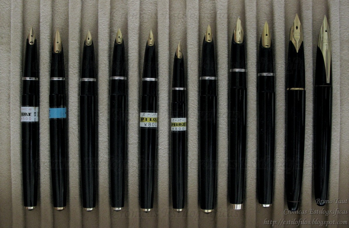
The Pilot Myu was launched in 1971 and was clearly inspired on the short lived Parker T1 for its basic feature: the integrated nib. On the other hand, this is a pocket pen, a concept created in 1964 and adopted by Pilot in 1968. It was on production until 1980. There existed three basic variations—the most common in plain steel shown on this chronicle; another in black stripes; and the very rare with non-colored stripes.

Interestingly enough, this pen deserves just one short sentence, and no picture, on Lambrou’s book Fountain Pens of the World despite being well known outside Japan and having become an icon. Arguably, this pen might be responsible for the popularity of affordable Japanese pens outside Japan. It certainly proves that Japanese pens are a lot more than just those decorated with maki-e and urushi techniques.


1. Appearance and design. (8.0/10)
I will start by admitting that I am positively biased towards this pen. I find its clean lines very attractive and being a pocket pen only adds value to it. However, I reckon that some users (strongly) dislike metallic gripping sections. This pen is clearly not for them.

Regarding the design, I am prompt to admit this pen has several weak points. The main one is directly associated to its streamlined look—the integration of nib and section makes the pen very vulnerable to defects and to accidents affecting the nib as there is no actual replacement for the nib. This is the inherent price to pay for pens like this.

Not so inherent are other elements. The beautifully looking clip is not spring-loaded and cannot be used with thick fabrics. Some would say that this was a pocket pen and, therefore, this pen was intended to be carried in shirt pocket, and this purpose is perfectly suited with this clip.

On this picture, both threads of the central ring are loose. Only one, that on the right, should open when inking the pen with anew cartridge or to access the converter.

A third weak point is the central ring. Section and barrel are hold together by this two-threaded ring. When opening the pen, only the barrel thread should come off. However, at times it is that in the section that comes off, and that exposes the spring loaded clutch —a very subtle detail— that secures the cap when closed.

These defects, though, do not affect the performance of the pen.

The central ring, completely disassembled from the section (top left) and from the barrel (bottom right). The clutch to secure the cap can be seen on the section.


2. Construction and quality. (9.0/10)
This pen is certainly well made. It is solid and has stood rough treatment in pockets and backpacks over the years. The fit between barrel and cap, essential for the writing comfort of a pocket pen, is still perfect. On the negative side, I will note that the barrel has become slightly scratched by the cap by the repeated process of posting the pen.


3. Weight and dimensions. (9.5/10)
This pen is a bit on the heavy side, but its very correct balance (55% to the tip-45% to the top, posted) makes it for its ease of use. And indeed this pen is a very good writer.

Diameter: 11 mm.
Length capped: 119 mm.
Length open: 105 mm.
Length posted: 143 mm.
Weight: 19.4 g. (inked, full cartridge)
Center of gravity: at 78 mm from the tip, posted.


4. Nib and writing performance. (8.0/10)
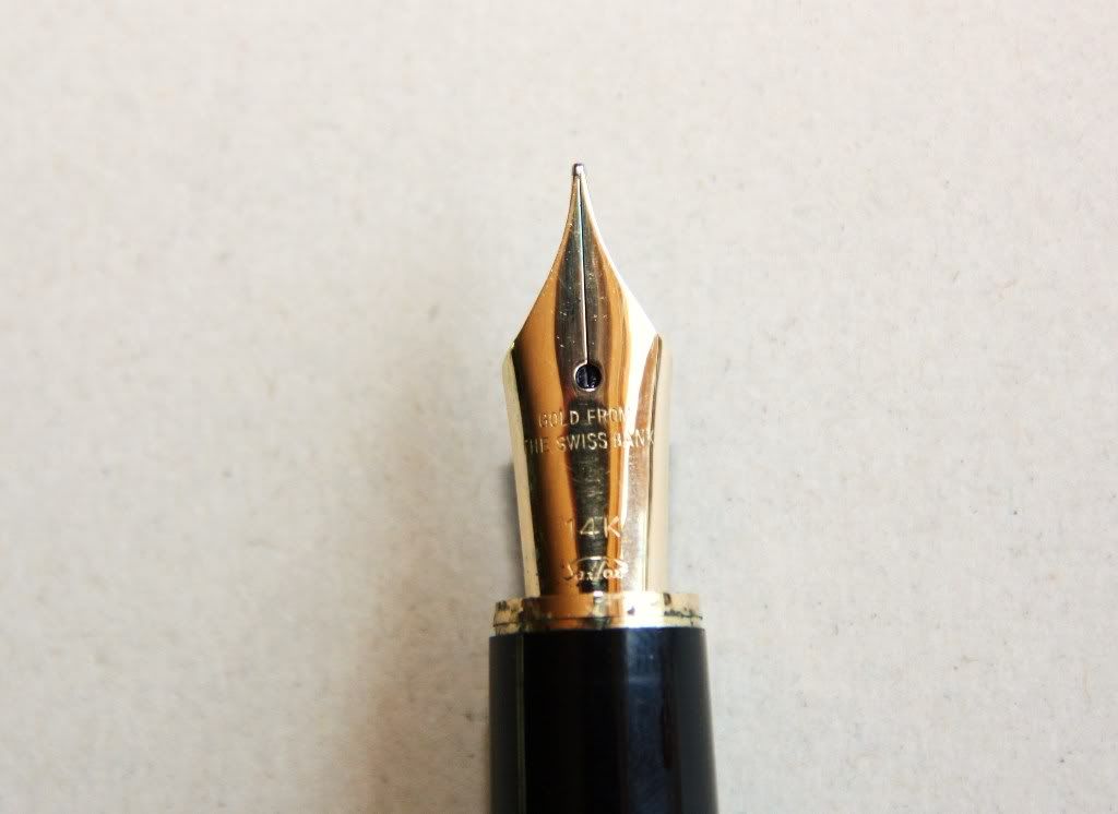
This pen is equipped with a very rigid nib made of steel. Its F point is very smooth despite being on the dry side. However, the ink flow is perfectly constant and never skips a bit. This Pilot is, in my opinion, a basic functional pen and this nib is accordingly reliable even if uneventful beyond its looks.

These pens had three nib point options: F, FM, and M. The second of them, though, is very rare.

Nib and feed of two Pilot Myu with points F (back) and M (front).


5. Filling system and maintenance. (8.5/10)
This is a Pilot-proprietary cartridge-converter pen, and of all the different converters of the company, only the bladder-type CON-20 actually fits in this pen.

Cleaning wise, this is not a difficult pen, as is the case with most cartridge-converters. On this pen, though, removing the feed is not straight-forward and the basic cleaning option is simply flushing some water through the section.

Minor corrections of ink flow are harder and riskier to carry out on this pen than in more standard pens, i. e. with non-integrated nibs. But this is hardly a real need given good quality control of these pens.


6. Cost and value. (8.5/10)
This pen cost JPY 3500 when it was marketed in the 1970s. The contemporary Capless (1971), on its side, was JPY 4000, and the fancier black stripped Myu (model M-500BS), JPY 5000. These relative costs make some sense after all—the Capless is a more sophisticated pen and includes a 14 K gold nib. The Myu was a more basic tool and was price accordingly. And, therefore, there is a steep overprice for the more appealing looks of the black stripped pen.

My grades reflect the current pricing in Japan, where the plain steel Myu is relatively easy to find.


7. Conclusion. (51.5/60 = 86/100)
Writing this review was a struggle between my high appreciation for this pen and the actual knowledge of its weak points, and the final score seems to reflect the first rather than the second. Nonetheless, I hope I had described the defects I have seen in this pen over the years, which, at the same time, do not compromise its very good performance.


(Pilot Myu 701 – Pilot blue, cartridge)

Bruno Taut
January 11th, 2012
[etiquetas: Pilot, Japón]

08 January 2012

Sailor's Inlaid Nib

Among all the pocket pens made by Sailor I have shown there are some with a special interest. One of them was the already described steel pen with a Swiss, or wherever, gold nib. Another is this one with inlaid nib.

Another example of a pocket pen.

This is a typical formal looking pen in black and gold. Re filling system, there is nothing remarkable—nominally a cartridge-converter that actually is a cartridge-only pen. The 14 K gold nib on this pen is inlaid on the section and its shape resembles that of the accordion filler by Pilot (Super 500 G)—both nibs are formed by almost flat sections. The Sailor’s looks less extreme that the Pilot’s, and it is certainly smaller. On the more positive side, this Sailor nib is nicely springy, and provides what Japanese aficionados call a “soft touch”.

On the left, the Pilot Super 500 G; on the right, the Sailor's pocket pen with a similar looking nib.

These are the dimensions of the pen:

Diameter: 12 mm
Length closed: 121 mm
Length open: 104 mm
Length posted: 139 mm
Weight: 12.5 g

The section of the pen is engraved with a subtle sign saying 301. I do not know what this figure might mean. If a date stamp, it could be March of Heisei year 1 (1989), which seems a bit too late for a pen like this. The other option, January of Showa 30 (1956), is far too early for a pocket pen. My best guess is that this pen is from the 1970s.


(Sailor, 14 K gold inlaid nib – Montblanc Irish Green)

Bruno Taut
January 7th, 2012
[labels: Sailor, plumín]

05 January 2012

Family Portrait (II)

The Super range of fountain pens was the Pilot’s workhorse between mid 1950s and early 1960s. They arrived to replace the R models —lever fillers— in the market since the end of the war—if not before. Super pens were phased out by the first cartridge-converter pens by Pilot in the early 1960—those using the short-lived double-spare type of cartridges.


A selection of Super pens in black. They were also available in a number of colors.

Most of these pens were equipped with nail-type nibs, albeit there are a couple of exceptions about which I will speak later on. However, the leading characteristic of these pens was the filling system—the quarter-switch device, called “hose system” in Japan. It is composed of a rubber sac covered by a metal sheath inside which there is a pressing plate operated by a small lever located on the top of the sheath. Small Super models, though, could not fit this system inside and implemented a much simpler pressing plate in the fashion of a traditional aerometric device.

The three filling systems on Super pens: accordion (bellows) on the top, quarter-switch on the middle, and the more simple pressure bar on the bottom.

As for the nib materials, in my experience, the vast majority of them were made of 14 K gold. The exceptions were the cheapest models –the Super 50, for instance—, whose nibs were made of gold plated steel. And regarding the points, although most of those available today in the second hand market were rigid Fs, there existed more exciting nibs including flexible falcon and three-tined music nibs.

Four examples of nail-type nibs on Super pens. The first and the third from the left are made of steel.

The exceptions to those characteristics were two pens that I have already described on these chronicles—the accordion filler Super 500G and the Super Ultra 500, which implement inlaid nibs. Actually, the later, as the top of the line model, is a very unique model that deserves a chronicle for itself.

(Pilot Custom 74, music nib – Pilot Iroshizuku Sho-ro)

Bruno Taut
January 3-4th, 2011
[etiquetas: Pilot]

31 December 2011

Evolution

Let us remember now that all the Presidente pens I have seen were aerometric fillers. And they were based on the first cartridge pens ever made in Japan—the Platinum Honest 60 and its later evolution the Honest 66.

Two Presidentes.

Platinum Honest 66, on the back, and Honest 60 on the front.

How do those filling structures compare?

On the top, a Platinum Honest 60 with its Honest cartridge. On the bottom a Presidente with the squeezer removed from the section.

A further step in disassembling the pens. Again, the Platinum pen on the top, and the self-filling Presidente on the bottom.

The answer is both easy and revealing. On two of the Presidente pens, the squeezer device can easily be removed from the pen, and, inside, the breathing tube remains attached to the feed. The interesting detail is that these squeezers could work as converters on the Platinum Honest 60 and 66 pens. On these, the breathing tube is much shorter and is covered by the nipple where the cartridge is attached. This makes perfect sense—this tube is never strong enough to open the cartridge. Its shorter length, however, makes the filling system less efficient. On the opposite direction, the Platinum Honest cartridge could be used on the Presidentes if the breathing tube were removed, which is not difficult to do.

On the left, the Platinum Honest cartridge; on the right, the squeezer of one of the Presidente pens.

All this illustrates the logical evolution of filling systems. Some sources (Ron Dutcher, Kamakura Pens) speak of a bulb filler Platinum Honest in 1955. However, in view of the similarities among the Presidentes and Honest pens, I think of the Spanish brand pens as the early self-filling versions of the Japanese models.


(Athena Basic Line – Sailor Yama-dori)

Bruno Taut
December 31st, 2011
[etiquetas: Presidente, Platinum, conversor, soluciones técnicas]

29 December 2011

Family Portrait (I)

My first chronicle was entitled Metamorfosis, and it was about the internal change many of us, stylophiles, go through when we acquire a passion like this. It does not come without mixed feelings and I have already spoken about how many pen aficionados insist in being users over collectors … if not hoarders! On my side, I did give up some time ago—I am a collector, even if modest, and a hoarder.

Small family portrait: Four hoshiawase pens.

Then, the following family picture makes some sense. It displays my modest collection of Pilot hoshiawase pens from the 1920s. All four of them are late models, from between 1926 and 1928.


The latest arrival dated from August 1927. It has a 14 K gold nib in size 3, and the hard rubber body is chased. Its overall condition is fairly good.

The latest arrival.

These are its dimensions:
Diameter: 12 mm.
Length capped: 122 mm.
Length uncapped: 117 mm.
Length posted: 155 mm.
Weight: 12 g.


The hoshiawase system was finally dropped because it never worked well enough in its purpose to seal the ink deposit. Therefore, its interest nowadays lies more in its originality and rarity than on the actual functionality of these pens. But the temptation to use them is always present. How would the experience of writing with such a pen be?

(Sailor Profit Junior – Pilot Iroshizuku Yama-budo)

Bruno Taut
December 29th, 2011
[labels: Pilot, estilofilia]

28 December 2011

Swiss Bank

On my previous chronicle I mentioned the existence of this Sailor’s nib engraved with the rather cryptic text “Gold from the Swiss Bank”. Nibs like this are made of 14 K gold and were present in a number of pens, both in pocket and full sizes.

The Swiss Bank gold.

But what about this reference to banks in Switzerland or, better, THE Swiss Bank? Does it account for any actual origin of the gold or was it a mere cosmetic detail or a marketing trick?

This inscription could also be seen on older Sailor pens (I, II), probably from the 1970s, whose nibs were very different to the one here shown. As for this particular one, in this original shape, dating it should not be difficult. It is engraved with what looks like a date: 902. It could correspond to September of Heisei year 2, which corresponds to 1990. Although a bit late for pocket pens, it might still be reasonable.

Where did this white gold come from?

A similar nib is present on this other pen, made of steel with black stripes. This time, the nib is made of 18 K white gold and has no engraving stating the origin of the gold. It seems to be dated in 610, which could correspond to June 1998 (Heisei 10). However, these two pens share an air of familiarity that suggest a common origin.

These are the pen dimensions:


Pocket pen. Catalog number 11-0408 220. 14 K gold nib:
Diameter: 12 mm.

Length capped: 120 mm.

Length uncapped: 102 mm.
Length posted: 141 mm.
Weight: 17 g.


Full size pen. Catalog number 11-0604 220. 18 K white gold nib:
Diameter: 11 mm.

Length capped: 136 mm.

Length uncapped: 121 mm.

Length posted: 150 mm.

Weight: 15 g.


(Pilot Custom 74 with music nib – Pilot Iroshizuku Sho-ro)

Bruno Taut
December 27th, 2011)
[etiquetas: plumín, Sailor]

24 December 2011

Sailor's Pockets

Sailor’s approach to pocket pens –that Japanese invention initiated by Platinum in 1964—was quite erratic. Even though pocket pens indeed came in a number of nib points and body decorations, the nib styles were limited for both Platinum and Pilot pens.


In contrast, Sailor’s pocket pens display almost all kinds of nib shapes —from semi-hooded to inlaid— and on materials, although in this department Pilot and Platinum were also quite promiscuous. However, only Sailor made nibs with "gold from the Swiss bank". But that should the topic of another chronicle.

A collection of different nibs, all from Sailor's pocket pens. All of them are made of gold with purities between 14 and 23 K. Two of them are made of white gold.


(Parker 51 – Pilot Iroshizuku Kon-peki)

Bruno Taut
December 22nd, 2011
[etiquetas: Sailor, plumín]