17 May 2016

Vintage Inks

Two are the issues associated to the two words in the title: how old can an ink be before using it, and how often do companies change the formulation of the inks?

Last weekend, at a meeting of the Wagner group in Tokyo, we had the opportunity to check five different varieties of the Pilot Blue-black ink. The older of them was about 60 years old. All of them were in their original packages and were, apparently, in perfect working order.


Vintage Pilot Blue-black inks. The oldest inks were from around 1955.


The four iron-gall inks to be tested. From left to right, from 1955, 1965, 1975 and 1985. The price as well as some details in the inkwells allow for a detailed dating.


Inking the pens, Hero 616, for the writing tests anyone could take.

Pilot Blue-black is, even nowadays, a water resistant ink. Formerly, this property was achieved by the classical trick—iron-gall formulation. But at some point in the early 1990s, it was abandoned in favor of a solution that reacts with the cellulose of the paper. Therefore, all the sampled inks but the most recent were ferrogallic. Some minor differences in color among those iron-gall inks are visible, but it is not possible to say whether those variations were due to any ageing process or to any variation in the formulation. The major differences are, as expected, between those classic inks and the newer formulation.


Writing test of all five inks (left), and water resistance test (right). The sample was one full minute under running water. Some dyes were removed from the iron-gall inks. All of them are remarkably resistant to water--even the modern, non ferrogallic, formulation.

A surprising detail we could see was how usable those vintage inks were despite their age. All of them were in perfect condition without mold or deposits. However, once open, these iron gall inks face an issue—the Iron ions will react with atmospheric Oxygen. Then, what is the open-inkwell lifetime of these inks? The ink should be all right as long as there were no mold or deposits, and some users spoke of some time between one and two years as safe to keep on using them.

My thanks to Mr Niikura, Mr. Nyoi, and Mr Toda.


Pilot Myu 701 – Pilot Black

Bruno Taut
Nakano, May 16th, 2016
etiquetas: Pilot, evento, tinta

14 May 2016

Size 30

The initial rumor was released some months ago (on March 11th 2016, exactly)—Fountain Pen Network member Tinjapan wrote about a new flagship pen by Pilot to be released in a near future. This pen was to be designed with Sailor’s King of Pen in mind and would be urushi-coated.

But the most remarkable feature would be its nib—a size 30. This implies a totally new nib (and feed). Currently, the bigger units in the Pilot-Namiki catalog are size 15 (Pilot), and 20 and 50 (Namiki), as can be seen on KMPN’s unnamed blog.

Newer information in now available and it confirms the basics of Tinjapan’s report. This new pen seems to be one of the three pens Pilot Corporation is preparing to celebrate the 100th anniversary of the company. The new size 30 nib is confirmed; and this model will be black. It will be released this coming October. Name and code number (and therefore price) have not yet being announced. Tinjapan’s information spoke of around JPY 80000.

Interesting news!—not everyday we learn about new nibs being released.

My thanks to Tinjapan, who released the initial information


Ban-ei in black urushi – Pilot Blue

Bruno Taut
Nakano, May 13th, 2016
etiquetas: Pilot, plumín, mercado

10 May 2016

Bonded Acrylic

In 2012, the company Classic Pens, owned by Andreas Lambrou, commissioned the production of 350 pens in seven colors. The maker was going to be Sailor; the material, a special type –or so they say— of acrylic material made by the British company Carville (according to A. Lambrou & M. Sunami’s Fountain Pens of Japan. 2012). They call it “bonded acrylic”.

The result is a variation on the King Profit model of Sailor—a torpedo style pen in the “King of Pen” (KOP) size. Well, not that much of a variation, as the LB5 (such is the name of these pens) is in essence a King Profit—same nib, same feed, same cartridges and converters. The differences are limited to a minor variation in the total length (the LB5 is 5 mm longer than the King Profit) and the acrylic material of the body.


Two LB5, by Classic Pens, made by Sailor.

These are the dimensions of the LB5:

Length closed: 158 mm
Length open: 137 mm
Length posted: 173 mm
Diameter: 19 mm
Weight: 42.7 g (inked)
Ink deposit: 1.2 ml (cartridge), 0.7 ml (converter)


The insides of the LB5 can be disappointing for some. After all, these are cartridge-converter pens.

The cap ring is engraved as follows: “SAILOR LB5 – specific color name – xx/50”. xx stands for the pen number in the limited edition. The specific color name can be either of these: Tairiku, Kaen, Tensui, Kõseki (albeit spelled as Kouseki), and Midorigi. Two of these, Tensui and Tairiku, are represented in two different versions.


These two LB5 pens carry the same name--Tairiku. One is marble white, the other is amethyst mauve.

The nib, as was mentioned before, is well known—the KOP type of nib present in the most luxurious line of Sailor pens. The engraving on those reads as follows: “1911 / (logo) / 21K / 875 / Sailor / JAPAN”. The nib point is on the side: either M or B, although the Nagahara’s cross nib is available at a premium.


The nib is the well known, and magnificent, super big by Sailor.

Then comes the price. Owning any of them costs around USD 1250 or JPY 150000 (the nominal price is USD 1500). In contrast, a regular King Profit cost JPY 60000 (plus tax) if made of plastic, and JPY 70000 if in ebonite. In fact, these regular models can be found for less. These prices are, roughly, half of the cost of the limited edition LB5 of Classic Pens.

So, is it worth to pay over JPY 75000 for 5 mm more and some fancy acrylic colors? Is being a limited edition that appealing?


A King Profit Realo. Black plastic. Piston filler. Limited edition. JPY 80000 (plus tax).

If the smart guy chose the nib over the pen, these LB5 are not for him. But some other people think otherwise (::1::, ::2::, ::3::).

My thanks to Mr. Hoshino.


Sailor Magna – Tomiya Tomikei Blue

Bruno Taut
Nakano, May 9th, 2016
etiquetas: Sailor, mercado, Classic Pens

06 May 2016

55°

On a Japanese rarity:

There are lines, and there are squares in several sizes; there is the Seyès ruling at French schools, the Cornell note-taking scheme in notebooks, the genkõ yõshi ruling for writing in Japanese, and even ruling for left handed people (no affiliation)… And now, the ruling for those who write at an angle. That is, at least what the cover of this notebook says.


The cover of the Tsubame notebook. It is made by Life Stationery Company.


The unusual ruling of this particular notebook. The angle is 55°.

This is a Tsubame notebook, a product of Life Stationery Co., in size B5 (179x250 mm²). The paper, as is customary in Tsubame notebooks, is very well pressed and shows no problems of feathering or bleeding: it is perfectly suited for fountain pens. The paper density, secondary to the paper pressing quality, is 83.5 g/m². The price is JPY 310 (52 pages).


The paper is very good. No feathering...


... and no bleeding. Not even with very wet nibs.

But the distinctive element of this notebook in particular is its ruling. Guiding lines are rotated 55° over the horizontal. The utility? As the cover says, for those who write with crooked lines. This angle, that many consider excessive, is nothing fancy nor was ever carefully considered. It is simply the angle of the diagonal of a B or A type of paper over the horizontal (arctg √2 = 54.7°).


The looks of a written page are... unusual as well.

However, would it not be easier and cheaper to rotate a regular notebook? A regular ruled notebook of this size by Tsubame costs JPY 170 (plus tax).


Ban-ei in black urushi – Pilot Blue

Bruno Taut
Nakano, April 17th, 2016
etiquetas: papelería, Life Stationery

02 May 2016

Daiso's Fountain Pens

Daiso, the Wikipedia says, is a franchise of 100-yen shops original from Hiroshima, in Japan. This company is present in a number of countries including US, Canada and Australia.

Among the many products present on the Daiso’s shelves we can always find some fountain pens. On this Chronicle I will describe some recent examples. All of them cost JPY 100, plus tax.


This picture taken in 2010 shows a number of inexpensive pens present in the Japanese market. Among them, some of the pens marketed by Daiso analyzed on this Chronicle.

1. Daiso Mini, ca. 2008. This was a small pen to be used posted. It uses Sailor cartridges, but it has no room for the regular Sailor converter. The nib is made of stainless steel and carries no engraving at all.


Daiso Mini.


Daiso Mini's nib, shared with the Regular model.

2. Daiso Regular, ca. 2008. This is the sister pen of the Daiso Mini. It is a regular size pen and accepts a converter. Section and nib are identical –and interchangeable – on both pens. This model could be found in black and in red.


Daiso Regular in red.

3. Sailor Ink Pen, ca. 2008. This is the cheapest Sailor fountain pen in recent years. It is a regular size pen that uses Sailor-proprietary cartridges and converter. The nib is labeled as F-4, is made of stainless steel, and is not tipped.


The Sailor Ink Pen, now discontinued.


The untipped F-4 nib of the Sailor Ink Pen.

4. Platinum Riviere. I saw this pen at Daiso shops back in 2008 and it is still available. Again, this is a cartridge-converter (Platinum proprietary) pen with steel nib. The nib is engraved with the platinum logo and the nib point—M. It is tipped and the pen is a smooth writer. Several colors --at least, black, blue and red— have existed, but lately only black seems to be available.


The Platinum Riviere in blue.


The Platinum nib of a 100-yen pen.

5. Daiso metal pen, ca. 2015 on. The latest arrival is this all metal pen save for the section. It implements a steel nib and uses international cartridges and converters. This pen is available in grey and white.


The non-branded fountain pens on sale at Daiso's shops nowadays.


Not much information is provided by the nib itself.

This last pen is, by far, the most attractive of those here described. On the other end we encounter the Sailor Ink Pen, whose untipped nib made it a bit tricky to use for the novice.

In any event, these Daiso pens show that there are refillable pens in the market for less than a US dollar or a Euro.


Pelikan M800 – Tomiya Tomikei blue (by Sailor)

Bruno Taut
Nakano, April 30th, 2016
etiquetas: Daiso, mercado, Japón, Sailor, Platinum.

26 April 2016

Sailor's Plunger

Plungers are old and new, particularly in Japan. Some of the first fountain pens arriving in this country were Onoto plunger fillers, and the well known Japanese eyedropper system (::1::, ::2::) of storing ink in the pen is a simplification of the original Onoto system.

However common the Japanese eyedropper is, Japanese companies continued making plungers for some of their models. Pilot’s examples, the P type, are well documented, but these are by no means the only ones.


This is a Sailor, not an Omas.


The clip is clearly signed as Sailor.

Sailor also made some, and such is the case of the pen on display today. It is a small celluloid pen made around 1935. The nib, not that big, is labeled as being a size 20.


The size-20 nib. The engraving reads "14 CR GOLD / Sailor / REGISTERED / PATENT OFFICE / -20-".

These are the dimensions of this pen:
Length closed: 124 mm
Length open: 112 mm
Length posted: 151 mm
Diameter: 11 mm
Weight: 15.2 g (dry)


The plunger, half retracted.

The basic problem of this filling system is its vulnerability. It is very fragile and prone to break down due to failures in the plunger seal.


The plunger, disassembled.

My thanks to Mr. Sugimoto and to Mr. Mochizuki.


Pelikan M800 – Tomiya Tomikei Blue (by Sailor)

Bruno Taut
Nakano, April 25th, 2016
etiquetas: Japón, soluciones técnicas, Sailor, Pilot, Onoto

21 April 2016

Pens at an Exhibition

The National Museum of Japanese History, in the city of Sakura (Chiba prefecture), hosts these days –March 8th to May 8th 2016—an exhibition on fountain pens: “Fountain Pens: Their History ad Art in Japan”. That is the official English title. However, the original in Japanese is more along the lines of “Lifestyle and Fountain Pens. The Modernization of Writing”.


Finally I had the chance to attend it and these are my recollections:

Sakura is a small town (population around 180000) in the prefecture of Chiba, about 60 minutes away from Tokyo Station by train. The Museum is connected to the train station by a bus route that takes 15 min. The admission fee to the exhibition is JPY 830. No pictures are allowed.

This is the outline:

Lifestyle and Fountain Pens. The Modernization of Writing.
0. Introduction. Literature and writing in Japan.
1. Fountain pens in Japan and their craftsmanship.
1.1 History of fountain pens in Japan.
1.2 Craftsmanship.
-- Lathe masters.
-- Maki-e.
2. Fountain pens and contemporary Japan.
2.1 The time of fountain pens.
2.2 Fountain pens and the modern organization.
2.3 Fountain pens and daily life.
3. Epilogue. Writing revisited.

The starting point of the exhibition is the role fountain pens played around 1900 in Japan. Fountain pens –that is, a reliable writing tool with an integrated ink deposit—were a much better writing device in a highly literate society whose writing system was based on handwriting. This starting point, somehow, defines the whole exhibition whose focus is on the social influence of pens and not on the historical development of them.


In fact, as could be seen on the outline, the part dedicated to the history of pen in Japan is limited to the first section (1.1). It is, however, rather limited and is organized by brands, with the big three companies taking most of the available space. A more chronological display would have been a lot more illustrative. There is also the obvious void of pens made after 1980 (save for some contemporary Pilot Capless and some Kato Seisakusho’s models).

Given the focus of the exhibition, most of the pens on display are common tools that were available to the average citizen. The most obvious exception to this rule is the selection of maki-e decorated pens used to illustrate the section on Japanese craftsmanship.

This section is completed with assorted memorabilia: ads, display cases, sale materials, etc.

More importance is given to the theme of craftsmanship of pens (section 1.2), focused on two aspects: pen turning and maki-e decoration.

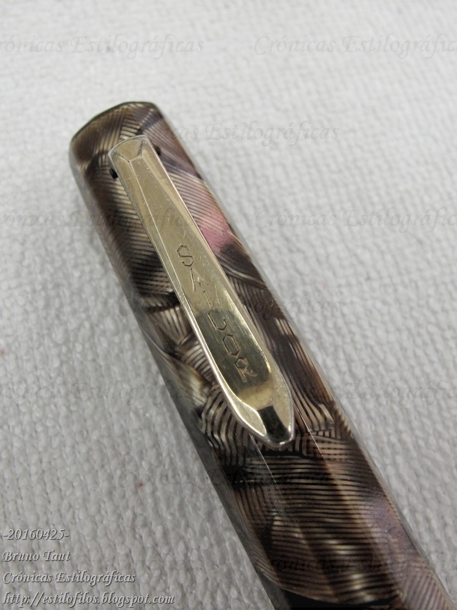
Pen turning by rather primitive means has always been an important part of the Japanese pen industry. Let us remember brands as Ban-ei, Kato Seisakusho, Hakase, Eboya, Ohashido, and many others. Several of those lathes --pedal operated, with precarious chucks more often than not, and unstable toolposts— together with sets of tools can be seen at the museum.

Maki-e is also very well presented. The selection of pens, many from private collections, is magnificent and is supported by a computer system where visitors can explore the decorative motifs in detail through high quality pictures.


Page 111 of the catalog. It displays a maki-e decorated pen by Platinum. A pen, actually, already described on these Chronicles.

The exhibition is interesting and worth the trip from Tokyo. After all, pens rarely show up collectively in museums. Unfortunately, pictures are not allowed. However, there is a very serious flaw: pens and other objects are not dated. This is an inexplicable mistake to any curator.

The catalog is nicely printed and is affordable in price (JPY 1800, plus tax). Pictures, and in particular those of maki-e pens, are very good. But the editor made a big mistake. There are a number of pictures of pens that are seamless compositions of pictures of single pens. At the time of putting them together, someone made the stupid decision of representing all the pens in the same length, not respecting the actual differences in size. The result is ridiculous: a pocket pen of the same length of a full size Pilot Custom Sterling, as can be seen on the accompanying pictures.


Page 30 of the catalog shows these six Pilot pens. All of them, apparently, have the same length.


This is how those six pens (save minor decorative details) really look like with respect to each other. This ridiculous mistake is repeated in a number of pages of the catalog.

The lack of dates in the exhibition is not corrected in the catalog. Again, we are deprived of that valuable piece of information.

But I would visit the exhibition “Lifestyle and Fountain Pens” again.

My thanks to Poplicola-san.


Ban-ei in black urushi – Pilot Blue

Bruno Taut
Nakano, April 20th 2016
etiquetas: evento, Japón, estilofilia