Showing posts with label Sailor. Show all posts

05 August 2019

A Pen Is A Pen

A pen must write well in any country. That should be a given, but not all pens perform correctly.

When a Japanese pen is at fault, the different writing scripts –Kanji and kana in Japan, alphabet in the West— have been used by some to explain why it did not work properly, and even to justify how suitable a pen is for certain market.

These are some examples:

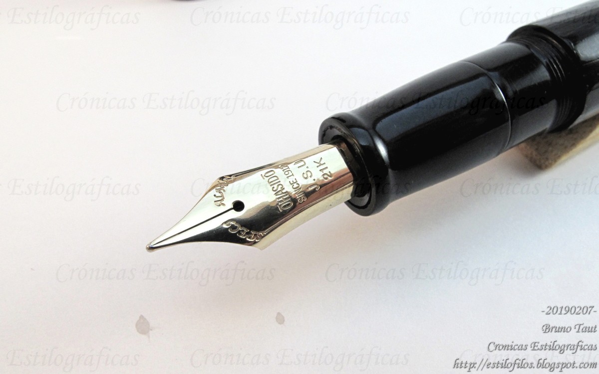
Some years ago, it became well known that the size #10 Falcon nib by Pilot (present on the models Custom 742 and Custom Heritage 912) did not always behave properly (::1::, ::2::). Many units tended to railroad under almost any pressure. But to this obvious fault some in the West invoked the special way of writing (Japanese, that is) to explain and justify that failure.


Pilot Custom 742 with a Falcon nib.

More recently, Davidoff argued –at least in Japan-- that their nibs were perfectly suited for Japan because their nibs were Sailor's... Like if Pelikan and Montblanc pens were so bad at that and had a hard time in the Japanese market.


Davidoff pens.

The case of Naginata Togi nibs has already been discussed on these pages. In the Japanese market, Sailor brags about how suitable those nibs are to write Japanse (::3::, ::4::), but that does not prevent Sailor from selling them in the West...


Sailor Naginata Togi nibs.

All those examples are nothing but bland excuses and cheap marketing. A pen is a pen and must write well in any script. And Pilot claimed this long time ago:

A Namiki ad from 1927 in the UK explained that the Japanese writing was the perfect benchmark to ensure the correct performance of their pens under any circumstance... such as writing in alphabet!


The Bookseller & the Stationery Trades Journal, July 1927. Page 27. As seen at the Pen Station, Tokyo, in April of 2013. Japanese as the perfect test for any pen!

Japanese are not from another planet. Neither are Westerners when seen from Japan.


Sailor Profit Naginata Togi – Pilot Iroshizuku Ku-jaku

Bruno Taut
Nakano, July - August 2019
etiquetas: mercado, Japón, japonés, Pilot, Sailor, Davidoff, plumín

08 April 2019

The Case of Naginata. V. Results

On the previous Chronicle, I wondered whether the alleged virtues of the Naginata Togi nebs were real and detectable. To do so, I published a picture with seven sets of ideograms --焼肉定食, yakiniku teishoku--, all of them written by the same Japanese hand using seven different pens. Then I asked if we could find out which one had been written with a Naginata.

From top to bottom, the pens were as follows:

- Kubo Kohei nib. Unlabeled point, but it is about an MF.
- Montblanc 149 (F?)
- Henckel nib, architect grind.
- Sailor Naginata Togi, NMF.
- Pilot #5, music nib.
- Pelikan M200, F.
- Pilot Vpen, F.


The solutions to the question of last Chronicle.

The most popular answer –both on comments to my text and on Instagram-- was number 5; that is, the music nib by Pilot.

This result is surprising—either people love the results of writing with a stub nib or most of us do not really know how a Naginata nib is actually cut.

On second position came number 3 –a Henckel nib with an architect grind--, and on third, the actual Naginata Togi. This is more reasonable, as the Naginata nib can be seen as a smooth architect's nib.


The architect's grind on a Henckel nib.


A Naginata Togi nib.

The conclusion is that the alleged beautifying effects on the writing come only through practice with the Naginata Togi nib itself. But if so, many people, in Japan and overseas, buy Naginata pens without really knowing how to use them and take no benefit of their supposed advantages.

But Naginata Togi nibs are excellent writers for whatever script, Eastern or Western. And christening a nib with an exotic name is an excellent marketing strategy.


Sailor Profit Naginata Togi – Pilot Iroshizuku Ku-jaku

Bruno Taut
Bunkyo, April 2nd 2019
etiquetas: plumín, Sailor, japonés (idioma), mercado

27 March 2019

The Case of Naginata. IV. Writing

On the previous text I tried to deconstruct what a Naginata Togi nib was. I concluded that in essence, a Naginata Togi nib is a variable nib. My friend and fellow blogger Fudefan reminded me how Sailor marketed these nibs as optimized to write beautifully in Japanese.


A Naginata Togi nib.

Now, how true is that?

The following picture shows the same text (焼肉定食, yakiniku teishoku) with seven different pens. Only one of them is a Naginata Togi.


焼肉定食 with seven different pens. Some were Japanese, some Western.

Can anyone figure out which one was written with a Naginata Togi?

Which one do you think is more beautiful?

Finally, does this matter?


My thanks to Fudefan and to Poplicola-san.


Iwase Seisakusho prototype – Hôgadô Doroai (Sailor)

Bruno Taut
Bunkyo, March 26th, 2019
etiquetas: Sailor, plumín, japonés, mercado

23 March 2019

The Case of Naginata. III. The Brand

After the two year hiatus in the production of Naginata Togi nibs we have them back in the market at a significant overprice. With this price hike, Sailor tries to cash the very good name of this nib.

But what is, in actual terms, a Naginata Togi nib? Is it worth the price Sailor is asking for them?

First and foremost, a Naginata Togi nib is a variable nib―a nib whose line width changes with the angle between pen and paper. Then, a Naginata Togi is a longer than usual nib, and this allows for some experiments to create new points―bending the nib, duplicating and triplicating the nibs, etc.


Three Naginata Togi nibs in three different sizes.

The question now is whether these features were so unique in the market as to justify Sailor in its bold move.

Variable nibs are not new at all―they have existed for more than a century. Nowadays, though, they are not that common, but they are not exclusive to Sailor. The paradox is that Sailor offers a much cheaper alternative―the zoom point available on various models including the very affordable Young Profit (JPY 5000, plus tax), also known as Somiko.


Sailor's Zoom nib in medium size. Photo courtesy of Zeynep Firtina (Write to me Often).

Then, what about the experiments nibmeister Nobuyoshi Nagahara performed on these nibs? Brilliant as they are, facts show that they do not need a Naginata Togi as a base. And nowadays there are a number of nibmeisters out there, in Japan and overseas, recreating those two- and three-fold nibs.


Nibmeister Nagahara Nobuyoshi in October of 2011.


Three Sailor Cross nibs (2-fold nibs). Note how the nib on the lower right side is made over an old nail type nib.


Two cross nibs: the one on top was made by nibmeister Yamada over a Pelikan M800; the other is a Sailor nib made for the 90th anniversary of the company in 2001.

What is left, then?

What might be left are some of the cuts Sailor offers or used to offer on these specialty nibs―the King Cobra, the King Eagle... But mostly, what is left seem the name Naginata Togi as a brand in itself. And time will tell is Sailor's strategy to cash it is correct or not.


The new and expensive Naginata Togi nib.


My thanks to Zeynep Firtina.


Iwase Seisakusho prototype – Hôgadô Doroai (Sailor)

Bruno Taut
Chiyoda, March 20th, 2019
etiquetas: Sailor, plumín, mercado, nibmeister Nagahara Nobuyoshi

28 February 2019

The Kubo Singularity

The big three Japanese pen companies make their own nibs, and it seems very hard to get those nibs as spare parts or as third party nibs for other makers. However, there are cases of that:

Hakase uses Pilot and Sailor nibs with their own original imprint. Ohashido and Taccia do the same with Sailor nibs.


A Pilot nib labeled as Hakase.

The rest either use Pilot nibs without any modification –StyloArt Karuizawa— or use some of the traditional supplies of third party nibs: Bock for Eboya and Masahiro (although previously Masahiro implemented Pilot nibs); JoWo for Taccia (lower end pens) and Wajimaya Zen-ni.


A JoWo nib labeled as Taccia.

The newcomer Iwase Seisakusho aims at sourcing its nibs from old nibmeister Kubo Kohei for its original pens. However, this is still an uncertain operation whose continuity we can only speculate about. Not to mention that the old age of Kubo Kohei –pushing 90 years old-- might affect any plan for a long term supply of parts.


Nibmeister Kubo at work.

But the bottom line is that Kubo Kohei is the sole independent maker of nibs in Japan, and his production is small, slow and artisanal.

Is there room –and market— for another independent operation in Japan to supply nibs and feeds to small pen companies?


Iwase Seisakusho prototype with Henckel nib – Takeda Jimiku Hisoku

Bruno Taut
Chuo, February 12th 2019
Etiquetas: Pilot, plumín, mercado, Sailor, Eboya, Hakase, Ohashido, Iwase Seisakusho, Taccia, Bock, JoWo, Wajimaya, nibmeister Kubo Kohei

19 February 2019

The Namiki Effect

Stylophiles are a special bunch. Driven by our anachronistic passion we often crave for certain features: gold nibs, self-filling mechanisms (as opposed to cartridges and converters), ebonite feeds, some specific materials like celluloid or ebonite,… And we demand those features for pens over certain price. Or, in other words, we might despise pens over certain price if they didn't offer some of them.

But the market might be telling us that we are mistaken. Just a quick look at today's catalogs shows how many luxury brands offer nothing but cartridge-converter pens with plastic feeds. Materials and gold nibs are less of a problem, though.


An expensive Pilot. Cartridge-converter and plastic feed.

Luxury pens of Platinum-Nakaya and Sailor are cartridge-converters. Pilot-Namiki does offer Japanese eyedroppers, but only for the biggest nib size. All the others, with nibs sizes 5, 10, and 20, are cartridge-converters despite how expensive they are.


An expensive Hakase.

Then, small makers like Eboya, Hakase, Ohashido, Stylo-Art Karuizawa, all focussed on higher-end pens only offer cartridge-converter pens. The only exception to this trend might be Masahiro and the newly-arrived Iwase Seisakusho.

Now, are these two brands –Masahiro and Iwase Seisakusho— on the right path or the success of all the other brands shows the opposite? How important are those details like ebonite feed and self-filling mechanisms in the final price –and in the final value-- of the pen?


A Masahiro pen. Expensive, but it implements an ebonite feed, a self-filling mechanism, an ebonite body, and a gold nib.

The market might be telling us that we stylophiles are still a minority in the business. Or it might only be that I am very mistaken about what we demand, and cartridge and converters and plastic feeds are perfectly all right even on very expensive pens.

Or it might be that we are very easy targets. After all, every pen has its charm, and all those cravings are not so important.

And that is the Namiki effect--expensive pens can be, in essence, very simple. Namiki has proven it through years in the market.


Iwase Seisakusho prototype – Takeda Jimuki Hisoku

Bruno Taut
Bunkyo, February 9th 2019
etiquetas: estilofilia, mercado, makie, Eboya, Hakase, StyloArt Karuizawa, Masahiro, Sailor, Ohashido, Iwase Seisakusho, Pilot, Platinum

07 February 2019

Ohashido (II)

As I had said before, Ôhashidô pens, as of now, implement Sailor nibs of sizes medium and big (in Sailor terms). These nibs are engraved in origin, at the Sailor's plant in Kure (Hiroshima), with the Ôhashidô imprint. In fact, Ôhashidô occasionally implements nibs that are not available on regular Sailor pens—big size nibs made of 14 K gold, and nibs labeled as S –soft– as opposed to the omnipresent H –hard– nibs.


An Ôhashidô nib labeled as S, soft, that in actual terms is very rigid.

There are, usually, two other elements carrying some form of identification on Ôhashidô pens—the clip and the cap band. If present, as there are Ôhashidô pens without those features, they carry the inscription “JSU”, for “Japan Sendai Uehara” on the clip, or "OHASHIDO SINCE 1912 JSU" on the cap band.

However, all those signs might not be there, or there might be some others—such is the lack of system in the production of Ôhashidô pens.

Two examples of these pens I am showing today—one with very typical features; the other, right the opposite.


Exhibit one. Note the engraved clip: "JSU".

The first one is a pen finished in unpolished urushi. The clip is also engraved with the usual imprint: "JSU". The nib is large and carries the usual inscription “SPECIALITY / ÔHASIDÔ / SINCE 1912 / J.S.U / 21 K”, although without any statement about the nib point. The differences between "Ôhashidô" and "Ôhasidô" are the result of the lack of consistency among Japanese on how to transliterate Japanese names.


“SPECIALITY / ÔHASIDÔ / SINCE 1912 / J.S.U / 21 K”

The second pen has none of those usual identifications—the nib has no engraving save a hidden JIS mark and and manufacturing date, and there is no clip. But the barrel is engraved: “OHASHIDO / SINCE1912 J.S.U”. These two details are very unusual. As the nib itself is—it is certainly a Sailor, but a very soft one. It is a medium size made of 14 K gold (according to Mr. Uehara), and the nib point is M.


Exhibit two.


Unusual engraved body: "OHASHIDO / SINCE1912 J.S.U”.


Unusual plain nib, save for the JIS mark and the manufacturing date.

Interesting pens, but the lack of systems in the production process is a problem if the potential customer were looking for a defined –and unnamed- model. But this might be part of the success recipe of Ôhashidô's.


Iwase Seisakusho prototype – Takeda Jimuki Hisoku

Bruno Taut
Bunkyo, February 5th 2019
etiquetas: Sailor, Ohashido

20 January 2019

Nagahara 2020

The bare news:

Nibmeister Yukio Nagahara will retire from his current position in Sailor in February of 2020. He plans to pursue an independent career under the name “The Nib Shaper”. Nagahara is already preparing the website of this new operation.


Who will succeed Nagahara in Sailor?


Iwase Seisakusho prototype – Sheaffer Blue-black

Bruno Taut
Nakano, January 20th 2019
Etiquetas: Sailor, nibmeister Yukio Nagahara

17 January 2019

Ohashido (I)

Besides the big three Japanese pen companies –Pilot-Namiki, Platinum-Nakaya, and Sailor– there are a bunch of small operations, some of which I have described on these Chronicles: Masahiro, Eboya,... I haven't spoken much about Ôhashidô, and that despite being very active in the local (Japanese) market.

Ôhashidô –Ôhashidô Ltd.– was formally founded in 1965, but it has its origins in Tokyo in 1912, when Yoshiharu Uemura open his workshop in Asakusa while working for SSS, the big company of the time. He moved to Sendai, about 300 km north of Tokyo, after the Big Kanto Earthquake in 1923 to work with inventor Kazuyoshi Hiratsuka. The new shop was located close to the Big Bridge (Ô-hashi) over the river Hirose. Ôhashidô means “the hall of the big bridge”.

The business was completely destroyed during the War. The operation revived around 1950 in the hands of Yoshiharu's son Eiichi Uehara, but not through manufacturing pens but by fixing them. The production of pens was resumed some years later, and by 1965 Ôhashidô Ltd. started formally.

In 2010, Eiichi's son Yûichi Uehara took control of the company. He has become very active in the Japanese scene by attending a big number of sale events hosted by stationers and department stores where he sells his pens directly.


Yuuichi Uehara at work in Maruzen stationery in Nihonbashi (Tokyo).


The traveling rokuro (traditional lathe).

Ôhashidô's operation is quite unique. It seems anchored in the pre-industrial era. There is barely any system in the production: there are no model names, the warranty card is just Uehara's business card, there are no instruction sheets, etc... Contacting him is not easy either—he has no public email address, and only very recently he open a website (https://ohasibo.theshop.jp/).

As for the pens, they are made mostly in ebonite –sometimes from Nikko Ebonite, some other from old stocks of unclear origin--, and implement Sailor nibs of sizes medium and big (following Sailor names) in both 14 K and 21 K grades. In fact, for some time, Ohashido offered big nibs made of 14 K gold, which was not an option on Sailor pens. In a more distant past, Ohashido used nibs by Ishiwaka Kinpen Seisakusho, Kabutogi Ginjiro, and even Ishi Shoten (Yotsubishi). Some sources also speak of nibs made by Eiichi Uehara himself.


A big Ôhashidô nib made of 14 K gold. Of course, made by Sailor.


Pens for sale...

All current Ôhashidô pens use Sailor cartridges and converters. The later, at least, if the barrel was big enough, of course.

And on another Chronicle I will describe some Ôhashidô pen in detail.


Elysee pen, unknown model – Aurora Black

Bruno Taut
Nakano, January 2019
etiquetas: Sailor, Ohashido, Ishikawa Kinpen Seisakusho, Yotsubishi, nibmeister Kabutogi Ginjiro

10 January 2019

Pen Obsessions

Once again, I encountered one of those pens that show the essential conflict between the collector and the historian, or between the the rarity and the icon. I am well aware that most collectors would not hesitate to choose the exception over the norm despite the fact that very little do these rarities offer to the understanding of the history of pens.

Today's pen is a prototype.

In 2001, on the occasion of its 90th anniversary, Sailor created the corresponding anniversary pen. This was called “Mannenhitsu Dôraku”, something like “pen obsession". That was a limited edition of 900 units, made of dark or clear briarwood. This was –dare I say-- one of the most interesting limited editions made by Sailor due to its two-fold nib—a cross nib in the Sailor way of naming its specialty nibs.


The final version of the 90th anniversary pen of Sailor's. 900 units in dark or clear briarwood.

The prototype also implements a double nib, but a more complex one: a King Cobra with an overfeed (called “emperor”) to ensure the ink supply.


The prototype.

This was, apparently, a proof of concept for the final anniversary pen. I can only guess that the actual cost of this combination, King Cobra nib plus overfeed, was finally too costly and was rejected.


A King Cobra nib with overfeed.


The very characteristic point of the King Cobra.


These are the dimensions of the prototype:

Length closed: 150 mm
Length open: 132 mm
Length posted: 175 mm
Diameter: 15 mm
Weight: 41.0 g (inked)

In actual terms there is nothing unique to this pen... save the combination of elements. And stylophiles love it.

My thanks to Mr. Sekine.


Iwase Seisakusho prototype – Pelikan 4001 Royal Blue

Bruno Taut
Nakano, January 8th 2019
labels: Sailor, estilofilia, plumín