Showing posts with label Sailor. Show all posts

16 January 2020

2-Fold Nibs. Writing Samples

Some readers of my previous text demanded writing samples those unusual nibs. The problem –or the first of them-- is that I do not own all of those nibs.

As is often the case on these texts, I borrowed some of those nibs and pens from fellow stylophiles in Tokyo, I took pics and handed them back to their owners. This is, in fact, my primary occupation at any meeting with pen people.

The second point is my skepticism about what a writing sample can offer. Writing, or writing with a fountain pen is a lot more than the final line on the paper: is the nib smooth? How is the flow? Is the feed up to the challenge? Does the nib write on contact? How flexible is it? … None of those questions can be answered with a still picture of a writing sample.

Anyway, here I am publishing writing samples of some 2-fold nibs:

– Sailor Cross-music.


– Daiso's 100-yen pen with a 2-fold nib by Mr. Mochizuki.


– Ralph Reyes' 2-fold “concord” nib on a Kasama Una. Concord nibs, in Sailor terms, are nibs whose reverse writing is bold and juicy, and whose regular writing is lot more restrained.


So here they are. Interesting nibs? Certainly. Fun? Of course. Usable on a daily basis? Not all of them.


Penbbs 352 with Kanwrite nib – Noodler's Beaver

Bruno Taut
Shinjuku, January 15th 2020
etiquetas: Plumín, Sailor, Mochizuki, nibmeister Ralph Reyes, nibmeister Nagahara

10 January 2020

2-Fold Nibs

I cannot say for sure that it was Nibmeister Nobuyoshi Nagahara's idea on the first place, but certainly it was him who popularized the idea of two- and three-folded nibs with the support of Sailor.

Some early examples by him date back to the 1990s, as were reported on these pages.


An early Cross nib by Nobuyoshi Nagahara.

Those initial nibs later evolved into what we know today—open nibs with or without overfeed that made their way to the catalog of the brand and to commercial success.


Three generations of Cross nibs.

Then some nibmeisters copied this idea. Wagner-resident Yamada used Pelikan M800 as the base for his version.


Yamada's approach to a 2-fold nib-two overlapping Pelikan M800 nibs.

Wagner member Mr. Mochizuki, on his side, used a much more affordable canvas—a Chinese pen available at the 100-yen chain shop Daiso.


Mochizuki's approach based on a Daiso pen. A steel 2-fold nib.

Only recently, in the last couple of years, non-Japanese nibmeisters have attempted these two-fold nibs. The most brilliant of them, dare I say, is nib wizard Ralph Reyes of Regalia Writing Labs with his continuous development of old and new ideas. The nib here shows is a nice example of this—it is a cross-concord nib, in Sailor terms, with an overfeed; but the overfeed is made out of a third nib and is nicely integrated on the unit.


A 2-foold nib by Ralph Reyes based on JoWo #6 nibs.


My thanks to Inky.Rocks.


NOTE (16/January/2020): Writng samples of some of those nibs can be seen on the following Chronicle: https://estilofilos.blogspot.com/2020/01/2-fold-nibs-writing-samples.html


Opus 88 Koloro #6 – De Atramentis Beethoven

Bruno Taut
Shinjuku, January 10th, 2020
etiquetas: Sailor, nibmeister Nobuyoshi Nagahara, Nibmeister Yamada, nibmeister Ralph Reyes, plumín, Mr. Mochizuki

31 December 2019

Tokyo Pen Trends 2019

(This review is part of a collective initiative to summarize and analyze the relevant events of 2019 in the pen scene. The other members are Fudefan and Inky.Rocks:
Fudefan's take on 2019: https://www.fudefan.com/2019/12/2019-in-review/
Inky.Rocks' video: https://youtu.be/L2M372smNEg ).


A lot might have happened, pen wise- in this year of 2019, but not everything is equally interesting, and each of us has a different view on those. These are my selection and of the relevant events, and my reflections on them.

1. Pen Scene.
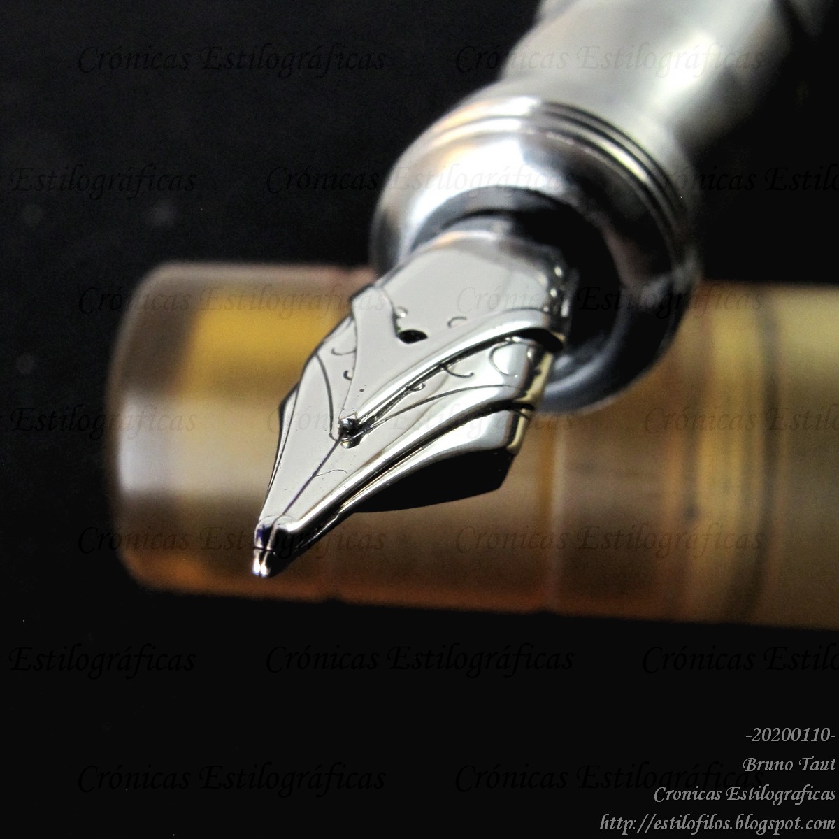
2019 was the year of the 100th anniversary of Platinum. This company managed the celebration a lot better than Pilot, whose centenary was celebrated in 2018, but Platinum quickly lost momentum after a promising start.

In Japan, the only new pen released in 2019 was the Pilot Custom NS (the Procyon, let us remember, was released in 2018). The NS is the first steel nib in the Custom family, and its price is about 20% lower than that the Custom 74 with a gold nib. Is this a correct strategy in the Japanese market?

Other than this Custom NS, there have not been any new pen—all there is are rehashed pens, minor cosmetic changes on well known models. The Prime, the Platinum pen to commemorate its 100th anniversary, is little else than a 3776 in silver costume. Sailor, on its side, is mastering the art of generating original models –this is the name they use— to be sold exclusively at a certain shop. It seems a very successful system to raise the attention of customers by creating a false sense of scarcity.


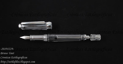
A sample of Platinum 3776 Centuries. All of them are essentially the same pen.


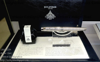
As this, The Prime, is also a 3776 in disguise. The Prime was the pen Platinum released to celebrate its 100th anniversary.
Anyway, not much new.

(The Capless LS has just been released in Japan and barely speaks about what went on along 2019. However, this is something new in the pen scene in Japan.)

In contrast, Taiwanese and Chinese pens are becoming a lot more active and innovative. They are offering new recreations of old filling systems with new models almost every month in the case of pens from the PR of China. Their distribution is also becoming more open and all those pens are easier to purchase.


This Wing Sung, obviously inspired on the Twsbi Vac700, in an example of the activity of many Chinese brands.


2. Ink Scene.
More colors more expensive. And the inflation continues.

The only positive side effect is the surge of small ink companies—Krishna in India, Trouble Maker in Philippines, Three Oysters in South Korea, Kala in Taiwan... But only time will say whether there is enough room for so many people. Or enough customers for so many colors...

But the radical approach to this would be to return to those old colors in unassuming inkwells for about JPY 400 per 30 ml: good and inexpensive ink.


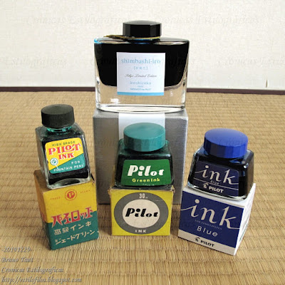
When initially marketed, Irishizuku's inks were very expensive. Now they are among the most inexpensive in the Japanese market. And even cheaper are the regular Pilot inks (the inkwell on the right): JPY 400 (plus tax) for 30 ml. This is the radical approach to the present inflation in inks and their prices.


3. Paper.
Paper, or good quality paper, is also becoming a luxury good. But the production costs might be at the heart of this phenomenon. The paper industry relies heavily on the economy of scale and a small community like that of fountain pen aficionados is unable to generate a big demand. The result--producing small batches to fulfill the demand of such small group is inherently expensive.


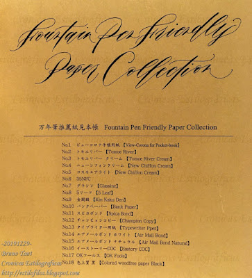
"Fountain Pen Friendly Paper Collection", by Yamamoto Paper. Some of those included on this pad are no longer available because some mills are no longer in business.

The alternative, for the time being, could be to go back to old Japanese scholar notebooks, some of which are made of good quality paper, albeit not labeled or advertised as “fountain pen friendly”. Kokuyo Campus, and regular Tsubame notebooks are two obvious options easily available.


This Tsubame paper is excellent and inexpensive. There are other rulings...


4. Events.
The Tokyo International Pen Show (TIPS) is here to stay after a very successful second edition. Its main feature –from my perspective— was the ability of gather people from far away locations. TIPS acted as the meeting point for aficionados from places as far away as Spain and Australia, and that despite being more of a stationery salon than of a pen show.


Tokyo International Pen Show. Not a pen show, but a meeting point.

In contrast, the active Tokyo pen community seems isolated and detached from the rest of the World.


5. Social Media.
I am new to this environment, and I am therefore very naïve –or simply skeptical- about it. However, it is hard to miss the huge activity on social media, and the personal connections created through them. The result is a much better connected pen community where parochial attitudes –like those of Japanese brands- are bound to fail.


Japanese companies have not understood anything related to social media, and behave following patterns anchored in the twentieth century, with segregated and separated markets. They do not seem to understand online shopping across borders.

On the contrary, Chinese and Taiwanese pen companies have embraced this new world and are taking benefit from their constant presence on them.


I am sure there is a lot more that could be said about this year 2019, but this is what called my attention.


WiPens Toledo – Montblanc Irish Green

Bruno Taut
Nakano, December 8th 2019
etiquetas: Japón, China, Taiwan, mercado, evento, redes sociales, Pilot, Platinum, Sailor, tinta

15 December 2019

Japanese Dorics

To my friend Croma, after a nice conversation in Madrid.

Copies are part of any industry, and therefore part of the pen industry. What is not tradition is plagiarism, some say...

On these pages we have already seen some examples of Japanese pens that were inspired –what an euphemism!- on models of success (see, for instance, ::1::, ::2::, and ::3::). So, this is nothing new, but there are always more models to describe, and some of them are very interesting.

Today I will call the attention to two different makers caught in the act of copying the same model—the Wahl Eversharp Doric (1931-1940).

The first example is a Sailor.


This is a plunger filler made of semitransparent celluloid. Its general shape is indeed close to that of the Doric. The clip, to name a detail, is remarkably similar.


Gold nib: "14 CRT GOLD / Sailor / REGISTERED / PATENT OFFICE / -1-".
On the clip, "SAILOR".


And engraved on the body, "SAILOR FOUNTAIN PEN".

Sailor manufactured this pen in 1937.

These are the dimensions:
Length closed: 123 mm
Length open: 110 mm
Length posted: 150 mm
Diameter: 11 mm
Weight: around 13.5 g (broken filling mechanism)

The second pen belongs to a very secondary maker called Order, about which nothing can I say.


An Order pen, signed on the cap and on the nib. On the cap, the inscription reads '"ORDER" / FOUNTAIN PEN'.

On this case, the pen is a lever filler, and also implements a golden nib. These are the dimensions:
Length closed: 120 mm
Length open: 112 mm
Length posted: 155 mm
Diameter: 13 mm
Weight: 16.3 g (dry)


On the nib: "ORDER / 14 KT / 5 / GOLD PEN".

These two pens show how copying was, and still is, a universal shortcut. And that Japan was paying close attention to what was happening beyond her borders.


My thanks to Mr. Sugimoto and Mr. Shobutsuen.


Yamada buffalo horn and silver – Pelikan 4001 Brilliant Brown

Bruno Taut
Nakano, December 13th 2019
etiquetas: Wahl Eversharp, Sailor, Order

13 November 2019

Kubota´s Yamada

NOTE (July 8th, 2023): There are some inaccuracies on this text: although the business Mannenhitsu-no Yamada strated in the early 1930s, the production of pens by Mr. Kubota started only in the 1980s or early 1990s. Some more informantion can be found on the following link: https://estilofilos.blogspot.com/2023/07/mannenhitsu-no-yamada.html.


There is more to Japanese pens nowadays than just the big three companies. I have written about some of the smaller companies on these pages--Masahiro, Eboya, StyloArt Karuizawa, Hakase, Ohashido, Wajimaya Zen-ni... even about the elusive Iwase Seisakusho.

But I had never mentioned Yamada Fountain Pens.

This company was founded by Mr. Yamada in Matsumoto (Nagano Prefecture) in the early 1930s. As of today, Mr. Hiroyoshi Kubota manages the operation.

Yamada pens are made to order. Ebonite is the base material, and Mr. Kubota decorates them inserting a number of materials (mother of pearl, gold, silver) and by adding elements made of buffalo horn and ivory. Some of those can be seen on the pictures of this text.


Three Yamada pens with three different decorative techniques.

Nibs and feeds are either Pilot or Sailor. On the present examples they are Sailor, although attached to Pilot converters.


Yamada pen, Sailor nib, Pilot converter. Buffalo horn and silver rings.

The main problem of Yamada pens is, once again, their anonymity. Nothing in them allows for a clear identification of the maker, and only the nibs carry any inscription, albeit misleading as these are not Pilot or Sailor products. The identification of these pens must be made through its general aspect, which is never an easy way to identify anything. The section of these pens, though, has a special and characteristic shape.


Yamada pens, Sailor nibs. And characteristic sections

But it is even worse than that--how do we contact Mr. Kubota? Yamada Fountain Pens does not have a website, and the most you can find is a postal address of the shop in Matsumoto, and a phone number.

Is this enough to keep the business running? Probably so--80 years of history speak high of the business model. Now, could Mr. Kubota enlarge the operation by becoming more accessible? Certainly so, but being a small business only that much demand he can meet.

And let´s not forget the appeal we collectors feel for the hard-to-find pen...


These are the contact details of Yamada Fountain Pens:
Mannenhitsu-no Yamada
2-5-11 Chuo
Matsumoto
Nagano 390-0811
Phone: +81 (0)263 32 2931


My thanks to Poplicola-san.


Lucky 9159 – Kingdom Note Fukutoshin Blue

Bruno Taut
Madrid, November 12th 2019
etiquetas: Sailor, Pilot, Mannenhitsu-no Yamada

08 October 2019

TIPS 2019. Again a Stationery Fair

This past weekend, the second edition of the Tokyo International Pen Show (TIPS) took place in the Ward of Taito in Tokyo. I attended it and these are my reflections.

The plain figures are very clear and straight-forward: about 2000 visitors, 1200 on the first day; about 200 foreigners; 86 tables with 71 traders. This means a big success and a significant improvement over the results of 2018: 1600 visitors and 50 traders.


People and inks. Are those the argument of TIPS?

My criticism this year is, in essence, the same as on 2018——this event was not a pen show, this was a stationery salon (like some others in Tokyo: Bungujoshi, Kamihaku, and Inkunuma (::1::, ::2::)) where you could find some fountain pens. Vintage pens, on their side, were limited to four or five tables——Wagner group, Seoul Pen Show, Andre Mora, Stylus Aurea, and Pen Land/Komehyo. And not even the parallel Wagner meeting on Sunday at a different venue, could correct this deficiency.


The table of the Seoul Pen Show with some vintage pens.

However, this didn't mean that there were no fountain pens. Many of the traders were well established stationers from all over Japan who have their own special pen models and inks, mostly made by Sailor. This was the case of BunguBox, Kingdom Note, Nagasawa, Ei-Publishing Co. (Shumi-no Bungubako)… And in fact there is a demand for all those somehow different pens—if only because of their colorful decoration.

This prevalent presence of Sailor –even if indirect-- made Leigh Reyes say that this was the pen show of Sailor. The presence of the other two big companies was marginal.


Sailor inks, Sailor pens. Kingdom Note.

The international presence was more important this year: Franklin-Christoph, Schon, Yaching Style, Armando Simoni Club, Andre Mora, Stylus Aurea, Aesthetic Bay... But they accounted to just about 10% of the traders.


Aesthetic Bay, from Singapore.


Franklin-Christoph, from USA.

All in all, the most interesting aspect of the show was, as is often the case, the community of users. On this edition, and much to my surprise, the number of visitors coming from overseas was particularly big. Organizers speak of 10% of the attendees being foreigners. That means about 200 people. I don't know how they came with this number, but I am afraid they considered any long term resident in Japan as foreign visitor. Anyway, this edition attracted visitors from Australia, Hong Kong, Taiwan, Thailand, Philippines, Singapore, United States, Canada, France, Italy, Spain... This fact is indeed remarkable and contributed to provide a cosmopolitan air to an otherwise very parochial show.


An active and enthusiastic group of foreign visitors.

TIPS is not a pen show, and TIPS is barely international. But 2000 visitors move a lot of money and are a powerful argument not to change the business model.

At the end, the stationery market is a lot more important and lucrative than that of fountain pens.


Paper, paper, paper...


NOTE: TIPS 2020 will take place on November 7th and 8th in Hamamatsucho area in Tokyo.


My thanks a Inktraveler for several of the pictures here included.


Parker 51 Demi 1948 – Kobe Nagasawa Bokko

Bruno Taut
Nakano, October 8th 2019
etiquetas: mercado, evento, Sailor, Tokyo, papelería

05 August 2019

A Pen Is A Pen

A pen must write well in any country. That should be a given, but not all pens perform correctly.

When a Japanese pen is at fault, the different writing scripts –Kanji and kana in Japan, alphabet in the West— have been used by some to explain why it did not work properly, and even to justify how suitable a pen is for certain market.

These are some examples:

Some years ago, it became well known that the size #10 Falcon nib by Pilot (present on the models Custom 742 and Custom Heritage 912) did not always behave properly (::1::, ::2::). Many units tended to railroad under almost any pressure. But to this obvious fault some in the West invoked the special way of writing (Japanese, that is) to explain and justify that failure.


Pilot Custom 742 with a Falcon nib.

More recently, Davidoff argued –at least in Japan-- that their nibs were perfectly suited for Japan because their nibs were Sailor's... Like if Pelikan and Montblanc pens were so bad at that and had a hard time in the Japanese market.


Davidoff pens.

The case of Naginata Togi nibs has already been discussed on these pages. In the Japanese market, Sailor brags about how suitable those nibs are to write Japanse (::3::, ::4::), but that does not prevent Sailor from selling them in the West...


Sailor Naginata Togi nibs.

All those examples are nothing but bland excuses and cheap marketing. A pen is a pen and must write well in any script. And Pilot claimed this long time ago:

A Namiki ad from 1927 in the UK explained that the Japanese writing was the perfect benchmark to ensure the correct performance of their pens under any circumstance... such as writing in alphabet!


The Bookseller & the Stationery Trades Journal, July 1927. Page 27. As seen at the Pen Station, Tokyo, in April of 2013. Japanese as the perfect test for any pen!

Japanese are not from another planet. Neither are Westerners when seen from Japan.


Sailor Profit Naginata Togi – Pilot Iroshizuku Ku-jaku

Bruno Taut
Nakano, July - August 2019
etiquetas: mercado, Japón, japonés, Pilot, Sailor, Davidoff, plumín

08 April 2019

The Case of Naginata. V. Results

On the previous Chronicle, I wondered whether the alleged virtues of the Naginata Togi nebs were real and detectable. To do so, I published a picture with seven sets of ideograms --焼肉定食, yakiniku teishoku--, all of them written by the same Japanese hand using seven different pens. Then I asked if we could find out which one had been written with a Naginata.

From top to bottom, the pens were as follows:

- Kubo Kohei nib. Unlabeled point, but it is about an MF.
- Montblanc 149 (F?)
- Henckel nib, architect grind.
- Sailor Naginata Togi, NMF.
- Pilot #5, music nib.
- Pelikan M200, F.
- Pilot Vpen, F.


The solutions to the question of last Chronicle.

The most popular answer –both on comments to my text and on Instagram-- was number 5; that is, the music nib by Pilot.

This result is surprising—either people love the results of writing with a stub nib or most of us do not really know how a Naginata nib is actually cut.

On second position came number 3 –a Henckel nib with an architect grind--, and on third, the actual Naginata Togi. This is more reasonable, as the Naginata nib can be seen as a smooth architect's nib.


The architect's grind on a Henckel nib.


A Naginata Togi nib.

The conclusion is that the alleged beautifying effects on the writing come only through practice with the Naginata Togi nib itself. But if so, many people, in Japan and overseas, buy Naginata pens without really knowing how to use them and take no benefit of their supposed advantages.

But Naginata Togi nibs are excellent writers for whatever script, Eastern or Western. And christening a nib with an exotic name is an excellent marketing strategy.


Sailor Profit Naginata Togi – Pilot Iroshizuku Ku-jaku

Bruno Taut
Bunkyo, April 2nd 2019
etiquetas: plumín, Sailor, japonés (idioma), mercado