Showing posts with label plumín musical. Show all posts

31 May 2013

Transitional

Some weeks ago, I wrote about a Platinum pen from the 1960s that sported a beautiful music nib. Following a couple of indicators I guessed that it had been made by the mid 1960s. One of those was the old globe logo of Platinum engraved on the nib and on the cap. This old globe, let us remember, had been officially replaced in 1968 by the current logo showing a P.


The P-300 Platinum.


The nib in detail--the old Platinum logo together with the manufacturing date--544, May 1969.

A more careful inspection of nib revealed the imprint of a date—544, or May of Showa year 44, corresponding to 1969. And that on the same side of the nib stamped with the pre-1968 logo.


A newer Platinum music nib with the post-1968 logo--save transitional units. This newer nib was cast in 1973.

This nib, thus, shows that the transition between logos took some time. “Sounds very Platinum”, a stylophile friend told me in Tokyo. “They often take decisions before having the money to implement them.”

And the Platinum P-300 I showed was manufactured later than I had assumed. The nib was stamped in 1969.


Platinum 3776 (1978) – Platinum Blue-Black

Bruno Taut
Machida, May 7th 2013
etiquetas: Platinum, plumín musical, plumín

09 April 2013

Sixties Music

Music nibs are not a Japanese invention, but it seems that it is only in this country where they have found the favor of pen companies on these days (see ::1:: and ::2::). As about pen aficionados, that is not the case given the popularity of these nibs in other markets.

Music nibs have been produced in Japan since, at least, 1950s, as we have already seen on these Chronicles by courtesy of nibmeister Yamada, and of some others. However, they are not easy to find –and I try hard--, and any success is always a source of joy.

The following Platinum pen is one such example. Simply put, this is a cartridge-converter pen made of plastic with a metallic cap, black with golden decorative elements. And the nib is a three-tined beauty made of 18 K gold. It is smooth and juicy, and shows a nice line variation.


The inside of this pen. The nib and feed can be taken out of the section upon disassembling the central ring. The converter on the picture in an old model.

These are the dimensions of the pen:
Length closed: 142 mm
Length open: 124 mm
Length posted: 153 mm
Diameter: 12 mm
Weight (dry): 10.8 g
Ink capacity: 1.2 ml (Platinum cartridge) and 0.53 ml (Platinum converter) (data taken form Platinum's catalog)


Writing sample with this music nib by Platinum. The small square is 2 mm wide. The ink is a Sailor Jentle in a color ordered by the Wagner group of pen collectors.

This pen is very nicely balanced and is perfectly usable as a regular pen. Some users, though, might consider this nib to be too broad, but that did not bother me at the time of writing this text.

Masa Sunami reported on a similar pen on the book The 101 Pen’s Collection of M. Sunami (M. SUNAMI and S. NAKAJIMA. Hankyu Communications Ltd. 2006. ISBN: 978-4-484-06221-1) and dates it from 1966.

NOTE added on May 31st, 2013: This pen was made in 1969. Please, check the Chronicle Transitional.

Platinum P-300, music nib – Platinum Black

Bruno Taut
Shinjuku, April 5th, 2013
etiquetas: Platinum, plumín, plumín musical

06 February 2013

On Candies. Correction

Some months ago I wrote several texts (::1::, ::2::) on the Clear Candy fountain pen Sailor released in 2011. On those texts, I mentioned that the origin of those pens was a previous line called A. S. Manhattaner. Well, that was true, but just in part.


The 2011 Sailor Clear Candy.

Actually, some sources (Masa Sunami and Andreas Lambrou, magazine Shumi no Bungubako –issue 19-- and some websites like ::1::, ::2:: and ::3::, all three checked on January 2013) teach that there was a Candy fountain pen, by Sailor, released in the 1970s. It was, actually, a big success, selling about four million units in two years. The structure of this first Candy was entirely the same as the current model, as can be seen on the pictures. But as commentator and friend Koskas K pointed out, these early Candy pens had their nibs marked as made in Taiwan.


Several ads of the Sailor Candy from 1970s. Picture taken from Sailor's shop website, as shown on the picture's watermark.


A 1970s Sailor Candy. The motiff of the cap jewel has changed along the history of the model since 1976. Picture by Kostas K.


The F-2 nib made in Taiwan. Picture by Kostas K.

Incidentally, I will add that in 1979 there existed the option of a three-tined music nib made of steel on these inexpensive pens. They were called Candy Music and are now a rarity. Let us remember that the current line of music nibs by Sailor has only two tines.


The 2011 Clear Candy pen does not have its nib imprinted with the "MADE IN TAIWAN" sign.


2011 Clear Candy pens at stationery shops in Japan (2011).

To summarize—the true origin of the Sailor Clear Candy line of pens released in 2011 on the occasion of the 100th anniversary of the company dates back from 1976, when the first Sailor Candy was released.

My thanks and appreciation to Mr. Kostas K.


Sailor Profit Junior, 14 K music nib – Diamine Graphite

Bruno Taut
Yokohama, January 30th, 2013
etiquetas: Sailor, plumín musical, Shumi no Bungubako, plumín, Taiwan

06 March 2012

Waterman's Music

Wagner meetings, I have already mentioned on these chronicles, are always a wonderful opportunity to see great pens in the hands of passionate stylophiles.

The impressive collection. Or part of it...

Nibmeister Yamada is the happy owner of an impressive collection of early Waterman pens. Among them, a model 54 (a lever filler, 5) with a wonderful music nib in size 4.

The Waterman 54 and its nib.

This three-tined nib is really flexible and remarkably wet. The slits are quite subtle, and it takes some attention to realize this is an unusual nib. There is one single breathing hole half-way between the tines, and that makes the nib to have a very normal look.

A sample of the ways of this wonderful nib.

My thanks to Mr. Yamada.

(Aurora 88 – Pelikan 4001 Blue-black)

Bruno Taut
March 4, 2012
[labels: Waterman, evento, plumín]

13 February 2012

Profit Realo

Pen review: Sailor Profit Realo with a Cross-music nib.

To a certain extent, this review has already been written and published on these chronicles. The two most distinctive elements of this pen were analyzed, or deconstructed, and put in the context of the current catalog of Sailor pens: Are this nib and this filling system worth the price we would have to pay for them?


I should start this review by saying that this pen is a frankenpen. This combination of nib, a specialty nib by Nagahara, and filling system is not included in the catalog of the brand—specialty nibs are associated to cartridge-converter pens. But this frankenpen allows us to cover several elements that are to be found on a number of Sailor pens.

This Sailor is the regular Realo model and NOT the limited edition from 2006 based on the King of Pen model. Regular Realo pens implement the senior nib size in 21 K gold. Smaller nibs are the junior size –in 14 and 21 K gold--, and bigger, the King of Pen nibs in 21 K gold.


1. Appearance and design. (7.0/10)
This model, the Profit, it a cigar type pen à la Montblanc. Being a Realo implies its filling system was a piston, and its barrel has an ink window. Its very obvious design, the window is framed by two golden rings, is not the most charming one—it makes me miss the more subtle appearance of original Realo made for the 95th anniversary (2006). The ink deposit is on the small size.

The decorative elements on this pen are golden, and this seems to be the only option for Realo models.


2. Construction and quality. (9.0/10)
Very good quality. The plastic material –that precious resin of some other manufacturers—is resistant to scratches. Posted, the cap fits well on the barrel and does not leave any mark. The piston action is very smooth and requires little effort. So far, this has not compromised its seal.


3. Weight and dimensions. (9.0/10)
As I mentioned on the introduction, the regular size Realo is based on the senior size in Sailor’s line of pens. This means that all senior size nibs fit in this pen’s section.

This is a well balanced pen, especially if unposted. These are the dimensions:

Diameter: 16 mm.
Length closed: 142 mm.
Length open: 122 mm.
Length posted: 157 mm.
Weight: 22.0 g.
Ink deposit: 1.0 ml.
Balance open: center of masses at 67 mm to the tip (55%-45%).
Balance posted: center of masses at 89 mm to the tip (57%-43%).

The feed is made of plastic.

4. Nib and writing performance. (9.5/10)
Sailor’s specialty nibs are indeed unique. This Cross-music is the result of overlapping two nibs. The four tines and two slits ensure a juicy and constant flow of ink. There exists a further sophistication for this (and the rest of specialty nibs)—the implementation of an overfeed, by the name of “emperor”, to make sure that the high demand of ink of this nib is met. The emperor has a hefty price—JPY 10,000 to add to the already high price of these nibs.

The 21 K gold nib. The tip is certainly big, but it is also very carefully cut.

The nib point is cut to provide a very broad horizontal line and a fine vertical one. But that is not all—increasing the angle between pen and paper the line becomes thin in all directions.

This nib performs its duty wonderfully (and therefore, there is barely any need of any overfeed), but at a high cost in material, labor and money. Much simpler fude nibs do a very similar job at a lower cost.


5. Filling system and maintenance. (7.0/10)
Sailor Realos are piston fillers, and that attracts the attention of a number of pen aficionados. However, this pen’s ink capacity –1.0 ml— is smaller than that of a Sailor converter (1.2 ml). In a sense, this pen embodies the contradictions of those who demand sophisticated filling systems regardless the ink capacity. Needless to say, Sailor Realos are not the only example of this.

Maintenance wise, any piston filler is a bit more complex than most other systems. Disassembling the piston requires some tools and not all stylophiles have them at hand or are inclined to tinker with their beloved pens.

Nib and feed, though can easily be removed from the section. Cleaning them is so an easy process.

On this picture, the piston can be seen through the window.

6. Cost and value. (6.0/10)
This is an expensive pen. Cross-music nibs are associated to pens whose price is around JPY 50000, and Realos have a tag of JPY 30000. Exchanging the nibs and selling that complete pen we did not want (a cartridge-converter pen with a regular fine or medium nib) helps to lower the price, but by not much. However, this two-fold nib is unique and provides a wonderful writing experience.


7. Conclusion. (47.5/60=79/100)
Expensive pen with a unique nib and a small self-filling ink deposit. Other Sailor pens provide similar features at lower prices by simplifying the nib or the filling system.

No company nowadays compete with Sailor in the market of innovative and complex nibs. Montblanc pens, the obvious model for the Profit, are not cheap either, but Montblanc’s nibs are nowhere near the beautiful sophistication of this Cross-music.


(Sailor Profit Realo – Athena Sepia)

Bruno Taut
February 9th, 2012
[labels: Sailor, soluciones técnicas, plumín, Montblanc]

31 January 2012

Cross-music

The cross-music nib is one of the specialty nibs created by nibmeister Nagahara. Being a cross nib means that it is composed by two overlapping nibs. Therefore, it has four tines and two slits, and the space between the nibs acts as an additional reservoir of ink. The primary result is a fairly wet nib with a broad line… if so we wanted.

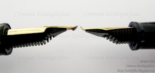
The two-fold cross-music nib on the left and a fude nib (55 degrees) on the right. The fude nib is not tipped.

The second characteristic of the cross-music is the way the point is cut: the vertical lines are very fine, and the horizontal strokes are very broad. However, grabbing the pen at a high angle with respect to the paper generates a fine line drawn only by the upper nib of the set.

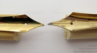
Steel fude nib on the left, and gold cross-music on the right.

This way of writing is very similar to that of fude nibs, also made by Sailor, and by some other Asian brands. The problem is the price difference between them.

Writing samples. The color rendition of the scanned page is very inaccurate. The angles shown on the image are those between pen and paper.

Needless to say, the cross-music nib is a lot more complex than any fude, and its price reflects this in a quite dramatic way. For similar looking pens –Sailor’s Profit in senior size, 21 K gold nibs, cartridge-converter filling system—the cross-music nib has an overprice of JPY 15000: JPY 50000 for the cross-music, and JPY 35000 for the naginata fude. And if we were interested mostly on the function, there are even cheaper options: fude pens by Sailor with steel nibs bended at angles of 40 or 55 degrees are available for only JPY 1000.

The cross-music nib in a Profit Realo, on top, and, on bottom, a Fude pen (55 degrees) in a balance model by Sailor.

Chasing the nib over the pen has some interesting consequences. The cross-music nib, though, is truly exciting.

(Sailor ふでDEまんねん, 40 degrees – Waterman South Sea Blue)

Bruno Taut
January 29, 2012
[etiquetas: plumín, Sailor]

17 October 2011

Young Music

Pen review of the Sailor Young Profit (Somiko in some markets) with music nib.

Feeding my inclination for music nibs I have finally put my hands on this single-slit nib labeled as music by Sailor Company. This is the cheapest music nib among those made in Japan.


1. Appearance and design. (6.0/10)
This is a black pen with golden accents. Even the steel nib is gold plated to match. Therefore, it keeps the classical serious and formal look of many a pen. However, this is not a torpedo pen à la Montblanc despite the model name—Profit pens are the Sailor copies of the German formal pens.

This pen, in a nutshell, is a cartridge-converter, with a snap on cap and a rigid steel nib. All very correct and functional, and nothing really exciting.


2. Construction and quality. (8.0/10)
The materials employed on this pen are correct and show no abnormal wear. Everything seems right. The pen looks durable and ready for years of use.


3. Weight and dimensions. (8.0/10)
Medium weighted pen, which is somehow surprising as it is mostly made of plastic. Fortunately, it is well balanced either posted or unposted.

Dimensions:
Diameter: 12.0 mm.

Length capped: 135 mm.
Length uncapped: 123 mm.
Length posted: 145 mm.
Dry weight: 18.1 g (including the converter).


4. Nib and writing performance. (7.5/10)
Once again, this is the key point of the pen. The nib seems to be the only argument in an inexpensive cartridge-converter pen with boring looks.

This music nib is made of steel and is gold plated through a process of physical vapor deposition. Sailor was a pioneer in using it for pen nibs and decided to mark it with the acronym TIGP: Titanium Ion Gold Plated. However, this is still a steel nib with no special geometry. So, it is also quite rigid.

The nicely engraved steel nib. On top, the acronym TIGP describing the plating process. On the side, MS shows this is a music nib.

Performance-wise, this pen shows a nice line variation between the strokes horizontal (parallel to the tines) and vertical (normal to the tines). However, it is quite critical on this nib to write with no inclination between the nib and the paper. Or in other words—both tines have to be in good contact with the paper. Otherwise, the nib becomes dry and easily looses the ink line. The reason for this behavior, annoying most of the time, lies in the width of the tine, wider than usual. Then, small angles between nib and paper create bigger gaps between the slit and the paper thus breaking the ink drop.


This is not the case in three-tine music nibs because the second slit naturally shortens the outer tines thus making the gaps due to pen inclinations less critical to the nib performance. This Sailor music nib is not suitable for those who use oblique nibs.

All this makes me confirm my initial impression of this nib—it is more of a stub than of a music nib. It is, nonetheless, an interesting and upscale alternative to calligraphy (i. e. italic) nibs.

Writing sample of the Sailor Young Profit with music nib.

5. Filling system and maintenance. (6.5/10)
This is, as are most Japanese pens, a cartridge-converter pen. The converter, of 0.7 ml of capacity, is on the small side for the wide line of this nib. Having a replacement cartridge with this pen is a must.

Nib and feed can easily be detached from the barrel by pulling them. Cleaning the pen is very easy.


6. Cost and value. (8.5/10)
For JPY 5000 (plus taxes) you get a smooth and rigid stub that Sailor insists in labeling as music. It is not easy to master and many would never go through the effort of getting use to it. Two are, in my opinion, the alternatives to this pen: One is the more expensive three-tine music nibs by Pilot and Platinum. The other is any of the calligraphy sets by a number of Western companies. Those Japanese music nibs are easier to use, whereas with those italic sets we are bound to encounter similar problems to those we faced with this Sailor music nib.


7. Conclusion. (43.5/60=72.5/100)
Not very high marks for this pen. Its only interesting feature is the nib, but it is not very user friendly, and, compared to other music nibs as Sailor insists with its naming, it is not a real competitor. The rest of the pen is fairly uneventful.

(Sailor Young Profit with music nib – Sailor Tokiwa-matsu)

Bruno Taut
Yokohama, October 17th, 2011
[labels: plumín, Sailor]

13 October 2011

Music Metaphysics

The NK nib by Kubo Kohei I showed some weeks ago raises some metaphysical questions on the essence of music nibs. What is indeed a music nib?

Kubo Kohei´s music nib in steel.

This Japanese nib, let us remember now, barely shows any line variation unless was pushed down against the paper. And at the same time, the second slit does provide the extra ink flow this wider line demands.


Modern three-tined music nibs: one by Platinum (on top) and two by Pilot.

Music shiro nib by Platinum (mid 1950s).

On the other hand, I voluntarily ignored Sailor´s approach to music nibs when I compared those by Pilot and by Platinum a year ago. “Sailor´s”, I said, “lacks the visual appeal and the extra flow of the second slit. Sailor´s is more of a smooth stub than a real music nib.” But it really shows some line variation.

Modern two-tined music nib by Sailor in steel.

So, what is the essence of a music nib? Is it on the line variation? If so, mostly any stub or italic nib —broad vertical stroke and thin horizontal one— could qualify for such.

What about the three tines? Should this be the standard, what do we do with three-tined nibs showing barely any line variation, like that by Kubo Kohei?

Pilot pen from 1970s with a three-tined music nib in 14 K gold.

Some stylophiles claim that a true music nib must show some flexibility, thus dismissing all those modern Japan-made music nibs. But then, does any flexible or semi-flexible nib qualify for this category? Again, the case of Kubo Kohei´s nib comes in handy—it is not really very different from a semi-flex nib in its performance, but regular nibs showing some flexibility are not considered music nibs.

One more note on this regard. One of those wonderful specialty nibs by Sailor´s master Nagahara is named Cross Music. It has not just three tines but four by means of overlapping two nibs. The result is a very juicy point with a wonderful line variation opposite to that of a standard music nib and closer to an Arabic or fude nibs: thin vertical strokes and wide, very wide, horizontal lines.

The Cross Music nib by Sailor´s nibmeister Nagahara.

Reverse view of the Cross Music nib. The four tines are now visible.

At the end, we might conclude that a music nib is any nib the maker wanted to label as such. Just like a novel is any text under whose title the author added the word “novel.”

(Sailor Young Profit with music nib – Sailor Blue)

Bruno Taut
Yokohama, September-October, 2011
[labels: Pilot, Platinum, Sailor, Kubo Kohei, plumín, plumín musical]