29 September 2010

500

I had already seen this pen in previous pen clinics, but I cannot help showing my admiration for what I consider a beautiful pen.


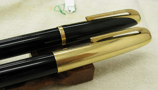
This is the Pilot Super Ultra 500, from 1959. It was designed by Shigeki Chiba and won several design awards. But its production was too expensive and the model was short lived.


In 1995, Pilot made a replica of the original, albeit with a different filling system. The 1959 model used the switch or quarter turn filler whereas the replica was a cartridge/converter pen.


Mr. Niikura brought two variations of the original pen. One with a gold plated cap, and another one –more interesting in my opinion— with a black cap with golden accents shaped as the inlaid nib inside.


Currently, these pens are highly priced in the second hand market.

With thanks to Mr. Niikura for showing these beauties.

(Pilot Elite Pocket Pen with crosshatched cap (H187) – Pilot Iroshizuku Yama-guri)

Bruno Taut
Inagi, September 28, 2010
labels: evento, Pilot

28 September 2010

Dissipation

This month’s Wagner Pen Clinic was more crowded than in previous occasions. The weather was very nice in Tokyo this past weekend and it invited to go out after the humid Turkish-bath-like days of this past summer.

To this event, Mr Noguchi, the expert in commemorative editions, brought the pen Sailor marketed on the occasion of its 90th anniversary in 2001. It is called “Mannenhitsu Doraku” (万年筆楽), which could be translated as Stylographic Dissipation. That really seems an apt name for all us stylophiles.


This is a very beautiful pen. It is made of carefully treated rosewood. Only 200 units were produced.


However beautiful, its main feature is the nib. Sailor opted for one of its specialty nibs created by master Nobuyoshi Nagahara—the two-fold cross nib. This is a very wet and broad nib, a real pleasure for the senses—might this be what Sailor meant by “Stylographic Dissipation”…


One of the usual attendees to these pen clinics is another creative craftsman—Mr. Yamada. So, comparing the Sailor cross nib to the two folded creation by Mr. Yamada based upon the Pelikan Souverän M800, already mentioned in these chronicles, was only natural.

On the left, and on top on the last picture, the Mr. Yamada's re-creation of a Pelikan M800. On the left, bottom on the last picture, the Sailor cross nib by master Nagahara.

The writing experiences with those pens are difficult to judge, and personal preferences will play the most important role in this call. What is very different, and very significant is the filling system on each of those pens. The Pelikan uses its traditional piston filling system whose ink capacity is about 2 ml. On the other side, Sailor chose a cartridge/converter system with an ink capacity of about 0.6 ml for the converter, and 0.9 for the cartridge. These values are fairly small when dealing with ink guzzlers like these nibs.

The somehow disappointing insides of a beautiful pen.

That is a major problem among Japanese pen manufacturers. And only recently this is changing with pens like the Sailor Realo and the Pilot Custom 823. Now, these two companies have the possibility to combine exciting nibs with interesting –and generous— filling systems.

With thanks to Mr. Noguchi.

(Waterman Lever Filler made in Canada – Sailor Red Brown)

Bruno Taut
(Inagi, September 28, 2010)
[labels: evento, plumín, Sailor, Pilot]

24 September 2010

Dilemma

There's a big dilemma
About my Big Leg Emma, uh-huh, oh yeah
(Frank Zappa)

To ink or not to ink: that is the question.

Now Old Stock (NOS) –for those who are not familiar with this jargon— are goods no longer on production that have never been sold at retail. Therefore, NOS goods are nominally new—mint in their condition. Consequently, in the second hand market, they are higher considered than any used equipment, no matter how perfect its condition.

Then, should we ink NOS pens or not? Every stylophile has his own opinion. Personally, I do ink them—I buy pens to use them and that is my reason to buy more pens. And in doing so, I have encountered some that did not perform well at all and needed adjustment.


The last of such cases was a Pilot Murex (MR) whose ink flow was quite dry. Nibmeister Paco, a regular at the Wagner pen clinics, took good care of the problem. That Pilot now writes wonderfully. But this reluctance to ink pens poses an interesting question: How many of those NOS pens, so valued by some collectors, do actually write?

This coming Sunday –September 26th—the monthly meeting of the Wagner association will take place at the usual venue near Ebisu Station in Tokyo from 9:30 to 17:00.

October will hold, other than the usual Wagner meeting, the yearly Fuente Pen Show on the weekend of the 23rd and 24th. Presumably, it will be celebrated at the Scandinavian Crafts Gallery “Hokuo-no Takumi” (北欧の匠) in Ginza (Chuo ward, Tokyo).

And given the offer of pens in those events…
To attend or not to attend: that is the question...

(Pilot Custom 74 with music nib – Sailor Red Brown)

Bruno Taut
(Inagi, September 22, 2010)
[labels: evento, estilofilia]

21 September 2010

Inadequate

Following the advice I received at the Pilot Pen Station re my Pilot Custom 742 with falcon nib, I attended one of the pen clinics this company organized in collaboration with a department store this past week.

There I went with my pen. I showed my problem to the “pen doctor”–a clear lack of ink flow when flexing the nib, and problems to start—, and I let him work. He changed the feed and readjusted its inner core. He also tried to modify the geometry of the nib by pushing the tip downwards, like trying to make a posting nib—clearly an attempt to reduce the flexibility of this falcon nib.


The pen indeed improved. The flow is now more adequate to the demands of the flexible nib, and it now more reliable at starting. But the problems have not disappeared—the nib still railroads more often that what is desirable even if writing slowly. Better behaved pen it is now: acceptable for regular writing, but not up to the real challenge of its flexible character.

Writing "I am" the railroading became very evident, and was followed by a total absence of ink in the nib—the m is totally lost.

The “pen doctor’s” recommendation was the same I received at the Pilot headquarters at the Pen Station: don’t flex, write lightly. Flexing, he added, is the cause of the problems to start to write because it removes the ink from the nib.

Frustrating—and expected.

As I already explained, there is no point in this nib other that its flexibility in order to write with some line variation. For any other purpose, Pilot makes a number of nibs perfectly able to perform correctly.

Falcon nibs by Pilot showing the characteristic cuts on the sides. The size 15 is less flexible, but more reliable. More expensive too.

If not to flex, why cutting the sides of the nib?

So, the conclusion is that Pilot has failed twice with this nib—in the design of the feed, and in the support to those who bought it. Blaming the customer is seldom a good strategy.

(Platinum 3776 with music nib – Sailor Red Brown)

Bruno Taut
Shinjuku, September 18, 2010
[labels: Pilot, plumín]

17 September 2010

Encore

Pen review: Pilot Custom 74 with music nib.

Living in Tokyo, running into a music nib is very easy. Pilot’s overwhelming presence in department stores and stationery shops is often shown with a tray with eleven Custom 74 pens on it—each of them with a different nib. And the last one on the right hand side is the music nib. So, there is no need to ask anybody for an inkwell and a piece of paper. The pen is inked and the paper is right there.

Some weeks ago, I wrote a chronicle ("Ongaku") on music nibs, and I used a Platinum 3776 and a Pilot Custom 742 as the testing subjects. The later has the size 10 Pilot nib. The ubiquitous Custom 74 has the smaller size 5 nibs. Then, is there any difference between them? That is the point of this review.


1. Appearance and design. (7.25/10)
The Custom 74 is, once again, a black torpedo à la Mont Blanc. It is slightly shorter than the 742 model and looks less balanced in its proportions. Material-wise, this one is made with the same plastic —or is it a precious resin?— as its bigger relative.


2. Construction and quality. (9.0/10)
Solid. Good quality. No flaws.


3. Weight and dimensions. (7.75/10)
It is a well balanced pen when unposted. Being this pen shorter than the 742, this pen feels closer in the hand to the nicer balance of the Platinum.

Dimensions:
Diameter: 13 mm.
Length capped: 143 mm.
Length uncapped: 125 mm.
Length posted: 160 mm.
Weight: 22 g.


4. Nib and performance. (7.75/10)
The nib is a 14 karat gold one with two slits. The feed is conventional with only one ink groove. There are occasional loses in the ink flow.


This nib—with the testing ink, Sailor Red Brown—shows some feedback, without becoming uncomfortable.

This is, in fact, a very interesting point. At the shops where I tested this pen so many times, this nib felt quite smooth. The ink in its cartridges —at the shop— was almost invariably Pilot Black. But for the purpose of this reviews I wanted to use a non biased ink; not Pilot, not Platinum—a Sailor ink. We certainly know that no pen works well with absolutely every ink, nor any ink works well in every single pen out there.


All in all, I feel this nib to be a tad smoother than its close relative in the Custom 742.


5. Filling system and maintenance. (7.5/10)
Everything I said about the Custom 742 applies here: easy to clean pen, easy to extract nib and feed from the section, excellent converter (CON-70).

The only drawback is that, in this case, the converter is not included with the pen and needs to be purchased separately.


6. Cost and value. (8.25/10)
This pen is significantly cheaper that the Custom 742 and it gives a similar if not better writing experience. So, I think this pen is a better value than the 742.

Now, compared to the Platinum 3776, this pen’s nib is not up to the challenge—the Platinum music nib is much better.


7. Conclusion. (47.5/60=79/100)
Given its price, this pen is a very interesting option for those wanting a music nib. It is certainly no match —nib wise— to the Platinum 3776, but the Custom 74 offers other features: better quality materials and a much better converter with bigger ink capacity.

The final score is a middle point between the Custom 742 and the 3776 analyzed previously on these Chronicles.

(Pilot Custom 74 with music nib – Sailor Red Brown)

Bruno Taut
(Inagi, September 13, 2010)
[labels: Pilot, plumín, Platinum]

14 September 2010

Parallel

This is one of these chronicles I hesitate to publish, so advertisement-like it might look. Especially as there is hardly any competition in the market for this product. But here I go...

An italic nib –we all know— is a nib whose line is thin on the horizontal strokes and broad on the vertical ones. And its edges are sharp, the theory goes, to ensure clear and well-defined lines.

Currently not many companies market italic nibs. Most of those sell calligraphy sets composed by several italic nibs of different widths. In a more expensive range, Pelikan has recently released a Souverän M800 with a 1.5 mm italic nib marked as IB.

Handwritten sample with one of the Parallel Pens. I used a standard inkWaterman's Florida Blue— instead of the dedicated Parallel-Pen ink.

Pilot offers the models Plumix –in the American market— and Pluminix –in Europe— with medium italic nibs of about 1 mm wide. But those are not sold in Japan. The closest to an italic are a stub and a three-tine music nibs in some of the Pilot Custom models. These two nibs have their edges polished and are fairly smooth in their writing.


The alternative, for italic writing, Pilot offers is the Parallel Pen. Apparently, these pens are very different to a fountain pen. Instead of a cylindrical or conical nib with a slit, the writing element in a Parallel Pen is composed by two thin plates that drive the ink to the lower flat end. The feeding system, however, is the same for a fountain pen and a parallel pen. And both use water-based ink.

Side and front views of the Parallel Pen nib.

Parallel Pens come in four sizes –1.5, 2.4, 3.8, and 6.0 mm. All of them are smooth and wet writers. The creative possibilities, endless. Especially for those touched with any artistic ability, which is not my case. These pens, however, can hardly become daily writers.

All four Parallel Pens. On the picture, only the red ink is specific for these pens. Yellow and green are Sailor's, and blue is Waterman's. Note how the pen with yellow ink became contaminated with red ink simply by writing on top of the later.

Pilot claims that the ink they provide is specific for these pens. They offer a selection of twelve colors in standard Pilot ink cartridges. All of them, they say, mixable. But despite these warnings, I have tried other inks –Waterman and Sailor in particular— in these pens with very good results. Now, intermixing them might be an issue. We know by now, though, that all Sailor inks –save the obvious exceptions of the pigmented black Kiwa Guro and blue-black Sei Bokucould be mixed.


Each of the pens comes in a plastic box that includes two cartridges –black and red—, a Pilot converter, and a cleaning sheet. The instructions say that the converter is only for cleaning purposes… Well, they do try to sell their overpriced cartridges. But at the same time, cartridges provide too little ink for these ink guzzlers. Then, a look at the barrel shows it is made entirely in plastic and the pen could easily be transformed into an eyedropper.

(Pilot Murex – Pilot Black)

Bruno Taut
(Chuo, Tokyo, September 11, 2010)
[labels: Pilot, plumín, papelería, caligrafía]

10 September 2010

Egg

Review of the Tombow Zoom 828 (1989).

Some days ago I spoke about a jumbo pen presumably made by Platinum/Nakaya. As I already explained, jumbo pens were oversize in their girth and somehow short in their length. Although their golden age were the thirties and forties, they have been on production –sometimes as souvenirs— until recently. Such was the case, for instance, of the Platinum Glamour from the 1980s.

Another example could be the pen under analysis today—the Tombow Zoom 828, also known as “the egg”. Tomow realeased writing tools with this shape in 1987, but the fountain pen had to wait until 1989. The original price was JPY 3500.


Tombow is a company very fond of new designs and of rethinking the form and use of writing utensils. Thus, very thin, or very short, or very thick pens could be found in its catalog. In this task, Tombow has collaborated with a number of designers well beyond the Japanese borders.

1. Appearance and design. (8.0/10)
This pen is a short and fat version of the stereotypical Montblanc torpedo. Its shape and size are unusual and many express their skepticism at its functionality. But that is the topic of another section of this review.

Suffice to say now that this design is an additional twist to a very traditional idea of a fountain pen.


2. Construction and quality. (7.5/10)
Some people might call this a “precious resin”, but at the end, it is plastic. This one in particular seems quite resistant to scratches. The golden coatings on clip and nib are disappearing. This pen, I must say, endured constant and heavy use during my college years.

So, I give it a 7.5 because it was not an expensive pen and it still works perfectly after years of heavy use—albeit cosmetically is quite worn.


3. Weight and dimensions. (7.5/10)
This is the key point of this pen.

Diameter: 23 mm
Length capped: 110 mm
Length uncapped: 98 mm
Length posted: 135 mm
Weight: 32 g

Figure wise, this is a heavy pen. But being so short, the center of gravity is well between the grabbing fingers. Therefore, the balance of this pen is very good. The overall comfort, though, could be much better had the pen been longer or the posting system more secure. The grip, given its girth, is very comfortable.


4. Nib and writing performance. (8.0/10)
This is a steel nib, gold coated. A very smooth and rigid fine point. It is on the dry side, but nothing uncomfortable. Very constant and reliable flow.


5. Filling system. Maintenance. (8.0/10)
This pen uses international short cartridges. Some small aerometric converter might fit in, but I have not found it.

The barrel has a lot of empty space inside, and the short cartridge looks a bit ridiculous when attached to the pen. So, given this conditions, this pen could be a very good candidate for an eyedropper. The only problem is a metallic piece in the area of the nipple that could be corroded by the ink.

Maintenance is easy, as is the case with most cartridge/converter pens.


6. Cost and value. (8.5/10)
Not an expensive pen originally, and a good reliable writer make a good value. Nowadays, it has the additional element of the originality.


7. Conclusion. (47.5/60=79/100)
Original pen. Good and reliable writer. Correct, even if boring, nib.

(Tombow Zoom 828 – Waterman Havana)

Bruno Taut
(Inagi, September 10, 2010)
[labels: Tombow]