23 September 2011

Perfect Pitch

For those with musical inclinations, perfect pitch is a kind of a holy grail. Perfect pitch is the ability to figure out the note –the frequency—of any sound without the need to compare it to any given reference.

Regarding color, we are told, we all have that ability provided we were not daltonic. However, I think there is a limit to that ability—we might reach it when comparing similar hues. Side by side, it is easy to distinguish them; but once we take them apart, once you no longer have a reference, everything becomes a lot harder and those tonalities become the same color in out memory. Just like close sounding music tones.

Different shades of brown: Noodler´s Old Dutch, Pelikan Brilliant Brown, Platinum Brown, Sailor Brown, Sailor 100717031, Sailor Red Brown, Waterman Havana. Excuse the misspelling on the picturewe all know the name should indeed be written La Habana...

Then, why this obsession about all those green or brown or red inks? Could we really distinguish and name that particular shade of, say, brown without having the other at hand as a reference? I think not.

Then, let us relax our cravings for all those endless variations of ink colors…

(Sailor Pro Gear – Diamine Evergreen)

Bruno Taut
September 22th, 2011
[labels: tinta]

21 September 2011

Sailor´s Paradox

I have already complained on these Chronicles on the difficulties, on modern Japanese pens, to find interesting nibs combined with self-filling systems other than the boring –albeit convenient— cartridge-converter scheme.

The "Mannenhitsu Doraku" pen released on the occasion of the 90th anniversary of Sailor. It implements a beautiful Cross point nib, and a sad converter.

Two Cross points. On the right, the nib implemented in the above mentioned "Mannehitsu Doraku". On the left, a two-fold nib made by nibmeister Yamada based on a Pelikan M800. Both nibs are very similar. However, Yamada´s work is backed by a big ink deposit operated by a piston.

The case of Sailor pens is particularly interesting. This company is arguably the most exciting producer of nibs nowadays. Sure enough, other companies make good nibs, but none of them has reached, in my opinion, the level of sophistication and innovation achieved by nibmeister Nagahara for Sailor. His combination of overlapped nibs and overfeeds and variable points has introduced a new dimension to the idea of nib and to the actual writing experience with a fountain pen.


The Sailor catalog does not consider the Naginata Togi nib as a specialty nib by Mr. Nagahara. However, a number of his creations are based on this variable point nib. On the image, a Naginata Togi in M.

This is one such casethe Concord nib with the emperor (overfeed) is based on the Naginata Togi.

Most of those nibs, and certainly the Cross (two-fold nib) and the Eagle (three-fold) ones, with or without overfeed, are high on ink demands. And here we have the paradox: Those nibs are always associated to cartridge-converter systems whose ink deposits are never that big. At the same time, the contrast between those exquisite nibs and the unsophisticated cartridges and converters is too hard to ignore. Exactly the same cartridge or converter can be found in a big oversized King of Pen in lacquered hard rubber, and in an all plastic Clear Candy. The piston-filler model Realo, let us remember, is only available with the standard triad of nibs F, M and B, at least in the Japanese market according to Sailor´s catalog.

The Cross Music. A magnificent two-fold nib.

The disappointing insides of the pen with the Cross Music nib.

Can we avoid our disappointment? Is it too much to ask for equally sophisticated systems on nibs and on filling systems? Sailor has already made the hardest part; that is, creating unique nibs unmatched by any competitor. The rest should be a lot easier.

And I know I am not the only one who thinks this way.

My thanks to my friends Mr. JLML, Mr. Noguchi, and Mr. Yamada.

(Sailor Profit with Naginata Togi nib – Diamine Evergreen)

Bruno Taut
September 20th, 2011
[labels: Sailor, soluciones técnicas, plumín, Yamada]

14 September 2011

Kubo Kohei

To my friend Noritoshi.

Music nibs are a favorite of mine, as could easily be understood from these Chronicles. So, it is not difficult to imagine how delighted I became when this friend gave me this present.


The imprint on the nib is as follows: "STANDARD / NK / JIS logo / IRIDIUM / -<2>- / NPK".

This music nib is engraved with the Japanese Industrial Standards logo and, besides some other information, the initials NK. They stand for Nobel Kubo. Nobel was a pen brand owned by pen master Kubo Kohei (久保幸平) —my friend´s mentor— about which not much information can be found. Kubo Kohei was also involved in the better known brand Elliott, active between 1930s and 1950s, and based in the Kita ward of Tokyo.

A Nobel pen, model Super Gold. A cartridge/converter pen from, probably, early 1960s.

An Elliott in celluloid. This pen´s filling system is a blow-filler or nakaoshi-shiki in Japanese.

This size 2 music nib is made of steel and is slightly flexible. Its point is, surprisingly, quite symmetric and barely shows any line variation unless some pressure was applied. This nib could easily pass as a medium-fine or medium point.

The Twsbi Diamond 530 with the steel music nib.

The nib point is very thin despite the three tines.

This text was written with the NK music nib attached to the Diamond 530. Barely any line variation unless some pressure was applied, as ca be seen at the bottom. Then, the ink flow increases and so does the drying time.

I have attached it to a Twsbi Diamond 530 —remember, the box had already been open— and the results are very pleasant. This nib matches quite well with the Twsbi feed and the resulting ink flow is quite generous, which is very convenient for the demands associated to two slits and to the limited flexibility. Limited, I said, but needed to create any line variation with this nib. At the same time, this ink flow contributes to the overall smoothness of the well made and attractive nib.

(Twsbi Diamond 530 with NK music nib – Diamine Evergreen)

Bruno Taut
September 13th, 2011
[labels: Twsbi, Nobel, Elliott, plumín]

11 September 2011

Local Produce

A market driven by collectors is bound to being irrational. And indeed, anything can happen when the actual needs give way to cravings.

Fountain pen inks are one such example. There are many inexpensive inks in the market, and many of those brands offer a very wide selection of colors. However, the business of fancy inks packaged like exquisite perfume is flourishing despite their color charts or their intrinsic quality might not be different from those cheaper ones. Diamine in Europe and Noodler´s in North America could easily be the rational inks of choice if we only paid attention to the actual price per milliliter of ink. And sure enough, their selection of colors is wide and rich—wider, actually, than those by most other brands.

Ink selection in a shop in Tokyo.

Japan, paradoxically, might have a more limited market. Paradoxically I say given the fascination felt in the West for dyes made by Japanese companies. The big three pen companies –Pilot, Platinum, and Sailor— have inexpensive inks for the domestic market, but with a very limited selection of colors. Interestingly enough, the cheapest ink in Japan, other than buying 350 ml bottles by Pilot, is the German-made Pelikan 4001 series.

The table shows the local prices of the inks mentioned on the text. Figures in bold face show the local prices in the local currency for those inks. The exchange rates used for the currency conversions are those of September 11th, 2011, as shown on the following table


The motto “think globally, act locally” might also be a good idea for the ink business in order to regain some common sense. Think globally to be aware of the market variations, and act locally to keep your buying power in good health.

(Platinum Pocket Pen, Atelier Yamada – Pilot Blue Black)

Bruno Taut
September 6th, 2011
[labels: Mercado, tinta, Noodler´s, Pelikan, Diamine, Pilot, Sailor, Platinum]

07 September 2011

Japanese Accordion

The accordion self-filling system was patented by the French company Stylomine in 1938 and used in the model 303. This company disappeared in the 1950s and once the patent expired other brands copied it. Such was the case of the Fit de Bayard, or some “Spanish” Conklin model.


But not only in Europe was this system used. Pilot did also in one of its Super models—the Super 500G, not to be confused with the Super Ultra 500. The Super 500G also features some other quite unique characteristics.


The accordion system is basically a sac with a very specific shape –similar to that of the accordion bellows—that allows it to shorten and enlarge its length and volume. Guided by a rigid frame, a transparent push button at the end performs this operation while acting as ink window. An internal snorkel, like that in a standard aerometric filler, is in place to increase the efficiency of the system by making the ink and the air go through different routes. And indeed this system is efficient—through repeated pushing of the accordion sac the filling seems complete.


The Pilot Super 500G also sports a very unique integrated nib. It is mostly formed by flat facets in different orientations. It is made of 14 K gold and its point is, most likely, an F. It is fairly rigid.

The Super 500 G faceted nib.

Elite (top) and Super 500 G (bottom) side by side. The Elite is a cartridge/converter pen.

This pen might very well be a predecessor to the later Pilot Elite, launched initially in 1964. Their external shapes and sizes are very similar, and both share the feature of the integrated nib. Their shapes, however, are different, and so are their filling systems.

(Pilot V Pen – Diamine Teal)

Bruno Taut
September 1st, 2011
[labels: Pilot, soluciones técnicas, Stylomine]

Post data: More information on this other Chronicle: Missing Link.


04 September 2011

2nd Generation

The Pilot Petit-1, already reviewed on these Chronicles, is one of the inexpensive fountain pens marketed by Pilot. It is indeed an attractive product, visually appealing and a very acceptable writer, albeit with some minor problems.

Initially, it was marketed in 14 different colors, and pen body and feed were colored accordingly. The price was JPY 300 (plus taxes).

Its main inconvenient features were, first, the inability to use converters—the barrel is too short—and the insecure posted configuration. The cap could indeed be posted, and in fact, posting was required for the pen to be comfortable for writing, but one could never be sure how secure was the cap on the barrel.

Those Pilot Petit-1 are now on their second generation, and Pilot has changed some details.

Pilot Petit is now a line of three different pens: a fountain pen –Petit-1--, a signature pen –a kind of marker, the Petit-2--, and a brush (fude) pen by the name of Petit-3. All three use the same type of ink cartridge.

The three Petit pens: The fountain pen Petit-1, the signature pen Petit-2, and the brush pen Petit-3. All three use the same type of cartridge and of ink.


The eight inks available for the Petit line of pens.

The number of inks has been reduced to eight, and some of the most interesting colors have disappeared—that is the case of a dark green and a dark brown.


The five different models of the Petit-1 fountain pen.

The fountain pen also shows some changes. This second generation is not colored following the ink selection. Instead, there are only five different variations in yellow, violet, pink-purple, whitish and transparent. The feeds are now transparent and they become colored by the ink. Contrary to the previous practice, now the pens are not inked.


The transparent feed.

Finally, the pen barrel has also changed. Now it has four very subtle notches where the cap fits securely when posted.


The barrel has four notches to secure the posted cap.

The price of this pen is now JPY 200 (plus taxes) and the three-cartridge pack costs JPY 100. This second generation might not be so attractive as the first, but its performance has increased and its price is lower.

(Pilot Petit-1, 2nd generation – Pilot Appuru Gurîn, Apple Green)

Bruno Taut
September 2nd, 2011
[labels: Pilot]

31 August 2011

Candy

Despite what many people actually think, fountain pens are not necessarily expensive. A number of companies –and certainly so the big three pen producers in Japan— make entry level inexpensive pens aiming at younger users.


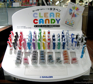
A recent arrival in this market is the Clear Candy pen made by Sailor. Sixteen different models —or sixteen different decorations for the same pen— form this line aiming at high school and college students. Regular Sailor cartridges and converters can be used on these pens, and a special selection of cartridged inks are marketed in combination with them. Sure enough, these cartridges can be used in any other cartridge/converter Sailor pen (save the obvious exception of the ultra-thin Chalana).

With the exception of the yellow ink, they could very likely be the same colors marketed in inkwells by Sailor for this year.

The Candy inks: pink, green, yellow, red brown, black, orange, blue black, and sky blue.

The F2 steel nib. The threads for the cap can be seen on the bottom right corner.

The pen, on its side, performs smoothly with a constant ink flow. The nib, in steel, is very rigid, and its point, not declared, might be a medium fine. The cap, quite surprisingly for an inexpensive product, screws in the barrel.

Sky blue and red brown ink cartridges.

The price of the pen is JPY 1000, plus taxes, and a set of two cartridges cost JPY 100 (plus taxes). The later is fairly expensive given the fact that a pack of six ink cartridges in black or blue-black can be found for that same price.

NOTE added on February 6th, 2013. More information on the Sailor Candy can be found on the chronicle "On Candies. Correction"

(Pilot Super Ultra 500– Pilot Blue black)

Bruno Taut
August 30th, 2011
[labels: Sailor]