03 August 2010

Fude 40

Pen review of the Sailor Fude Pen 40.

This is a very special, and very East Asian pen. Fude pens, as they are called in Japan, have their nibs bended up at a certain sharp angle. By doing this, the user has the possibility of choosing the line width by changing the angle between pen and paper. On top of that, at a certain inclination, a horizontal line drawn with this nib is very wide, while the vertical line remains thin.

Only some Chinese companies and Sailor in Japan manufacture this type of nib. The waverly nib Pilot offers does not have these characteristics. Sailor, on its side, makes three cheap pens with these nibs. Two of them have the nibs at an angle of 55 degrees. This one reviewed here has it at 40 deg. This company also produces a golden fude nib for more upscale pens.


1. Appearance and design. (6.5/10)
This pen is made entirely of plastic and does nothing to hide it. It has no clip to attach the pen to a pocket, but a notch on the cap to keep it from rolling. The cap screws to the barrel.


This is a surprisingly long pen. It seems to be made for the purpose of using it on a desk, and not to carry it around.

2. Construction and quality. (8/10)
Despite its cheap price and appearance, this pen seems to be well made. Nothing is loose and everything fits well.


3. Weight and dimensions. (7.5/10)
As I mentioned before, this is a long pen. But made in plastic, it is light and well balanced, especially unposted.

Dimensions:
Diameter: 13.0 mm.
Length capped: 169 mm.
Length uncapped: 150 mm.
Length posted: 191 mm.
Weight: 14 g.


This is a big pen and it might be inconvenient to carry it around. However, this is not a usual pen and few people would use it as a daily writer. For that purpose, Sailor makes a smaller torpedo-like fude pen.


4. Nib and writing performance. (9.0/10)
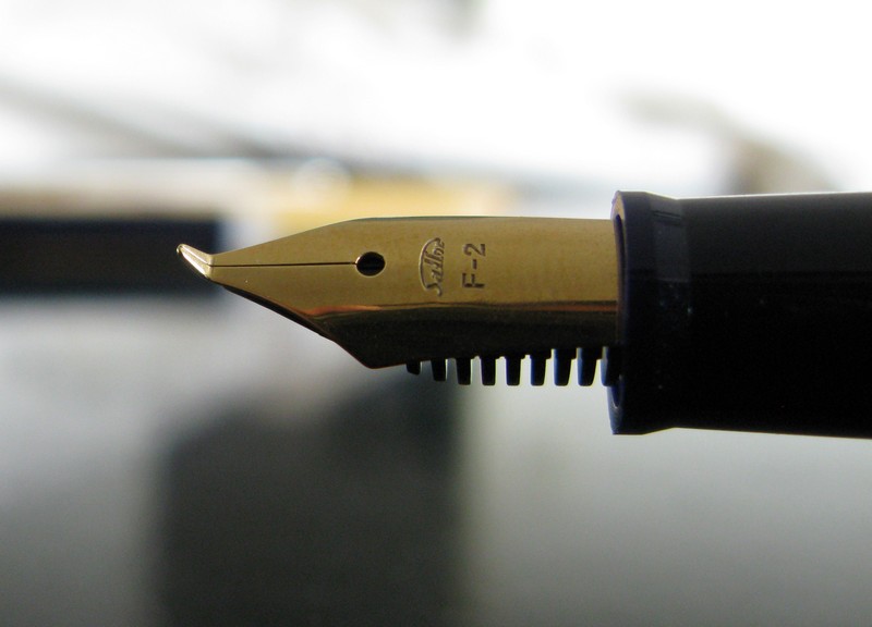
This pen’s nib is, once again, the raison d’être of this pen. It is bended upwards at an angle of 40 degrees to allow the user to write with different line widths—from extra fine to extra coarse. Its purpose is to write Chinese characters with the line variation a brush provides naturally.


The nib is made of stainless steel. Non-tipped, rigid, very wet. And very smooth.

For those of us who do not write Chinese ideograms, this pen is more suitable for drawing and more creative tasks. It is fun to use.


5. Filling system and maintenance. (8.0/10)
A cheap pen, but accepts Sailor cartridges and converters. Its main problem is the limited capacity of those in a very wet pen. I see no major problem in making it an eyedropper, and then the pen would have a huge ink deposit.

Cleaning this pen is very easy. Nib and feed are easily removed from the section by pulling.


6. Cost and value. (9.0/10)
This is a very specialized pen. So, taken it into consideration, the value is excellent. The cost, less than €10 (JPY 1050, taxes included).


7. Conclusion. (48.0/60=80/100)
This pen is fun to use, although it can hardly become a daily writer. It is inexpensive and performs well. The lower scores come in the department of design and appearance—it could certainly be more attractive.

PS (August 9, 2010): Some additional comments on this pen are available on the entry entitled Angle.

(Sailor Fude Pen 40 – Sailor 100717031)

Bruno Taut
(Inagi, August 2-3, 2010)
[labels: Japón, Sailor, plumín, caligrafía]

01 August 2010

90

Pilot Company celebrated its 90th anniversary in 2008. To commemorate this event, many of us know, Pilot created the limited edition M90 fountain pen. Limited but not so limited—9000 units, Pilot says, made it widely available.


Much less known is the fact that Pilot also lunched two other fountain pens. The most exclusive one is a maki-e Emperor size of which only 90 units were crafted.


More widely available was a radenmaki-e with small pieces of shells— pen. There were 900 of them. And during the past Wagner pen clinic I had the opportunity to test and photograph this raden pen.


(Platinum WG Tang Dynasty – Platinum Black)

Bruno Taut
(Inagi, August1 2010)
[labels: Pilot, evento]

29 July 2010

Black

Pen review of the Sailor 21 black pocket pen.

After having written a review on a black Platinum pocket pen, speaking about its Sailor counterpart is only natural—and boring. But this is my daily pen these days.


1. Appearance and design. (6/10)
Again, a formal black pen for shirt pocket. The accents are more silvery than golden. The nib, however, is golden in color and material.

As mentioned for already reviewed pens (I, II), this is a Japanese product of the 1970s. And, I add now, on the more formal style. But at the same time, it is a handy and convenient design.

2. Construction and quality. (7/10)
This pen had been used when I got it in my hands. It shows some tear and wear on the cap, mostly. The adjustment between cap and barrel and cap and section is perfect despite the years of use. And that is especially important for the writing comfort in a pocket pen.


3. Weight and dimensions. (8.5/10)
Standard size for a pocket pen. Well balanced.

Dimensions:
Diameter: 11.0 mm.
Length capped: 118 mm.
Length uncapped: 99 mm.
Length posted: 146 mm.
Weight: 12 g.


4. Nib and writing performance. (8.5/10)
Very smooth fine nib in 21 K gold. There is no indication of the actual point. The nib engraving only says “Sailor, 21 K, -2-“.


The ink flow is just perfect for this nib. The demands are easy to meet as the nib is very rigid.


5. Filling system and maintenance. (5/10)
A Sailor pocket pen does not give you many options—you must use, or re-use, Sailor-proprietary cartridges of 1.1 ml in capacity. This is, nonetheless, quite enough for a fine nib.

There existed converters for these pens, but they are long out of production.

The adaptation of the current converters to these old pens presents a problem in the bore of the section—it is too narrow for the metallic part of the converter to fit in. There are exceptions to this general rule, but that is not the case of this particular pen.

Regarding maintenance, there is nothing complicated on this pen, as is the case on most cartridge only pens.


6. Cost and value. (8.5/10)
Cheap pen, good writer. Therefore, good value.


7. Conclusion. (43.5/60=72.5/100)
Good pen for daily use. Boring looks and proprietary cartridges with no possibility of converter take many points away. The nib scores very high.

(Sailor 21 black pocket pen – Sailor Brown)

Bruno Taut
(Inagi, July 10, 2010)
[labels: Japón, Sailor]

27 July 2010

Stars

Monthly meting of the Wagner association this past Sunday. As in previous occasions, lots of exciting pens, although the attendance was this time lower, maybe due to the heatwave we now suffer in Tokyo—terrible heat and mortifying humidity.

Mr Niikura, this time, came with a beautiful selection of Pilot pens from the 1920s. Their common characteristic was this security system called hoshiawase (星合せ)—star system.

The box with the sixteen hoshiawase pens Mr. Niikura presented. All of them, eyedroppers.

The story goes that Japanese manufacturers were, in the 1910s and 1920s, obsessed about leaking pens that could stain the valuable kimono of their customers. Sounds certainly charming, but I wonder if that is an element unique to Japanese pen manufacturers. I guess American and European brands were also concerned about the ink stains in the more boring suits and shirts. Boring maybe, but equally valuable to their owners.

Anyway, Japanese companies devised a number of systems to seal the ink deposit of the pen when this was not in use. The hoshiawase system is only one of them. It consists of a section composed by two parts that rotate one with respect to the other. Only when the two red dots are aligned the ink can flow from the deposit to the nib. Misaligned, the ink deposit was sealed and, we assume, it was safe to carry the pen with a minimal risk of staining kimono or shirts.

The stars (red dots) are alignedthe pen is ready to write.

The stars are crossedthe ink is sealed in the deposit and the pen is ready for your pocket.

The pens Mr. Niikura presented showed the evolution of this system. But the chronicles say it was never a good enough to fully confine the ink in its reservoir. Apparently, these pens were discontinued in 1926.

This is the back of the section. Note the two concentric cylinders: they rotate between the two ends, limited only by the small stick attached to the inner cylinder.

The barrel of the pen whose hoshiawase system was depicted before. Note the brand name engraved on the metal.

Regarding the nibs, they had a full gamut of possibilities—from hard nails to fairly flexible.

This was another example of the pens on display.

And this is its nib.

A total of sixteen hoshiawase pen were presented. Impeccable, uninked, with the original price tags—few yen could buy them back in their days. And that raises the question of the purpose and goals of pens and of pen collecting. But that demands a chronicle all for itself.

Suffice to say that I would use one of those pens if I had the chance.

(Sailor 21, black pocket pen – Sailor Brown)

Bruno Taut
(Inagi, July 26 2010)
[labels: Japón, Pilot, evento, soluciones técnicas]

25 July 2010

Ippitsu

I wanted to talk about a stationery article that I have only seen in Japan. It is called ippitsu (一筆). Literally, it means “one brush”. A better translation, however, would be "few words". The second ideogram, 筆, by the way, is also used in the Japanese word for fountain pen: mannenhitsu (万年筆), ten thousand year brush.

Several ippitsu-sen (ippitsu notebooks) with different motifs.

These are small pieces of paper for short notes to mail—invitations, thank you notes, acknowledgments of reception… all those are often written on ippitsu.

Ippitsu with drawings inspired by the Kobe Jazz Festival.

Nothing strange or unusual, we could say. In fact, reduced format papers are used here and there in the West. But what is not so usual is the inclusion of clear decorative elements on them. And that is the feature that makes ippitsu unique.

On the left, a reproduction of a ukiyo-e engraving in an ippitsu bought at the Japan Ukiyo-e Museum, in Matsumoto (Nagano). On the right, an engraving by Jean Cocteau honoring Paul Klee.

I am always willing to send one of them on the mail, the old snail mail. Their paper is, more often than not, very good and it becomes a pleasure to write with a fountain pen on them. Now, I only need to find the right excuse.

(Sailor Pocket Pen WG – Sailor 100717031)

Bruno Taut
(Inagi, July 24 2010)
[labels: Japón, papelería]

21 July 2010

100717031

Long and hot weekend in Japan on the celebration of the Day of the Ocean. So, better stay inside, where temperature and humidity had some reasonable values.

Sailor organized this ink event in a department store –Isetan— in Shinjuku. As I had reported before, this ink mixer, Mr. Osamu Ishimaru, creates an ink to your taste.

He starts by asking you what type of color you wanted. He shows you a chart with tens of colors with the corresponding codes to recreate them. You choose one and then the game starts.

He creates a small sample of that initial color with eyedroppers and a watercolor mixing palette. A Sailor fude nib pen is offered to dip and write and check.


Darker, lighter, more red, more green,… The process continues until you become satisfied, or out of patience or, even, too confused to choose among all the endless small variations.

With the final color decided, he scales the sample up. Now the tools are jiggers and cocktail shakers to create 50 ml of the ink of your choice.


The final detail is to christen the new ink. Mr. Ishimaru then writes it on a label together with the numeric code to order more of that same ink through the department store or to Sailor directly. Mine is 100717031.

The final product, together with the business card of the expert mixer, Mr. Ishimaru.

All for the price of one of those shop-special inks made by Sailor—JPY 2100.

A real treat, or a terrible nightmare, for all those ink addicts in the world.

(Sailor WG Pocket Pen – Sailor 100717031)

Bruno Taut
(Shinjuku, July 19, 2010)
[labels: tinta, Japón, evento, Sailor]

20 July 2010

Tang Dynasty

Pen review. Platinum 18 K WG Tang Dynasty.

1. Introduction.
I bought this pen in a second hand pen shop in Tokyo. I checked it and I tested it before making my mind up. It did entice me with its looks and its smooth nib.

I guess this pen dates back to the seventies, but it is difficult to put an exact date to it.


2. Appearance and design. (8.5/10)
This is metal pen. Made mostly of stainless steel with a plastic gripping section. The body is nicely and subtly engraved. The pattern seems to reproduce some Chinese ornaments from the time of the Tang Dynasty (aD 618-907). To Western eyes, they might recall some designs by Scottish architect C. R. Mackintosh (1868-1928). So, in a sense, this could be an “art nouveau” pen—obviously non intentional.


Given the construction materials, plastic and steel, this seems to be a modern pen. Shape-wise, there is nothing really innovative.


3. Construction and quality. (8.0/10)
This is a full size pen. Basically metallic but not heavy. Very good balance either posted or unposted. The grip is correct and comfortable—the plastic section is not a problem.

These are the physical dimensions:
Diameter: 11 mm.
Length capped: 132 mm.
Length uncapped: 117 mm.
Length posted: 145 mm.
Weight: 20 g.


4. Nib writing and performance. (8.0/10)
The nib is an 18 K white gold medium. It is quite rigid and extraordinarily smooth. Therefore, almost no line variation. The ink flow is correct –not dry, not wet— and starts promptly in every occasion. Just the behavior Platinum pen consistently provides.


5. Filling system and maintenance. (9.0/10)
This is a cartridge/converter pen, and uses Platinum proprietary cartridges, but in Japan they are easily available. This might be different overseas, but there are also adaptors to use international cartridges in Platinum pens.

Refilling cartridges and using converters is economically wiser than using new cartridges. The converter is a transparent piston filler.

Not much maintenance is needed. It is easy to clean, as is the case in mostly every C/C pen.


6. Cost and value. (9.0/10)
These pens do not see to be valued in the Japanese second hand market. So, this pen has a great value: good, reliable, reasonable or even cheap in price.


7. Conclusion. (51/60 = 85/100)
This pen certainly scores very high. It performs very well in an attractive and discreet envelope. It could score higher had it a more exciting nib.

(Platinum 18 K WG Tang Dynasty – Platinum black, cartridge)

Bruno Taut
(Inagi, July 15 2010)
[labels: Platinum, Japón]