01 October 2014

Matching (XVI). Kilot

Like any other successful company, Pilot is bound to be copied and competitors and wannabes. But, when did that started? Well, I cannot give a clear answer, but I will show a very obvious example of these practices in the Japanese market.

Nowadays, the market is quite unified and copies, imitations and counterfeits take their models out of the World market. This was often the case, as anyone knowing pens like the Inoxcrom 55 could easily check. However, not so long ago, there also existed copies based on the domestic market. Domestic competition, in fact, created its own rules and its own local idols. Pilot was a successful company very early on and consequently had to deal with a number of not-so-loyal competitors and counterfeits within Japan.

The following pens are a very interesting example. The brand name, Kilot, says it all. Under that name a number of models were produced, and as it could hardly be otherwise, they mimic Pilot models. Some of them even sport the well known “kikuza” clip, so common on Pilot pens.


Three Kilot pens from, most likely, the 1950s.

Among the three examples displayed on the pictures, two correspond to copies of the model 53, while the third one mimics some of the Super models (from 1955 on).


The nibs of two of the Kilot pens. On the nib closer to the camera the Kilot logo is visible, and shows a remarkable similarity with that of Pilot at the time. Note the L underlining the O.


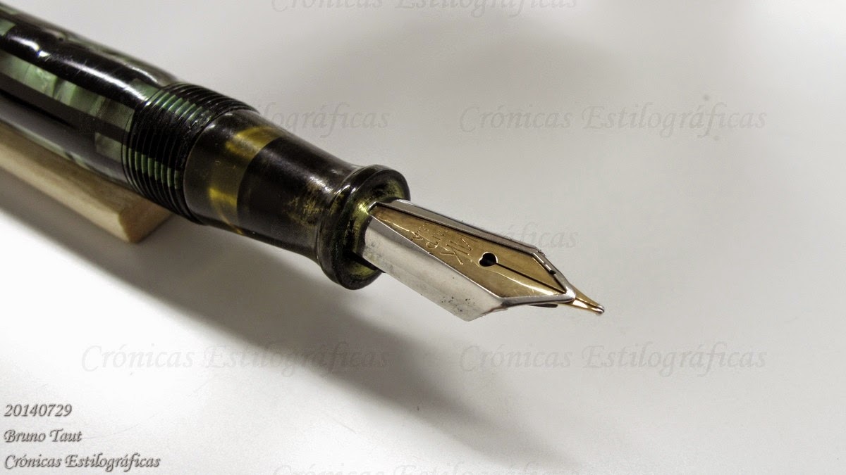
Pilot nib with the logo of the company during the 1950s. Again, note the L underlining the O.

The filling systems of these Kilot pens are invariably aerometric, a system a lot easier to implement than those usually employed by Pilot at the time—lever filler (T-shiki), eye-dropper with safety valve (inkidome-shiki), and hose-system.


A Kilot copy of the Pilot 53 model.


This Kilot pen clearly resembles a Pilot Super model. This aerometric system could be seen on smaller Super pens (Super 80A, for instance) made by Pilot.

Not much is known about this brand. On another Chronicle I will describe more in detail one of these Kilots.


Super T Gester 40 – Sailor Yama-dori

Bruno Taut
Nakano, August 16th 2014
etiquetas: Kilot, Pilot, mercado

20 September 2014

Feeds

The world of pens, nowadays, is full of reactionary obsessions. It could not be otherwise, for fountain pens are obsolete tools. Consequently, once this point is accepted and understood all cravings are allowed—-ancient materials, old filling systems, outdated manufacturing techniques…

One of the debates involves the material out of which the feed is manufactured. Old pens, before 1950s, used ebonite (vulcanized hard rubber) and around that time different plastics made their way as the material of choice for feeds as it is today. Ebonite, though, is still used today mostly on high-end pens. This is often used as a selling argument, although Montblanc’s flagship pen, the 149, uses plastic feeds. Many a stylophile are happy to buy that argument and swear by ebonite as the ultimate material to provide a good (and generous) flow of ink to the nib.

But, is the feed material that important for the final performance of the pen? Or, in other words, what are the differences between these two materials, plastic and ebonite?

The main difference lies in the way the ink interacts with those two surfaces. Ebonite is hygroscopic and favors capillarity and circulation of the ink along the ink channels.

On the other side, on plastic ink forms drops and its flow becomes more difficult. There are some ways to correct this issue: by making the surface rougher (“unpolishing” it) the specific surface of the channels increases and the ink smears along them. Another strategy was to add some hygroscopic layer to the feed.

But the final conclusion might be that due to that problem –the ink not wetting the plastic feed— ebonite should be the obvious option. However, ebonite carries its own problems to the production line—it is more expensive than plastic and needs to be cut. Ebonite oxidizes in the wrong environment, and its purity (or the presence of impurities in it) plays an important role in the final quality of the manufactured good. The final result is that it is not unusual to see deformed, bent or cracked pieces of ebonite, in feed or in other pen parts.


Ebonite feed from a Platinum pen from around 1935.


Section, nib and feed of a Super T Gester from ca 1960. This feed, made of ebonite, was bended and could not drive the ink to the nib efficiently.

Plastic, on the contrary, can be molded into the desired shape, and is very stable chemically. So, plastic is cheap, fast and reliable.


Two plastic feeds by Platinum from the late 1950s. The one on the left was misstreated, whereas the one of the right has never been used. Both preserve the original shape.

Well designed feeds, on their side, do work well and are able to provide fairly big flows of ink. Case in point—the Nagahara’s two- and three-fold specialty nibs are attached to plastic (ABS) feeds. There are no complaints in the pen community about their reliability, and they show that a proper design does the job despite the limitations of the material.


Plastic feed of a cross-music nib by nibmeister Nagahara. But in fact, all feeds are the same for a given nib size in the Sailor catalog.

Some argue that plastic feeds have not passed the test of time and that we cannot really asses whether they might degrade with time. And they go further into saying that we can also find perfectly preserved ebonite feed after many years of use or storage. But we also know –and that is the point here— that ebonite feeds are vulnerable.

After all these considerations, personal preferences and romantic ideas come. And they are welcome, for writing with these tools is in itself romantic and anachronic.


Pilot Custom 74, music nibGary’s Red-Black

Bruno Taut
Nakano, August 15th, 2014
etiquetas: soluciones técnicas

11 September 2014

Casa Hassinger

There was a time when there existed a production of Waterman ink in Spain. And maybe even more than just ink…


A bottle of Waterman ink produced in Barcelona.

A man by the name of Egon Hassinger acquired the license to produce ink from the American company Waterman. And the production was made in Barcelona, as can be read on the bottle. But the activity of the company Casa Hassinger might have included the assembly of Waterman fountain pens for the European market. The company imprinted a small H on clips and nibs to mark those units passing through their hands in Barcelona. Some stylophiles in Spain even suggest that some parts could have been manufactured locally, including the nibs. These could have been manufactured by Damiá Onsés Ginesta, a prolific nibmeister who provided units for mostly any Spanish pen company at one point or another.


A Waterman clip with the Hassinger mark. Picture courtesy of waltonjones.


The Hassinger's Waterman. Picture courtesy of waltonjones.

Casa Hassinger was registered in Barcelona at the address C/ Balmes 75. Egon Hassinger lived in this city between 1915 and 1948, when he passed away. The company was liquidated in 1990.

The bottle of Waterman ink marketed by Hassinger can be seen at the Gaudi’s Casa Milà in Barcelona. This is but one example of local production of ink of some well known brand. The cases of Parker and Pelikan had already been mentioned on these Chronicles.

My thanks to stylophile waltonjones for his pictures of the Hassinger’s Waterman fountain pen.


Pilot Elite pocket pen, manifold nib – Platinum Black

Bruno Taut
Nakano, September 10th 2014
etiquetas: tinta, Waterman, España, Barcelona, nibmeister Onsés Ginesta

27 August 2014

Matching (XV)

Which one is the original and which one is the copy? Sometimes the answers are easy, but the context of those copies is always interesting.

Some people, including some Japanese, like to bash Japanese pens on the grounds of not creating original products and, instead, copying well known alleged masterpieces, even though these were not original in the first place.


A selection of balance pens by the big thre Japanese manfacturers. Among them, a couple piston fillers (::1:: and ::2::) and a plunger filler. The rest are cartridge/converter pens.


Some of the nibs of the previous pens. They include several music nibs, a couple of falcon, a fude, some Naginata, a two-fold nib...

Some truth there is in that claim—those Japanese-made balance pens exist because of the success and ubiquity of the Montblanc models. But it is also true that the big three Japanese companies have proved their capability to innovate and have created most original products. And this, in fact, does not make any more innocent of the accusation of plagiarism. Most likely the opposite—cannot these companies implement their nibs and filling systems in original designs? In fact, now and then, they do that


Sailor released this pen on the occasion of the 90th anniversary of the company. It sports a cross nib by nibmeister Nagahara.

(More on the matter soon).

My thanks to Mr. Noguchi.


Inoxcrom 77, steel nib – Platinum Black

Bruno Taut
Nakano, August 12th 2014
etiquetas: mercado, Japón, Montblanc, Pilot, Sailor, Platinum

23 August 2014

Jentle 2014

More unpaid and unintentional advertising.

Some weeks ago I spoke of the new release of eight not-so-new ink colors by Sailor. Not-so-new because those eight colors had already been marketed 2010 as seasonal inks in limited editions with big success.


Weeks later, news and rumors in the Net claimed that Sailor had reduced the selection of inks in its catalog. From now on, only three basic colors would be available—black, blue and blue-black—and that there would be some fancy colors at a premium. That would mean, at least, that the basic color line (peach, sky-high, ultramarine, grenade, epinard and apricot) was coming to an end after just three years in the market.


The ink selection in 2011. Taken from Sailor website in 2011.

Now, Sailor has just released a new catalog of fountain pens and accessories after years of the same boring and incomplete edition. The new catalog included, needless to say, the latest releases like the Sigma and the Promenade and the Precious Woods series. And on the page dedicated to consumables we can see that the transition in the ink department is completed. Now, besides the permanent black (kiwa-guro) and blue-black (sei-boku), Sailor makes eleven Jentle inks: the basic three plus the eight re-editions of the 2010 seasonal inks. And the price is the same for all the eleven Jentle inks—JPY 1000 plus tax. So, no variations on this department with respect to the previous colors.


Page of consumables in the new (Summer 2014) catalog of Sailor for fountain pens and high quality writing utensils. Click on the picture for better resolution (too often Blogger is not up to the challenge).

One final reflection—does Sailor have any consistent policy about its inks? The changes in its catalog of the last five years seem quite erratic, especially when compared to Pilot and Platinum. However, those changes could also be understood as an effort to call the attention of all of us. And that Sailor did get.


Super T Gester 40 – Sailor Yama-dori

Bruno Taut
Nakano, Augusr 15th 2014
etiquetas: tinta, mercado, Sailor

20 August 2014

Question

Does anyone read my texts or looking at the pictures is mostly all we do when "reading" a blog, any blog?


Inoxcrom 77, steel nib - Platinum Black

Bruno Taut
Nakano, August 12th 2014
etiquetas: metabitácora

17 August 2014

Pen People

A pen person, Leigh Reyes rightly said, knows better than drinking anything looking like ice tea at a pen meeting. And would use almost anything as a pen holder. A pen person, as well, never misses a street with such a suggestive name as Namiki.


In Chuo-ku, Tokyo.

And wonders what Vanishing Point might mean as a bar, members only, in the sleazy streets of Roppongi (Minato-ku, Tokyo).


In Minato-ku, Tokyo.

Yeah, we are a crazy bunch.


Super T Gester 40 – Sailor Yama-dori

Bruno Taut
Nakano, August 16th 2014
etiquetas: estilofilia, Tokyo

14 August 2014

Matching (XIV)

Which one is the original and which one is the copy?

It is well known that the big three Japanese pen companies keep a close eye on each other, and we can see startling similarities on some of their current products. That, in fact, is not new. The original idea of the pocket pen, for instance, is disputed between Sailor and Platinum —Pilot’s first pocket pen came later, in 1968—, but the final result was by the end of 1960s all three of them –and even some other smaller brands— had their own version of a black and formal looking pocket pen well suited for the Japanese salary man.


From left to right, a Ferme, a Pilot, a Platinum (with damascene decoration, zogan in Japanese, on the section), and a Sailor. All pocket pens in black with golden accents. All four nibs of these pens are made of 18 K gold.

But not only that model was copied. Years later, by the mid 1970s, all big three offered pocket pens made of stainless steel—all clean and lean. Only one of them, however, dared to make an all-steel pen with integrated nib.


From top to bottom, Platinum, Sailor and Pilot pens. The Platinum unit uses a Pt-alloy nib. In other words, a white gold nib. Pilot and Sailor nibs are made of 14 K gold.

Which one is the original and which ones are the copies? Among the three examples shown today, the Platinum is probably the earliest of the lot given its Pt-alloy nib.


Inoxcom 77, steel nib – Platinum Black

Bruno Taut
Nakano, August 12th 2014
etiquetas: Japón, mercado, Platinum, Pilot, Sailor, Ferme

12 August 2014

Bulb Fillers

On the Chronicle describing the Surat pen, I mentioned that the bulb filling system was well known in Japan. That system, let us remember, consists in an ink deposit ended with a flexible rubber sac, and with a breathing tube inside.


From top to bottom, a Worla, a Surat (a Nakahara system, but that is a variation of the bulb system), a Tomei, and a SSS.

Today I am showing some examples from mostly unknown companies: Tomei, Worla, Meizen. The much better known SSS and Sailor also manufactured this filling system. And many others as well, most likely.


A Meizen pen in red urushi. This model was made after 1953, as the nib is marked with the JIS logo. Meizen was a brand active in Tokyo until the late 1950s or early 1960s.


A Sailor bulb filler from the early 1950s.

Albeit there are few, if any, indicators of the age of these pens, it is reasonable, given the construction style, to assume they were made around 1950.


Pilot Vpen – Diamine Graphite

Bruno Taut
Shinjuku, July 23rd 2014
etiquetas: Tomei, Worla, Meizen, SSS, Sailor, Surat, soluciones técnicas.

02 August 2014

4622

The information I offer today is already known—Kabutogi Ginjirô was a remarkable Japanese nibmeister who worked for a number of pen brands, including some of his own. And he was also responsible for the creation of some fake Pelikan nibs.

Today’s example is very significant. It is a wonderful paradox, a blatant contradiction. How could a Pelikan nib be engraved with the Japan Industrial Standards (JIS) mark and the registration number of a Japanese company? 4622 was registered to Kabutogi Ginjirô in connection to its brand Seilon, as we already saw.


A Japan-made Pelikan?

How far are countries willing to go in order to protect the local economy? Nowadays, Japan complains about China’s industry of counterfeit products but, didn’t Japan engage in these same activities back in the 1950s and 1960s?

This JIS-marked Pelikan nib is a stubborn proof.

My thanks to Mr. Sunami.


Inoxcrom 77, steel nib – Platinum Black

Bruno Taut
Nakano, August 1st 2014
etiquetas: Pelikan, Japón, nibmeister Kabutogi Ginjirô, Seilon

31 July 2014

Cheaper

Some months ago, over a year now, the Italian brand Delta launched a strange nib. Strange, but with a lot of hype on the benefits of its unusual structure.

The Delta Fusion is, in actual terms, a steel nib topped with a gold hat. This combination, Delta advertisement claimed, provided an improved flow because the interface steel-gold raised the temperature of the ink, this rendering it more fluid…


Delta's Fusion nib, made by Bock.


The reverse side of the very same nib--an untipped stub. These two pictures are courtesy of KMPN.

Really?

If so, any gold plated steel nib should provide the same effect. Let us remember that interfacial effects only involve some few layers of material –of gold and steel in this case— and no especially thick coatings were needed.


Two "fusion" nibs by Pilot.

But on top of this fallacy there another one—Delta’s nib is not even a novelty! A long time ago in a galaxy far away Wearever created another hybrid nib. On this case, however, the writing material –or that supporting the writing point—was gold, and steel was used to attach the nib to the feed and to the section.


A "hybrid" nib by Wearever. The steel plate holds the gold nib in place.

Both cases follow the same argument—how do we reduce the gold content of the nib while preserving the added value of the gold nib itself? A number of strategies have been attempted along the history of pens. Delta’s is simply the last one—and the most ridiculous of the lot.

My thanks to Wagner member Shokubutsuen and to KMPN, whose pictures of the Delta Fusion nib are greatly appreciated.


Pilot Custom 74, music nib – Gary’s Red-Black

Bruno Taut
Shinjuku, July 23rd 2014
etiquetas: plumín, Delta, Wearever, soluciones técnicas, Bock

24 July 2014

Nakahara-shiki (中原式)

I finished the previous Chronicle with the picture of an interesting but mostly unknown pen—a Surat. Now, given the reactions that picture triggered it seems that further information is in order.


I discovered this pen through a fellow stylophile from Kansai (Osaka region). Mr. Mochizuki had found a big number of them at some flea market. And, even better, many of them were complete with box and papers—like the one I am now presenting.


On the manual, the pen is described as featuring an original filling system names as Nakahara-system (中原式, Nakahara-shiki). However, upon opening the pen we only see a bulb filler –a rigid cylinder closed with a rubber sac. Nothing new as bulb fillers were one of the earliest self-filling systems and can easily be found in American, European and Japanese pens.


Basic parts of the Surat. In the middle, the "magic center", or breathing tube. Note the conic piece on the left end. It works as a valve against the section of the pen.

The Surat, though, does present an original detail. Inside the ink deposit, the breathing tube is not attached to the feed. On the contrary, this breathing tube –named “magic center” by the manufacturer— can move back and forth inside the deposit. The conic piece on the front part works like a valve to avoid emptying the deposit when depressing the rubber bulb. In this regard, this system reminds of two Pilot’s creations: the pulsated piston A-shiki, and the current CON-70 converter. The system works efficiently and the deposit is filled up in about 10 strokes of the bulb. This means that the ink enters the deposit through the “magic center” despite not being attached to the feed.

On its side, the manufacturer also claimed that this “magic center” balanced the internal pressure and prevented ink leaks. Whether this is real or just hype is at anybody’s guess.


The blind cap displays, on this picture, the black button that touches the rubber bulb enough to release a drop of ink out of the feed. A clear mistake in the design.

The Surat also displays an unsettling detail—the blind cap protecting the bulb has some sort of push button at the end. Its movement is not wide enough to depress the rubber bulb in any efficient way and, therefore, it cannot be used to ink the pen. But it does touch the bulb enough to release a small drop of ink through the feed. The manual simply mentions the existence of this button and does not comment on its actual function. This problem is just a flaw in the design, but does not affect the writing performance of the pen.

Finally, the deposit can be unscrewed from the section and the pen could also be filled with an eyedropper or a syringe.

These are the dimensions of the pen:
  • Length closed: 129 mm
  • Length open: 115 mm
  • Length posted: 151 mm
  • Diameter: 12.5 mm
  • Weight (dry): 12.1 g
  • Ink deposit: 2.2 ml

All in all, this pen seems another experiment in filling systems carried out in Japan in the last 100 plus years.


The nib is an extra-fine point with a hint of flexibility. It is made of stainless steel and carries the following inscription: “WARRANTED / HARDEST / IRIDIUM / STAINLESS / SPECIAL / PEN”.

The pen is also signed on the barrel (“SURAT / TRADE MARK / PATENTED 6564”). The instruction sheet speaks of Tokyo Suishindô as the manufacturing company. No address is provided.


And nothing else we know so far. This is just another pen that would rarely make its way in any book on pens despite its interesting features. But a detailed description of the technical evolution in pens would allow for some way of dating it. My best guess is that this Surat was manufactured around 1950.


My thanks to Mr. Mochizuki and to Poplicola-san.


Universal, music nib – Pelikan 4001 Brilliant Brown

Bruno Taut
Nakano & Shinjuku, July 2014
etiquetas: Surat, soluciones técnicas