Showing posts sorted by date for query Wagner. Sort by relevance Show all posts

01 June 2023

New 3776 Nib

The Platinum Decade pen described on the previous entry implements, as we saw, a new nib. And this nib represents a new step in the evolution of the 3776 nib.

So this is a good time to revise that evolution of nibs and feeds along forty-something years of history.

Early models, (between 1978 and some time in the early 1980s) had very cylindrical nibs and ebonite feeds. The first year model had a feed with no fins at all. There were also music nibs with this geometry.


Nib and feed of a Platinum #3776 from 1978. Note the ebonite feed.


The feeds of these early models changed quickly. By the second year, they had implemented some fins.

Later on, the nib became flatter on the top area, but there were few, if any, changes on the ebonite feed. This detail changed at some point and from then on all Platinum feeds have been made of plastic.


Nib and feed from 1984. The nib is obviously flatter on top while the feed is still made of ebonite.


Nib and feed from 2002. The nib is apparently identical to the previous one (1984), but the feed is now made of plastic.


Nib and feed from a #3776 Century. Labeled as manufactured on November of 2011. Note the shorter nib and the very specific feed. Needless to say, it is made of plastic.

The #3776 Century was launched in 2011. On this newer edition, two-tine nibs (i. e., non music nibs) changed with respect to previous models. Now they are shorter than before, and the feed had been modified to anchor the nib on the right position.


On the left, a music nib of a #3776 Century, dated on 2012. On the right, a music nib of a #3776 of 2009. The feeds are identical. The nibs share the same basic geometry.


Music nib and feed of the Wagner 2015 pen. Note the absence of holes in the tail of the nib.

These changes, as I said, did not affect the three-tine music nibs. In some occasions, some gold was removed from the tail of the nib –that area hidden under the section-, but is also seems not to be always the case. The feeds of these music nibs are more cylindrical in shape and have no fixed position for the nib.


Two and three tine nibs dated in 2009 and 2010. They were interchangeable in their sections. I am well aware that the two tine nib is a Nakaya, but Nakaya implements #3776 nibs.

And in 2022, the model released to celebrate the 10th anniversary of the 3776 Century sported the following nib:


It is slightly narrower and longer than the previous nib. The feed remains untouched.

Now, the question is whether this new nib will become the standard for all 3776 Century and associated products (::1::, ::2::). Time will tell.


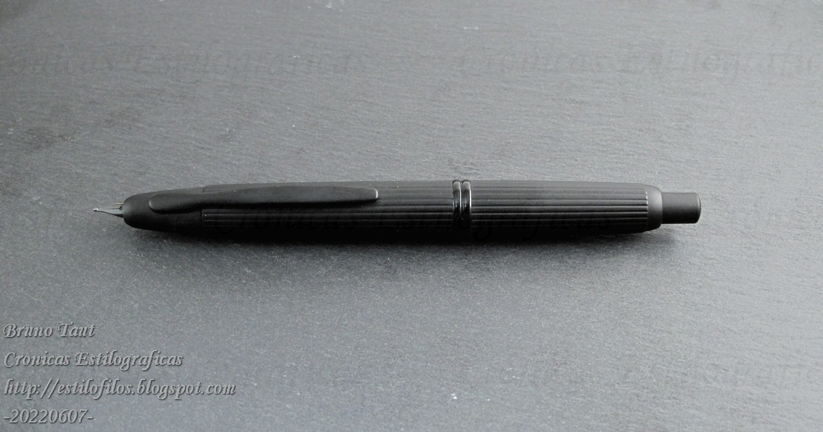
Pilot Custom 742, S nib – Diamine Imperial Purple

Bruno Taut
June 1st, 2023
etiquetas: Platinum, plumín, plumín musical

01 September 2022

The Green Grass

For some, the Japanese Domestic Market (JDM) looks like paradise: “Japanese always keep the best products for themselves”, said a commenter on these same pages. But is that true?

Even if that was true, on-line trade does challenge that old structure of exclusive distributors associated to a well-defined location. Japanese pen companies might not like this idea, but there is not much they can do.

However, anchored as these companies are in this old model, they insist in marketing products just for certain markets. Then, in the same way as there are JDM pens and inks, there are Japanese products that are not distributed in Japan.

Such is the case of the following Capless “Black Stripes”:

Black Stripes.

But it can be found on-line. And whether this is better or worse, prettier of uglier than those regularly sold in Japan might be a matter of availability.

Assorted Capless, some made for non-Japanese markets.

After all, the grass is always greener on the other side of the border.


Nuart Antigua's Akatamenuri - Sailor Wagner ca 2010

Bruno Taut
September 1st, 2022
labels: Pilot, Capless, mercado

10 January 2020

2-Fold Nibs

I cannot say for sure that it was Nibmeister Nobuyoshi Nagahara's idea on the first place, but certainly it was him who popularized the idea of two- and three-folded nibs with the support of Sailor.

Some early examples by him date back to the 1990s, as were reported on these pages.


An early Cross nib by Nobuyoshi Nagahara.

Those initial nibs later evolved into what we know today—open nibs with or without overfeed that made their way to the catalog of the brand and to commercial success.


Three generations of Cross nibs.

Then some nibmeisters copied this idea. Wagner-resident Yamada used Pelikan M800 as the base for his version.


Yamada's approach to a 2-fold nib-two overlapping Pelikan M800 nibs.

Wagner member Mr. Mochizuki, on his side, used a much more affordable canvas—a Chinese pen available at the 100-yen chain shop Daiso.


Mochizuki's approach based on a Daiso pen. A steel 2-fold nib.

Only recently, in the last couple of years, non-Japanese nibmeisters have attempted these two-fold nibs. The most brilliant of them, dare I say, is nib wizard Ralph Reyes of Regalia Writing Labs with his continuous development of old and new ideas. The nib here shows is a nice example of this—it is a cross-concord nib, in Sailor terms, with an overfeed; but the overfeed is made out of a third nib and is nicely integrated on the unit.


A 2-foold nib by Ralph Reyes based on JoWo #6 nibs.


My thanks to Inky.Rocks.


NOTE (16/January/2020): Writng samples of some of those nibs can be seen on the following Chronicle: https://estilofilos.blogspot.com/2020/01/2-fold-nibs-writing-samples.html


Opus 88 Koloro #6 – De Atramentis Beethoven

Bruno Taut
Shinjuku, January 10th, 2020
etiquetas: Sailor, nibmeister Nobuyoshi Nagahara, Nibmeister Yamada, nibmeister Ralph Reyes, plumín, Mr. Mochizuki

08 October 2019

TIPS 2019. Again a Stationery Fair

This past weekend, the second edition of the Tokyo International Pen Show (TIPS) took place in the Ward of Taito in Tokyo. I attended it and these are my reflections.

The plain figures are very clear and straight-forward: about 2000 visitors, 1200 on the first day; about 200 foreigners; 86 tables with 71 traders. This means a big success and a significant improvement over the results of 2018: 1600 visitors and 50 traders.


People and inks. Are those the argument of TIPS?

My criticism this year is, in essence, the same as on 2018——this event was not a pen show, this was a stationery salon (like some others in Tokyo: Bungujoshi, Kamihaku, and Inkunuma (::1::, ::2::)) where you could find some fountain pens. Vintage pens, on their side, were limited to four or five tables——Wagner group, Seoul Pen Show, Andre Mora, Stylus Aurea, and Pen Land/Komehyo. And not even the parallel Wagner meeting on Sunday at a different venue, could correct this deficiency.


The table of the Seoul Pen Show with some vintage pens.

However, this didn't mean that there were no fountain pens. Many of the traders were well established stationers from all over Japan who have their own special pen models and inks, mostly made by Sailor. This was the case of BunguBox, Kingdom Note, Nagasawa, Ei-Publishing Co. (Shumi-no Bungubako)… And in fact there is a demand for all those somehow different pens—if only because of their colorful decoration.

This prevalent presence of Sailor –even if indirect-- made Leigh Reyes say that this was the pen show of Sailor. The presence of the other two big companies was marginal.


Sailor inks, Sailor pens. Kingdom Note.

The international presence was more important this year: Franklin-Christoph, Schon, Yaching Style, Armando Simoni Club, Andre Mora, Stylus Aurea, Aesthetic Bay... But they accounted to just about 10% of the traders.


Aesthetic Bay, from Singapore.


Franklin-Christoph, from USA.

All in all, the most interesting aspect of the show was, as is often the case, the community of users. On this edition, and much to my surprise, the number of visitors coming from overseas was particularly big. Organizers speak of 10% of the attendees being foreigners. That means about 200 people. I don't know how they came with this number, but I am afraid they considered any long term resident in Japan as foreign visitor. Anyway, this edition attracted visitors from Australia, Hong Kong, Taiwan, Thailand, Philippines, Singapore, United States, Canada, France, Italy, Spain... This fact is indeed remarkable and contributed to provide a cosmopolitan air to an otherwise very parochial show.


An active and enthusiastic group of foreign visitors.

TIPS is not a pen show, and TIPS is barely international. But 2000 visitors move a lot of money and are a powerful argument not to change the business model.

At the end, the stationery market is a lot more important and lucrative than that of fountain pens.


Paper, paper, paper...


NOTE: TIPS 2020 will take place on November 7th and 8th in Hamamatsucho area in Tokyo.


My thanks a Inktraveler for several of the pictures here included.


Parker 51 Demi 1948 – Kobe Nagasawa Bokko

Bruno Taut
Nakano, October 8th 2019
etiquetas: mercado, evento, Sailor, Tokyo, papelería

31 August 2019

Kubo's Pens

Kubo Kohei stands nowadays as the sole maker of nibs in Japan not associated with a pen maker. And this in itself is an interesting fact that deserves a separate reflection. But today I want to speak about some of the operations in which nibmeister Kubo has participated.

As of today, other that the nibs one could order directly from him, it is possible to find Kubo nibs on pens Tohma, made by Toma Kiyotaka of Pen Cluster, and on some models by Iwase Seisakusho, albeit its activity seems currently suspended.


A Model N by Iwase Seisakusho with a nib by nibmeister Kubo.

But nibmeister Kubo has a long history in the pen industry in Japan. Two brands associated with Kubo were Nobel –or Nobel's, as he likes to call it-- and Elliott.

The Elliott company was founded by former worker of SSS Uesugi Yoshizaku around 1936 or 1937 in the Kita Ward in Tokyo. Around 1960, Kubo's uncle bought the company and Kubo Kohei started working on it. The engagement with this brand lasted until around 1980.


An Elliott ad in the 1950s.


On top, a pre-Kubo Elliott pen from 1950s. Bottom, an Elliott pen that looks like a Nobel pen.

In parallel, at least during the late 1960s and 1970s, Kubo Kohei also worked on his own brand Nobel. For those pens, he used injected plastic for the bodies and adopted Platinum cartridges and converters as filling mechanisms, as was the common practice among small companies of the moment.


Two Nobel pens: the "Super Gold" model on top; and a pocket pen. Both were made by Kubo Kohei. They use Platinum cartridges.


Kubo's music nibs for his Nobel pens (::1::, ::2::). NK stands for "Nobel Kubo".

So these are some of the nibs and pens made by nibmeister Kubo. However, they are not easy to find in the market.


My thanks to Mr. Kanesaki, Mr. Sugimonto and Mr. Sunami.

Note (Sept 1st, 2019): I have changed some of the original pics form some others with better quality.


Pilot Custom 74 – Wagner 2008 (Sailor)

Bruno Taut
Nakano, August 30th 2019
etiquetas: Nobel, Elliott, Nobel, Tohma Pens, Iwase Seisakusho, nibmeister Kubo Kohei

13 May 2019

Tokyo Pen Scene in 2019

The 19th edition of the Pen Trading event in Tokyo was celebrated on the weekend of May 4th at the KFC building in the district of Sumida. And for the first time, this event lasted three days.

But all in all the figures of the show have not changed much along recent years—about 20 to 25 traders, and 200 visitors. And these numbers hardly justify such a long duration.


The first day, Friday 3rd, had Platinum as protagonist—Mr. Masa Sunami gave a lecture on the history of the brand, and the president –Mr. Nakata— answered some questions previously submitted by the attendees. However, the answers were to be kept strictly intramural, and any leak through social media was prohibited. Trading started at 12:30, albeit restricted to non-gold nib pens and assorted goods.

Saturday and Sunday were more of a traditional pen show –no restrictions of the type of pens to be on offer--, and were combined with a number of workshops.


Pen Trading in Tokyo, 19th edition.

Along this past year there has been a wealth of activities in the fountain pen world in Tokyo. The Wagner group has extended its events in order to attract younger aficionados, for instance. In October, the Tokyo International Pen Show (TIPS) worked well as a meeting point for aficionados previously disconnected, thus enlarging the pen community.

All this should imply that the trading events like that of Spring should become more important in the basic figures, but that was not the case ten days ago. The second edition of TIPS, to be celebrated in October 5th and 6th, looks like the best chance for the local activity to become something more according to the relevance of Japan in the international market.

And the only way to do so is to become more international.


So, next stop, the second edition of the Tokyo International Pen Show in October 5th and 6th. Hope to see you there.


Iwase Seisakusho prototype – Wagner 2008 ink

Bruno Taut
Shinjuku, May 9th 2019
etiquetas: Tokyo, Japón, evento, mercado

30 October 2018

Katana or Kimono?

A play in one act. Based on actual events.

Characters: He, She, a Clerk.

A big stationery shop in Tokyo, buying a Nakaya.


The kimono? Maybe not.

HE: Among the pen community, the silk pen case is known as “the kimono”.
SHE: No Japanese would ever call that a kimono.

SHE: (Facing the clerk.) What is the name of that pen case?
CLERK: We call it “katana bukuro”.
HE: A bag for the sword?
SHE: I told you—no one in Japan calls it a kimono.
HE: Did anyone in Japan hear about pens being mightier than swords?


Afterword:

A “katana bukuro”, a bag for the sword. Besides the obvious meaning, it is also an ornament carried by women in their kimono at their wedding. Apparently, Japanese women needed some form of self-defense on those dire situations... The irony is that the “katana bukuro” is merely ornamental and inside there is nothing but a cylindrical cardboard instead of the traditional dagger, the “kaiken”.


The ornamental (and empty) "katana bukuro" with the elaborate knot and the two tassels.

A pen would be a better filling—provided the name of the bag changed accordingly.


Pilot Custom Heritage 912 – Wagner 2008 ink

Bruno Taut
Shinjuku, October 30th 2018
Etiquetas: Platinum, Japón

24 October 2018

The Case of Naginata. II. The Two-Year Hiatus

Allegedly, Sailor stopped the distribution of specialty nibs (Naginata Togi and derivatives) in Winter of 2016-17. Or so we were told. The reasons behind that decision were the difficulty to attend the demand of those nibs, particularly from the North American market, and the need to train more people to make them. And in the meantime –until further notice, they said-- no more Naginata were to be distributed.


A collection of (old) Naginata nibs.

Or were they?

Indeed they were, albeit in small numbers and through selected retailers. On the following pictures we can see a Naginata Togi nib produced in 2017. The pen was purchased at a well-known stationer in Tokyo.


An old Naginata?


Not so old --2017--, but the old engraving. (And on another Chronicle I should speak about the dating codes on modern Sailor nibs).

That nib displays what now we know as the old engraving. This shows how this nibs predate the new policy –new prices, new distributions, new decoration-- of Sailor re specialty nibs.

Nibs like this –and it is not the only example-- are the last examples of the second generation of Naginata nibs, and the later pricing decisions of Sailor is making them all the more desirable.


Pilot Custom Heritage 912 – Wagner 2008 ink

Bruno Taut
Bunkyo, October 23rd 2018
etiquetas: mercado, Sailor, plumín

22 May 2018

Kubo, Yotsubishi and Iwase

NOTE added on July 23rd, 2018. The body of this pen is not a creation of Mr. Momose, but an old and unused stock of pen bodies of Ishi Shoten's Yotsubishi.


The works of Mr. Iwase as a raden artist have already appeared on these Chronicles, and today I wanted to describe more in detail one of his creations.

Two are the basic types of canvases Mr. Iwase uses for his works—Pelikan and Montblanc pens on one side, and pens manufactured by old lathe masters and companies long gone lathe master Momose Yasuaki. Today’s pen belongs to the later type.

Three elements characterize this pen: the pen body, the nib, and the decoration. Each of them was created by a different craftsman.


"18 K pen raden / Kubo Kohei fountain pen".

On this case, the basic pen was made by the company Ishi Shoten for its brand Yotsubishi. Its material is ebonite, although the barrel and cap finials are made of wood. The pen was originally intended as a Japanese eyedropper –the tail can be unscrewed and detached from the barrel--, but the final result is a cartridge-converter pen (Sheaffer type). The cap lip is protected with a silver ring.


A raden pen...


... or a cartridge/converter pen.

The nib and the feed were provided by nibmeister Kubo. The nib is made of 18 carat gold and is associated to an ebonite feed. The size of the nib would be comparable to a Bock's #5, or to a Pilot’s 10 (::1::, ::2::) or a Sailor’s “big” size, although the feed's diameter is bigger: 6.5 mm.


The Kubo Kohei's nib: "ELEGANT / KB / 18K 750 / MADE IN / JAPAN".
The feed has three ink channels that provide a rich ink flow.


Writing sample with the Kubo-Yotsubishi-Iwase pen.


Nothing special on the tip. Just well cut.

Finally, the decoration is a rich example of the raden technique: carefully cut sea shells glued to the pen body; then, urushi is used to fill up the spaces between the shell stripes and smooth the whole pen. Ad additional later of transparent resin protects the decoration. The gripping section is decorated with red urushi.


There is a simple inscription the cap ring: "silver 925 / 11/20".

All in all, the pen is an original and attractive work; the final result of two Japanese craftsmen working on old forgotten batches. And in this regard, this is not a unique example, albeit other models are mostly one of a kind.

This pen is one of the 20 units Mr Iwase marketed in 2015 and 2016, some of which were sold through the Wagner group. And as it is often the case on artisanal products in Japan, there is no clear sign of the authorship, with the sole exception of the engraving on the nib. However, not many stylophiles (much less occasional buyers) would identify the letters KB as a signature of Mr. Kubo.

These are the dimensions of this pen:

Length closed: 142 mm
Length open: 126 mm
Length posted: 165 mm
Diameter: 15 mm
Weight (dry) 21.9 g
Ink deposit: 1.1 ml (Sheaffer converter)


Minka Saturn – Diamine China Blue

Bruno Taut
Nakano, May 21th, 2018
labels: Nibmesiter Kubo, Momose, Iwase, raden, urushi, Yotsubishi