skip to main |
skip to sidebar
Among all the Capless models manufactured by Pilot since 1964, that from 1971 is one of the most appreciated by stylophiles. It is made of plastic and stainless steel. Its stripped design pattern will later be shared with a Myu pocket pen, 1973, and a Custom model from 1974. The three Pilots from the 1970s with black stripes.
 The 1971 Capless with a hard fine gold nib.
 The long feed is clearly visible on this picture.
Diameter: 11 mm.
Length closed: 139 mm.Length open: 146 mm.
Weight: 19.8 g (dry). Detail of the extended nib.
 The pen opening for the nib. Contrary to other Capless models, this one is circular.
 (Athena Basic Line – Sailor Yama-dori)Bruno TautNovember 2nd, 2011[etiquetas: Pilot]
Not much information is available about the Japanese pen Mitaka. A review on an eyedropper from the 1930s, by fellow blog author Jule Okami seems to be the basic reference. Therefore, this pen, even if apparently unremarkable and boring looking, has some interest. The Platinum Honest 60 pen, already reported on these Chronicles, was the first Japanese pen in using ink cartridges and converters. As a result, these cartridges were the first available in the Japanese market and several companies used them as the standard. Such was the case of Mitaka. This boxed set included a service cartridge branded as Platinum Honest 60 with blue black ink.Other than that, this pen is made of black plastic, with cap and nib being gold plated. The very rigid steel point is engraved with the company nameThis Mitaka pen is quite similar to the cheapest of the Pilot Super series—the Super 50 with steel nib. However, this pen is an aerometric filler. Both cost the same—JPY 500.
 On both pictures, on top, the Pilot Super 50. On bottom, the Mitaka.
These are the dimensions of the Mitaka pen:
Diameter: 11 mm.
Length capped: 135 mm.
Length open: 120 mm.Length posted: 155 mm.
Weight (dry): 10.5 g.Mitaka is also the name of a city in the prefecture of Tokyo. However, the company was based in the ward of Itabashi.My thanks to Mr. Alberto Linares.
 (Pilot Vpen – Sailor Tokiwa-matsu)Bruno TautOctober 31st, 2011[labels: Platinum, Mitaka, conversor, Pilot]
Among the big three Japanese pen companies, only Platinum (and its luxury division Nakaya) manufactures pens made of celluloid nowadays. That was not the case in the past, as we have already seen on these Chronicles. Actually, there has been a number of eyedropper pens made of this material, which is certainly strange given the extreme sensitivity of celluloid to color changes due to ink dyes. And in an eyedropper pen, ink is in direct contact with the plastic material of the barrel. However, this practice was not uncommon during the 1920s and 1930s in Japan and overseas. Pilot made a number of them, and such is the case of the pen here presented today. It is green and black pen, equipped with a shiro nib, fairly flexible, in size 3. The breathing hole, V-shaped, is quite characteristic of flexible steel nibs in Japanese pens.
 "Best in the World, Pilot -<3>-", the engraving says.
 This Pilot pen dates from the early to mid 1930s. The logo, engraved on the barrel, shows the N, after the company founder Ryosuke Namiki. It was changed in 1938 to show a P instead of the N coinciding with his retirement, which does not seem the best way to honor his legacy.
 The pen is in very good condition. It reached my hands in its original case, which included the instruction sheet. Probably, it has never been inked. These are its dimensions:
Diameter: 13 mm.Length capped: 132 mm.Length open: 120 mm.
Length posted: 167 mm.
Weight (dry): 15.8 g.
 (Athena Basic Line – Sailor Yama-dori) Bruno TautOctober 29th, 2011 [labels: Pilot]
In the Land of the Rising Sun, such is the usual translation to the more accurate of land where the sun originated (Nippon, 日本), it should came as no surprise that a number of companies use the term asahi, rising sun, in their names. Such is the case of newspaper Asahi Shinbun, the beer company Asahi Breweries, the television company TV Asahi… and even a pen company. This Asahi Tsubasa Hantsuki Mannenhitsu (旭ッバサ判付萬年筆), such seems to be the model name, is a truly interesting pen and it shows several unusual features.
 The box, the pen, the eyedropper, and the ink bottle.
  The pen, uncapped, with the shut-off valve and the main thread between section and barrel half open.
  The solid ink bottle. Its height is four centimeters shy.
  The top of the cap, disassembled. The brown flat piece is the uncarved stone for the seal. It is attached onto a black piece with a thread fitting on the cap, on the far end of the pic, creating a small deposit for the ink. It would go through the porous stone when printing the seal.
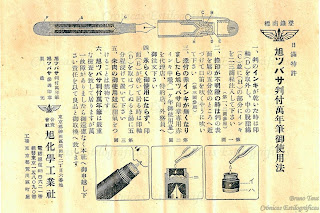 The instructions for this Asahi Tsubasa Hantsuki Mannenhitsu (旭ッバサ判付萬年筆).
  The steel nib in size 3.
Length capped: 130 mm.
Length uncapped: 105 mm.Length posted: 155 mm.
Dry weight: 15.8 g. The clip is imprinted with the brand name: Asahi Tsubasa.
  (Soennecken 105 – Diamine Evergreen)Bruno TautYokohama, October 21st, 2011[labels: Asahi Tsubasa, Japón]
Pen review of the Sailor Young Profit (Somiko in some markets) with music nib.Feeding my inclination for music nibs I have finally put my hands on this single-slit nib labeled as music by Sailor Company. This is the cheapest music nib among those made in Japan. 1. Appearance and design. (6.0/10)
This is a black pen with golden accents. Even the steel nib is gold plated to match. Therefore, it keeps the classical serious and formal look of many a pen. However, this is not a torpedo pen à la Montblanc despite the model name—Profit pens are the Sailor copies of the German formal pens.This pen, in a nutshell, is a cartridge-converter, with a snap on cap and a rigid steel nib. All very correct and functional, and nothing really exciting. 2. Construction and quality. (8.0/10)The materials employed on this pen are correct and show no abnormal wear. Everything seems right. The pen looks durable and ready for years of use.3. Weight and dimensions. (8.0/10)Medium weighted pen, which is somehow surprising as it is mostly made of plastic. Fortunately, it is well balanced either posted or unposted.Dimensions:
Diameter: 12.0 mm.Length capped: 135 mm.Length uncapped: 123 mm.Length posted: 145 mm.
Dry weight: 18.1 g (including the converter). 4. Nib and writing performance. (7.5/10)Once again, this is the key point of the pen. The nib seems to be the only argument in an inexpensive cartridge-converter pen with boring looks.This music nib is made of steel and is gold plated through a process of physical vapor deposition. Sailor was a pioneer in using it for pen nibs and decided to mark it with the acronym TIGP: Titanium Ion Gold Plated. However, this is still a steel nib with no special geometry. So, it is also quite rigid.
 The nicely engraved steel nib. On top, the acronym TIGP describing the plating process. On the side, MS shows this is a music nib.
 This is not the case in three-tine music nibs because the second slit naturally shortens the outer tines thus making the gaps due to pen inclinations less critical to the nib performance. This Sailor music nib is not suitable for those who use oblique nibs.All this makes me confirm my initial impression of this nib—it is more of a stub than of a music nib. It is, nonetheless, an interesting and upscale alternative to calligraphy (i. e. italic) nibs.
 Writing sample of the Sailor Young Profit with music nib.
 6. Cost and value. (8.5/10)For JPY 5000 (plus taxes) you get a smooth and rigid stub that Sailor insists in labeling as music. It is not easy to master and many would never go through the effort of getting use to it. Two are, in my opinion, the alternatives to this pen: One is the more expensive three-tine music nibs by Pilot and Platinum. The other is any of the calligraphy sets by a number of Western companies. Those Japanese music nibs are easier to use, whereas with those italic sets we are bound to encounter similar problems to those we faced with this Sailor music nib.7. Conclusion. (43.5/60=72.5/100)Not very high marks for this pen. Its only interesting feature is the nib, but it is not very user friendly, and, compared to other music nibs as Sailor insists with its naming, it is not a real competitor. The rest of the pen is fairly uneventful.
 (Sailor Young Profit with music nib – Sailor Tokiwa-matsu)Bruno TautYokohama, October 17th, 2011[labels: plumín, Sailor]
The NK nib by Kubo Kohei I showed some weeks ago raises some metaphysical questions on the essence of music nibs. What is indeed a music nib?
 Kubo Kohei´s music nib in steel.
This Japanese nib, let us remember now, barely shows any line variation unless was pushed down against the paper. And at the same time, the second slit does provide the extra ink flow this wider line demands.
 Modern three-tined music nibs: one by Platinum (on top) and two by Pilot.
 Music shiro nib by Platinum (mid 1950s).
On the other hand, I voluntarily ignored Sailor´s approach to music nibs when I compared those by Pilot and by Platinum a year ago. “Sailor´s”, I said, “lacks the visual appeal and the extra flow of the second slit. Sailor´s is more of a smooth stub than a real music nib.” But it really shows some line variation.
 Modern two-tined music nib by Sailor in steel.
So, what is the essence of a music nib? Is it on the line variation? If so, mostly any stub or italic nib —broad vertical stroke and thin horizontal one— could qualify for such.
What about the three tines? Should this be the standard, what do we do with three-tined nibs showing barely any line variation, like that by Kubo Kohei?
 Pilot pen from 1970s with a three-tined music nib in 14 K gold.
Some stylophiles claim that a true music nib must show some flexibility, thus dismissing all those modern Japan-made music nibs. But then, does any flexible or semi-flexible nib qualify for this category? Again, the case of Kubo Kohei´s nib comes in handy—it is not really very different from a semi-flex nib in its performance, but regular nibs showing some flexibility are not considered music nibs.
One more note on this regard. One of those wonderful specialty nibs by Sailor´s master Nagahara is named Cross Music. It has not just three tines but four by means of overlapping two nibs. The result is a very juicy point with a wonderful line variation opposite to that of a standard music nib and closer to an Arabic or fude nibs: thin vertical strokes and wide, very wide, horizontal lines.
 The Cross Music nib by Sailor´s nibmeister Nagahara.
 Reverse view of the Cross Music nib. The four tines are now visible.
At the end, we might conclude that a music nib is any nib the maker wanted to label as such. Just like a novel is any text under whose title the author added the word “novel.”
 (Sailor Young Profit with music nib – Sailor Blue)
Bruno Taut
Yokohama, September-October, 2011
[labels: Pilot, Platinum, Sailor, Kubo Kohei, plumín, plumín musical]
(Sailor Young Profit with music nib – Sailor Blue)
Bruno Taut
Yokohama, September-October, 2011
[labels: Pilot, Platinum, Sailor, Kubo Kohei, plumín, plumín musical]
On a previous Chronicle I spoke about the very interesting Pilot Super 500G: the bellows or accordion filler with the very unique faceted nib. I finished that text with the speculation of whether that Super 500G was the predecessor of the Pilot Elite with integrated nib.

 The Super 500G on top, and the two Elite on bottom. These two Elite have different filling systems. The most modern shows a CON-50 converter.
 The three nibs. The faceted one for the Super 500G, and the more common and well known of the Elite pens. Only one of them, belonging to the cartridge/converter unit is dated: October 1972.
Again, a mere speculation, but the search continues. (Athena Basic Line – Sailor Yama-dori)Bruno TautYokohama, October 8th, 2011[label: Pilot, soluciones técnicas, conversor]
 The three Pilots from the 1970s with black stripes.
 The 1971 Capless with a hard fine gold nib.
 The long feed is clearly visible on this picture.
 Detail of the extended nib.
 The pen opening for the nib. Contrary to other Capless models, this one is circular.
 (Athena Basic Line – Sailor Yama-dori)


