14 July 2018

Nib Sizes, Feed Diameters

Few elements in a pen are really standardized. Each maker created –still creates– many of the components and they only had to match the other parts of the pen without any regard to other manufacturers.

The closes one could get to normalization was in the area of nibs, where at some point there was a consensus about their sizes. In that environment, sizes 6 and 8 were quite big; sizes 10 and 12 were huge, rare, expensive and highly desirable.

And half the world away, Japanese pen makers had their own life to live. Sure Pilot numbered their nibs in a similar fashion --from 0 to 8--, but the consistency in the size was far from exemplary. Sailor, on its side, used some crazy numbers—sizes 30, 80, and 200 for some of the nibs that, in actuality, were rather small.


An old Sailor nib labeled as size 30.

Nowadays, Japanese makers are very consistent in the sizing of their nibs, but the naming is very arbitrary.

Pilot, on its more common line of nibs, calls them as 3, 5, 10, 15, 20, 30, 50. These numbers, however, do not mean much.

Platinum has three basic nibs—the 3776 with two and three tines, and the President. There is no indication of size.

Sailor, finally, has three basic sizes called medium, big and superbig.

And in the West, German nibs –third party nibs—tend to follow a more systematic approach. Bock nibs, albeit having their own number, follow a relevant pattern—the diameter of the feed. And the same happens with JoWo nibs: the feed diameter sets the nib size.

So, the question is how all these nibs –Japanese and German—compare. The following tables show the diameters of the feed of some manufacturers:

Pilot-Namiki

Nib

description

Feed

diameter

(mm)

5 6.0
10 6.2
15 6.4
20 6.5
30 7.6
50 9.0


Pilot and Namiki nibs. From left to right, sizes 5, 10, 15, 20, and 50. Sizes 20 and 50 are implemented currently only on Namiki pens. However, the examples here shown are still Pilot (::1::, ::2::). Missing on the table is size 3. And from the picture, sizes 3 and 30.

Platinum-Nakaya

Nib

description

Feed

diameter

(mm)

3776 old model

music 2-tined nib

6.0
3776 new model 6.5


Two 3776 nibs. These are the nibs implemented on Nakaya pens, the "alter ego" of Platinum. On the left, the feed and the nib of the old version of the regular nibs. This feed is still used on the music nibs of Platinum and Nakaya. On the right, the modern nib and feed of the 3776 series of pens and of Nakaya pens save for the cases of music nibs. Missing on the table and on the picture, the President nib.

Sailor

Nib

description

Feed

diameter

(mm)

Medium 5.8
Big 6.4


Sailor nibs and feeds of sizes medium (left) and big. Missing on the picture and on the table, the "super big" size of the "King of Pen" models.

Bock

Nib

description

Feed

diameter

(mm)

060, 076, 180 5.0
220, 250 6.0
380 8.0

JoWo

Nib

description

Feed

diameter

(mm)

#5 5.0
#6 6.0
#8 8.0


From left to right: Bock model 250 (6.0 mm in diameter), Bock model 380 (8.0 mm), and JoWo nib of size #6. All the feeds on the picture are made of ebonite.

The following pictures show how some of those nibs compare across brands.


Japanese nibs with similar external sizes. From the top left, clockwise: Sailor nib size big, Platinum 3776 Century (current model), Platinum 3776 (previous model), Pilot size 10.


Assorted pens whose nibs are about the size of a size 6 nib. From bottom left, clockwise: Pelikan M800, Clavijo with a JoWo #6, Senator pen with a Bock 250 (6.0 in diameter), Eboya with a Bock 250, Romillo with a Bock 250, Pilot with a size 20 nib, Pilot with a size 15 nib, and a Montblanc 146.


Assorted pens with nibs of about a size 8. From the bottom, clockwise: Romillo with a Bock 380, Eboya with a Bock 380, Montblanc 149, Pelikan M1000, and Sailor King of Pen.

The conclusion is interesting: Japanese follow their own systems and the actual sizes are very different to those of the German manufacturers.


Montblanc 149 – Platinum Black

Bruno Taut
Nakano, July 13th 2018
etiquetas: plumín, Japón, Alemania, Pilot, Platinum, Sailor, Bock, JoWo

07 July 2018

A Collection?

At first, most of us stylophiles, follow the same pattern. At some point we became attracted to fountain pens and started buying and accumulating as many pens as we possibly could.

And then came the typical question seasoned collectors ask:

‘What do you collect?’

The new aficionado has only one realistic answer:

‘Everything I can afford.’


An accumulation...

The question, needless to say, calls the newcomer in a number of ways: be selective, be wise with your resources, be patient… All those things so difficult to watch at first. Only time and experience teach wiser strategies in the art of collecting. But there is one detail seasoned collectors rarely say or do not really think about:

It is not just one collection you can pursuit, but several of them.


A collection. Just a possible collection. Or just one of them.

The discipline of collecting is learnt in an almost unconscious way by becoming aware of the limited resources at our disposal. And soon afterwards we also see that several arguments –several collections— is a way to keep the joy of collecting alive. After all, a strict limit on our collection might transform our hobby into a nightmare.


However, money counts, and money sets the true limits, and money is mostly everything. And collecting is a class activity.

But there is a collection to every budget. Or, even, more than one.


Sailor pocket pen, WG nib – Tomiya Tomikei Blue

Bruno Taut
Nakano, July 7th 2018
etiquetas: estilofilia

18 June 2018

Pilot 65

The Pilot 65 –or Custom 65 as some called it—is a model I have mentioned a lot on these pages, but I have never described it in detail. Given its relevance to understand modern Pilot pens it is about time to review it.

The 65 was the first (::1::, ::2::, ::3::) of those anniversary pens that later became a regular model, albeit with some minor differences.


The Pilot 65. Standard Pilot ball clip with "PiLOT" engraved on it.

So, in the year 65 of the Pilot era, 1983, Pilot launched a limited edition of 6500 pens –6460 in black, 20 in red and 20 in blue— in the well-known balance shape that many insist in associating to Montblanc. Pilot’s argument is that it follows the style of some Pilot models produced in the 1920s and 1930s, which is undeniably true.


On the cap band, the number 65 and the unit number. This was a limited edition of 6500 units.

The Pilot 65 is made of plastic with a barleycorn finish, with a wide golden cap band with an intricate decoration. The nib is made of 14 K gold and its size is not marked—this was the first of the future Custom models with a whole new set of nibs. But in actual terms, the 65’s nib corresponded to a current size 10.


The 14 K gold nib. The inscription: "PILOT / 14K-585 / < M > / (JIS):, plus the manufacturing date.

What is more interesting on this pen is the filling system—a captive CON-70 converter. Captive, I say, because it is built in the gripping section of the pen. This is, in fact, the first version of what later would become the CON-70 converter.


The captive CON-70 before this converter existed as such.

These are the dimensions of the Pilot 65 together with those of the Custom 67 and Custom 74, the natural evolutions of this anniversary pen:

Pilot 65 Custom 67 Custom 74
Length closed (mm) 140 142 143
Length open (mm) 126 125 126
Length posted (mm) 159 160 159
Diameter (mm) 13.5 14.0 14.6
Weight (g) 17.9 18.3 22.5

The Pilot 65, with its 6500 units, is now a well-sought after collectible pen. And that seems to be the fate of anniversary pens.


My thanks to Mr. NK.


Parker 50 – Sailor Tomikei Blue

Bruno Taut
Nakano, May 15th 2018
labels: Pilot, soluciones técnicas, conversor

11 June 2018

Trends 2018

Following the news and the movements in the market of fountain pens I can identify the following trends:

1. The Chinese invasion.

Chinese pens are no longer low quality pens. The proliferation of Chinese copies of the popular Lamy Safari (::1::, ::2::) some years ago was a very interesting sign—Chinese makers were able to compete in quality and in price with Western –and Japanese— entry-level pens.


Later on, those same Chinese companies have created other interesting models with higher price, thus creating an actual competition to many mid-range models.


Chinese pens are no longer cheap. The well made Hero H718. Photo courtesy of Foro de estilográficas member Antolín.

The expansion and reach of all these Chinese pens is severely limited by the lack of distribution networks, which would increase the actual cost of these pens. But, is it worth for, say, Sailor to produce the Sailor Procolor (a cartridge-converter, steel nib, plastic body, JPY 5000) when Penbbs is selling a decent copy of it for less than JPY 2000?

Pilot, Lamy, Pelikan, Sailor, Platinum… might need to analyze seriously their new positions the market.


A Penbbs 308 (in red) and a Sailor Procolor. Similar pens with similar construction quality. Photo courtesy of Pedro Haddock, author of the blog El pajarete orquidiado.


2. The luxury end.

Western and Japanese companies preserve their position in the high end of the market. However, these luxury pens rely more on the decoration and exotic materials than on the intrinsic quality of the pen as a pen.

This trend, consequently, opens the market to small manufacturers with limited production. Needless to say, this is not new as we all know operations like Edison, Namisu, Eboya, Conid… My contention, though, is that this trend will continue and we might see new small brands not bound by the necessity to mass produce in order to be profitable.


A luxury pen made by a small company: a Hakase made of buffalo horn. My thanks to Inquisitive Quill.


3. Small selection of nib points.

Nibs are becoming boring and predictable. Pens might look different and exciting, but under the cap we mostly find the same type of nib: rigid and with the very trite trio of F, M, and B points. And any variation on this is bound to result in additional costs.

The exception to this simplification are the big three Japanese makers, who offer a might wider selection (see, for instance, Pilot).


4. The ink inflation.

Ink makers have realized that people buy colors —many colors— instead of volume. On these Chronicles I have seen the cases of Sailor and Platinum, but this situation also affects to Caran d’Ache and Montblanc, at least.

Again, this is good news for small companies because these higher prices allow create some room for higher production costs. Now, is there a limit to this inflation of makers, colors and price?


Sailor's Ink Studio inks: inflation in colors and inflation in price. Is there a limit on this trend?


These are my reflections. And I could be very wrong.


Kubo, Momose and Iwase – Sailor Blue Iron

Bruno Taut
Shinjuku, June 6th, 2018
labels: tinta, mercado

30 May 2018

Carving

The title of this Chronicle could be a trite “yet another filling system”, for we have seen how fertile Japan has been on this field. But few truly innovative systems have survived that one model that oh-so-briefly put the system in the market. After all, cartridges and converters are truly handy and user friendly. Consequently, most of those systems are mere anecdotes. At times, though, anecdotes offer some interesting information.


The Carving pen. On the barrel there is an engraving: "CARVING / MADE IN TOKYO".
Dimensions of the pen: length closed: 138 mm; length open: 124 mm; length posted: 154 mm; diameter: 10 mm; weight: 12.6 g.

Nothing do I know about the brand “Carving”. However, the shape of this particular model, and the geometry of the nib point out at the 1960s as the production time.


A gold plated stainless steel nib. The engraving is simple: "CARVING / JIS ". The geometry is similar to some nibs made by Pilot and Sailor during the 1950s and 1960s.


Inside, something that looks like a cartridge. The inscription reads "カービンオーツマン61 / 吸入もできるスペアー" (Carving ôtsuman 61 / inhalation spare).

Its filling system also suggests an intermediate time between the 1950s and 1980s—it is an interesting middle point between two known systems. The first of them is the pulsated piston Pilot named as A-shiki (system A) in the late 1940s. The second, obviously by now, is the CON-70 converter, also by Pilot, currently on production.

On the first system –A-shiki–, the whole pumping action is driven from the tail, and a sliding sheath in the internal rod acts as stopper preventing the ink from going out on the downward movement of the system.


The system A on a Pilot from late 1940s.

The CON-70 acts in a similar fashion. Now the sealing valve is a rubber part that moves quite freely along the metallic rod in the central axis of the converter. And the basic difference with the system A is the spring that retracts the piston automatically. Well, and the fact that the CON-70, as a converter, can be detached from the pen.


A built-in CON-70 in a Pilot Custom (no additional number) from 1985. This filling system was also implemented on the Pilot Custom 65 (1983).

The “Carving” system implemented on the Carving pen works on the same principles: a pumping system and a closing valve. But now the pumping mechanism is a type of a sac, although on this case it is more of a plastic cartridge with some flexibility. The valve, on its side, moves freely inside the bladder, and seals it –partially— when pressing it. Carving called this “inhalation spare” and it makes some sense as the whole mechanism can be detached from the pen and could easily be replaced. I ignore, however, if the company marketed spare filling systems or had designed (and sold) more traditional –nominally disposable— cartridges.


The de-facto converter. The internal stopper is visible through the cracked plastic. The durability of this device is an obvious concern.

The fact that this “Carving” system was trivially detachable is, in itself, very interesting. First, because it shows that the time of the self-filling systems was ending and yielding its way to the disposable cartridge. Second, and more relevant here, because Pilot implemented the early versions of the later called CON-70 as built-in, non-removable filling systems on a couple of models in the early 1980s. In this regard, the Carving pen was well ahead of its time.

But it is also a small anecdote in the history of Japanese pens.

My thanks to Mr. Sugimoto.


Minka Saturn – Diamine China Blue

Bruno Taut
Nakano, May 2018
labels: Pilot, Carving, soluciones técnicas, conversor

22 May 2018

Kubo, Yotsubishi and Iwase

NOTE added on July 23rd, 2018. The body of this pen is not a creation of Mr. Momose, but an old and unused stock of pen bodies of Ishi Shoten's Yotsubishi.


The works of Mr. Iwase as a raden artist have already appeared on these Chronicles, and today I wanted to describe more in detail one of his creations.

Two are the basic types of canvases Mr. Iwase uses for his works—Pelikan and Montblanc pens on one side, and pens manufactured by old lathe masters and companies long gone lathe master Momose Yasuaki. Today’s pen belongs to the later type.

Three elements characterize this pen: the pen body, the nib, and the decoration. Each of them was created by a different craftsman.


"18 K pen raden / Kubo Kohei fountain pen".

On this case, the basic pen was made by the company Ishi Shoten for its brand Yotsubishi. Its material is ebonite, although the barrel and cap finials are made of wood. The pen was originally intended as a Japanese eyedropper –the tail can be unscrewed and detached from the barrel--, but the final result is a cartridge-converter pen (Sheaffer type). The cap lip is protected with a silver ring.


A raden pen...


... or a cartridge/converter pen.

The nib and the feed were provided by nibmeister Kubo. The nib is made of 18 carat gold and is associated to an ebonite feed. The size of the nib would be comparable to a Bock's #5, or to a Pilot’s 10 (::1::, ::2::) or a Sailor’s “big” size, although the feed's diameter is bigger: 6.5 mm.


The Kubo Kohei's nib: "ELEGANT / KB / 18K 750 / MADE IN / JAPAN".
The feed has three ink channels that provide a rich ink flow.


Writing sample with the Kubo-Yotsubishi-Iwase pen.


Nothing special on the tip. Just well cut.

Finally, the decoration is a rich example of the raden technique: carefully cut sea shells glued to the pen body; then, urushi is used to fill up the spaces between the shell stripes and smooth the whole pen. Ad additional later of transparent resin protects the decoration. The gripping section is decorated with red urushi.


There is a simple inscription the cap ring: "silver 925 / 11/20".

All in all, the pen is an original and attractive work; the final result of two Japanese craftsmen working on old forgotten batches. And in this regard, this is not a unique example, albeit other models are mostly one of a kind.

This pen is one of the 20 units Mr Iwase marketed in 2015 and 2016, some of which were sold through the Wagner group. And as it is often the case on artisanal products in Japan, there is no clear sign of the authorship, with the sole exception of the engraving on the nib. However, not many stylophiles (much less occasional buyers) would identify the letters KB as a signature of Mr. Kubo.

These are the dimensions of this pen:

Length closed: 142 mm
Length open: 126 mm
Length posted: 165 mm
Diameter: 15 mm
Weight (dry) 21.9 g
Ink deposit: 1.1 ml (Sheaffer converter)


Minka Saturn – Diamine China Blue

Bruno Taut
Nakano, May 21th, 2018
labels: Nibmesiter Kubo, Momose, Iwase, raden, urushi, Yotsubishi

07 May 2018

Kubo Meets Sakai

The figure of Kubo Kohei (久保幸平) is already known to the readers. He is a very prestigious nibmeister with a long history of nibs made for his own brands –Elliott, Nobel–, and for others –Push, Danitrio, even Zôhiko. The purpose of this Chronicle is to show some more remarkable creations of this master.


An unusual music nib by Kubo Kohei.

Kubo Kohei has made music nibs in the past, as I have reported here. However, that example was a very traditional music nib: two slits, three tines. The following examples go one step forward: three slits, four tines. The result is a very broad and wet line showing a good –but not extreme— variation on the writing.


Writing sample of a 4-tine music nib by nibmeister Kubo.

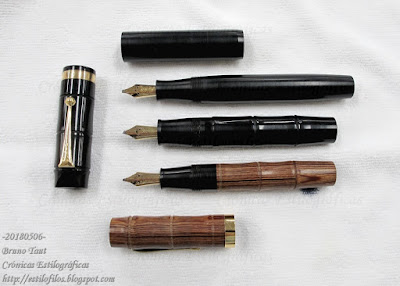
These three music nibs are associated to three outstanding pens—three old pens made by Sakai Eisuke (酒井栄助). They had not reached the market and had been retrofitted with Henckel nibs, which is not rare in what looks like production leftovers by the Ban-ei group.


All three nibs carry the same inscription: "ELEGANT / KB / 18 K - 750 / MADE IN / JAPAN".


However, the ways their tips are cut are different--the one on top is very sharp, and that on bottom is the roundest of them.

These pens are all Japanese eyedroppers of very generous dimensions. So big, in fact, that the Kubo’s nibs seem a tad too small. These are the dimensions of the pens:

-.Wooden.-

-.Plain,
- black ebonite.-
-.Bamboo-like,
- black ebonite.-
Length closed (mm) 145 173 152
Length open (mm) 130 150 132
Length posted (mm) 180 208 186
Diameter (mm) 20 18 20
Weight, dry (g) 36.3 44.0 44.9


The three pens where Kubo met Sakai--years after the disappearance of the later.
Only the pen in the middle (black ebonite in the shape of bamboo) has an additional engraving--on the clip it says "NEW CLIP", showing some parts coming from Fukunaka Seisakusho. The plain black pen (on top) has no clip.

Remarkable pens with remarkable nibs, although they might not be the best match. But sure they are attractive and desirable.

My thanks to Ms. Lai.


Platinum pocket, steel and stripes – De Atramentis Jeans Blue

Bruno Taut
Nakano, May 6th 2018
etiquetas: nibmeister Kubo Kohei, Ban-ei, plumín, plumín musical